From fragmentation to fusion: Breaking down the complexities of data management
UX Research
Brand Strategy
Visual Identity

We join forces with companies dedicated to addressing real human needs. Leveraging our full-cycle digital capabilities, we shape brands, experiences, and products that enrich the lives of millions every single day.
From fragmentation to fusion: Breaking down the complexities of data management
Transforming the global EdTech industry with a new brand strategy and website.
A new powerful and agile look to training analytics
Elevating the experience of the world’s most accessible data analytics tool.
Driving conversation and connecting ideas which empower creators and brands
Designing a new mobile experience for the all-in-one messaging platform.
From revolutionizing digital healthcare with Kinetik to simplifying global education with Wonde, we’re in the business of making a positive impact on our collective future.
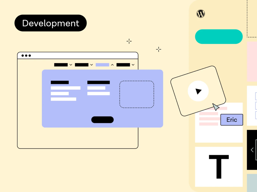
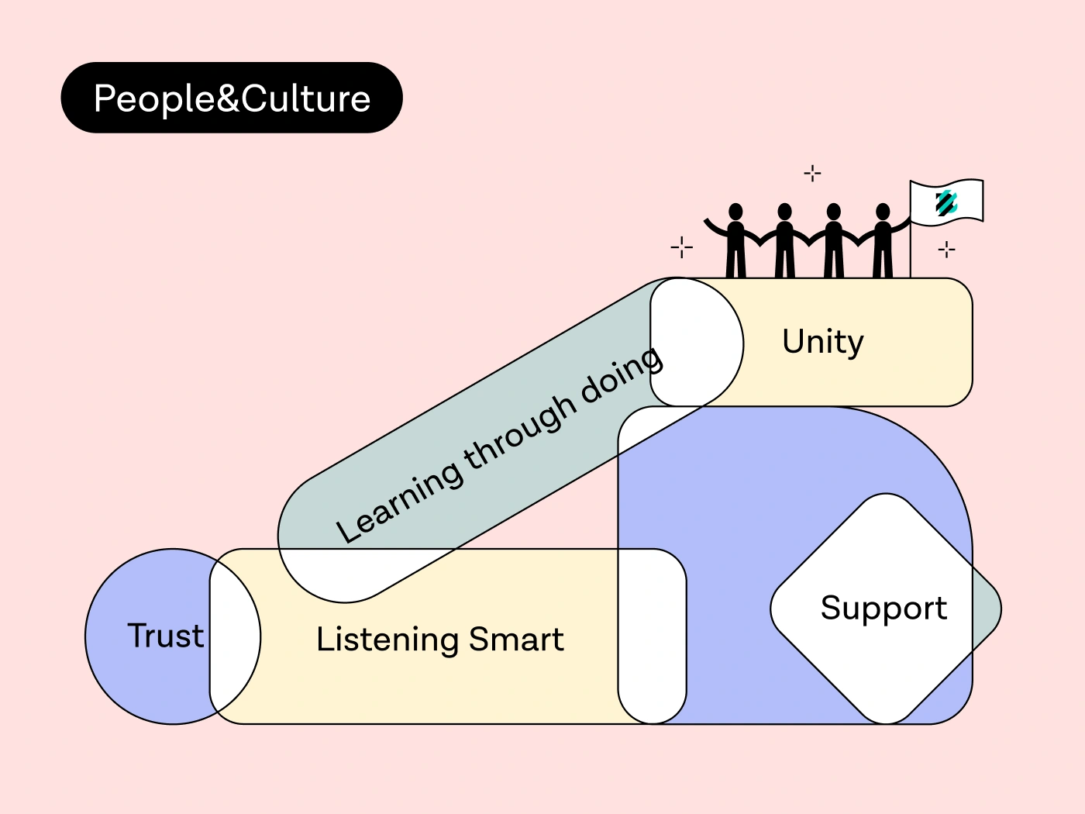
Our Approach
Through rich collaboration, we delve into your unique challenges and opportunities. This understanding shapes our comprehensive approach — from research and strategic direction to brand development and website or product deployment. We’re with you every step of the way, driving holistic change and creating lasting value.
Stay tuned into our latest endeavors, insightful articles, and the industry trends. Fresh insights delivered weekly.
Let’s get to work