This article narrates a personal journey transitioning from front-end development to product design.
The goal is to spark self-reflection on your design practices, seamlessly aligning with developers’ needs, and encourage you to steer clear of sloppy design habits.
My hope is that these insights not only ease the developers’ lives but also enhance collaboration, ensuring your work contributes to our shared objective — creating outstanding products, streamlining processes, and improving overall work experience.
Personal journey
Let’s rewind the tape — Back in 2014 I was working as a warehouse operative in Liverpool, England. My job revolved around picking store goods, arranging them like Tetris blocks into large metal containers, and my free time revolved around consuming too many calories in beers or scrolling on YouTube to find that one life-changing video. In short, I was knee-deep in a soul-sucking job, drinking too much and caring too little. I had finally reached a point of “Screw This”.
I decided to make a U-turn and head back to school for multimedia design — a program as broad as a Swedish buffet, offering classes on design, development, communication, business and everything in between. Fast forward, I landed my first job in the field, got my Design degree, Bachelor’s in Web Development, and later even secured a Master’s in Information Architecture.
Armed with both design and dev skills, my professional journey led me to startups searching for a “generalist” — UX researcher on Mondays, Product designer on Wednesdays, and Full-stack Engineer by Fridays. Not ideal, but I guess that’s what you need when you’re building MVP after MVP. Truth be told, I loved working this way and understanding every nook of the full-cycle product development, being a Jack of all trades. However, you know what they say: Jack of all trades, master of none. This is very much true and at a certain point I realized I wanted to specialize in one area, which for me at the time was front-end development.
As a front-end developer, I found myself at the sweet spot between creativity and precision. I embraced my specialization, delving into various development technologies, best coding practices, and the endless javascript frameworks, collecting them like a Pokemon cards to fill up the empty space on my resume.
However, as life goes, I either got bored or had yet another existential crisis. I came to a conclusion that development isn’t my happy place anymore. Back to UI and Product Design it was, determined to refine my craft there. A few years in, and I’m pretty sure I made the right choice.
Why am I sharing all of this with you?
Well, because my days as front-end dev granted me a backstage pass to the chaos that unfolded when, as a developer, I got handover files from other designers — these inconsistent, marvellous chaos of designs resembling Jackson Pollock paintings. In all fairness, it wasn’t ever that bad; and my own way of designing back then wasn’t perfect either, far from it, to be honest. But when you’re both the designer and the developer, you can get away with a bit of sloppy work or as we like to call it “creative mess”.
Designing with development in mind
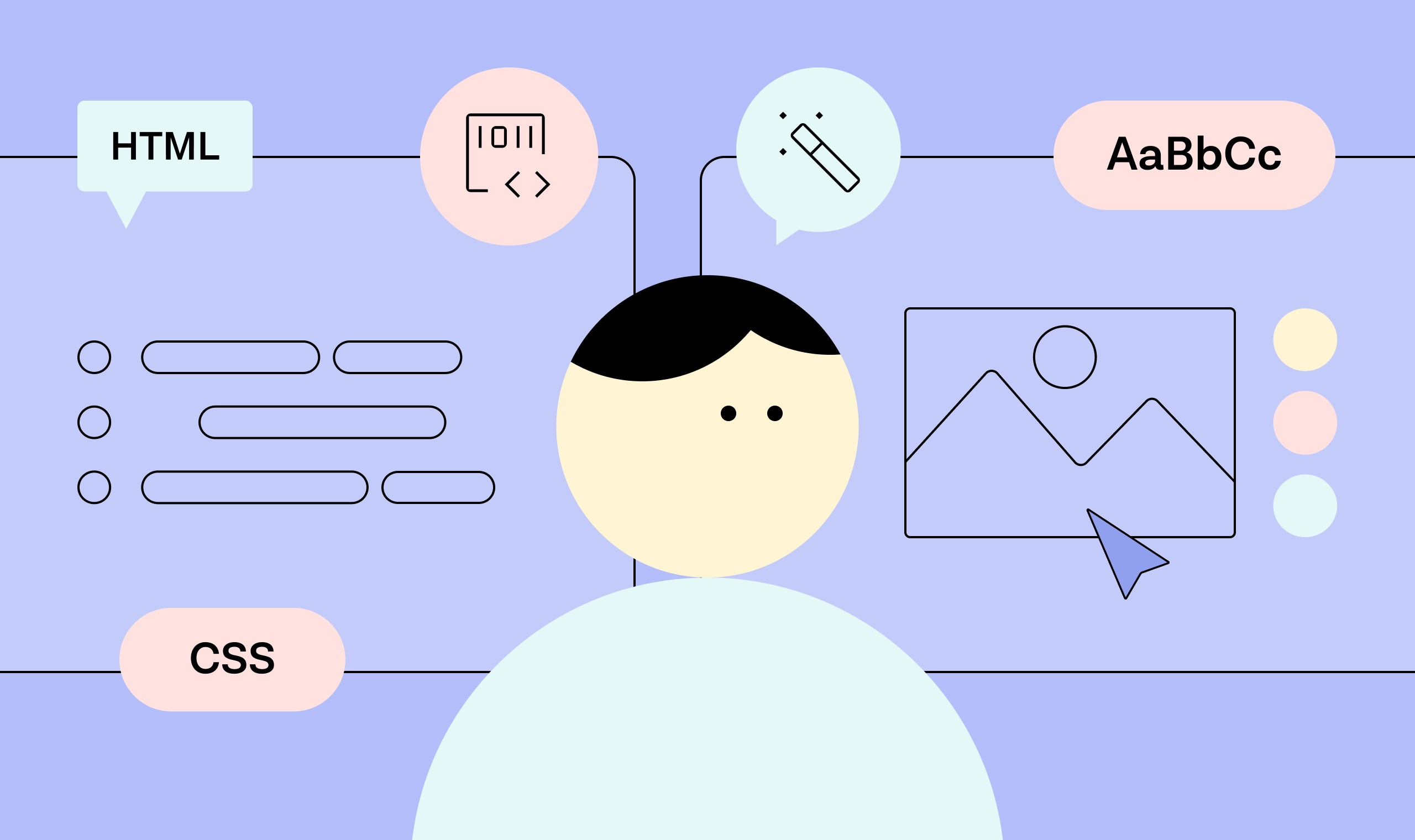
My experiences have taught me that good design comes from a holistic approach that values both design and development. Despite design and dev being two separate disciplines, they are closely interwoven with a symbiotic relationship. As a designer, stepping into the shoes of a developer shouldn’t be viewed only as a respectful acknowledgement but rather as a strategic move on your part to elevate your craft. You not only enhance collaboration but also streamline the entire product creation process, ensuring your designs seamlessly come to life with precision and functionality.
Designers, driven by creativity and user-centric thinking, should appreciate the logical and systematic approach of developers. Similarly, developers should recognize the creative intent behind designs and work towards translating them into functional, user-friendly interfaces.
So unless you are designing yet another Dribbble shot, you should be always designing with the development in mind. And no, I don’t mean that you need to understand how it’s going to be coded or how your designs translates into CSS. It’s honestly just about designing consistent and organized interfaces so that once they are being handed over to developers, they know how to do their part of the job.
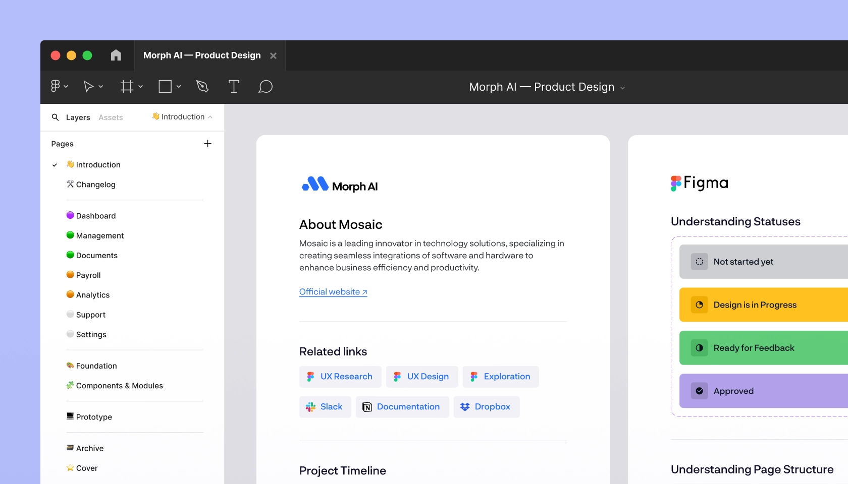
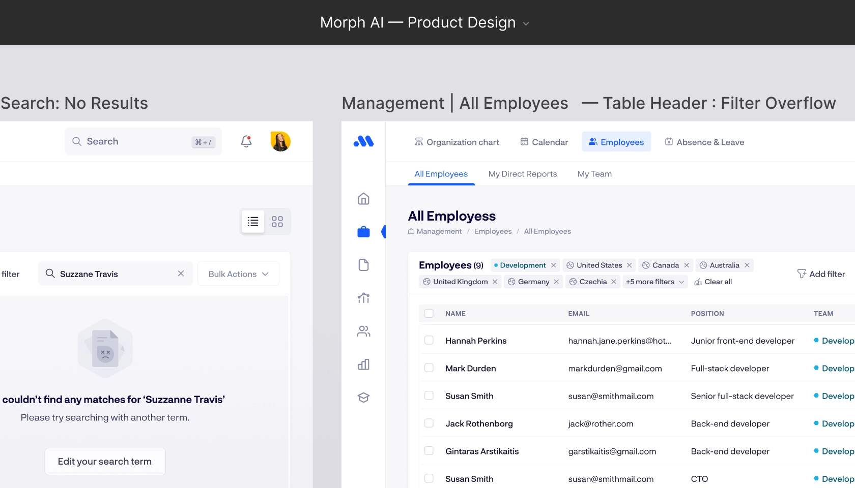
File Clarity Let’s start with the basics. Nobody wants to play a game of “Where’s Waldo?” in your design file. Try to give it some structure, divide all your content into clear pages like chapters in a book. Each page tells a story — make sure it’s a story that’s easy to follow. Use conventional statuses and labels throughout your design to indicate state of your design. And if your design is complex, simply provide more context and explanation. If the dev don’t need it, they can always skip, but there’s no harm in providing more information. Just remember, information is only useful when it can be understood, so keep it simple.
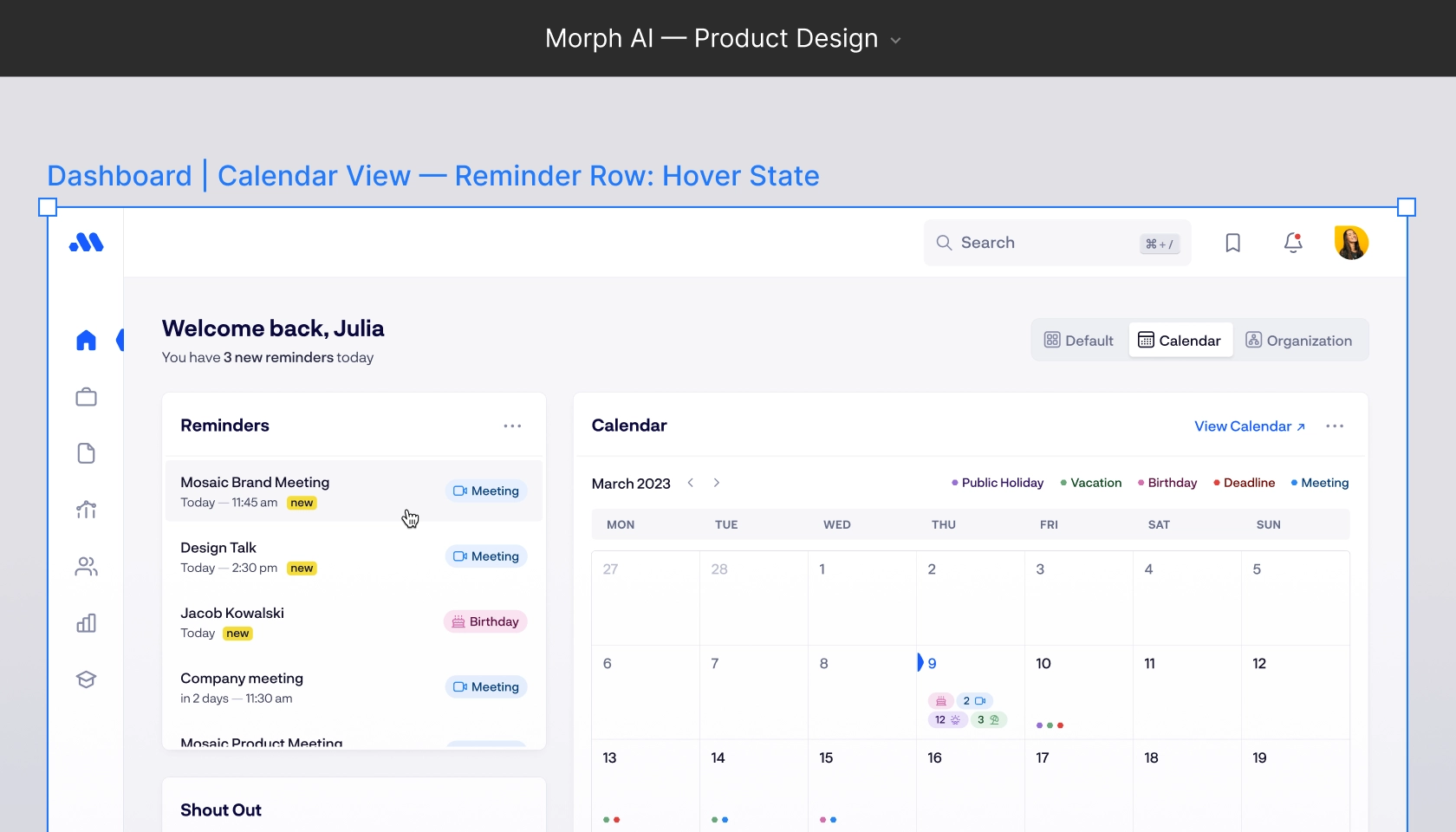
Naming Naming your pages, frames, and components in Figma is essential and will make your design more accessible, improve search-ability, and understanding. Proper communication is key to avoid misalignments that will unnecessarily prolong your work and delay everything. User flows are definitely helpful during the UX phase but during the actual design you might get away with clear and descriptive frame names and additional labels. Name things properly and try to make them self-explanatory.
It is about providing a good enough context for a smooth handover and helping others to understand and navigate through your designs. “homescreen v2” next to “homescreen v1” design doesn’t really communicate much. Don’t rely on dev to have to fill in the blanks, let them know what has changed. Utilize symbols such as dashes ( – — ), colons ( : ), slashes( / ) and pipes ( | ) to your advantage in your frame titles. Although I don’t think there’s one conventional naming format, just try to be consistent across your designs.
When it comes to layer naming, personally as a developer I never cared for proper layer names and know few others who can back me up on that. The thing about properly naming every single layer is that it really is time-consuming. So instead of doing a work that might not be appreciated, clarify with your devs; they might not needed either. A good practice is to have aptly named layers in you components, but everywhere else you can just take the advantage of plugins and bulk rename all your “frame128923878” to something shorter.
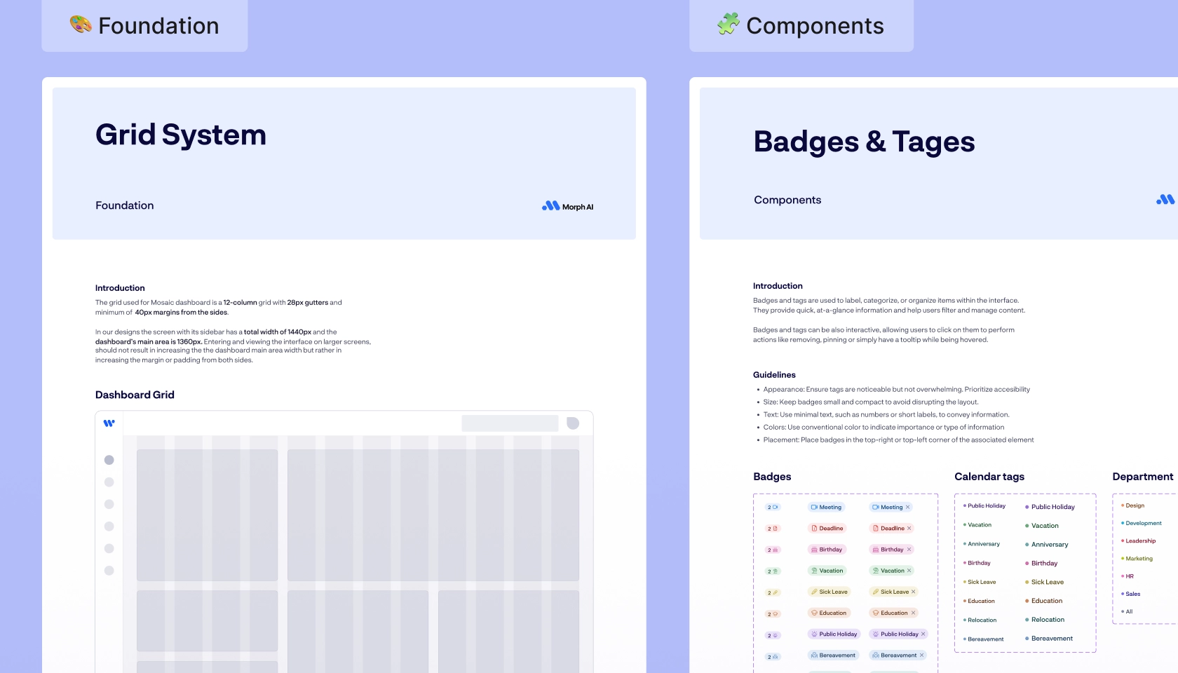
Foundation and Design System First let’s break down what I mean by Foundation and what by Design System. Starting with the foundation, as the name implies, it is a fundamental thing and serves as a back-bone of your design system — the core visual elements from which our design is built. Colors, Typography, Grid and Spacing are the main ones. While, of course, this list can be extended with other elements such as Elevation, Border radius, Motion, and more.
Well-defined foundation ensures unity and consistency in your designs and provide a basic building blocks for all of your components. Sure, there’s a time investment in the beginning but it always pays off and ultimately can save you time. Text styles and color styles are here for a reason so have them defined and use them everywhere in your designs; the dev team will appreciate it.
Now, about Design System. In a nutshell, Design System is a collection of reusable components, from which you build your interface. Atomic design by Brad Frost is pretty solid approach to creating a versatile and flexible system for your design. But no matter how you create your Design System, just make sure to create one. Sometimes it doesn’t hurt to provide more context for your foundation components. So if you see fit, provide additional information that might help developers while translating your design into code.
Foundation and Design System has many functions — it saves time, you are dealing with a single source of truth, and makes your designs consistent by introducing the right kind of constraints. You’ll stay true to the established design and won’t create inconsistencies that lead to angry developers, which lead to bad product, resulting in disappointed user. And who do we are about the most? The users, so don’t disappoint them.
Alignment What I hated the most in my dev days was when I received design with alignment all over the place, inconsistent spacing, and/or no grid at all. Us designers love to venture out of the defined grid to increase visual emphasis here and there, so if you do so, make sure it’s purposely done and you are not unnecessarily breaking your alignment. Remember, Grid and Spacing system are foundations of your designs; do not neglect them. The most standard one is 8-point grid but I would recommend using 4-point for more fine-grained level of control.
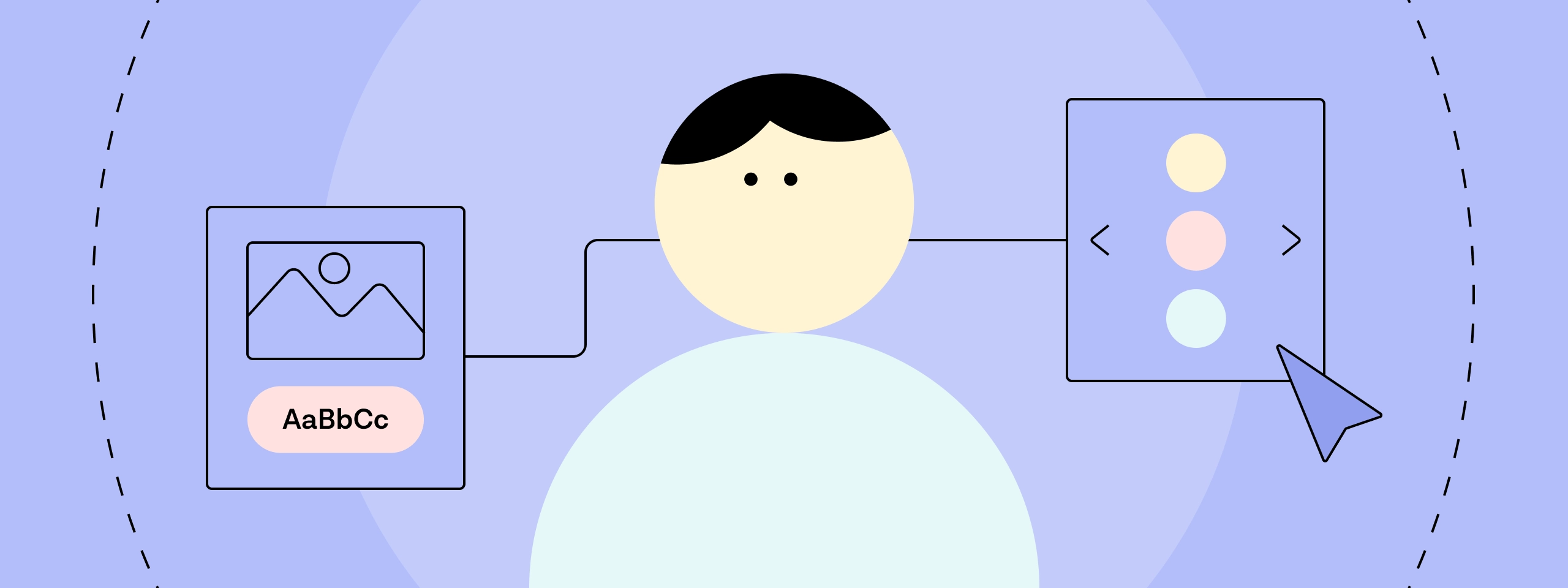
Images and Icons Is it easy to understand how the images, icons and other assets should work? You better have your icon ready for export, with a consistent stroke and weight, and in a bounding box; be a pro. And what about your images? Is it clear what is the desired image position? Should it be centered, or does it have fixed height and width, or is it fluid based on the column size, which one? Don’t leave the devs guessing.
Breakpoints & Edge cases Did you leave them out on purpose or you’ve simply forgottent. Different screen sizes, overflowing, overlapping, empty states, responsive Layout and UI elelement behaviour for more dynamic content. As a product designer you should try your best to cover them. Most of our designs are static within a finite space. But in reality your design needs to be flexible to adapt to variety of changes, different environment and dynamic content. And sure, your work will be more aesthetically pleasing when your “advanced filter” design has 2 items selected, instead of 12. However, a great design isn’t one that just looks pretty; a great design should be first and foremost be functional.
Prototyping Prototyping might not be your go-to move and very often might not be in a scope of your work, but when it comes to the functional behaviours and interaction patterns, it is something that again not only makes your design more consistent but also improve design-dev handover.
I am big advocate of prototyping, and prototyping early. Just mocking up a simple flow in a functional prototype might uncover crucial user experience issues that wouldn’t be discovered otherwise. Often it can also identify missing screens and edge cases in your static designs. It helps devs to better understand the user flow and various interactions. During client calls, creating a simple prototype can leave a lasting impression and help you “sell” your designs.
The bare minimum of your prototype can be a simple state change of your component, such as hover, and it’s done in a just couple of clicks. It would help the dev understand the transitions and behaviour and sets you apart from newbies.
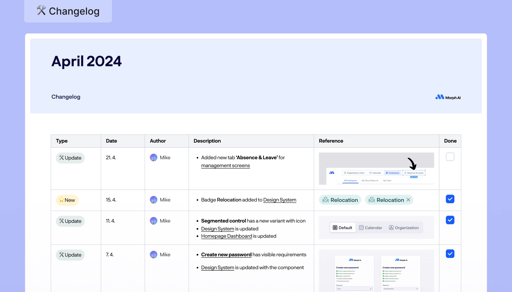
Account for changes I shouldn’t even be talking about this one, as it is something I always fail to implement in my own work, but it’s something we should not omit. Designs are like living organisms, they evolve over time — labels, annotation, timestamps and changelog can help you in this case. They keep everyone on the same page. Knowing your designs will change over time also means that old and unused stuff should be archived to avoid unnecessary clutter in your pages.
Handover
Odds are, nothing from the things mentioned above is exactly eye-popping discovery to you. But keeping those things in check as you design will really make you a better designer and your designs always ready for handover. Speaking of which, having your files ready for handover is great, but the handover isn’t the end game for you, or it shouldn’t be. The nasty connotation of the word handover implies that we’re stripping ourselves of the responsibility and it’s no longer our problem. Which is of course wrong. Handover should be viewed more as a collaborative process with teams built on a solid foundation of communication and interaction between each other, not isolated. So have an open mind and encourage sharing knowledge, we have nothing but to learn from each other.
Take everything with a grain of salt
To summarize, have good design hygiene and your file cleaned up before inviting someone over. Avoid clutter, be organized and label things clearly, describe when necessary, archive when not needed, and so on.
Having said that, not everything has to be perfect. If we have certain constraints and tight schedule, we have to prioritize and omit certain things. There are many variables that go into a project and you already have your own way or working, so please don’t interpret all of the things mentioned above as hard set rules. I only share what I’ve concluded based on my prior experience but by no means am I here to preach. Use what feels right and disregard the rest, the most important thing is finding what works for you and your team.
Looking back on my journey
From my early days as a warehouse operative to my current role as a product designer, I am genuinely content with where I’ve ended up. Over the years, my journey has been solely about finding something that I truly enjoy doing.
I like to think that the work I do contributes real value to others and the world, despite how cliché that may sound. But even if it doesn’t, its personal significance to me makes it meaningful regardless. This fuels my dedication to the craft and my continuous pursuit for improvement. So my final point is simple: Find what resonates with you and pursue it boldly.
Tips on making courage and vulnerability work for you
Culture
Filip Justić
How to make remote working work for you
Culture
Filip Justić
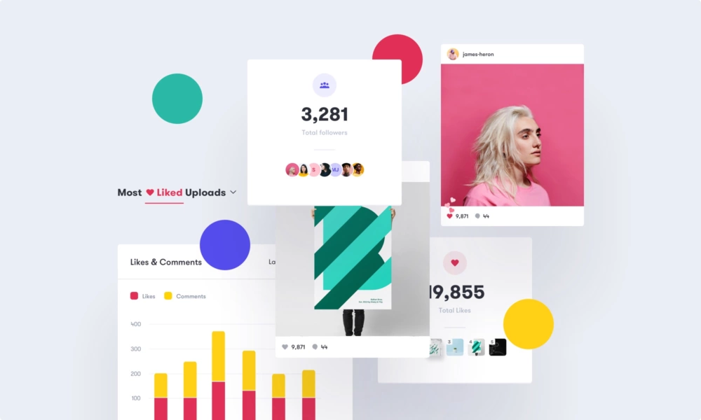
Iconosquare — a quick study of how colors and design choices shape brands and interfaces
Design
Manage Cookie Consent
To provide the best experiences, we use technologies like cookies to store and/or access device information. Consenting to these technologies will allow us to process data such as browsing behavior or unique IDs on this site. Not consenting or withdrawing consent, may adversely affect certain features and functions.
Functional
Always active
The technical storage or access is strictly necessary for the legitimate purpose of enabling the use of a specific service explicitly requested by the subscriber or user, or for the sole purpose of carrying out the transmission of a communication over an electronic communications network.
Preferences
The technical storage or access is necessary for the legitimate purpose of storing preferences that are not requested by the subscriber or user.
Statistics
The technical storage or access that is used exclusively for statistical purposes.The technical storage or access that is used exclusively for anonymous statistical purposes. Without a subpoena, voluntary compliance on the part of your Internet Service Provider, or additional records from a third party, information stored or retrieved for this purpose alone cannot usually be used to identify you.
Marketing
The technical storage or access is required to create user profiles to send advertising, or to track the user on a website or across several websites for similar marketing purposes.