The client
ShipBob is a logistics provider that supports e-commerce businesses with access to their network of fulfilment centres and tools to maintain control over inventory, orders, and shipments. ShipBob was founded in 2014 and is one of the fastest-growing tech companies in the US, with more than 450 employees and hundreds of thousands of square metres of warehouse space across the country.
Problem
ShipBob’s existing brand was selling them short. Having secured $62.5m in total funding, the time was right to rebrand and to better communicate ShipBob’s personality and story.
They wanted to bring to the fore their sense of warmth, emotion and the real connection to their customers that you don’t typically see in the logistics category. Functionally, they needed to create a more cohesive experience across their website, increase conversions and create more flexibility for their internal teams.
Solution
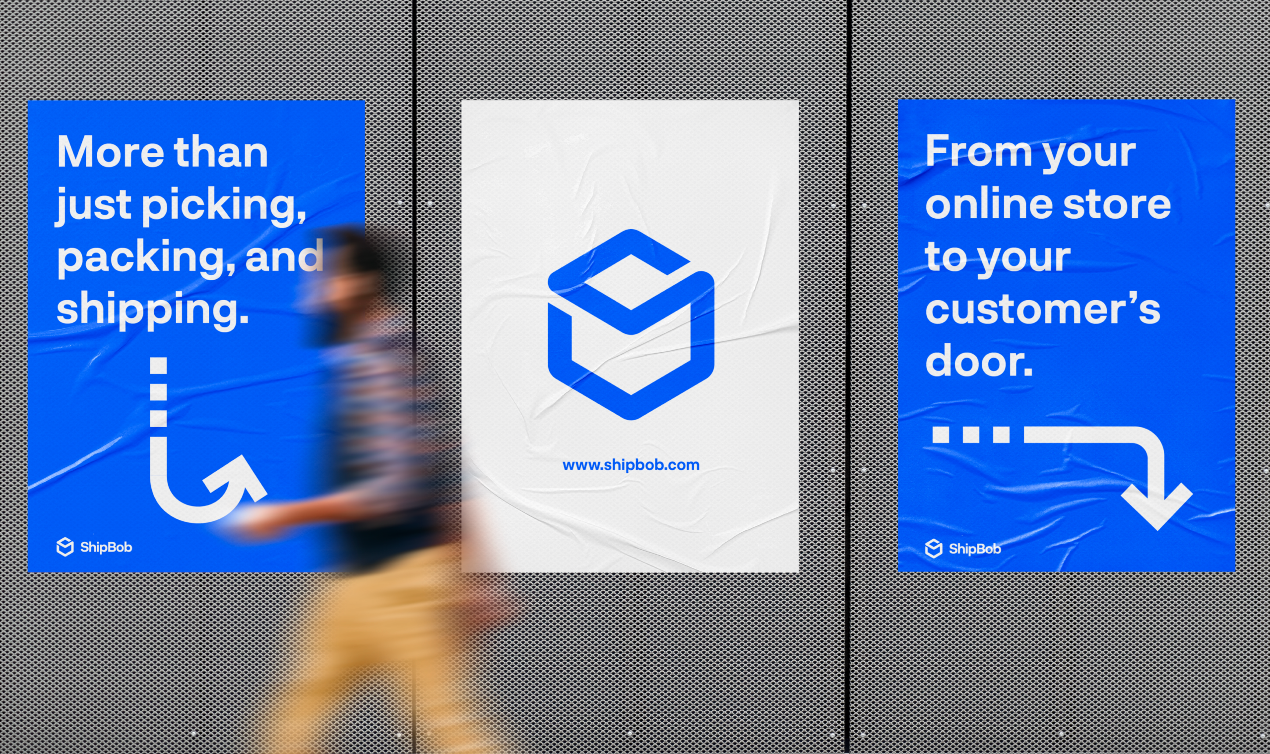
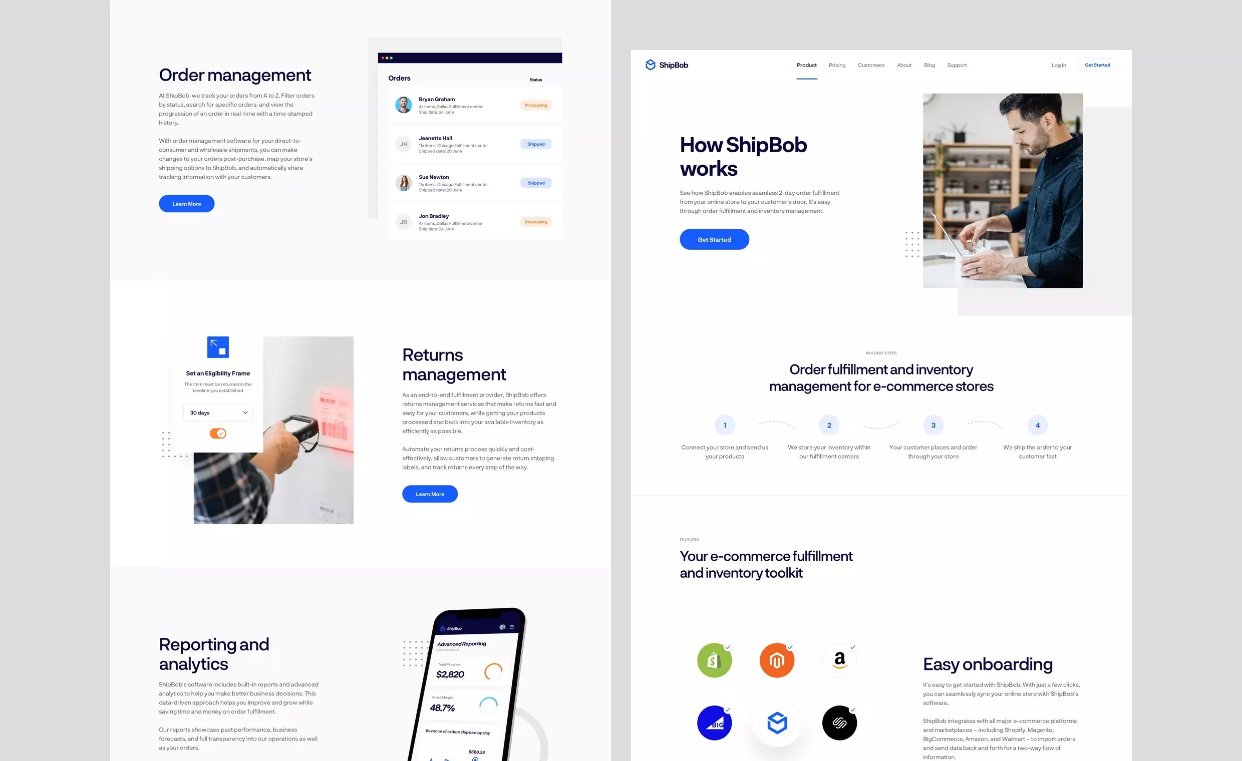
We refreshed ShipBob’s brand with an updated logo, colour scheme and UI design. We also designed and built a flexible new website and an easy-to-use CMS platform.
Helping ShipBob become a modern, professional, and highly credible brand.
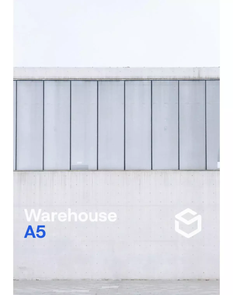
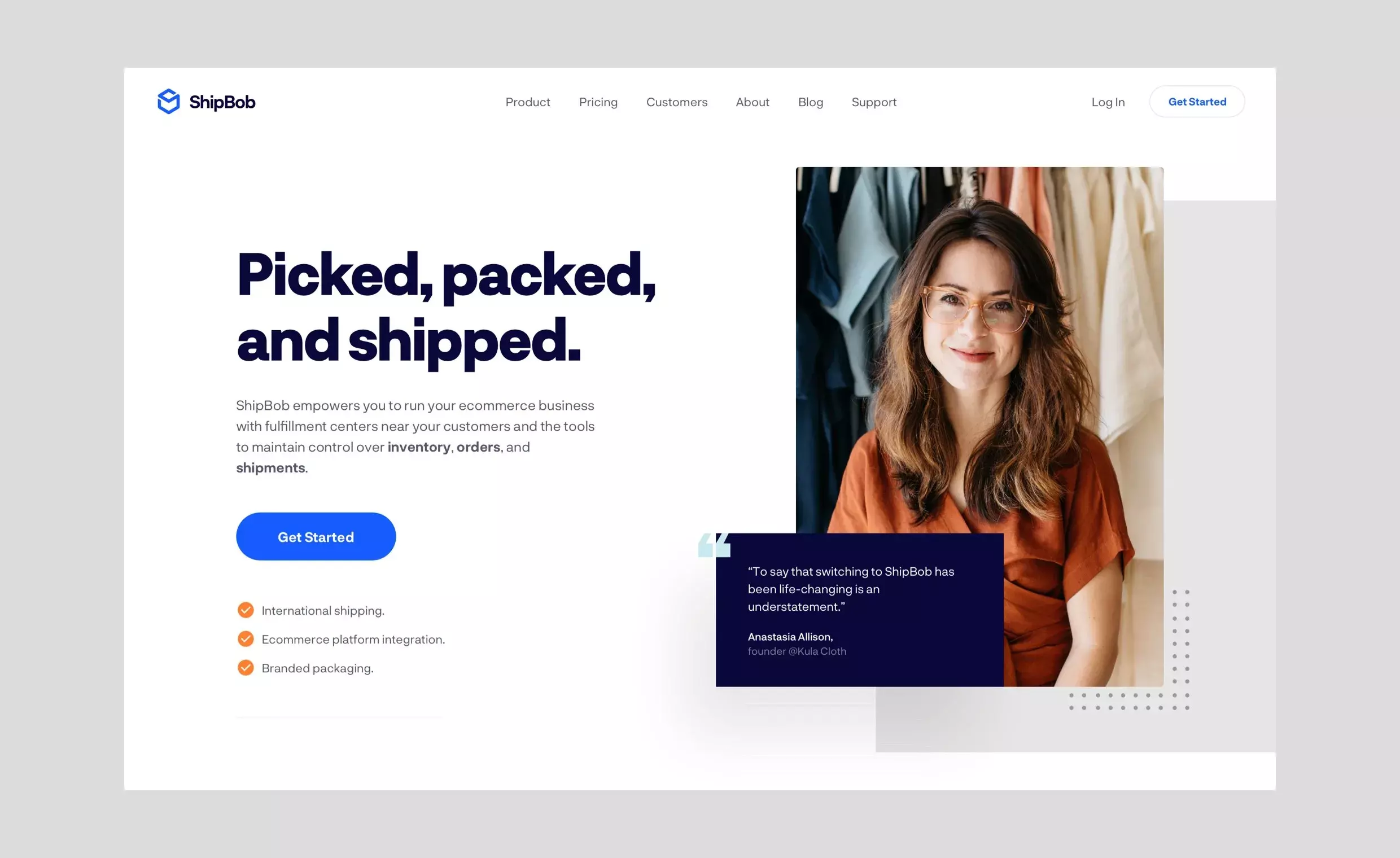
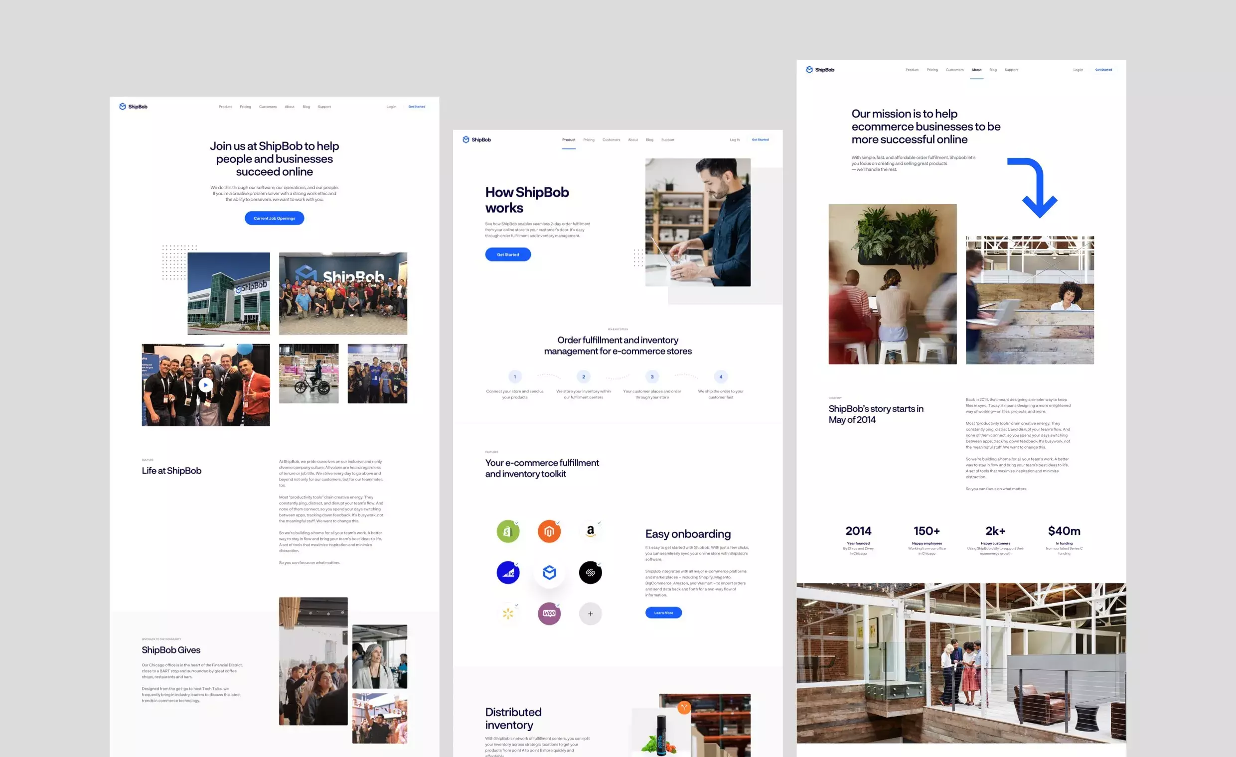
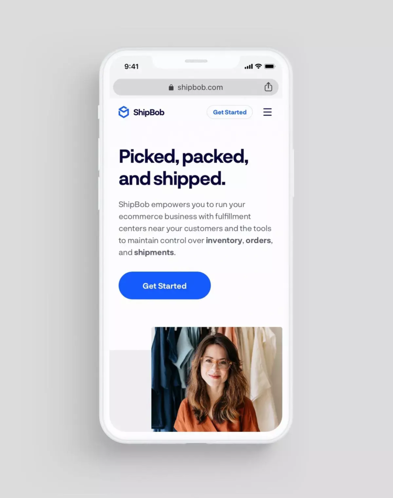
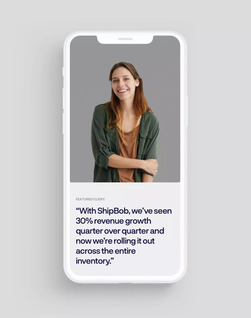
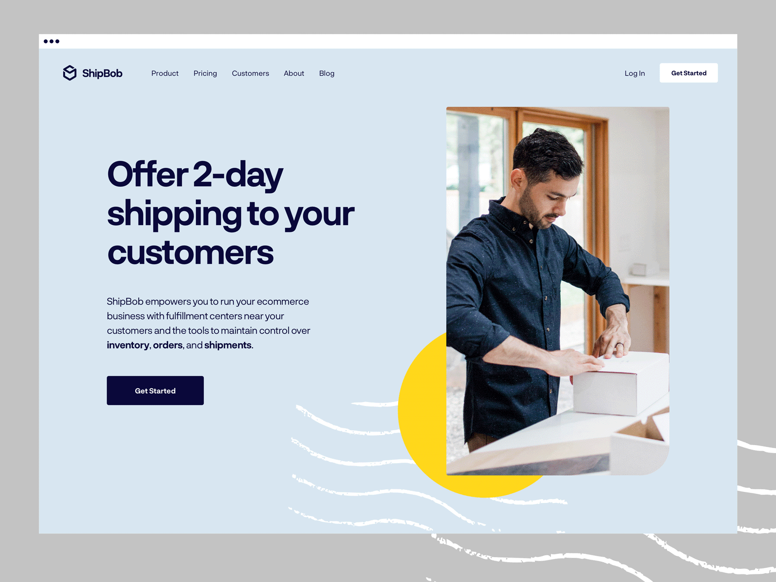
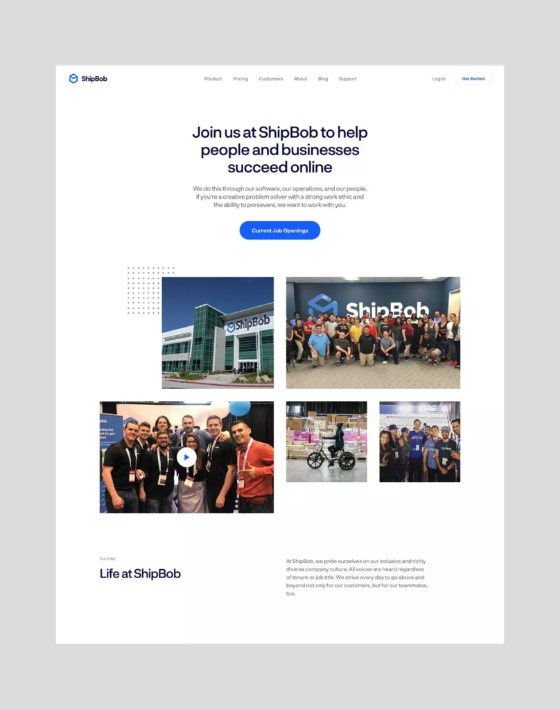
We focused on establishing a more emotional connection with ShipBob’s customers through content and design. We prioritised video testimonials and case studies on the homepage, and adjusted layouts to allow for more and larger images. Warehouse photography gives a snapshot into the size and scale of operations, and helps to build trust. Highlighting real ShipBob employees on the careers pages lends personality to the brand.
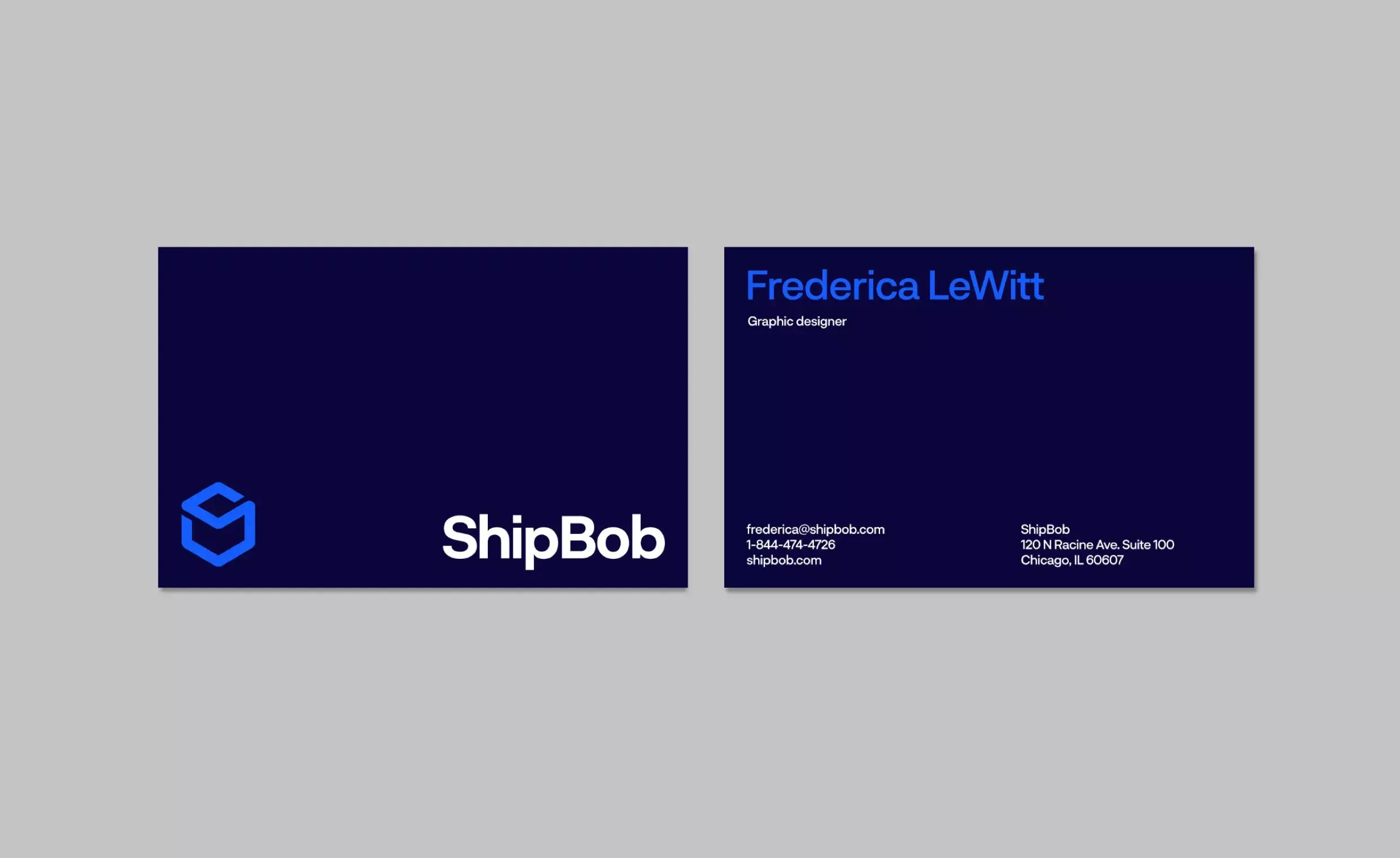
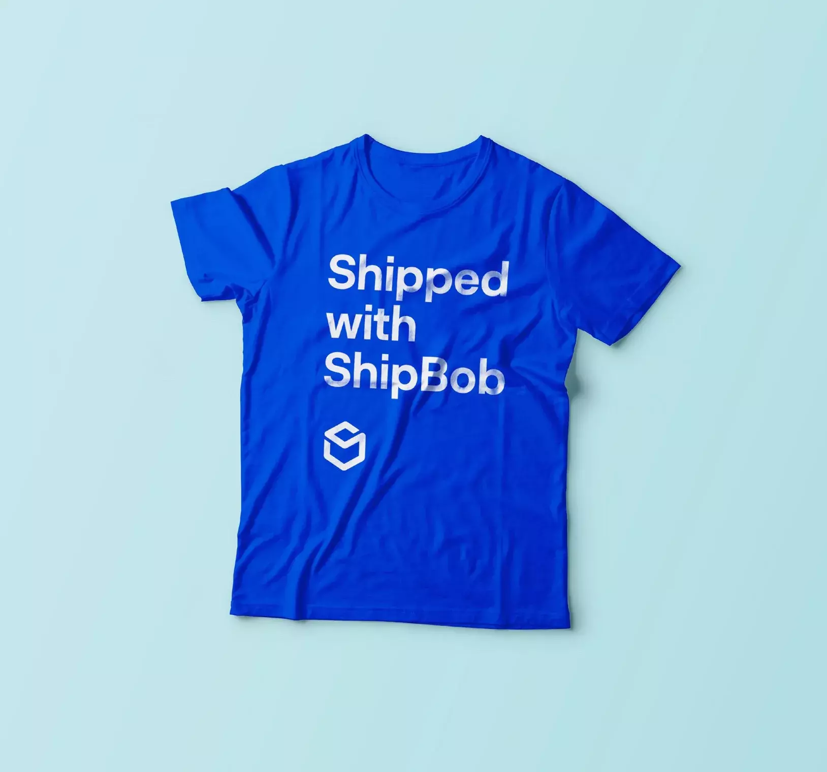
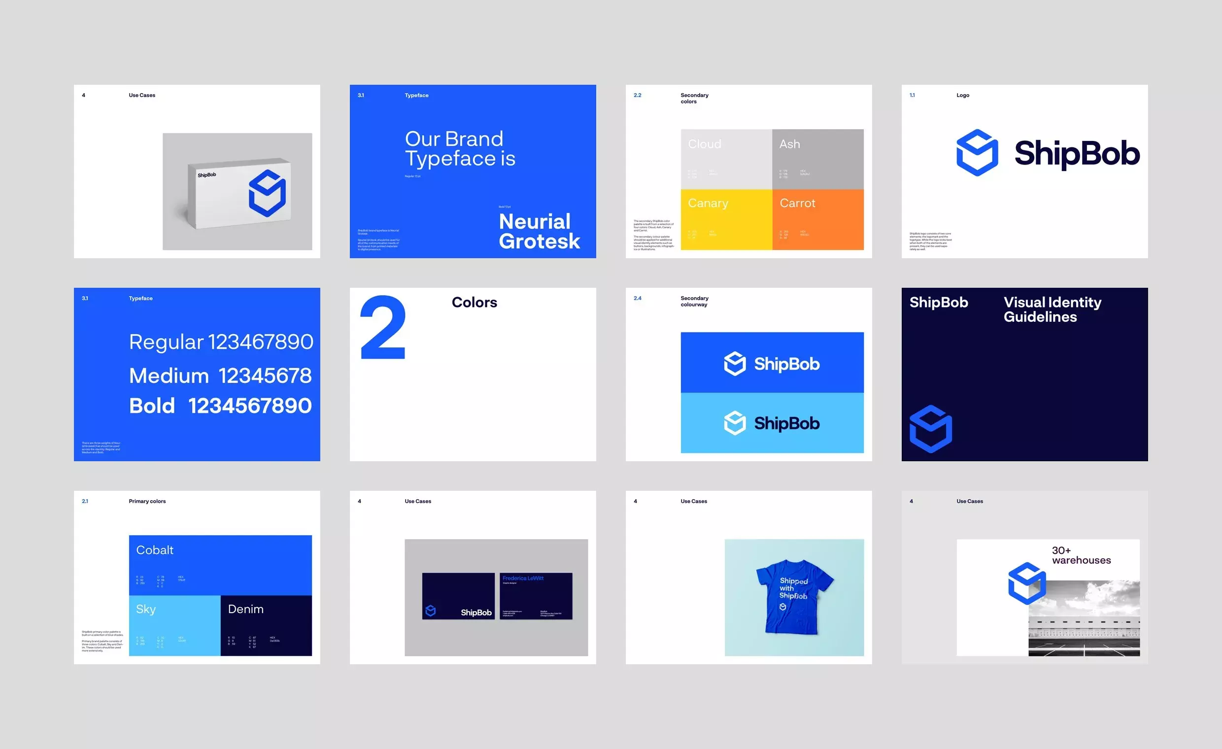
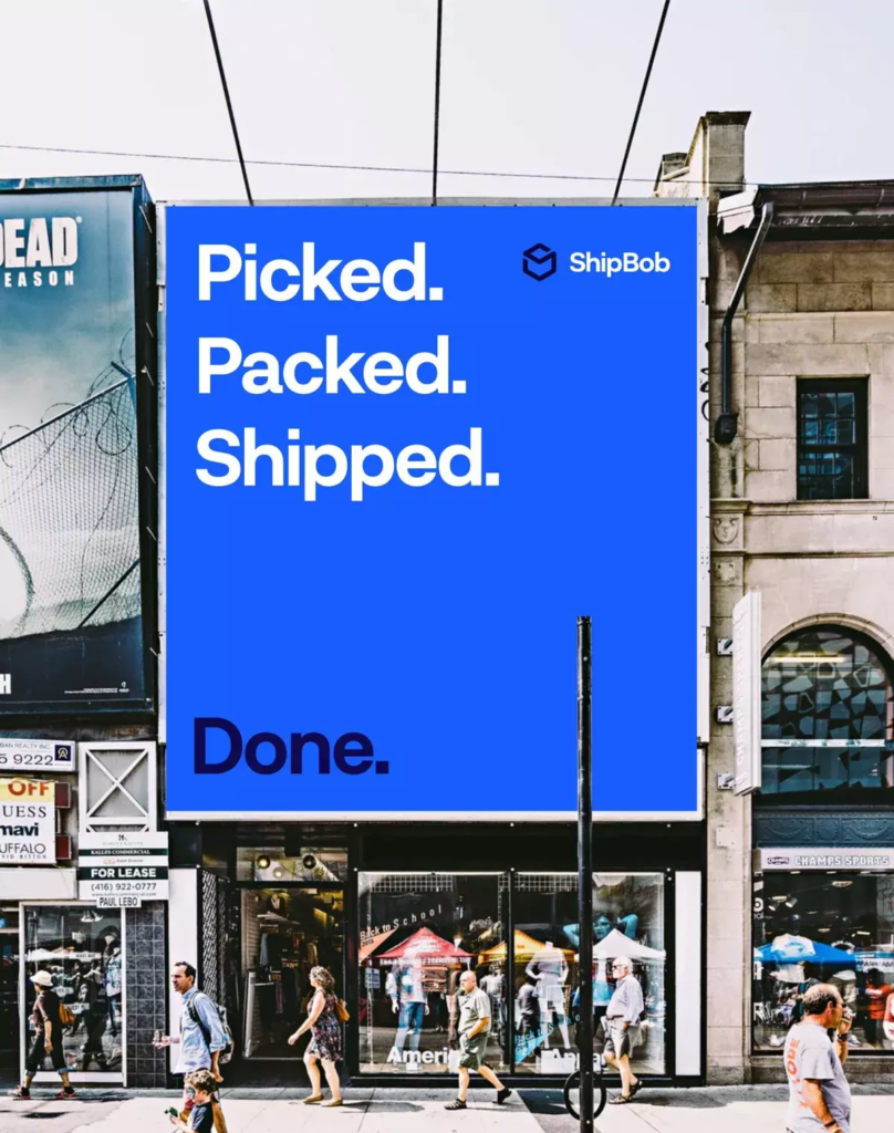
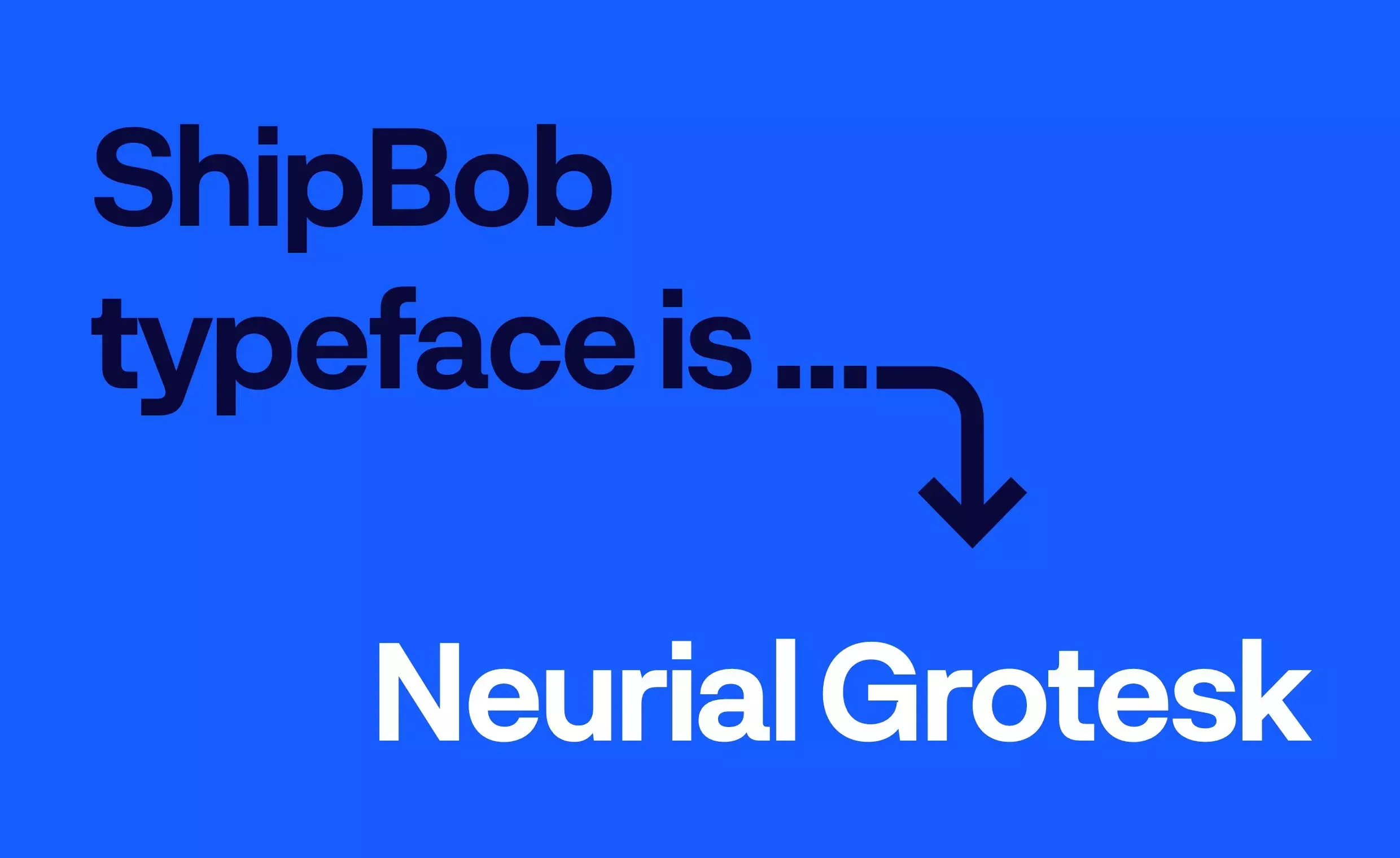
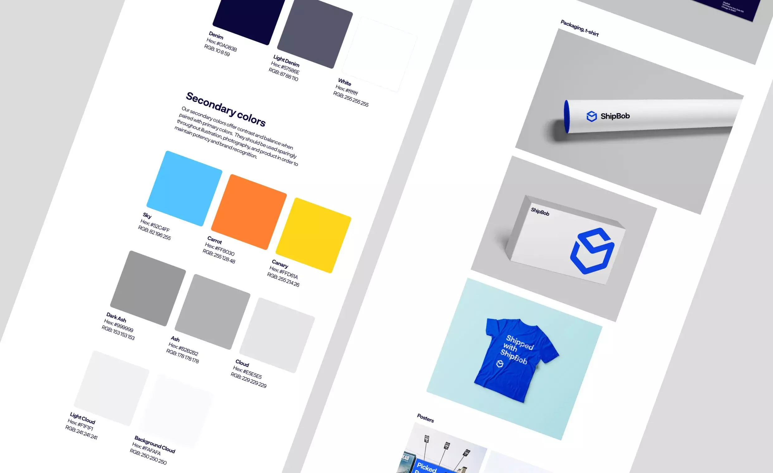
We redesigned and modernised their logo, introducing a completely new design language through colour, typography and style. We created new brand guidelines to help maintain structure and visual impact across print and digital applications.
The new website
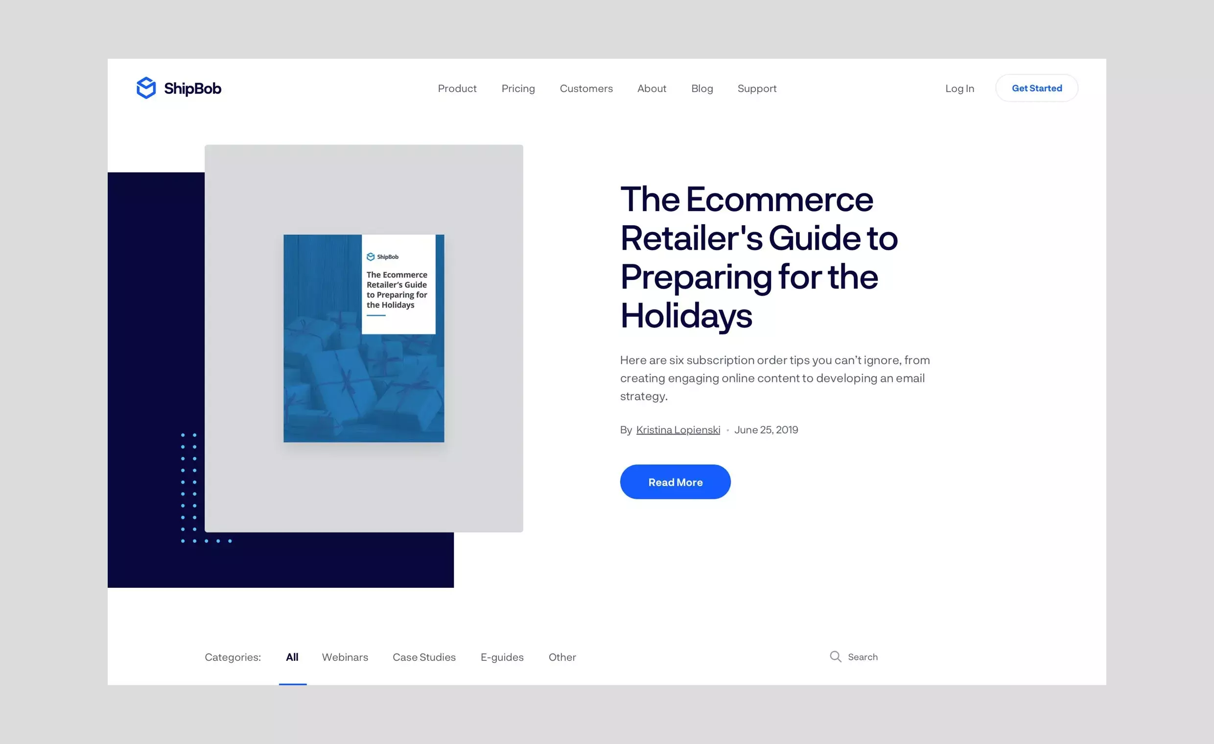
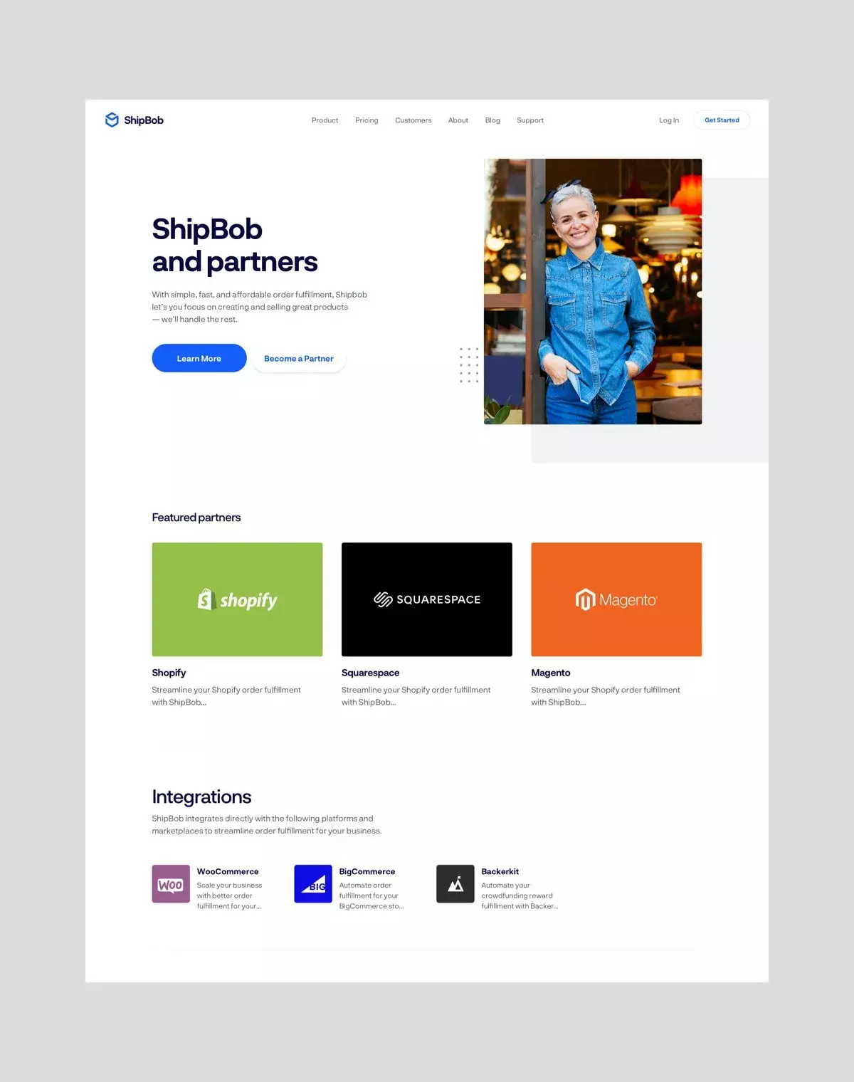
ShipBob’s website is its most important touchpoint, and it needed to do a better job of establishing the brand. Our redesign placed people at the heart of the experience in order to strengthen ShipBob’s point of difference as a human-centric logistics brand. We achieved this through the addition of a “content hub”, allowing for easy collating and publishing of case studies, press coverage, awards, and client testimonials.
ShipBob also needed functional flexibility. Using a module-based approach, we structured the WordPress CMS environment to bolster marketing’s in-house capabilities and provide more control over the brand’s online presence.