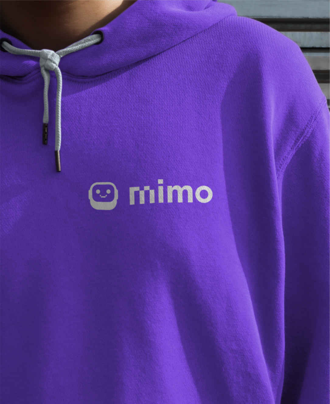
mimo
Reimagining code learning with a touch of retro and plenty of character!
How did we help:
Discovery
Visual Identity
Illustrations
Coding is one of those skills that open doors to many career paths, but different stereotypes around it make it intimidating, especially for first-time learners. Mimo challenges this perception, showing that coding is, in fact, a creative and collaborative skill anyone can learn.
Mimo—short for ‘micro-moments’—is an intuitive and user-friendly code-learning app, designed to engage in bite-sized lessons rather than lengthy, overwhelming sessions. And for professionals looking to make a turn in their careers, there’s Mimo Bootcamp, which they can attend at their own leisure and at a fraction of the cost of traditional bootcamps.
So far, over six million people have taken their first step in learning to code with Mimo.
Reimagining Mimo, Mimo Bootcamp, and M1M0
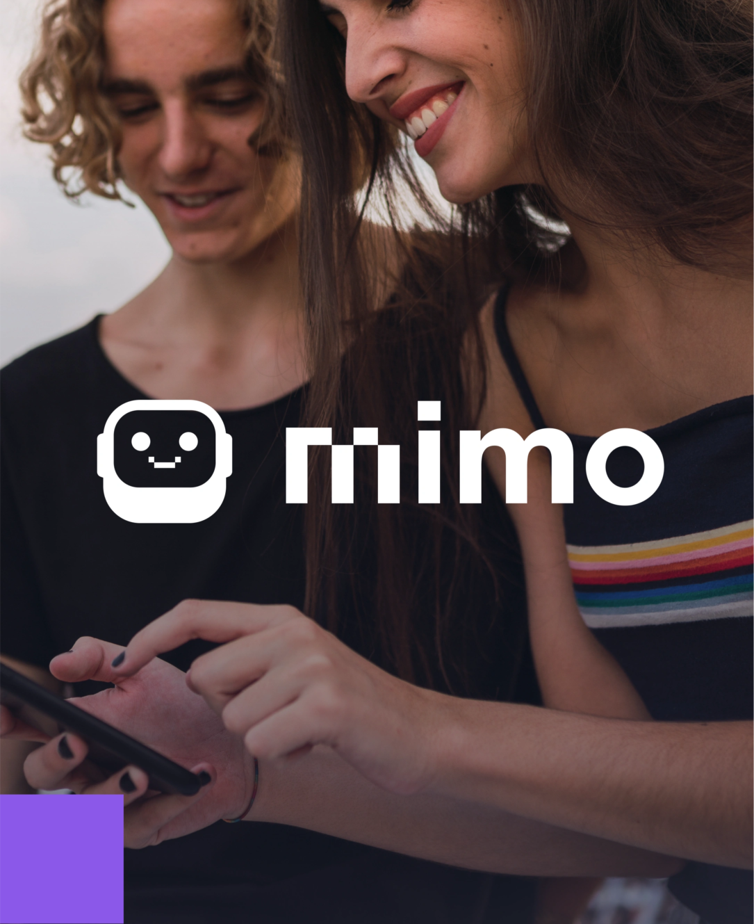
Mimo was looking for a refresh in their visual identity: for both Mimo and Mimo Bootcamp, as well as their M1M0 avatar. So we did what we do best: create a unified identity that maintains the brand’s essence, already well-established in the sector.
On our quest, we first needed to distinguish between Mimo and Mimo Bootcamp branding, which lacked clear differentiation despite targeting distinct audiences. Furthermore, we needed to infuse the avatar with a personality that resonates more with their audiences and define M1M0’s role in the brand’s narrative more clearly.
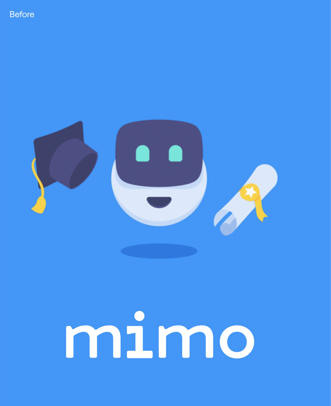
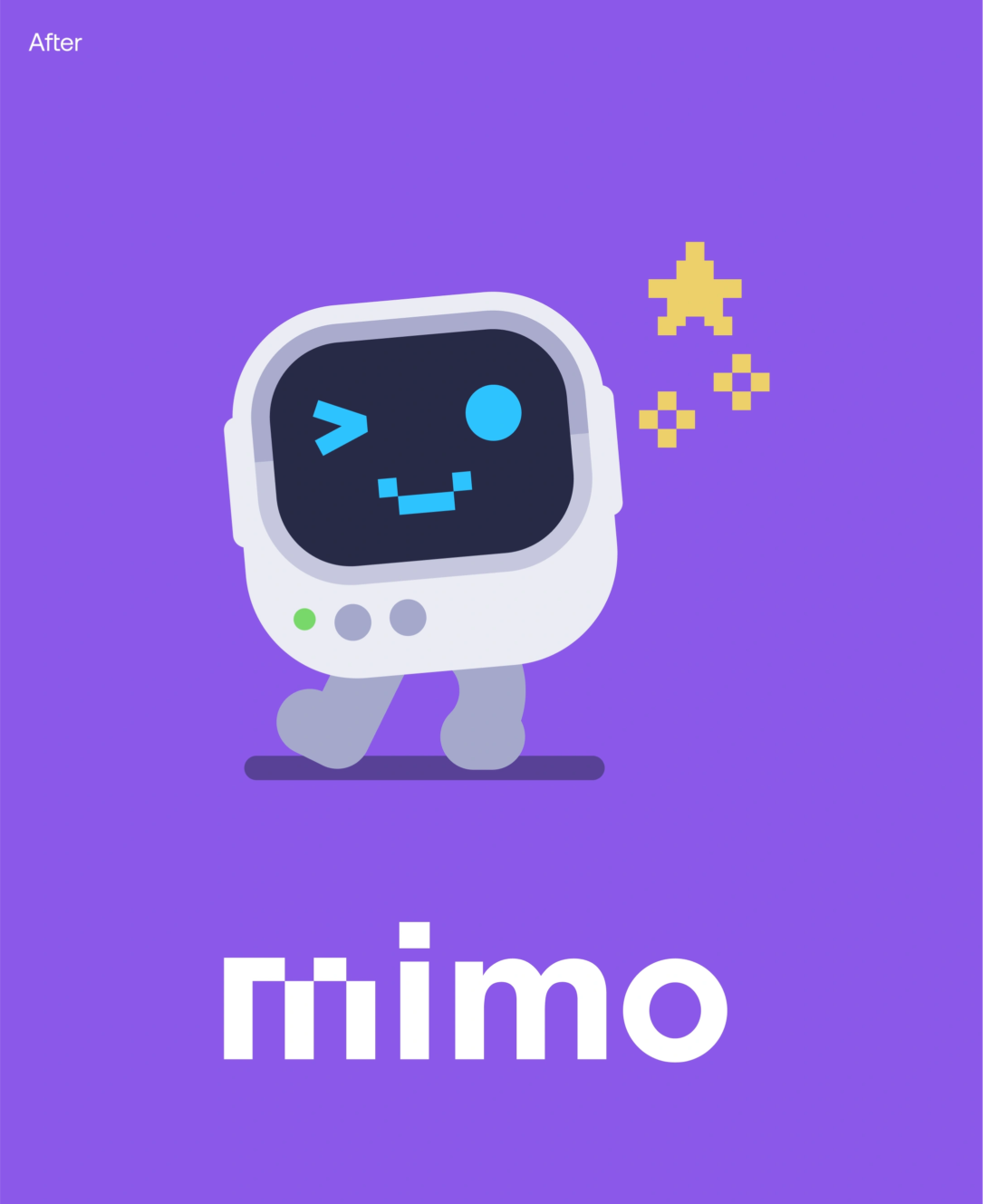
Finding M1M0’s personality and purpose
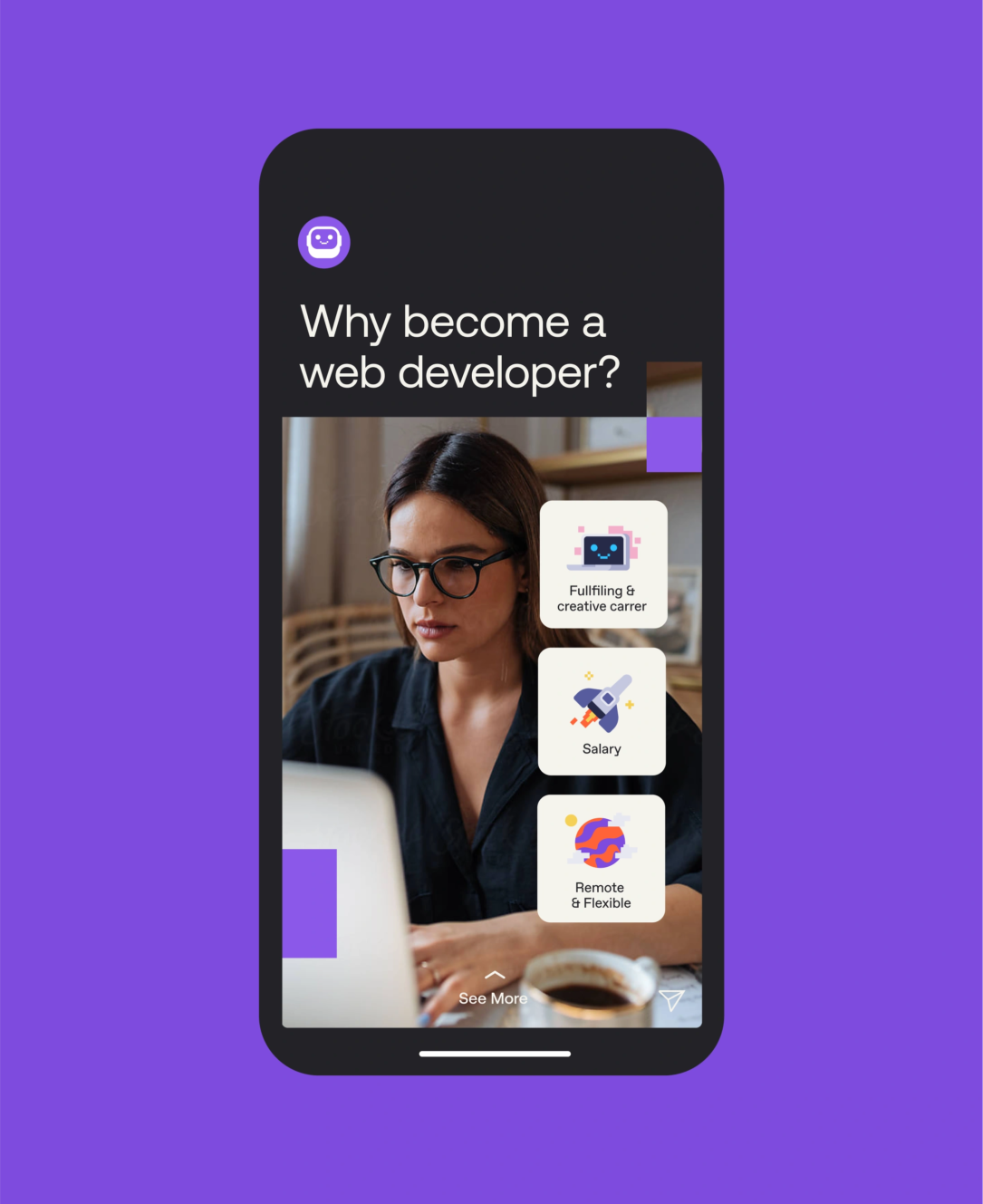
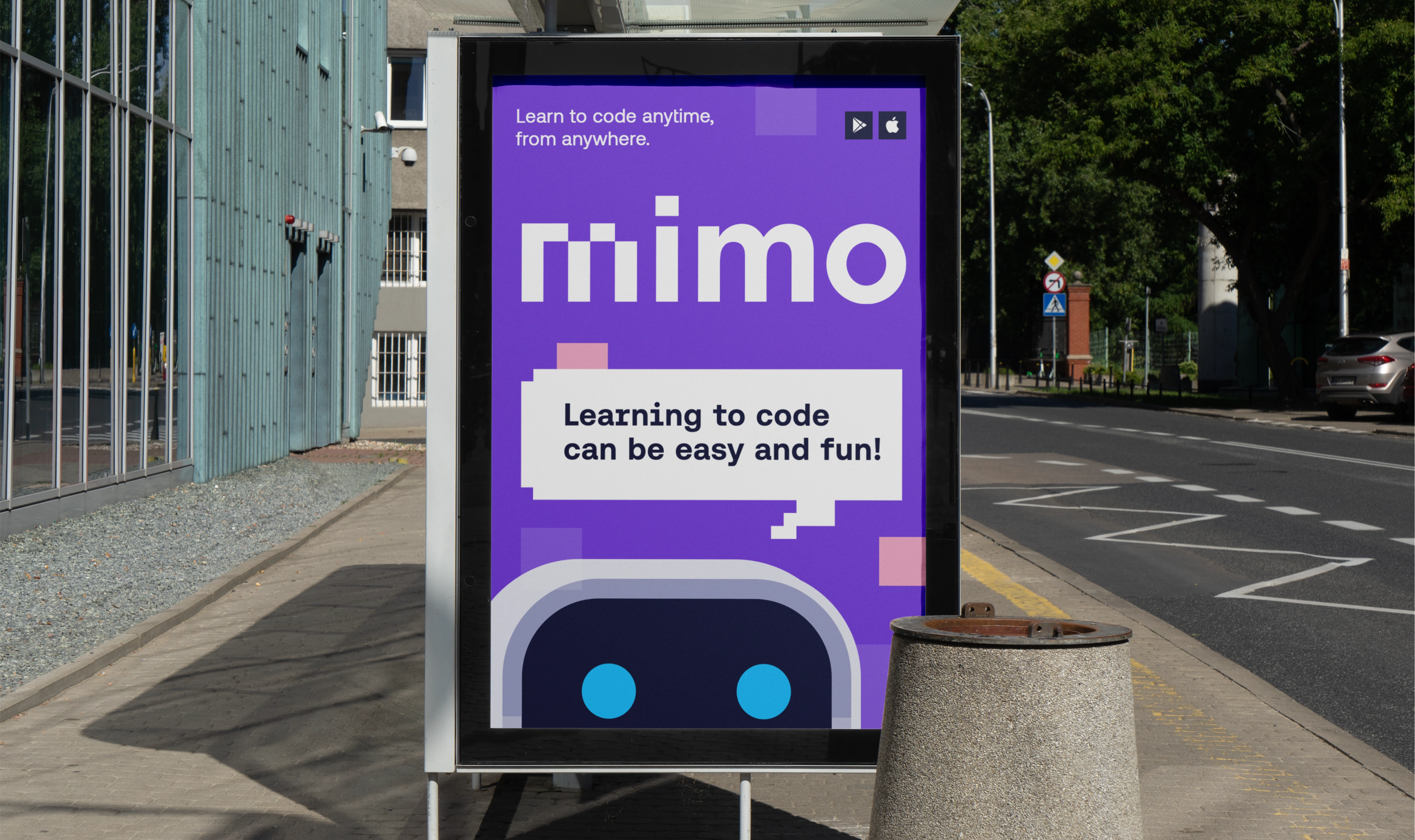
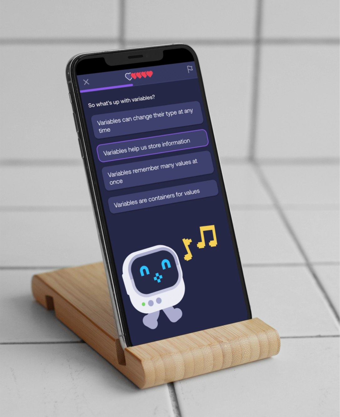
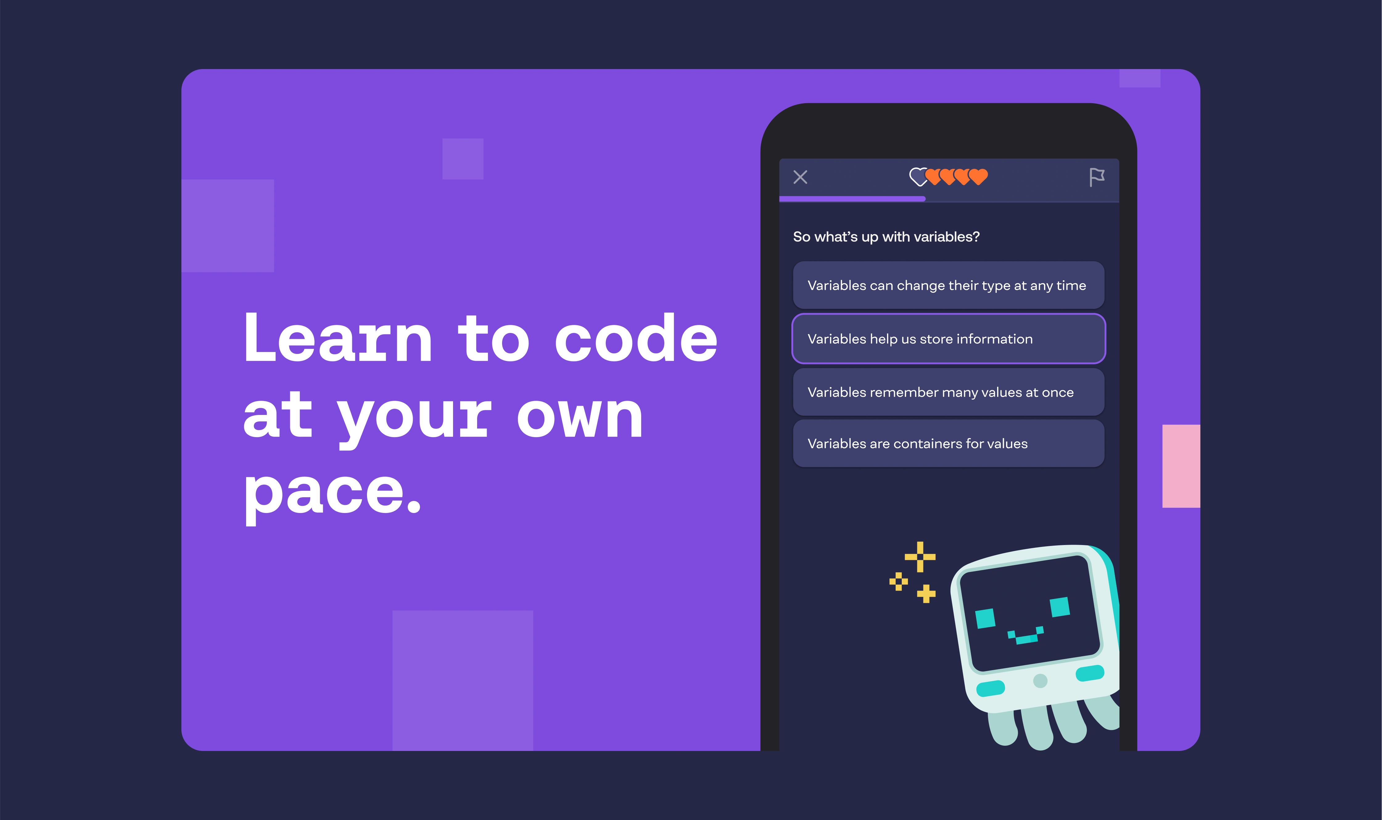
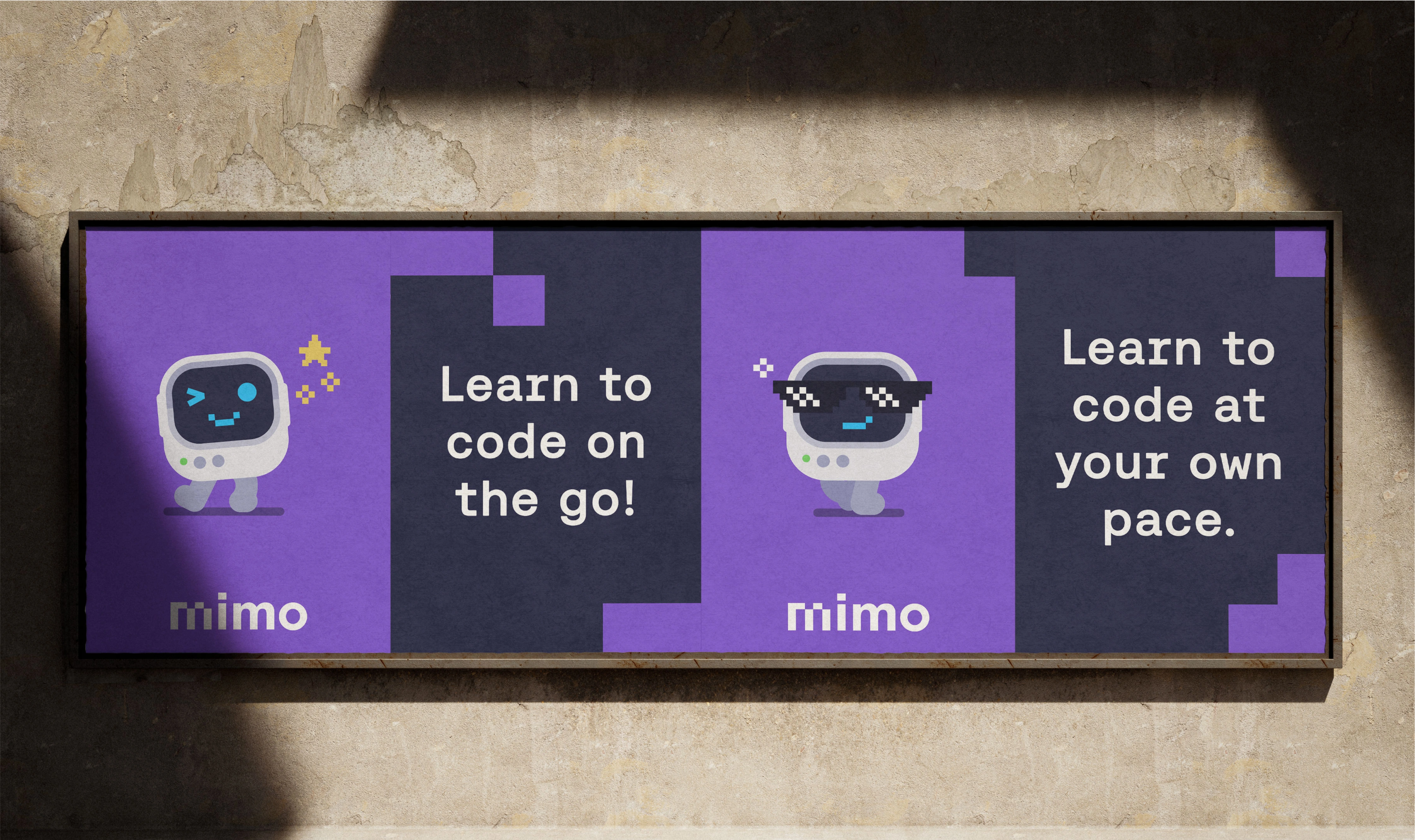
M1M0 was cute, but we wanted more depth in the avatar’s personality. Our goal was for M1M0 to become a trusty sidekick for code learners, making the journey of tackling new challenges feel both fun and achievable.
We crafted M1M0 to be unpretentious, relatable, and approachable, keeping learners engaged and connected. Now M1M0 can display a wide range of emotions—from excitement and happiness to fear and anger—reflecting and boosting the learner’s experience within the app.
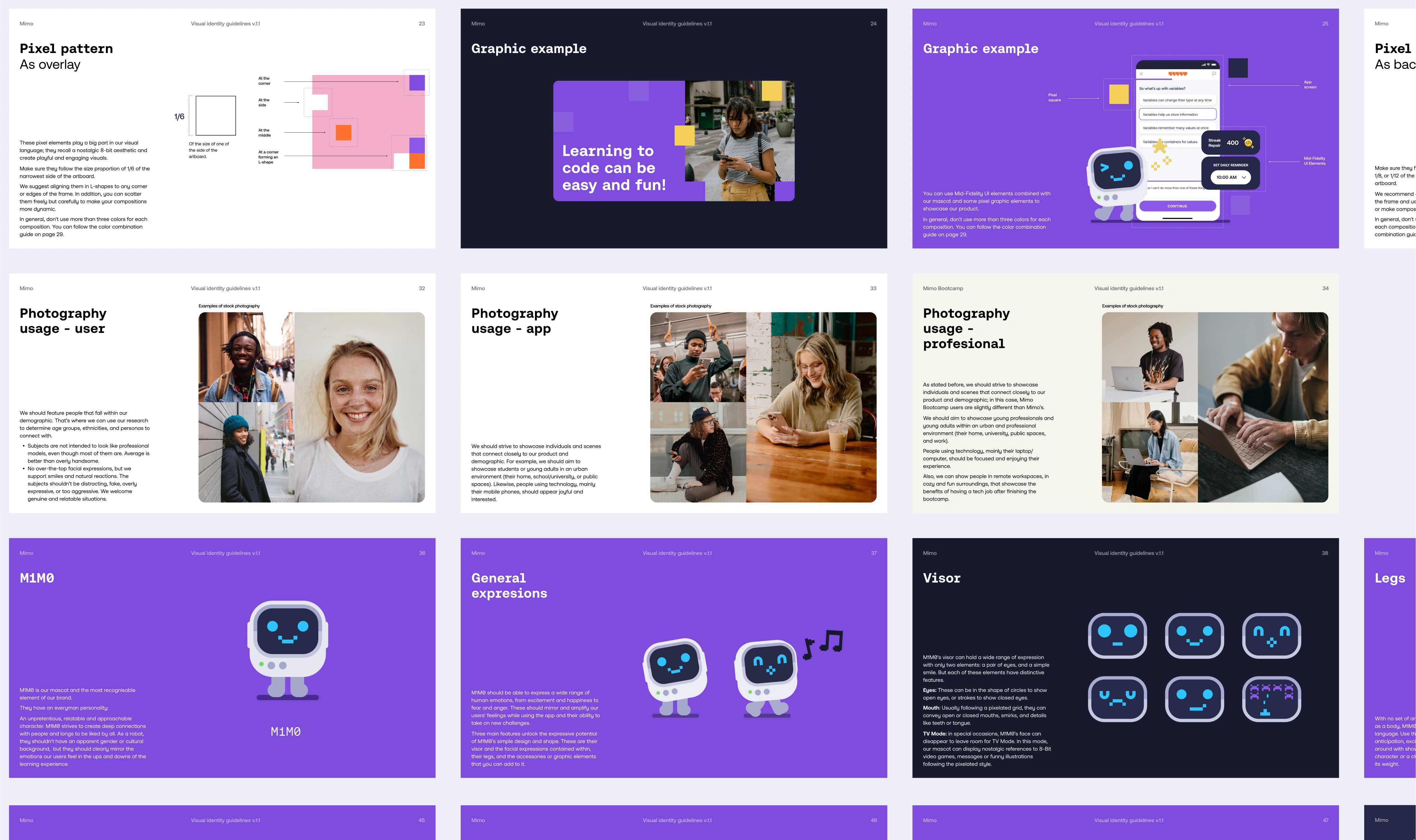
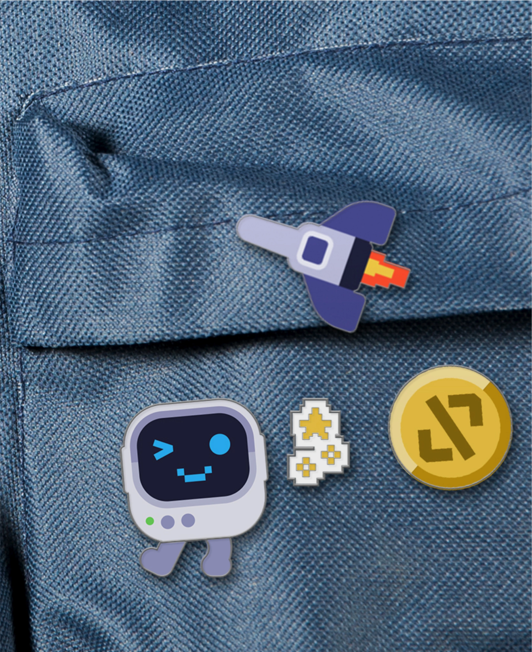
M1M0’s expressive potential is unlocked through three features: the tiny display conveys facial expressions, the position of legs suggests body language, and we can further expand the digital narrative through various accessories or graphic elements.
Tapping into nostalgia: The 8-bit aesthetic still resonates
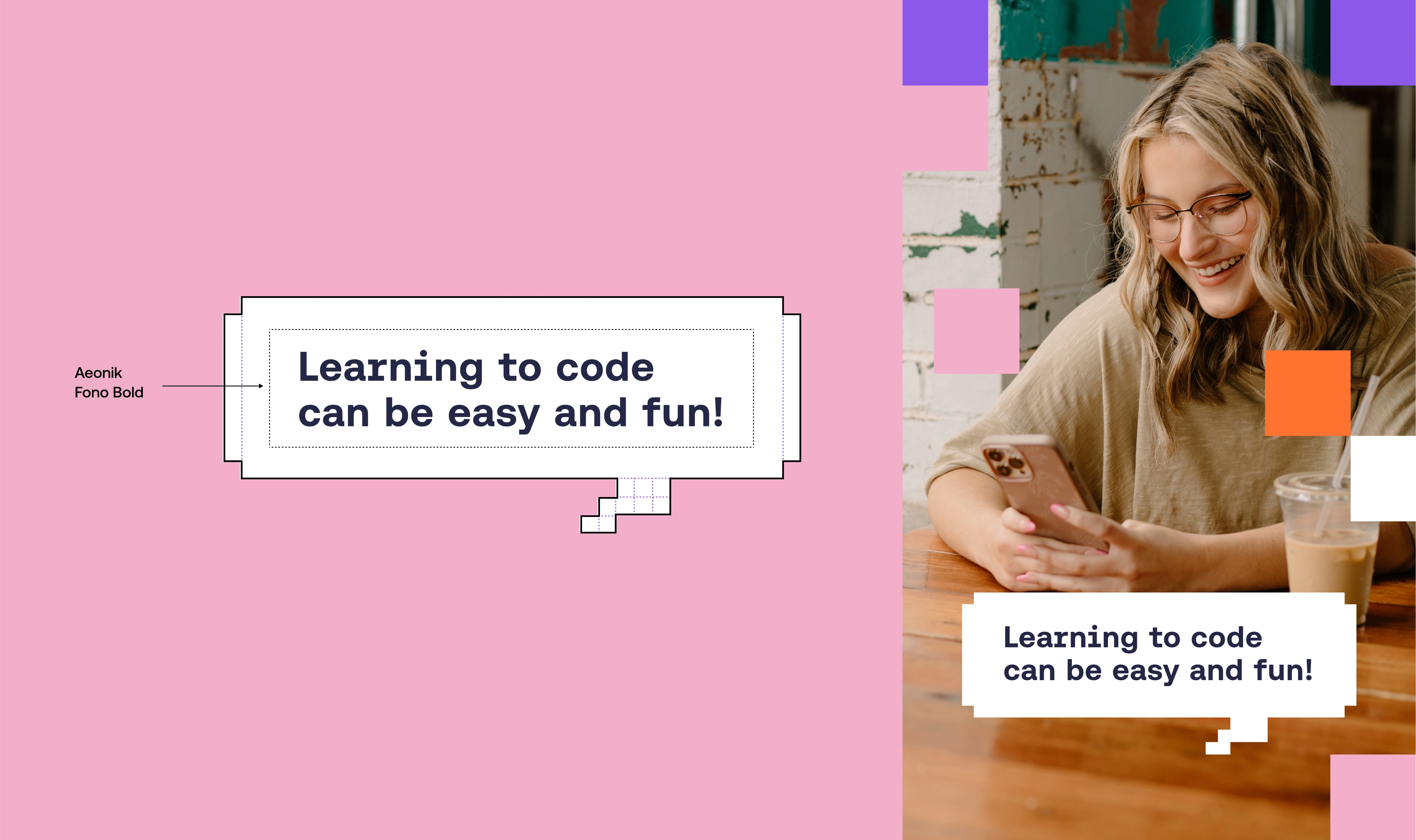
We opted for the lowercase wordmark to complement the logo—but gave it a twist. The first two letters are constructed with a square geometric grid, while the last two letters are in a regular geometric sans serif. These pixel elements play a big part in the visual language: they recall a nostalgic 8-bit aesthetic, creating playful and engaging visuals that resonate with all generations.
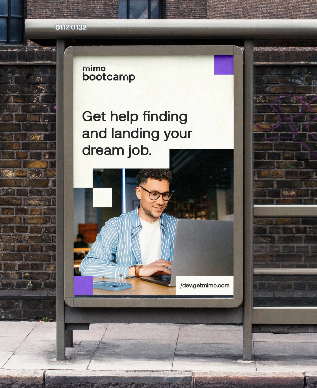
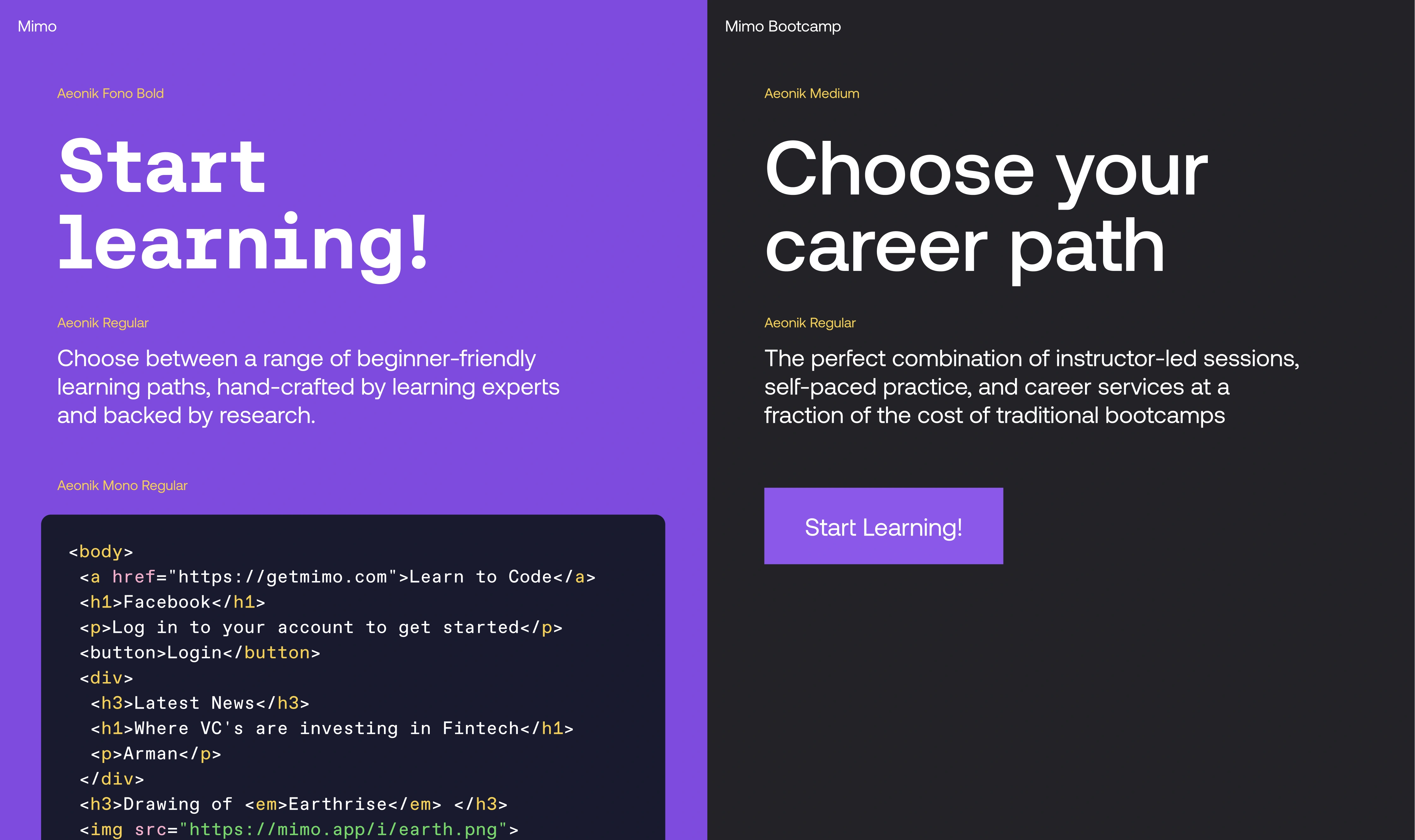
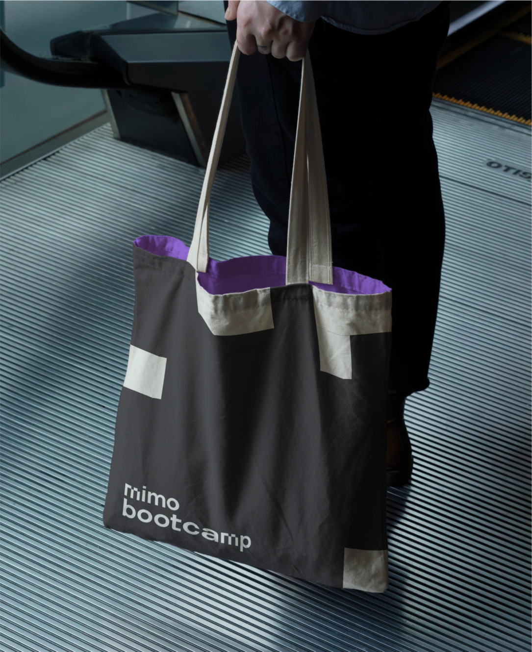
Mimo vs. Mimo Bootcamp: Making the distinction
During discovery, we noticed there wasn’t much difference in the look and feel between Mimo and Mimo Bootcamp. While Mimo’s ‘fun-sized-learning-anyone-can-master’ approach is ideal for its audience, Mimo Bootcamp serves a different purpose: it’s tailored for professionals aiming to transform their careers.
Mimo Bootcamp provides an in-depth training program focused on the most in-demand tech career paths, empowering developers with high standards, superior service, and continuous support. This comprehensive offering, delivered through a reliable platform, is priced higher than Mimo’s beginner coding courses, reflecting its advanced scope.
This realization led to a deliberate branding change. We developed a less playful and more sophisticated identity for Mimo Bootcamp, effectively communicating its unique value proposition and distinguishing it from Mimo.
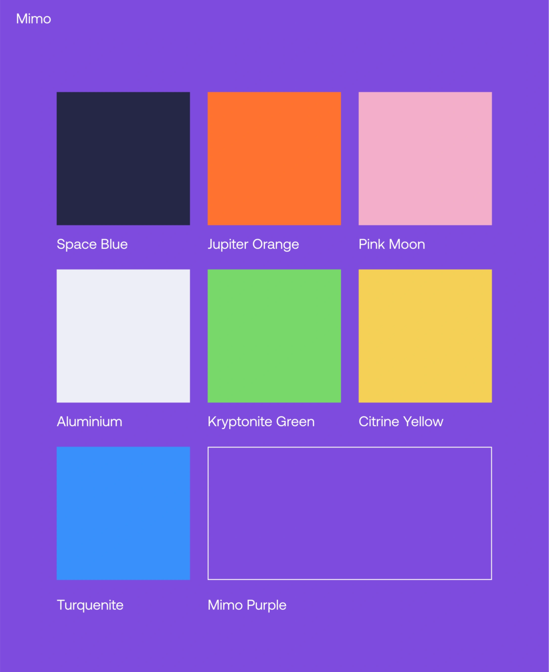
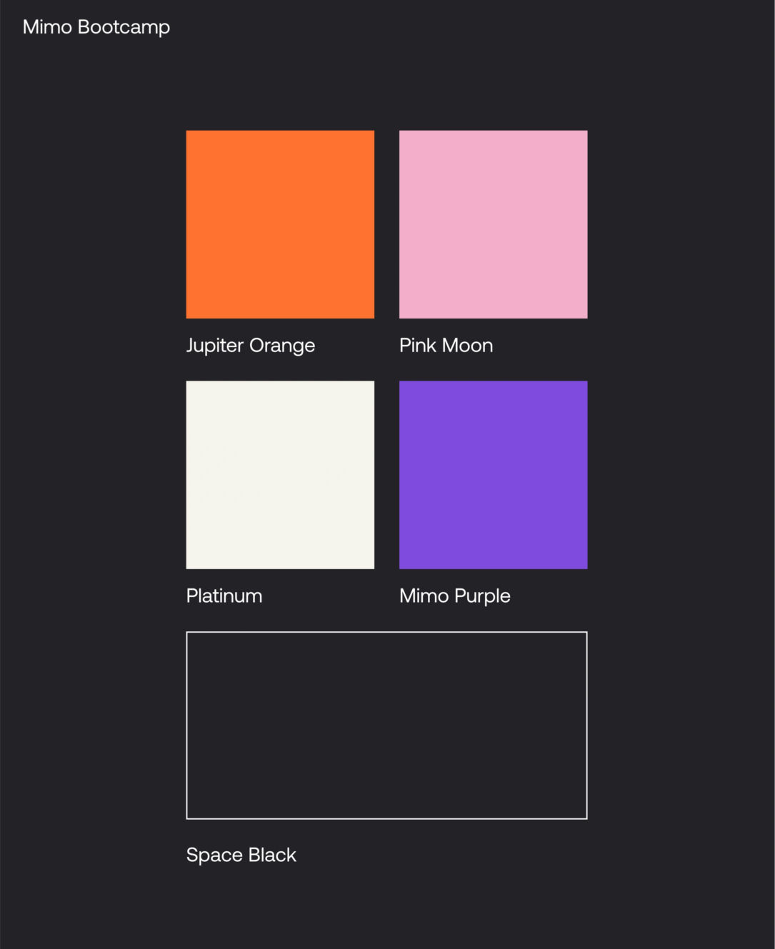
Mimo features a bold and vibrant color palette, whereas Mimo Bootcamp opts for a palette that conveys a more professional and mature aesthetic.
What makes M1M0’s illustrative world so vibrant
Variety is the spice of M1M0’s life. In different contexts and combined with different graphic elements, M1M0 can become a versatile character who works perfectly across formats—from digital platforms to out-of-home (OOH) advertising. For example, a simple speech bubble gives M1M0 a voice, allowing the avatar to speak directly to the audience.
Moreover, M1M0’s world can be enriched with nostalgic and pop-culture elements—as well as new characters. It can feature 8-bit visuals, anime themes, sci-fi narratives, or even nods to retro technology like the Commodore 64 computer. References to pop culture icons such as Transformers or Sailor Moon add another layer of engagement. This diverse range of elements enables M1M0 to capture attention and evoke emotions in exciting and sometimes unexpected ways.
Icons add more flavor to M1M0’s world. It’s all about mixing up stories and ideas, combining neat vector shapes with cool pixelated details. That way we reference familiar concepts, while at the same time adding a unique twist to the visual storytelling.
Thanks to mimo for giving us the opportunity to work on this amazing brand – check it out here.
How did we help?
Branding
- Brand Refresh
- Avatar Design
- Brand Guidelines
Discovery and Research
- Competitor and Market Analysis
- Visual Benchmark
Narrating stories that resonate, building experiences that people cherish, and achieving outcomes that matter demand true partnership. That’s why we’re here for the long haul, walking beside you every step of the way.