Hand in Hand With the Client: Meaningful Design Through Partnership
Design
ByBB Team
22-03-2024
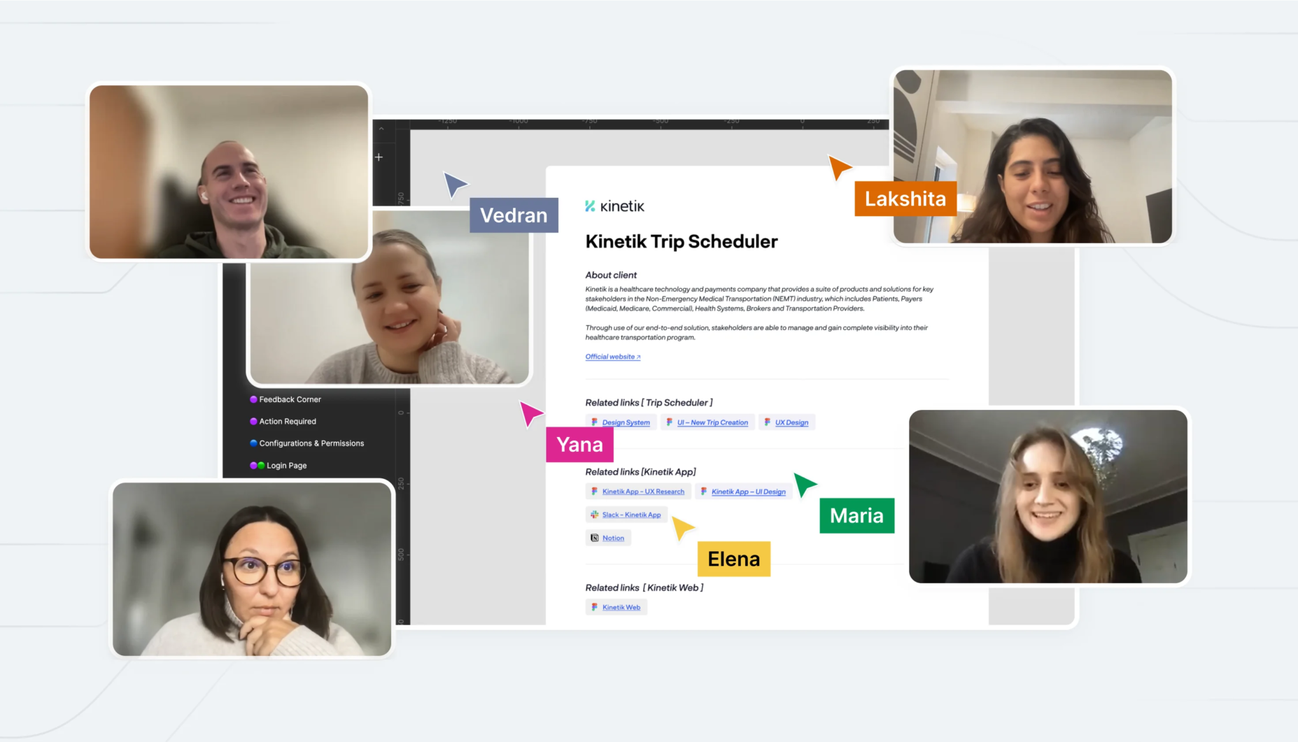
‘Teamwork makes the dream work,’ they say. That’s why, at BB Agency, we firmly believe that partnership and collaboration with our clients are crucial to a successful design project. In this article, we will share our approach to effective communication and demonstrate how it can impact the design process through our collaboration with Kinetik. This USA-based startup develops a disruptive healthcare ecosystem to build seamless delivery of non-emergency transportation services nationwide.
BB was initially brought in for a three-month project aimed at redesigning the Trip Scheduler app, dedicated to coordinating non-emergency medical transportation. Having been launched very recently, the app was already due for an upgrade to not only introduce new features but also fill in the gaps in the user experience by refining existing functionalities.
Success hinges on communication
Beginning with comprehensive UX research and competitor research, we aimed for clear and effective communication among all stakeholders right from the start. This approach guaranteed alignment across the BB UX and Product Design teams, the Kinetik Product team, and BB project management.
To achieve this, we structured our workflows into weekly sprints with regular feedback and ideation sessions. This approach fostered a design process akin to in-house, cross-team collaboration, moving away from the traditional, rigid agency-client relationship defined by a strict list of deliverables.
Keep reading to learn about the two cases from the Trip Scheduler project where this collaboration approach helped us address the specific client needs and iterate on the best possible solutions.
The first case illustrates the iterative design process we employed to build a complex feature. It wouldn’t have been possible without constant close collaboration between teams.
In the second case, our collaboration approach helped us achieve a deep understanding of the product challenges. This allowed us to secure design scalability through the flexible design system.
Agile in Action
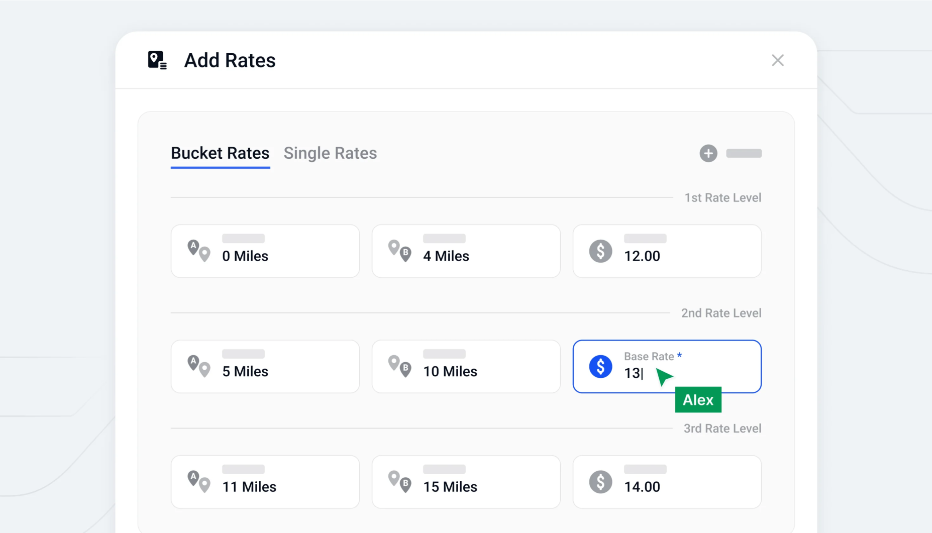
One of the features we redesigned was the transportation providers’ Rate Card interface. In a nutshell, it’s a list of transportation fees, which depend on many factors such as workday, time, transportation conditions, etc., and must always be up-to-date; otherwise, the provider can’t handle the trips.
The complexity of the flow was defined by two factors: a lot of data entry and repetitive user actions, along with a diverse range of target groups—from solopreneurs with a few vans to major transportation providers like Uber. We aimed to build an interface flexible enough to cover a vast array of use cases while keeping it simple enough for smaller clients to avoid getting stuck with the functions they don’t need. Considering that filling in the providers’ rates is a mandatory step before accessing the app’s core functionalities, we needed to come up with a smart solution.
To address this challenge, we attempted to simplify the rate card modal view by using customizable fields and separators to divide each rate level. At that moment, this concept appeared as a straightforward solution for the complex pricing system.
However, the user testing results showed that it remained too complex for users to perform the core tasks. So we had two options: double down on user education for the new approach or pivot to a more familiar Excel table-like pattern.
The final visual solution was to divide the user flow into two steps: the rate card table configuration, where users set up the complexity of the future rates table, and the interaction with the rate table itself, where rates can be easily added and edited through copy, paste, and duplication.
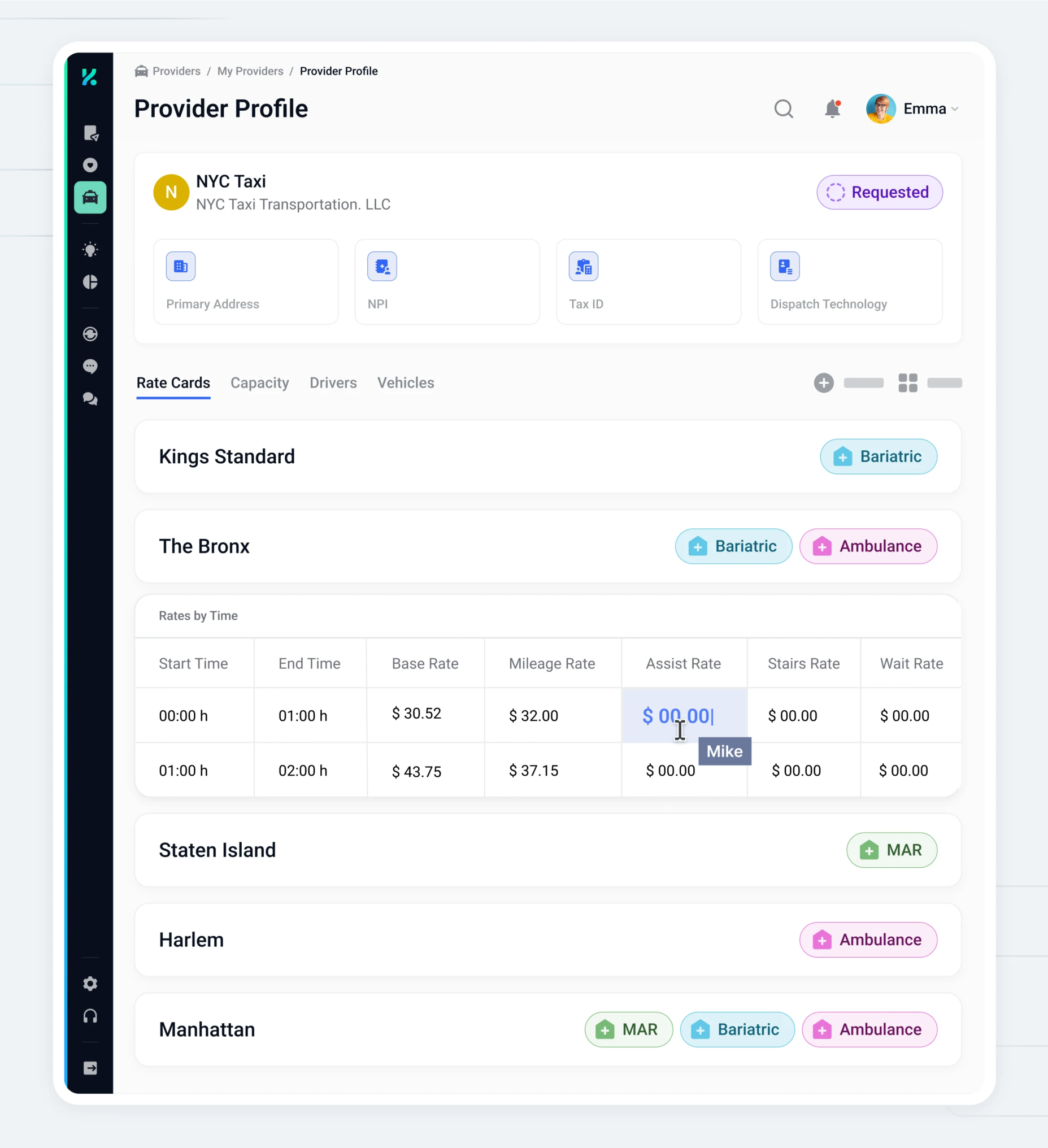
The approach to the rate table was based on the geographical blocks, each of which included specific rates. To support the proper hierarchy between the table blocks, we applied several levels of elevation along with delicate typography combinations. That gave users the ability to visually inspect and evaluate multiple rates’ cells at once, as well as to compare and modify individual cells easily.
Flexible design system as the key to scaling faster
Fortune-telling crystal ball
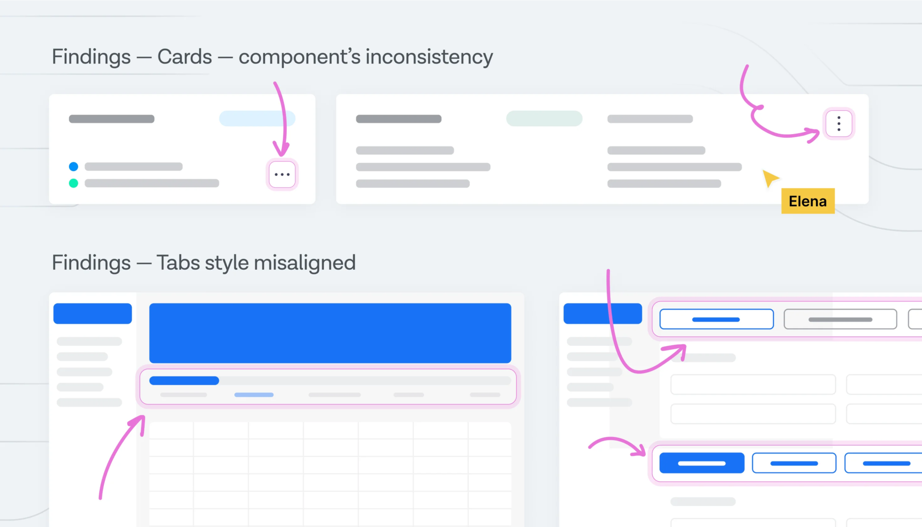
The design system architecture was first conceptualized during the UX review phase. It involved conducting an interface inventory to map out the functional and visual inconsistencies, identify gaps, and pinpoint scalability issues within the existing design system architecture.
To make sure that every module of the new interface can be readily used and adapted to a range of use cases, we employed an atomic approach throughout the wireframing process. We tried out the components in terms of copy length and potential text truncation.
To ensure functionality across scenarios, we also tested the interface elements separately as standalone components, within a list of recurring parts, and as segments of a more complex interface.
The adaptability of components serves as the foundation for our sophisticated visual language and has played a pivotal role in defining the Kinetik application.
As for the visual language, we supported the components’ flexibility with the primary visual aid. The core idea of the components’ structure was to utilize the horizontal space for displaying multiple pieces of data (text, numbers, and tags). Our approach involved positioning the field values, accompanied by a label icon, on the unit’s left side, and placing the field labels on the right side.
This approach made the essential information easily scannable through label icons. We de-emphasized the right-side field labels by making them smaller, reducing contrast, and opting for a lighter font weight. This ensured that the components would adapt seamlessly across different devices and screens, accommodating multiple tag rows and extensive text without compromising layout clarity. It also allowed us to use vertical space more efficiently.
Field-testing
One of the components that was subjected to testing in a live environment was the horizontal top card, originally implemented across all profile pages.
The introduction of the Provider profile feature required updates to the top cards with new information blocks. This allowed us to observe firsthand the tangible benefits of our design system’s flexibility within the product environment.
The smooth integration of these additional functionalities not only validated our design decisions but also underscored the effectiveness of our collaborative efforts. It demonstrated the system’s ability to adapt and evolve without compromising the overall user experience, highlighting the success of our approach in creating a scalable and robust platform.
Conclusion
We’ve dedicated over a year to developing the Trip Scheduler app, initially conceived as a short-term collaboration that blossomed into a long-term partnership.This collaboration between BB and Kinetik has evolved into multiple projects, each featuring extensive integration into the Kinetik ecosystem.
Throughout this journey, we’ve earned the trust of our client, which has been key in deepening our relationship and paving the way for exciting new ventures. Looking ahead to 2024, we’re excited about the opportunity to expand our collaboration further, potentially delving into branding initiatives as our ongoing work on the Kinetik app. This demonstrates not only our commitment to delivering exceptional results but also the trust and confidence our clients have in us.
Our collaboration with BB Agency has proven to be highly rewarding and enjoyable. The close and consistent collaboration fostered an environment akin to having an in-house design team rather than engaging an external agency for specific tasks. The designers’ enthusiastic approach allowed them to thoroughly immerse themselves in our industry, challenges, and products. This proactive attitude significantly enhanced the overall experience; Elena (UX Designer) adeptly considered the end-user experience from various perspectives and use cases, while Maria (Product Designer) effectively addressed complex issues such as information overload, employing a user-centric approach to resolve them.
Lakshita Chhikara,Group Product Manager at Kinetik
This article is the result of our team’s collective effort, with individuals from various departments coming together to share their knowledge and insights.
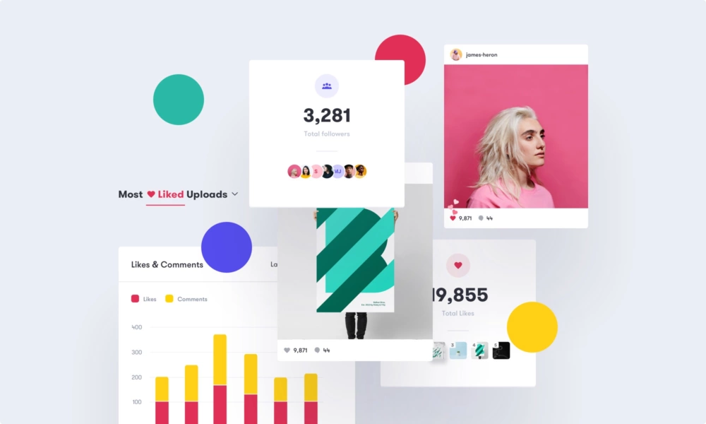
Iconosquare — a quick study of how colors and design choices shape brands and interfaces
Design
BB Team
The Importance of Remote Team Bonding at BB Agency
Culture
Emma Doležal
Nurturing Growth Through Feedback in a Remote Environment
Culture
Manage Cookie Consent
To provide the best experiences, we use technologies like cookies to store and/or access device information. Consenting to these technologies will allow us to process data such as browsing behavior or unique IDs on this site. Not consenting or withdrawing consent, may adversely affect certain features and functions.
Functional
Always active
The technical storage or access is strictly necessary for the legitimate purpose of enabling the use of a specific service explicitly requested by the subscriber or user, or for the sole purpose of carrying out the transmission of a communication over an electronic communications network.
Preferences
The technical storage or access is necessary for the legitimate purpose of storing preferences that are not requested by the subscriber or user.
Statistics
The technical storage or access that is used exclusively for statistical purposes.The technical storage or access that is used exclusively for anonymous statistical purposes. Without a subpoena, voluntary compliance on the part of your Internet Service Provider, or additional records from a third party, information stored or retrieved for this purpose alone cannot usually be used to identify you.
Marketing
The technical storage or access is required to create user profiles to send advertising, or to track the user on a website or across several websites for similar marketing purposes.