Nexudus
Building an industry-leading workspace management experience.
How did we help:
UX Research
iOS App Design
Product Design
Design System
Front-end Development
Company Size
11 — 50 employees
The client
Nexudus is the leading white-label platform to manage and scale up coworking spaces. It helps users automate operations, welcome members safely, enhance their community, and manage daily tasks from a central dashboard.
Nexudus works with 2,000+ workspace operators across 90+ countries and supports more than 200,000+ users daily. So structuring an environment that all operators can call their own was no easy task.
The challenge
The main challenge was reworking the whole customer-facing experience for the web and mobile Nexudus platforms. As a white-label product, the environment needed to be highly flexible and accessible to easily translate across thousands of different accounts and businesses.
We had to adapt and do quite a bit of research to make sure everything we were creating adhered to usability standards for various user flows like booking, payment, scheduling, messaging, and many more.
The solution
We restructured the complete customer experience to help Nexudus adapt its product to different client needs and business models. We designed and developed a white-label platform backed by a comprehensive Design System with flexible modules that can be used for various use cases and touchpoints, including the web and mobile apps.
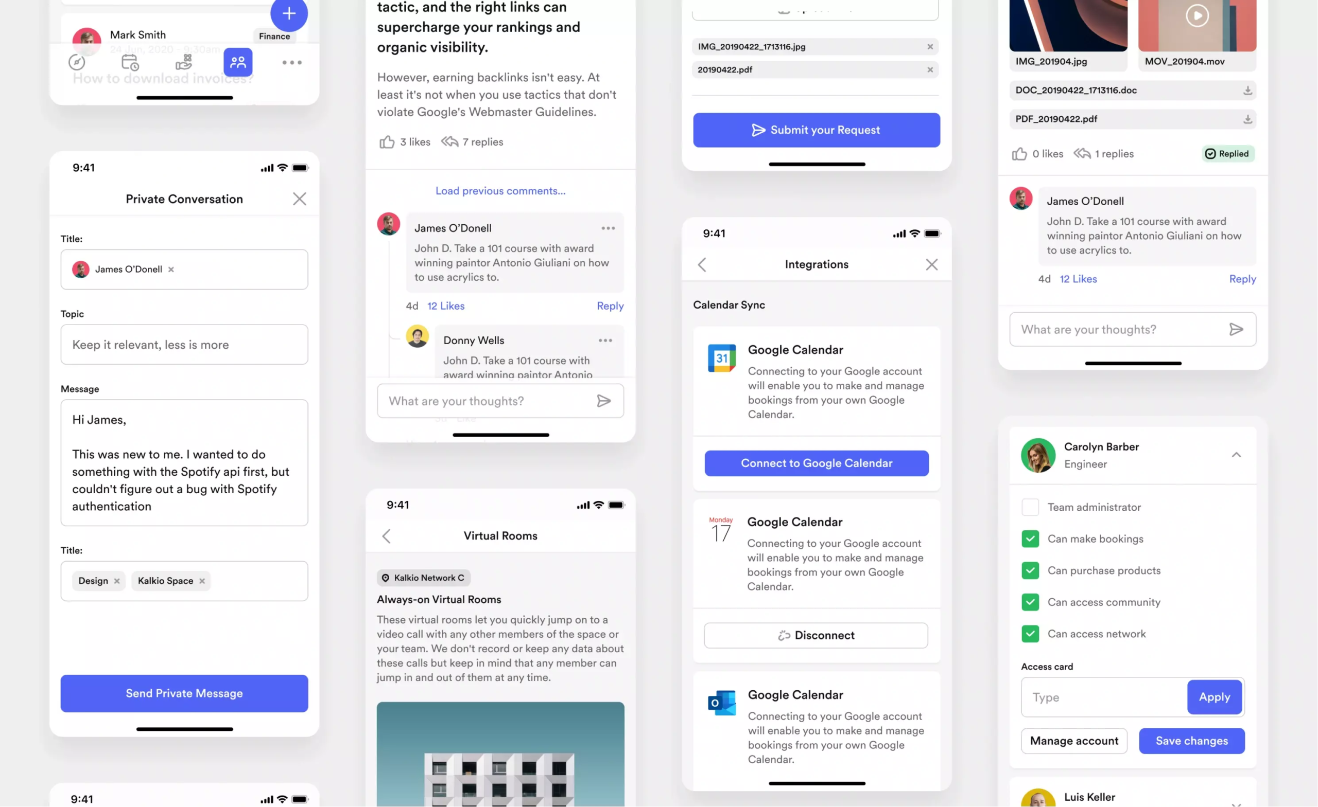
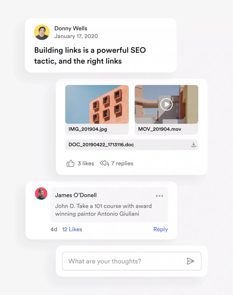
The undeniable power of the widget
White-label apps are governed by different rules than branded apps. To manage them effectively and extend their functionality, we’d to think outside the box and define all possible scenarios for how the app could be used. We were lucky to have good end-to-end communication with the client to define different use cases for all widgets.
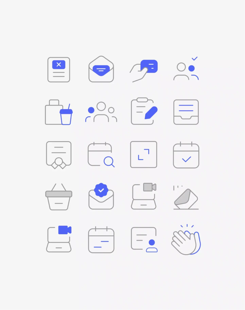
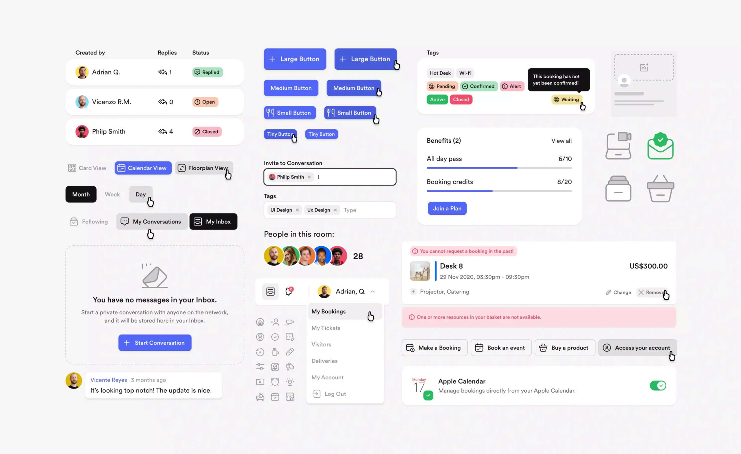
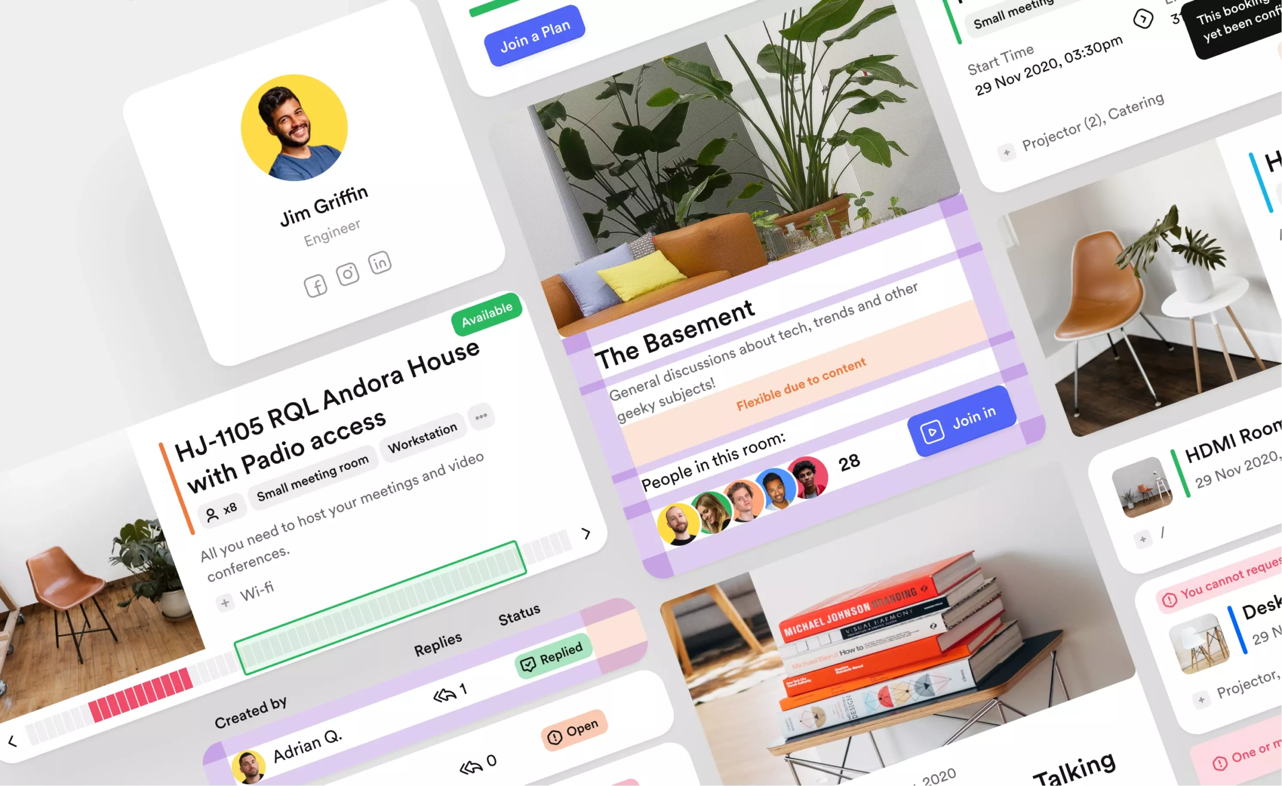
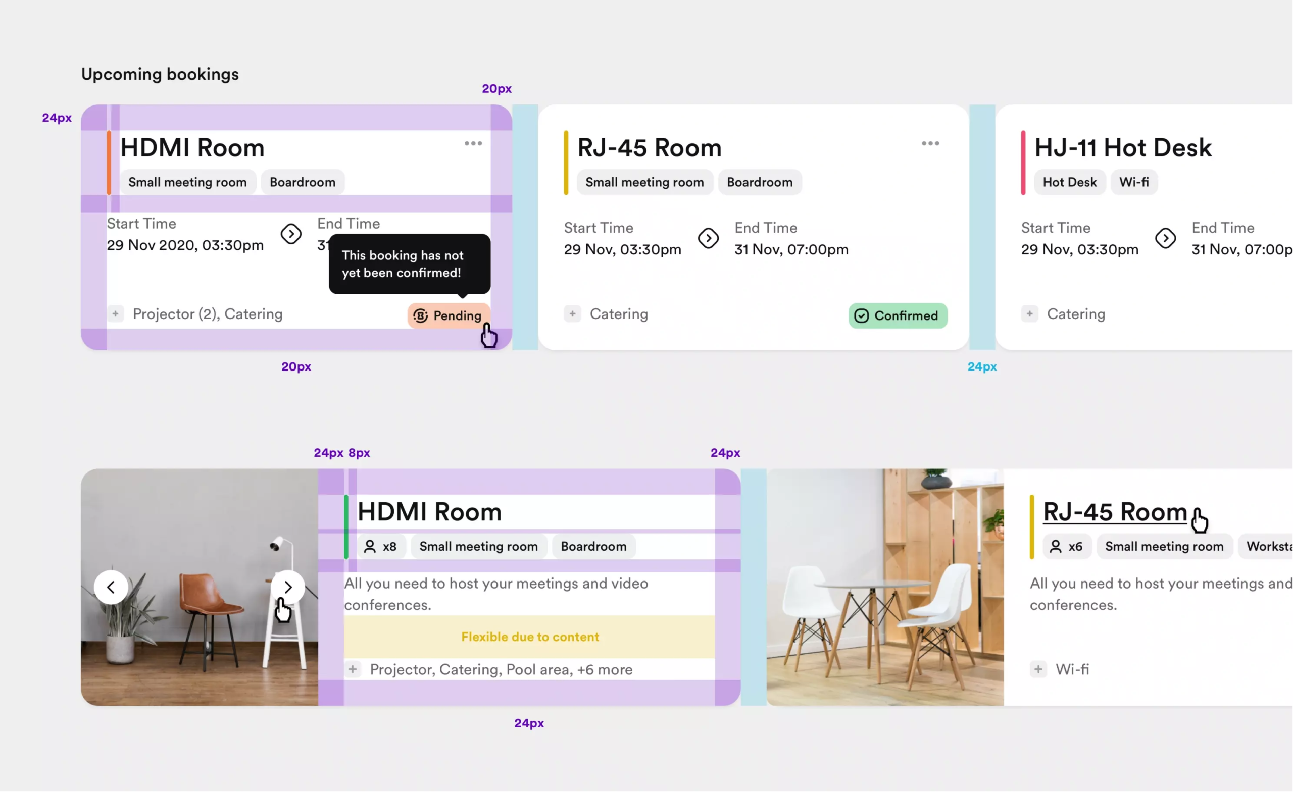
A widget can contain a lot of data: Headline, status tag, time, price, subscribers, likes, replies, author names, buttons, etc. The overall functionality could vary if all the features were available in a particular product.
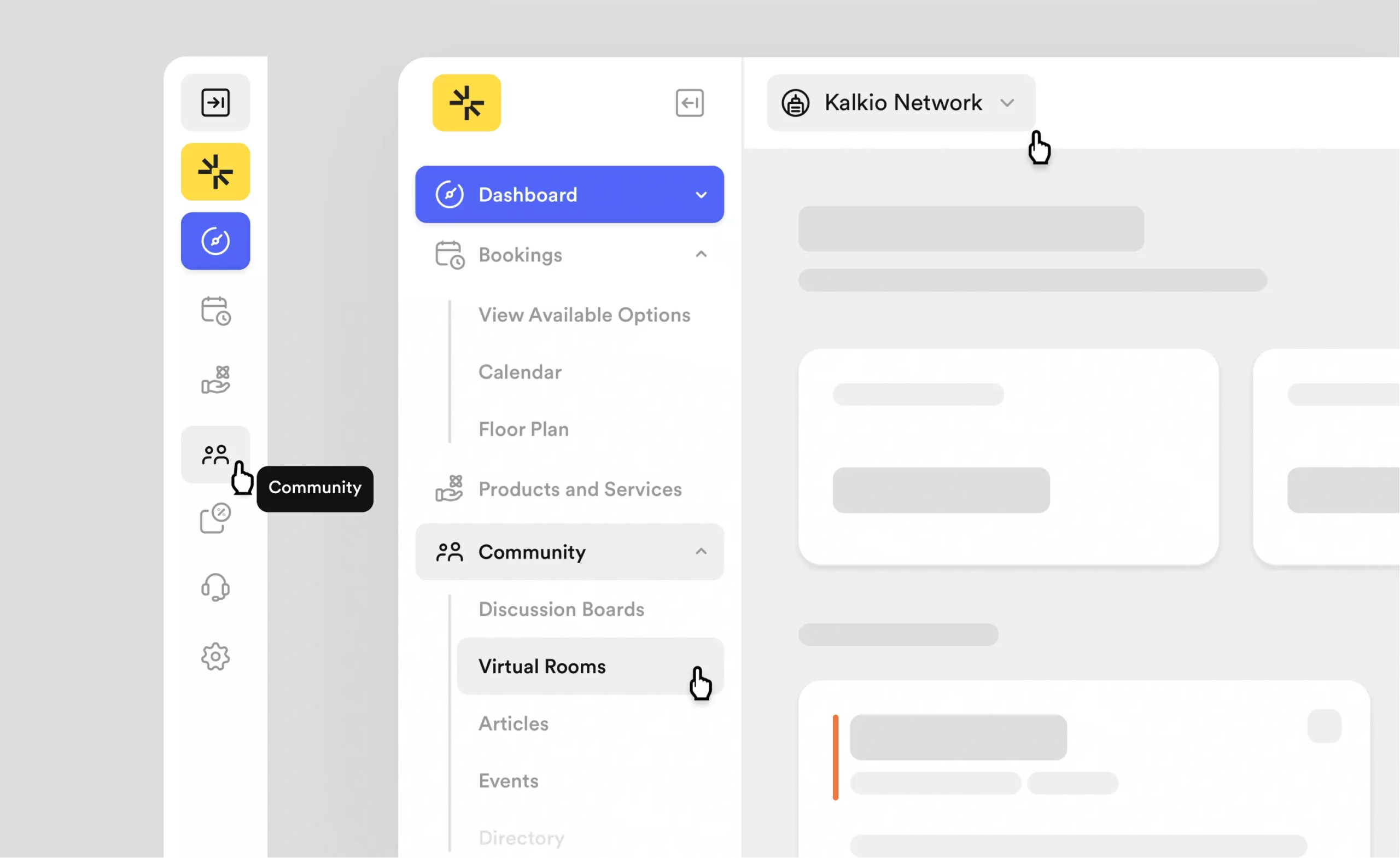
Conquering the world, one office space at a time
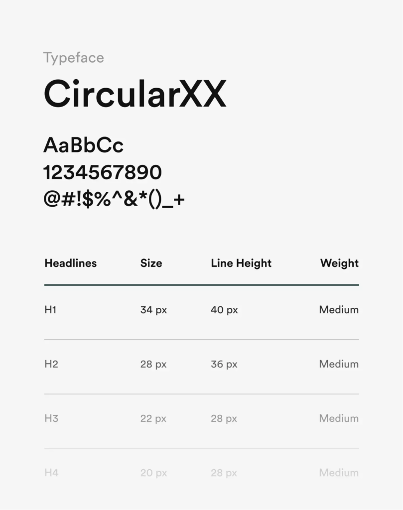
Since this product is used worldwide, we’d to keep in mind that it should work in a variety of languages, writing systems, and reading orders. Therefore, the typography had to be adaptable to welcome thousands of different customers.
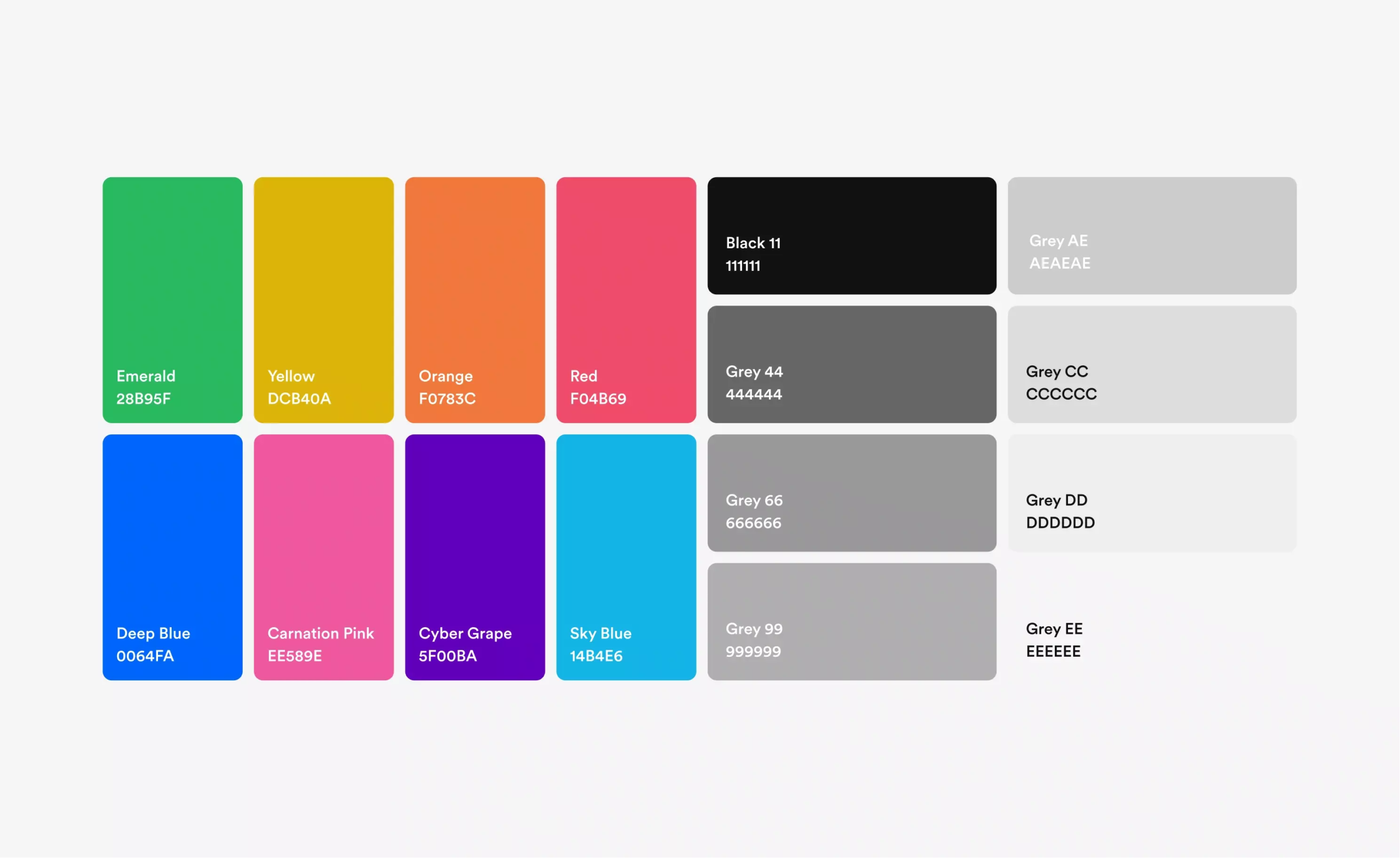
We were looking for a UI solution with a harmonious color palette that balanced visual approach, accessibility, and interface conventions. The color system allows companies to differentiate their dashboard by picking a primary color for their brand.
To meet the AA accessibility standards, our development team included a JavaScript feature that automatically changes the text and icon color between white and black, depending on the contrast of the primary color. All other colors used on the platform are system colors defined with the new design system.
With white label products, there’s not much control over how users can customize their look, so we used clean and functional modules. Large images enhance the look, while large colored icons accompany headings and paragraphs. All these customizations add a friendly touch to the simple design.
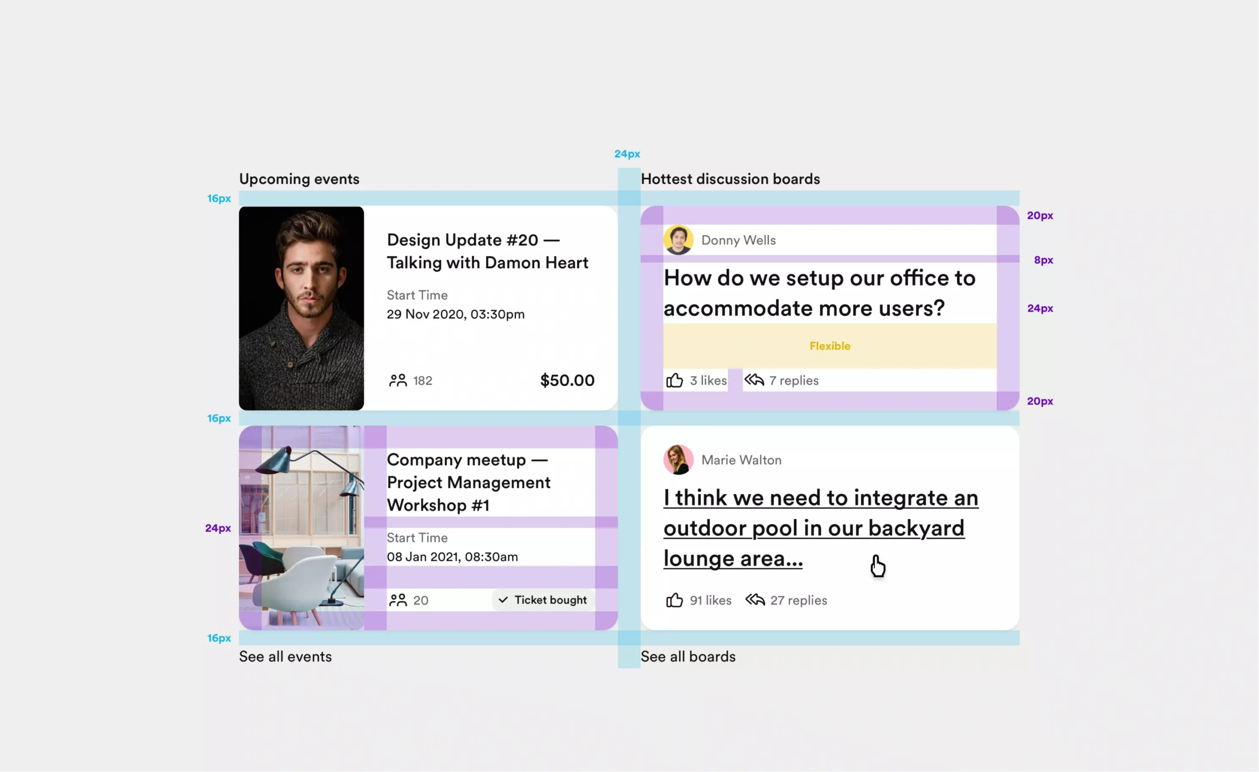
Because we took the same approach to all elements within a product, we were able to design all functions within a module to be clear and easy to use. For example, in a widget, we provided a flexible space for long and short text scenarios so that the widget maintains its height and proportions.
Different versions, same approach
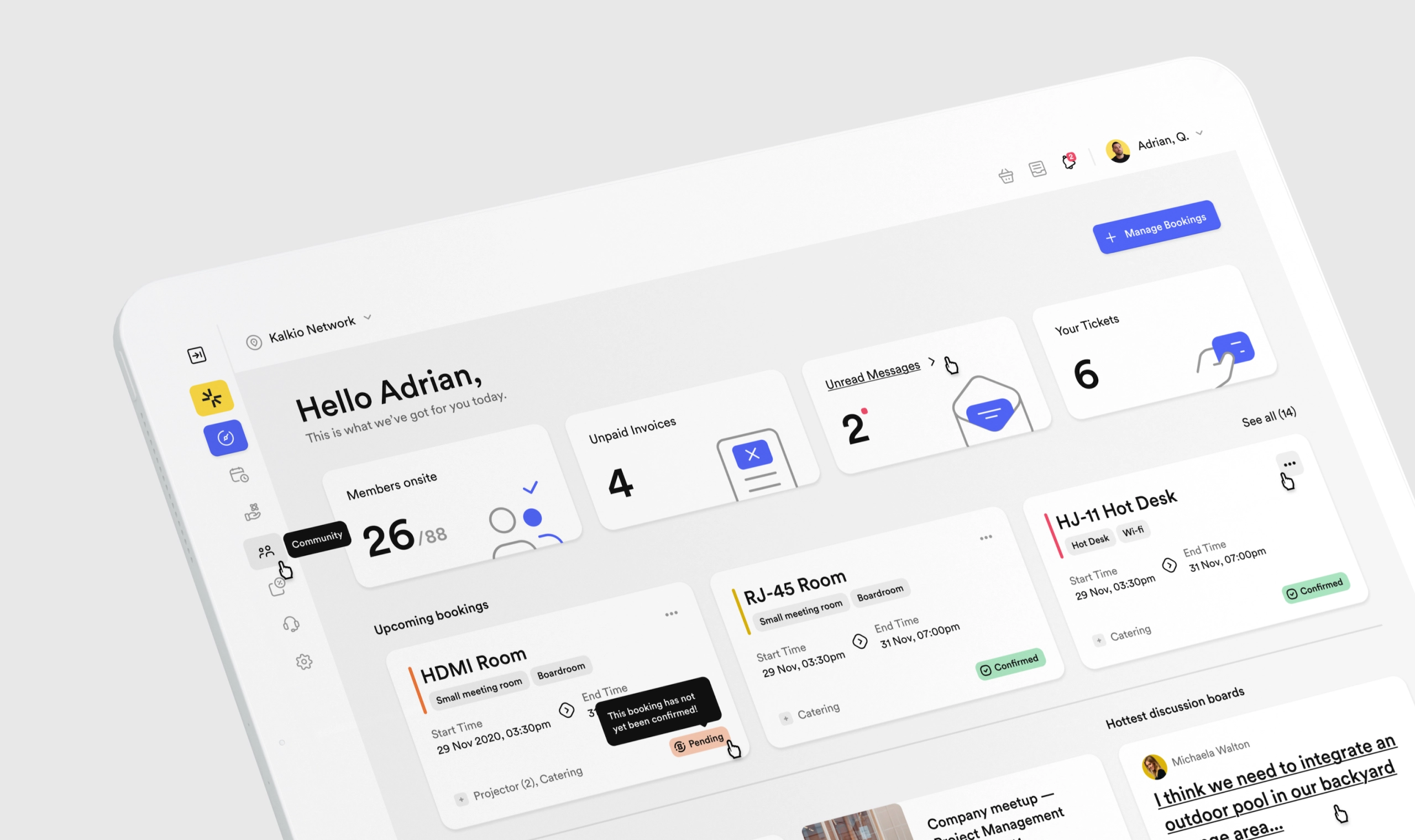
For the web app, we focused on 3 important aspects: the navigation, the booking flow, and the dashboard home screen.
Navigation
Since the app is customizable, the number of features and resources can vary from case to case. For this reason, we needed to develop a bulletproof solution that would work for all use cases and translate well to mobile devices.
Adding an extra layer to the complexity of navigation is the customer-facing landing page, which serves as a marketing website for users who’re not logged in. Again, it needed to be intuitive and flexible at the same time.
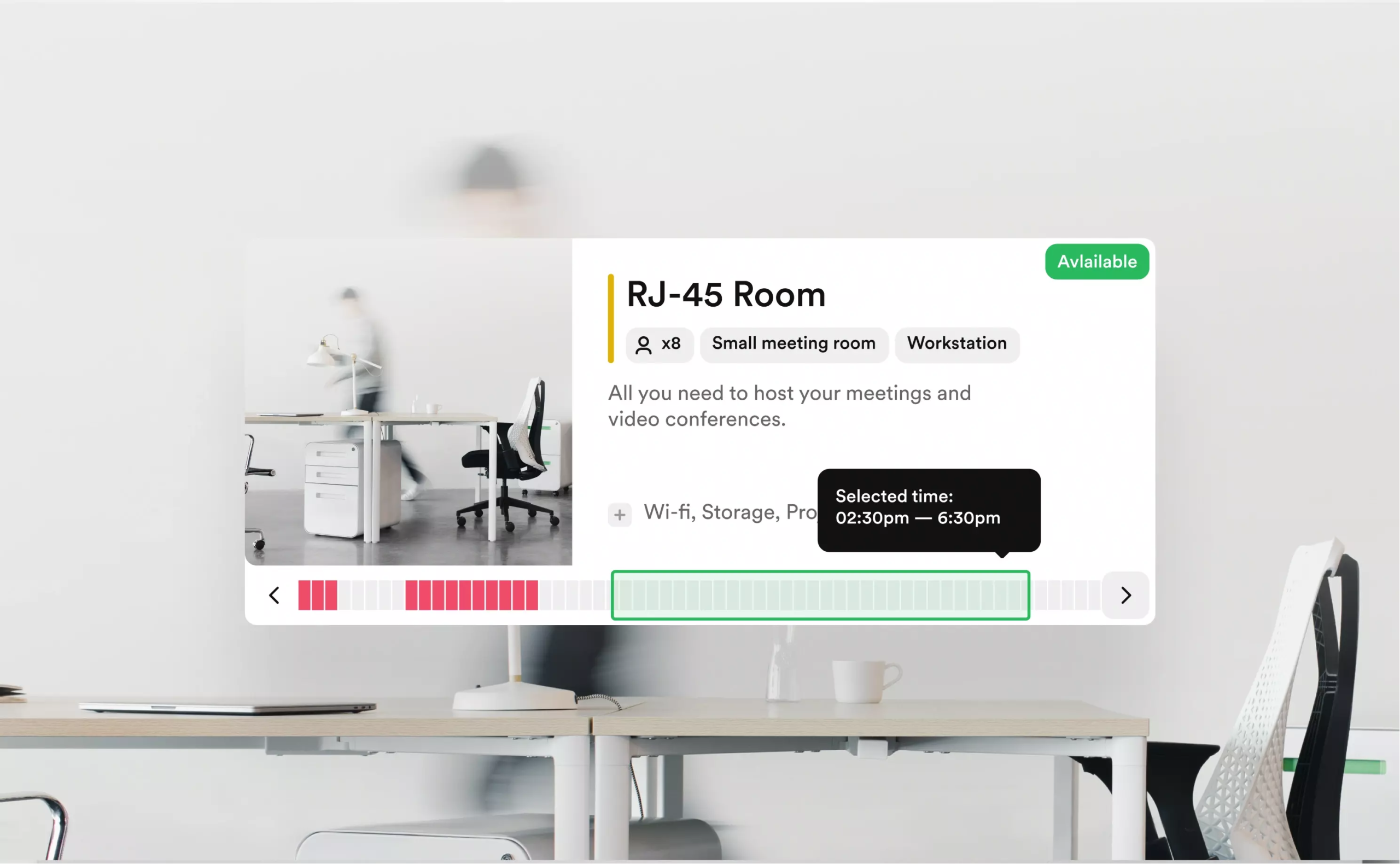
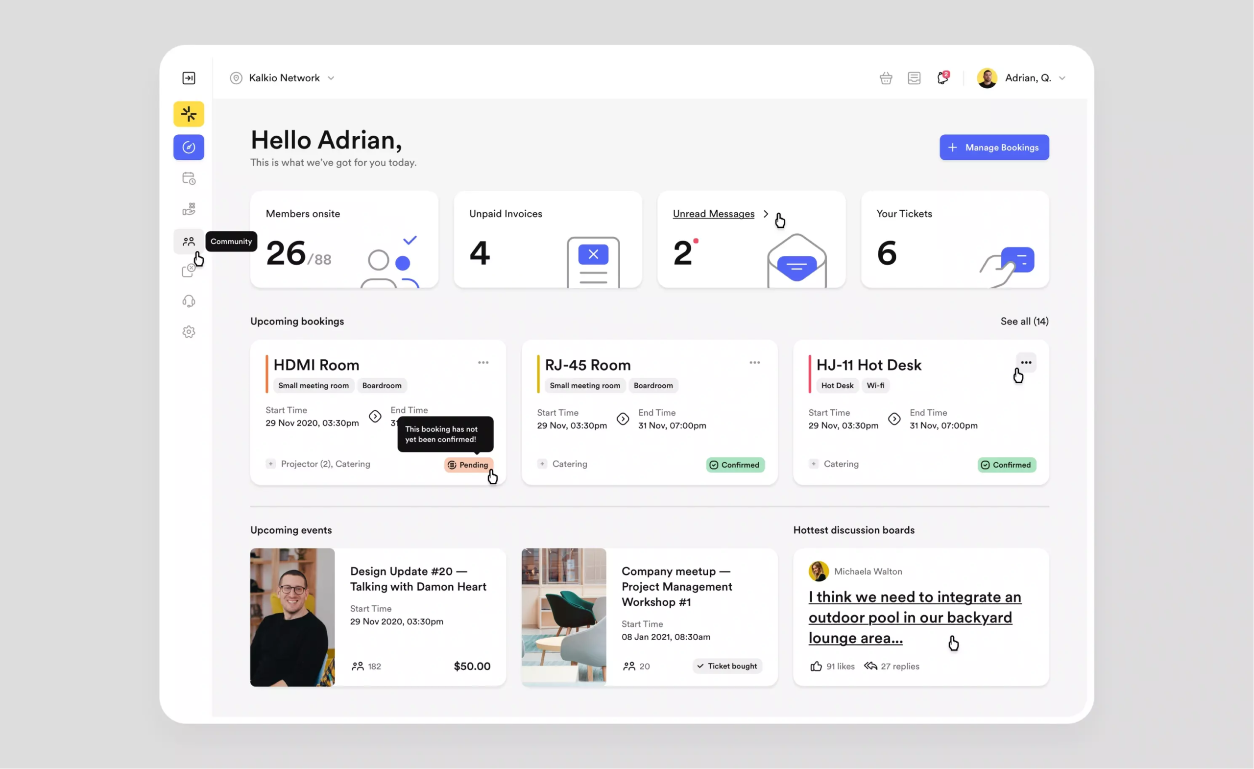
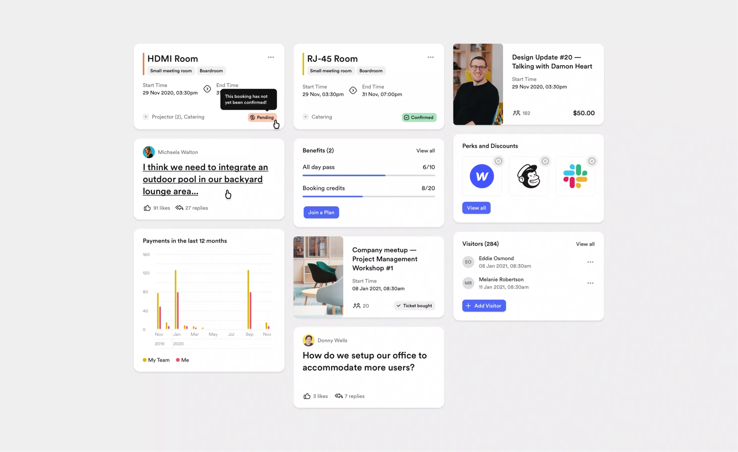
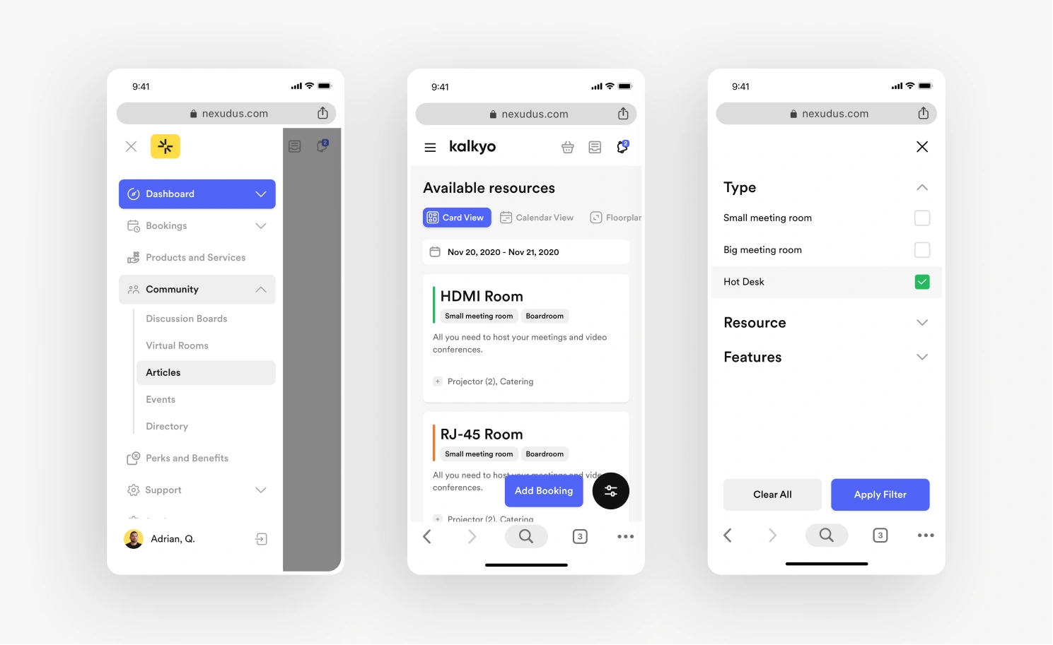
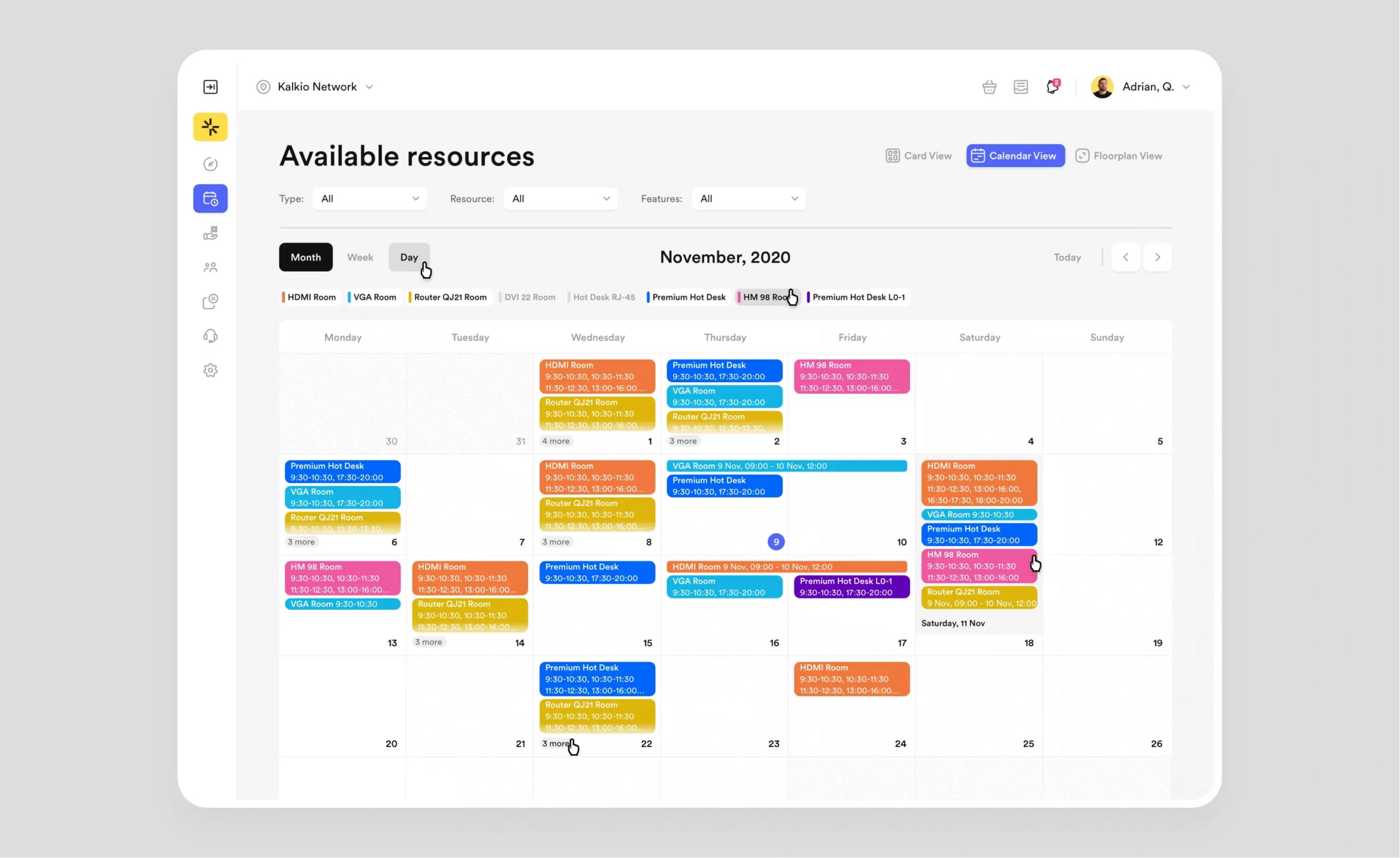
Bookings
There are three views for booking resources: card/list, calendar, and the floor plan. Previously, the overview of these three views was disjointed, making it difficult for users to navigate between them and book the resource they wanted. We brought them all under one roof so users could easily navigate between them. Responsive design and search filters made booking easier than ever.
Dashboard home
The old version had a flat approach to the information hierarchy. We redesigned both the layout and the information presented to create balance and make the app easier to navigate.
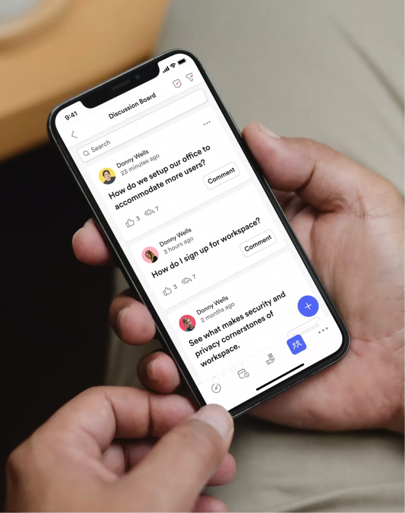
With the mobile version, it was a matter of integrating and translating missing functions from the web app and restructuring the navigation and booking process. We started with usability heuristics to analyze potential problems and eliminate inconsistencies in the new version.
Missing features
We translated the missing features by using the best cases for native mobile apps. We made sure to repeat the patterns found in the web app so that users accessing across devices could easily switch between platforms.
Navigation
The main idea was to structure navigation based on usage. This way, users could intuitively and quickly access the most frequently used functions and processes.
Bookings
This was the biggest challenge because there were technical limitations and the booking functions were complex. We needed to find a balance between these two aspects and make it intuitive enough so that users could manage the process without any problems.
Flexibility that accommodates
There are three user personas that use the product:
The co-working product is the default membership portal for spaces that need co-working management. Most of the daily processes in a co-working space can be automated. The design of the membership portal is based on two core concepts: community and operations.
With corporate offices, there’s no subscription. Customers don’t necessarily have to pay for bookings because they’re part of the company.
Virtual communities, on the other hand, need a platform to manage their members.
3 projects completed in 2 years with Nexudus.
BB Agency did a great job of taking general ideas and some very loosely termed flows or processes and then put them into a concrete UX experience … BB Agency is able to translate your vision into something amazing.
Matheus Matioli,
Customer Experience Specialist at Nexudus
Results
The Results
Our collaboration with Nexudus resulted in a significantly enhanced user experience, characterized by improved usability, visual appeal, and intuitive navigation. The revamped design system allowed for customizable and adaptable modules catering to diverse user needs globally.
The redesigned dashboard and streamlined booking process contributed to increased efficiency and a marked improvement in overall performance. User reception was notably positive, particularly with the modernized discussion board mirroring social media standards.
In essence, our work with Nexudus resulted in a more efficient, user-friendly platform, exceeding client expectations and aiding co-working space operators worldwide. The project successfully embodied our core design concepts of community and operations, underscoring our commitment to creating accessible and dynamic digital solutions.
How did we help?
Research
- Competitive benchmark
- User flows, and navigation
- Wireframes
Digital experience
- Creative direction
- Product design
- Mobile app design
- Design system
Engineering
- Front-end development
- Quality assurance
Narrating stories that resonate, building experiences that people cherish, and achieving outcomes that matter demand true partnership. That’s why we’re here for the long haul, walking beside you every step of the way.