Enterprise strength meets startup agility
Organizations today need to stay ahead of the curve to maintain their competitive edge. The market requirements are constantly evolving and can often be challenging to navigate. Pilot44 helps large consumer-facing companies speed up innovation and drive growth by leveraging lean processes, advanced technologies, and cutting-edge approaches to digital engagement.
As disruptors at their core, Pilot44 required a revamp of their brand identity and core brand assets, as well as their communication strategy. This update was needed to align with their position as a pioneer in innovation and to help them convey their essence with a bit more flair. BB Agency was just the right partner for the job. Let’s dive into what we achieved through this collaboration.
Defining the voice of the Architects of Growth
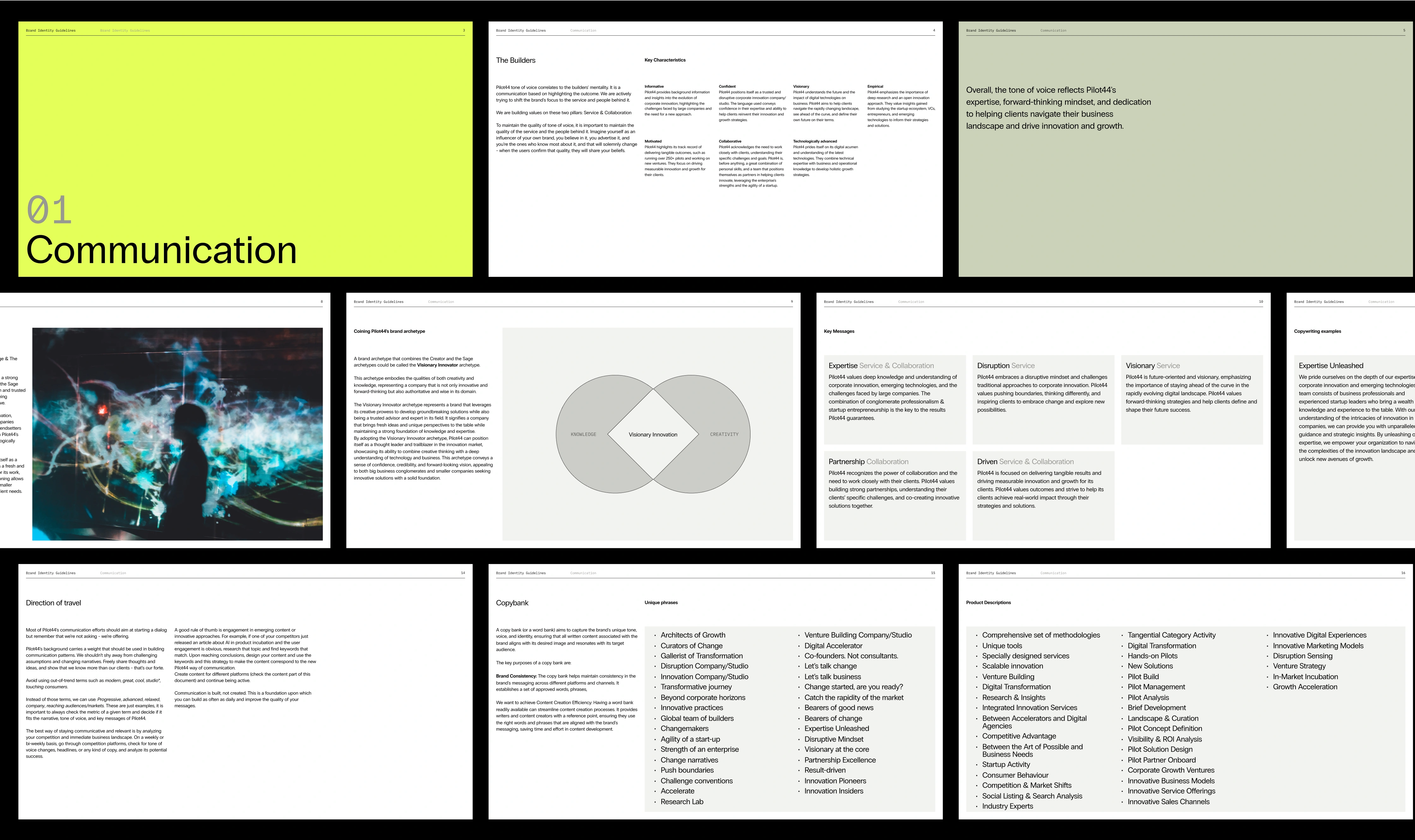
One of the key aspects of our collaboration with Pilot44 was outlining their communication strategy. Our starting point was extensive research and benchmarking that helped us define their brand character, craft their brand story, and finally specify their voice. With these basics covered, we were able to fine-tune their key messaging and direction of travel, providing guidance on maintaining consistency in their verbal expression.
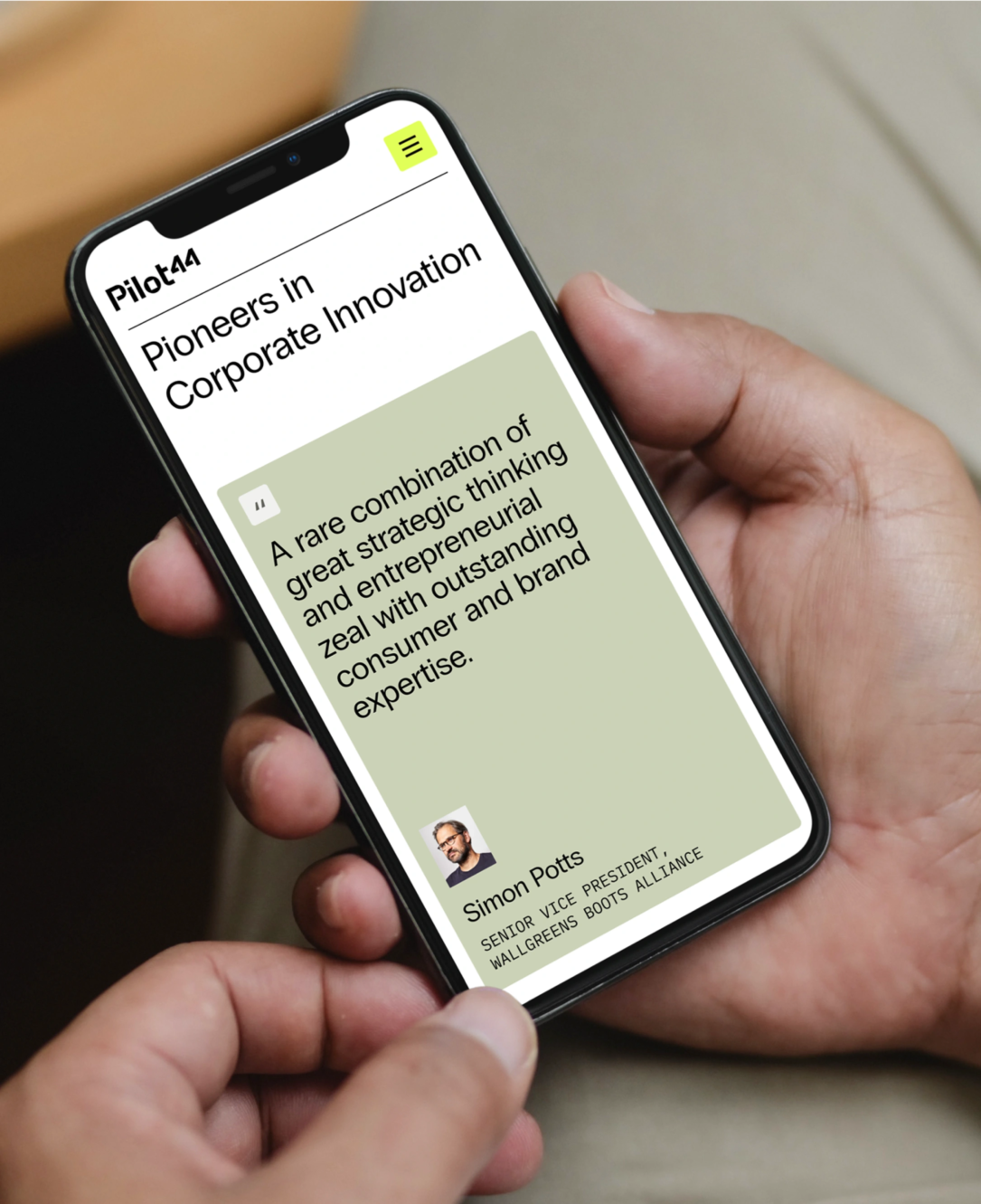
Embodying a Builder’s mentality, Pilot44’s verbal identity focuses on articulating the ultimate goal of their services and the people behind them. We refined their brand voice to mirror their expertise, forward-thinking mindset, and commitment to guiding clients through the business landscape, fostering innovation and growth.
Pilot44, also known as the Architects of Growth as characterized in the brand story, upholds an informative and confident verbal style. Simultaneously, they remain approachable in their communication (as a trusty partner would be)—firmly standing behind the results they deliver and owning their success.
Capturing the essence of the Pilot44 brand
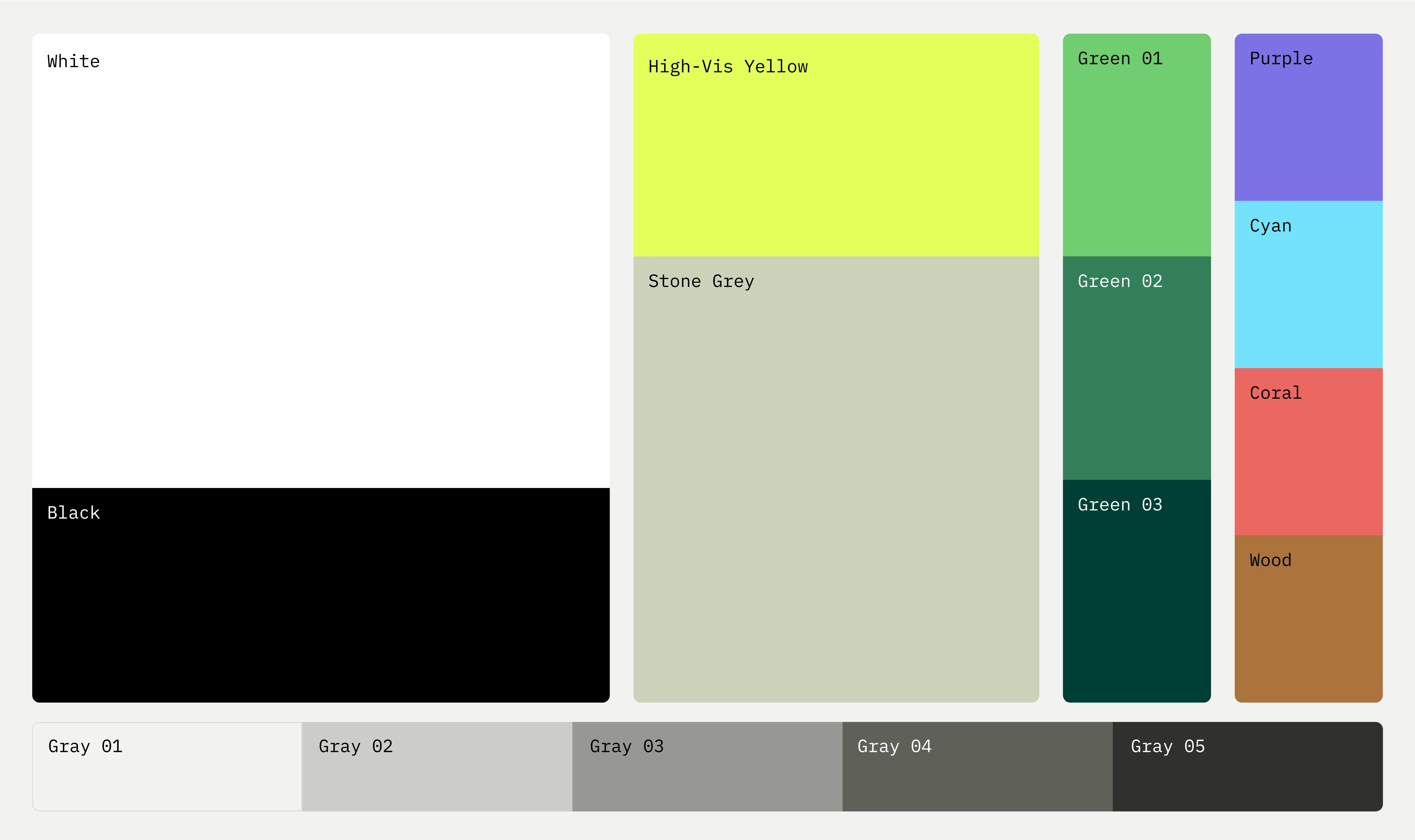
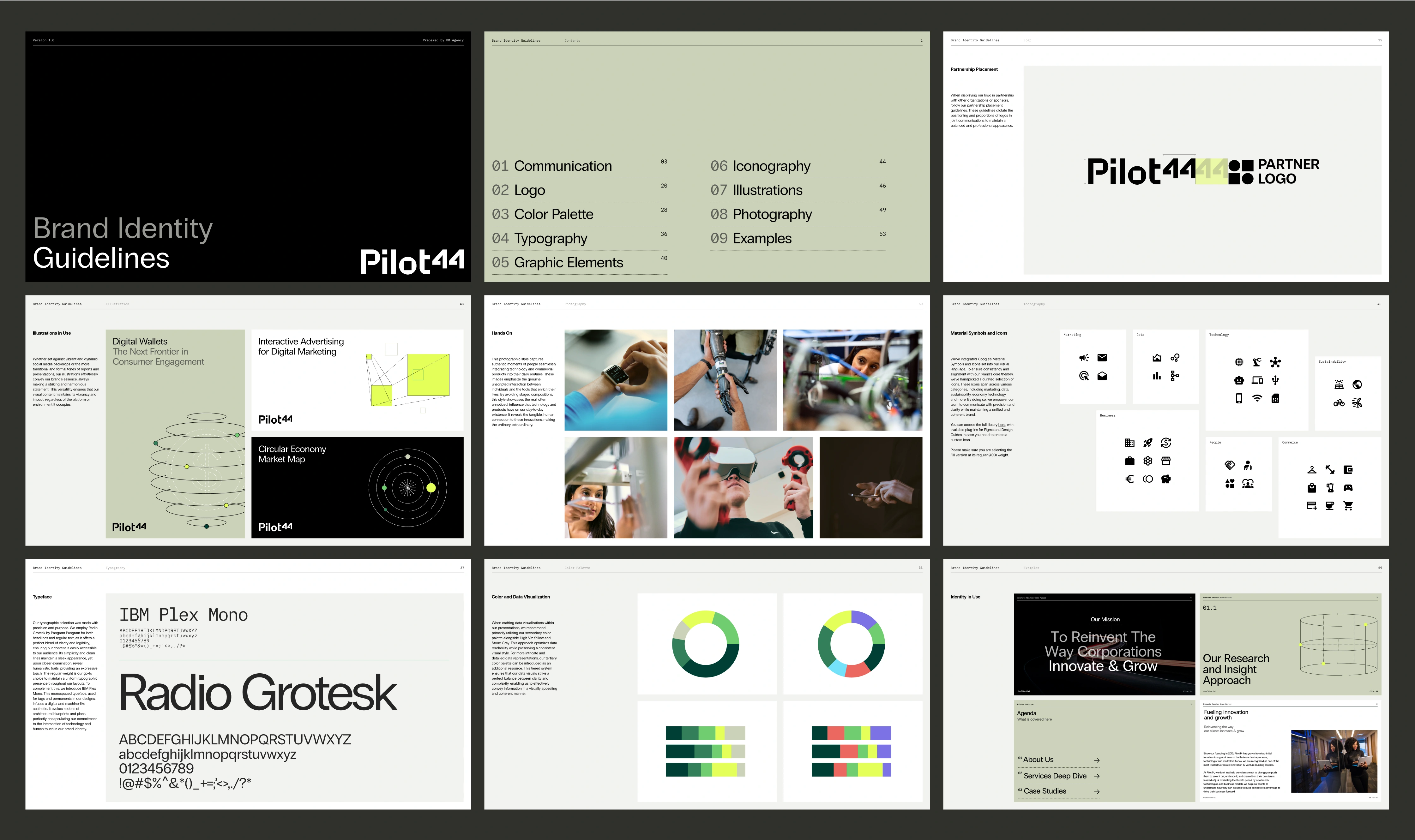
The challenge in branding for Pilot44 was to capture the unique axis of corporate expertise versus startup flexibility. In other words, their visual identity was supposed to convey a perfectly balanced blend of experience and innovation, reflected in the following set of branding elements we developed: a wordmark, color palette, illustrations, and layout structures that truly encapsulated the essence of Pilot44.
So, how do you create an identity that embodies agility, disruption, and creativity—the core of what Pilot44 stands for? Here’s our approach.
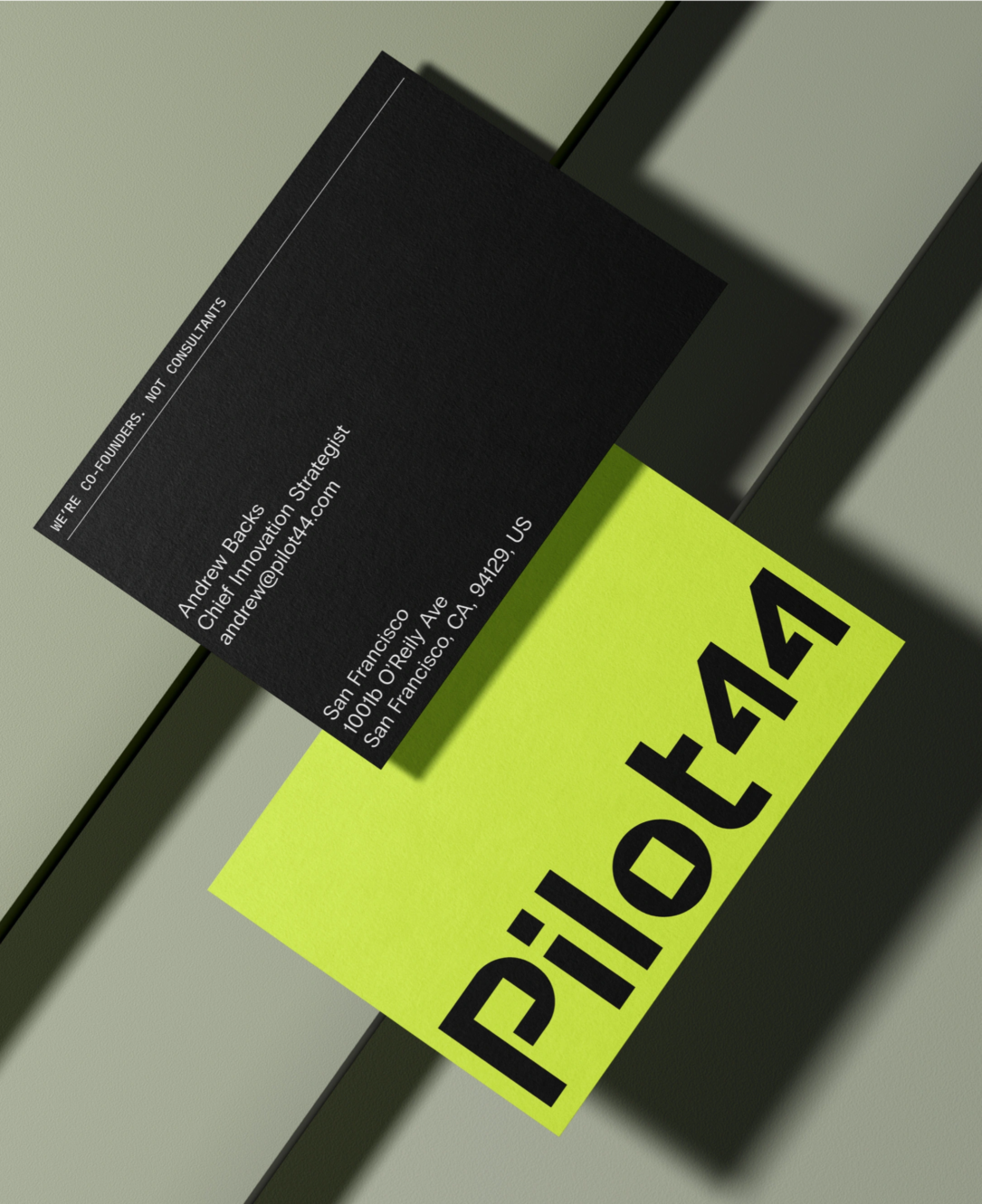
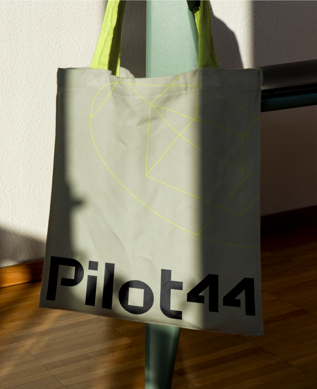
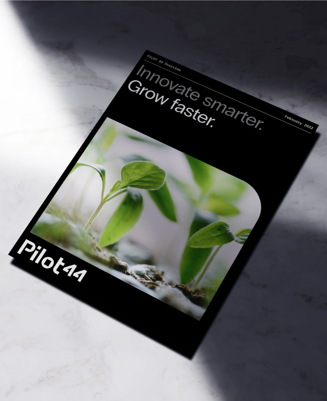
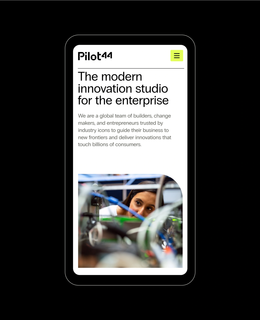
The new custom wordmark, crafted with thick, geometric strokes, evokes solidity and strength. The color palette plays with the contrast between stability and vigor, combining stoic stone shades with invigorating hi-viz yellow, which plays a big role in the identity as a whole. The illustrations, inspired by scientific and architectural aesthetics, stand out as a focal point, reflecting Pilot44’s dedication to reliability and precision.
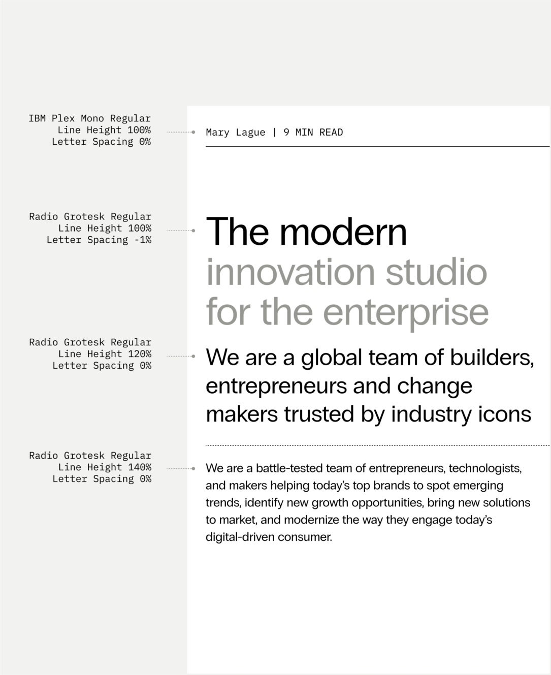
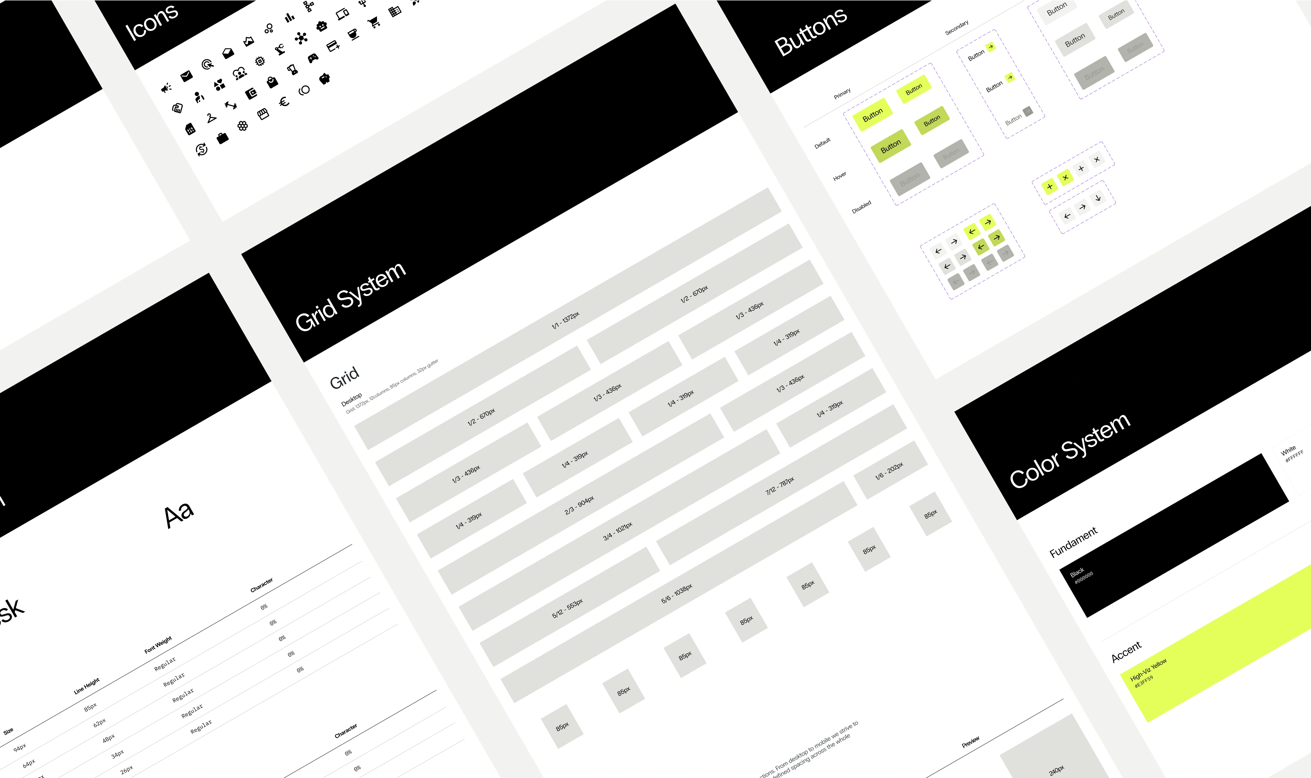
In our pursuit of consistency and simplicity, we ensured their layouts, presentations, and pitch decks communicated information and ideas with clarity and impact. The choice of typeface and layout was intentionally selected to bring clarity to their messaging, underscoring their straightforward communication style without losing depth.
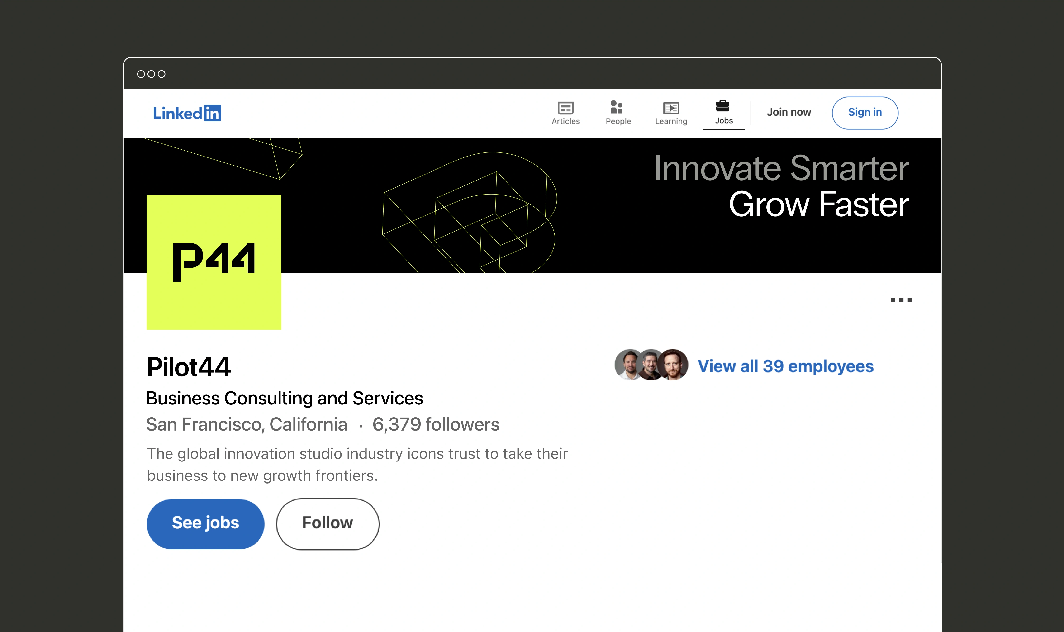
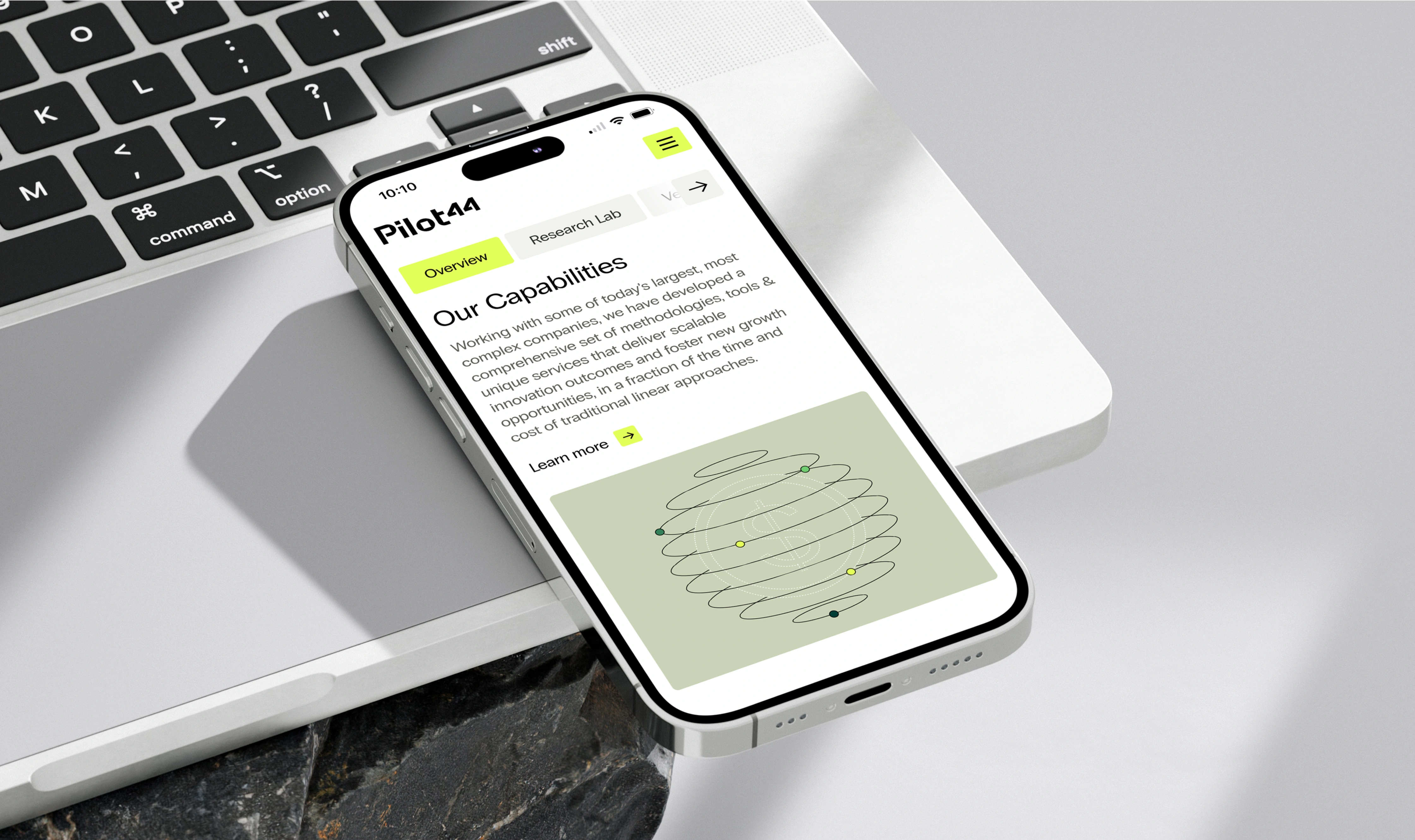
Translating the new branding into UI design
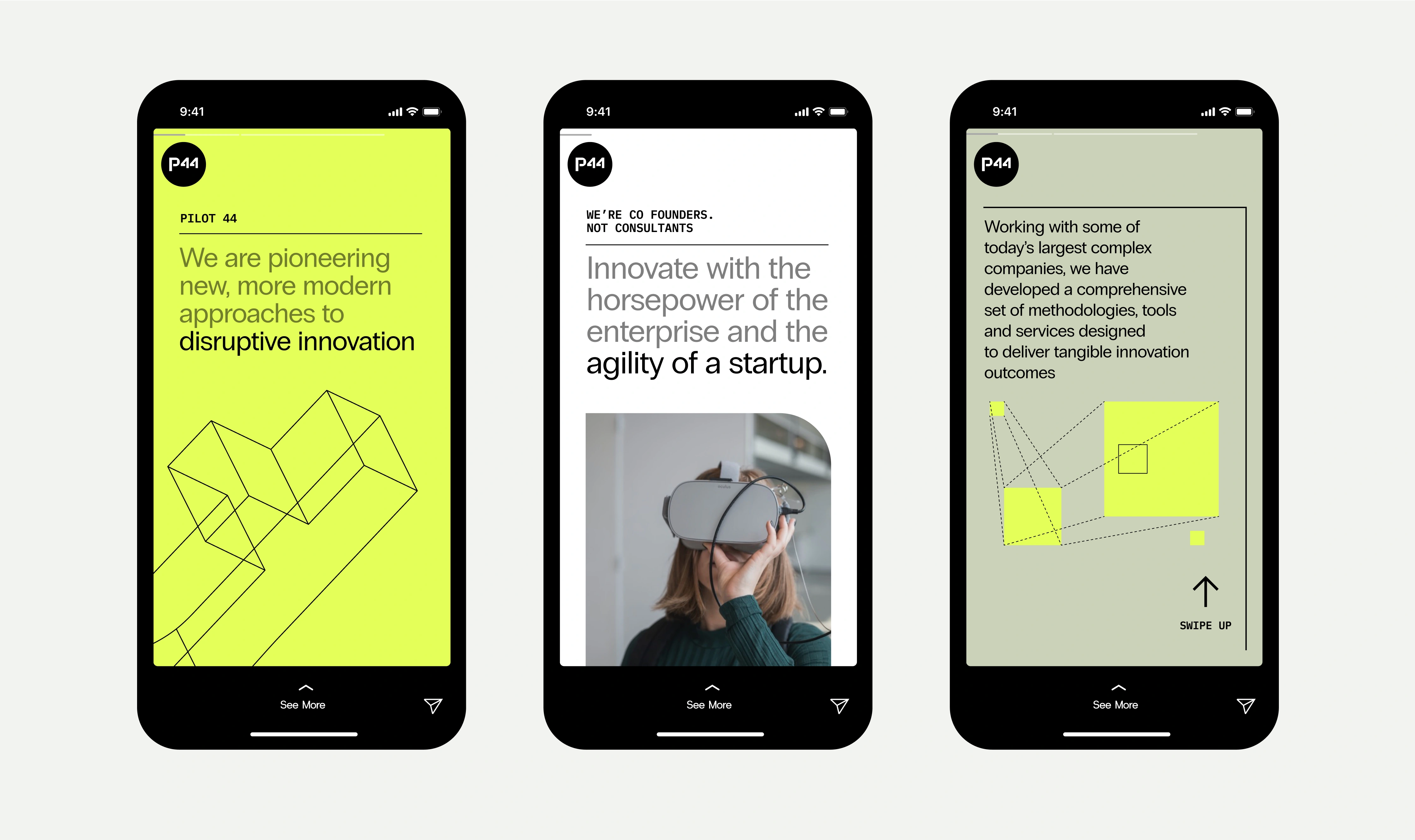
In the final stage of our collaboration, we embarked on translating the new branding into the UI design. Our goal was to maintain an editorial and clean aesthetic, with a grid-based structure for clearer content presentation. To test the optimal use of the newly defined brand elements, we designed the entire homepage, including 10 HubSpot modules and blog thumbnail designs, complete with usage instructions—wrapping it all up with a design system.
We aimed to develop a sophisticated and creative design language that resonated with Pilot44’s forward-thinking identity. The primary objective was to organize and present content in a way that was clear and concise, making it easily digestible for users. We incorporated subtle interactive elements to boost content understanding. Moreover, the combination of Radio Grotesk and IBM Plex Mono fonts used in a structured way added to design consistency.
This exploration confirmed that a clean design, featuring light neutral backgrounds with bold splashes of yellow, would create a striking impact without compromising on the message clarity. In fact, it facilitated the construction of a clear structure and hierarchy, proving essential in portraying Pilot44’s trustworthiness and expertise.