The client
Rainmaking is a corporate innovation and venture development firm from Copenhagen, Denmark. Their purpose is to unleash the power of entrepreneurship to solve big problems for the world’s leading companies. They do this by accelerating, scaling and investing in new business ideas, in partnership with brands and startups.
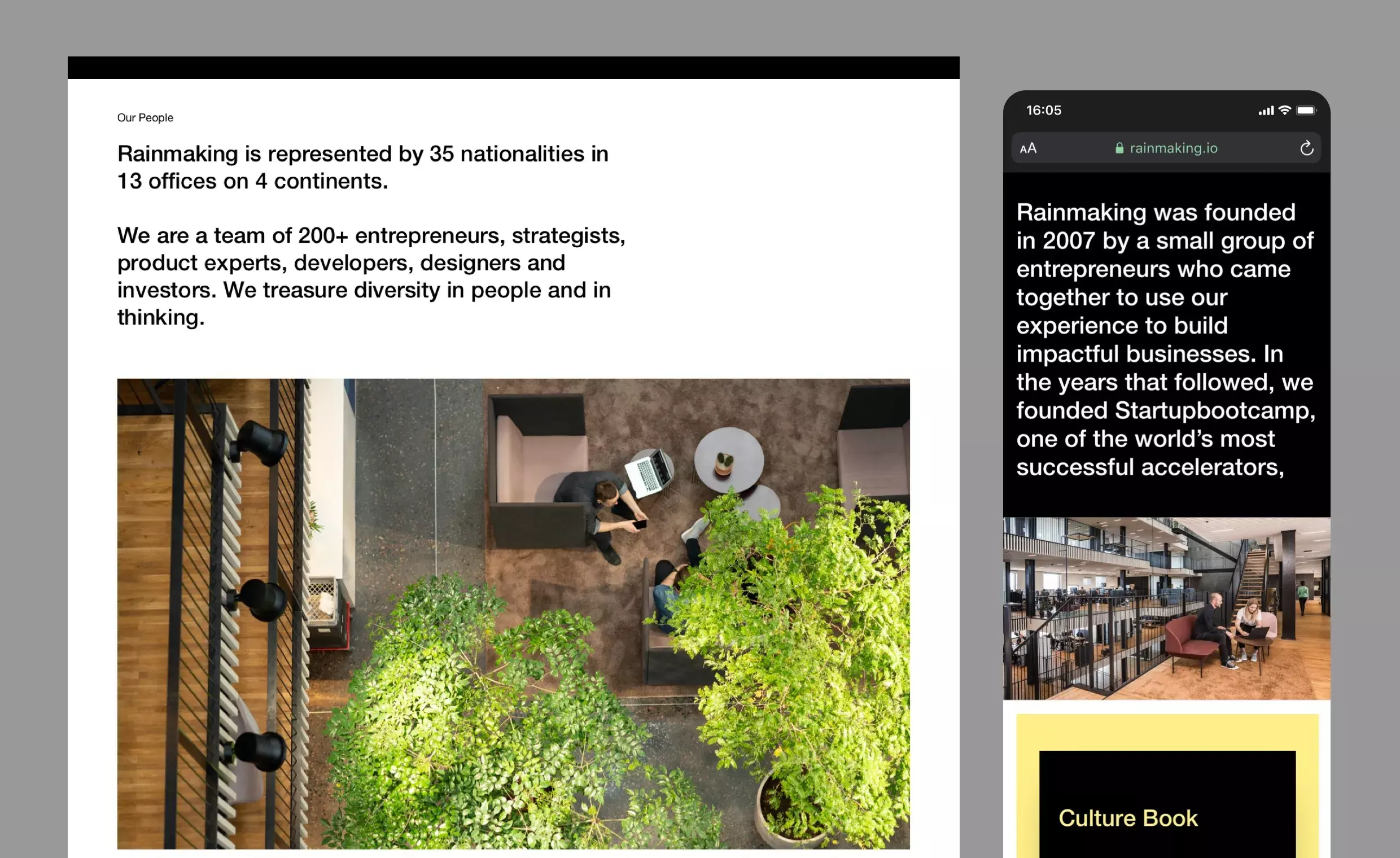
Rainmaking was founded in 2007 by a small group of entrepreneurs to build impactful businesses. Today, they are a team of 200+ entrepreneurs, strategists, product experts, developers, designers and investors working across four continents.
The challenge
Rainmaking approached us at a point in their growth when they were going from strength to strength. They had just completed a strategic repositioning of the brand, and ready to launch their new purpose (unleash the entrepreneur), they needed a new visual identity and website that could reflect this exciting new space they intend to carve in the market.
Functionally, the Rainmaking team needed a website that offered greater flexibility and control, so that their marketing teams could easily manage and expand their content internally.
The solution
For this project we collaborated closely with our clients at Rainmaking. They had already carried out extensive user research, but were relying on us to bring their vision to life and introduce a fresh perspective from outside their organization.
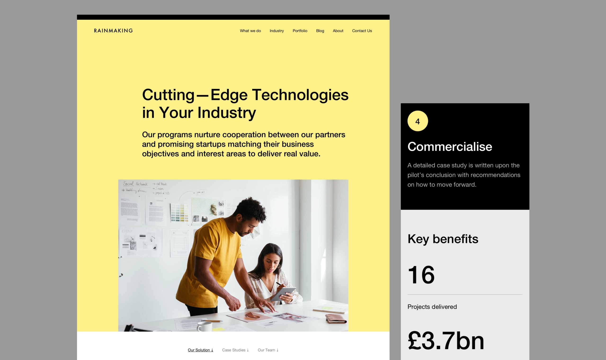
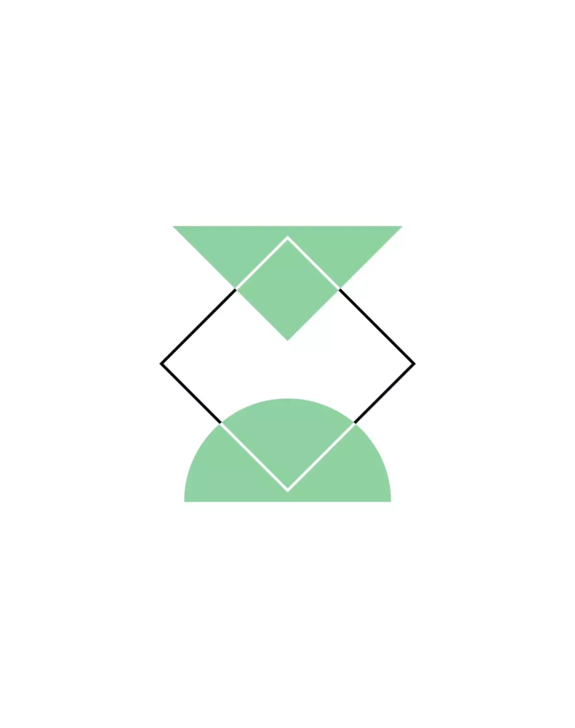
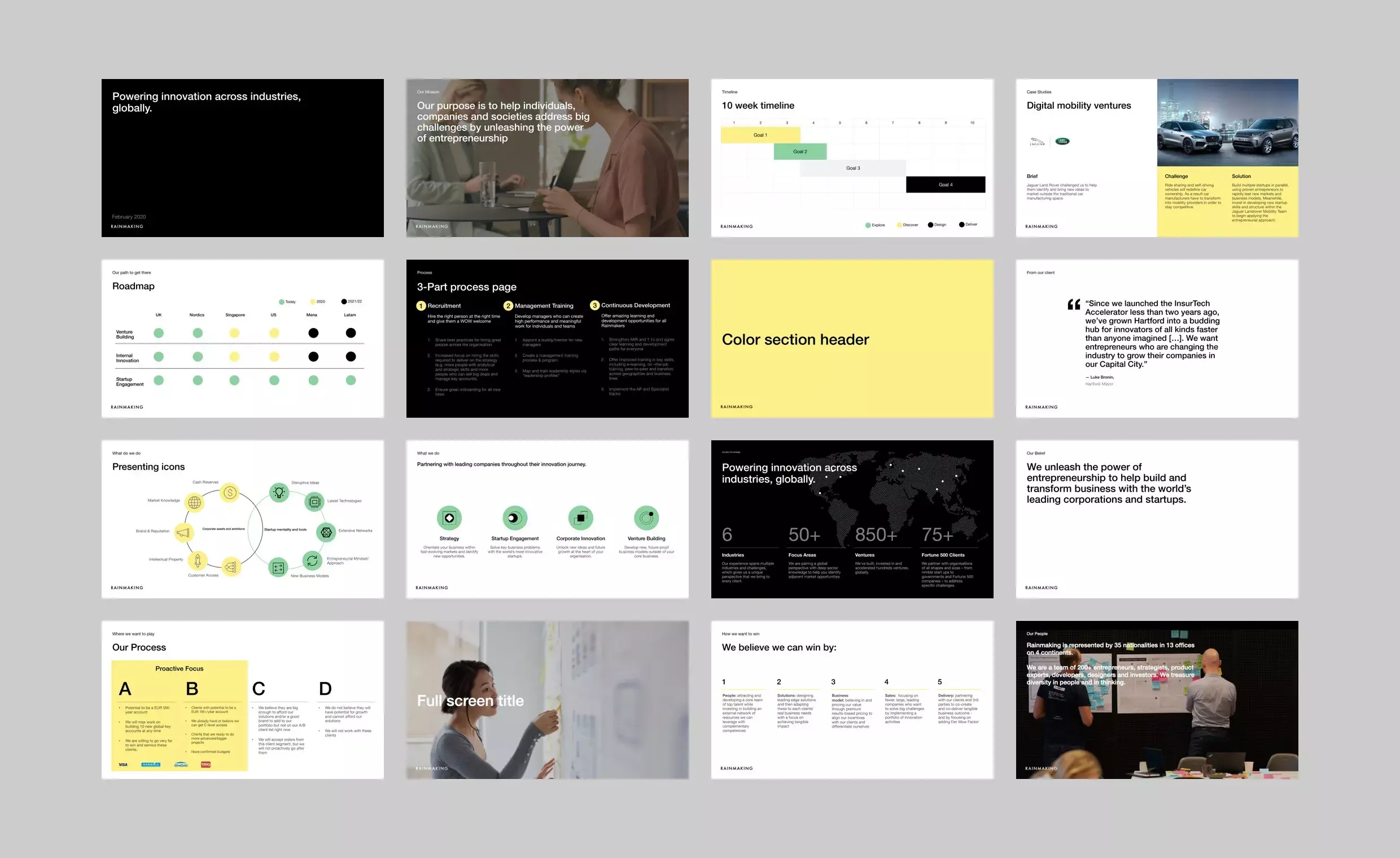
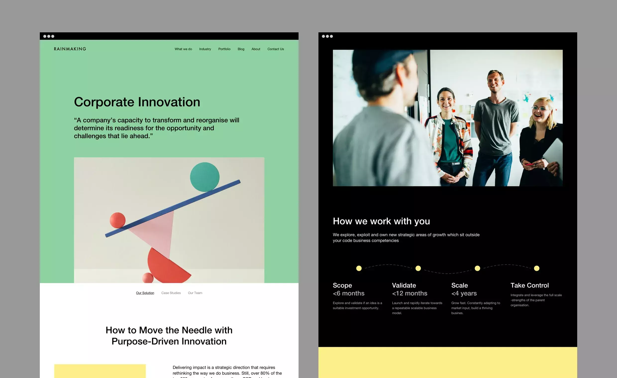
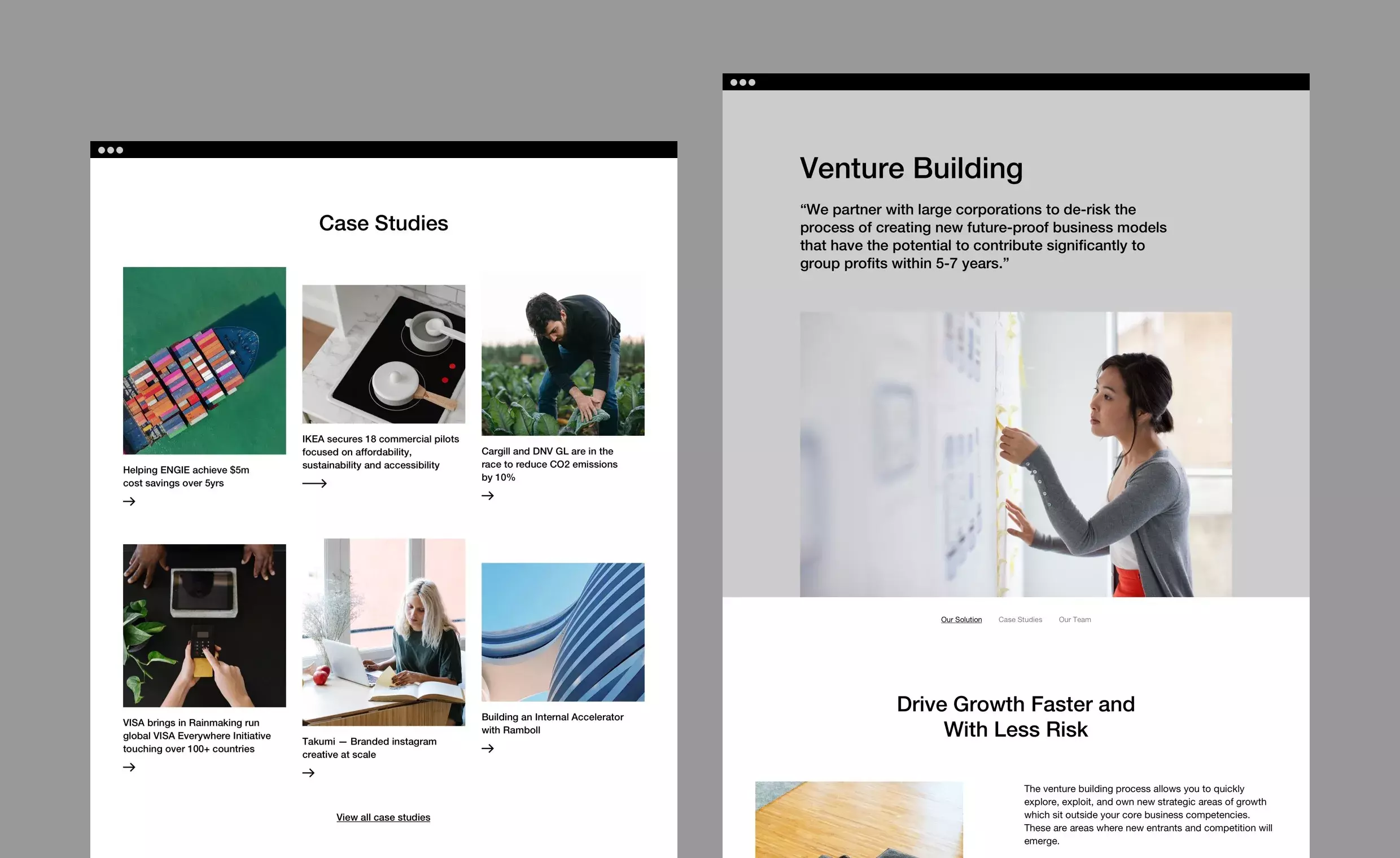
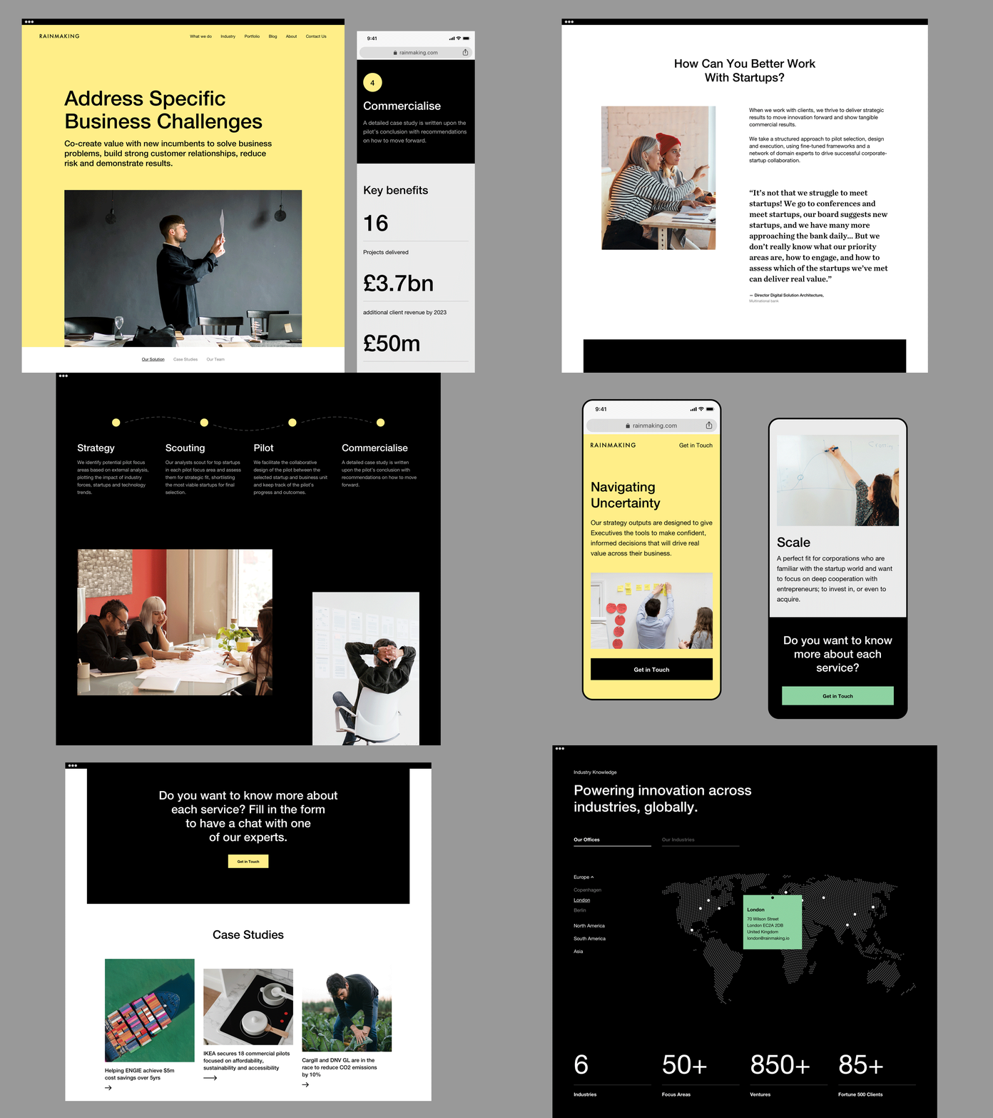
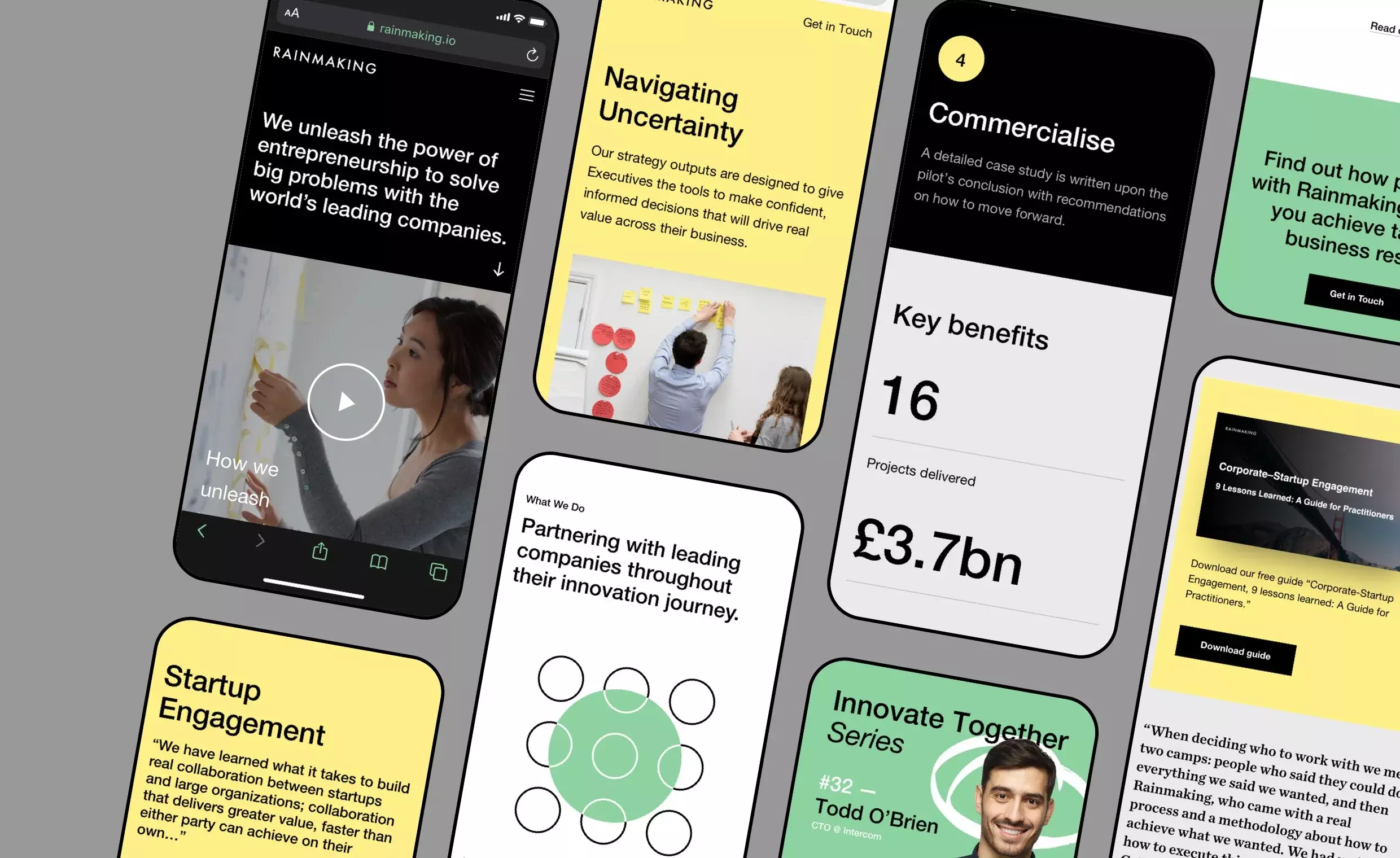
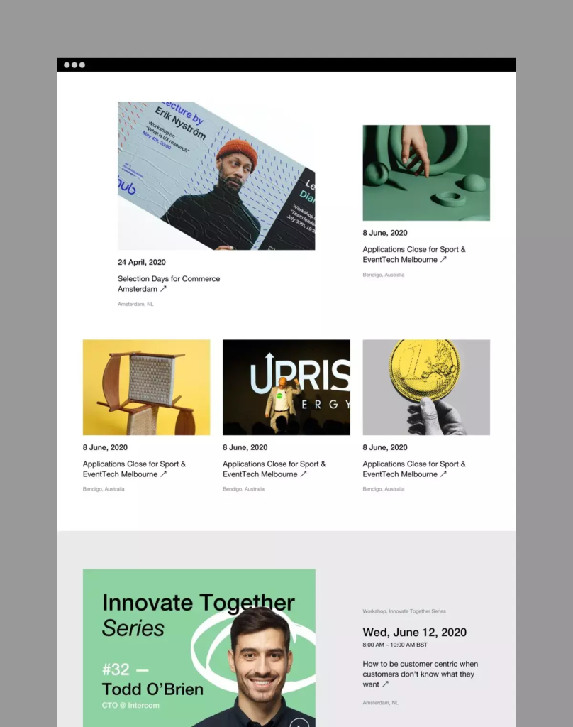
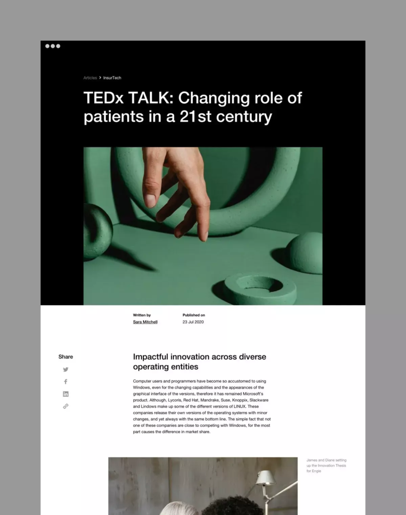
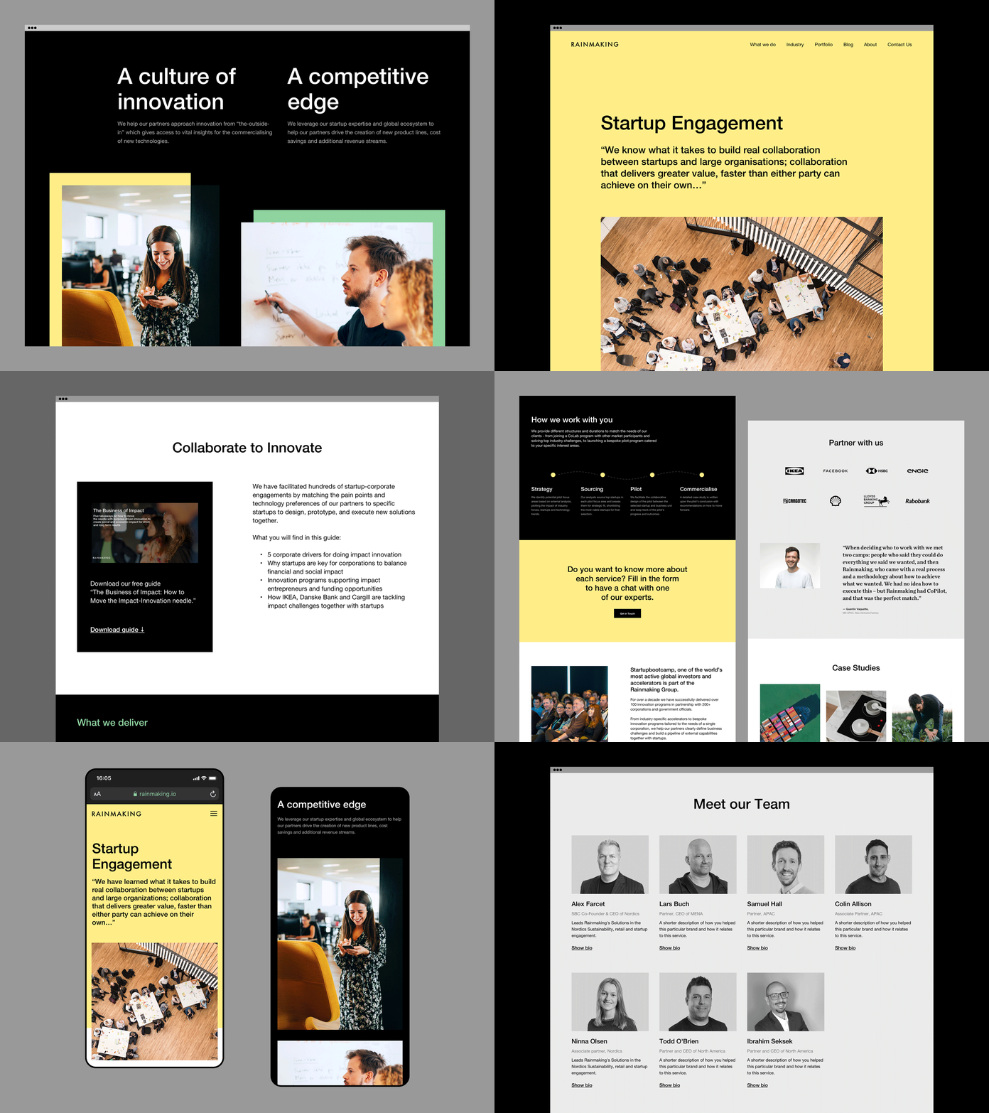
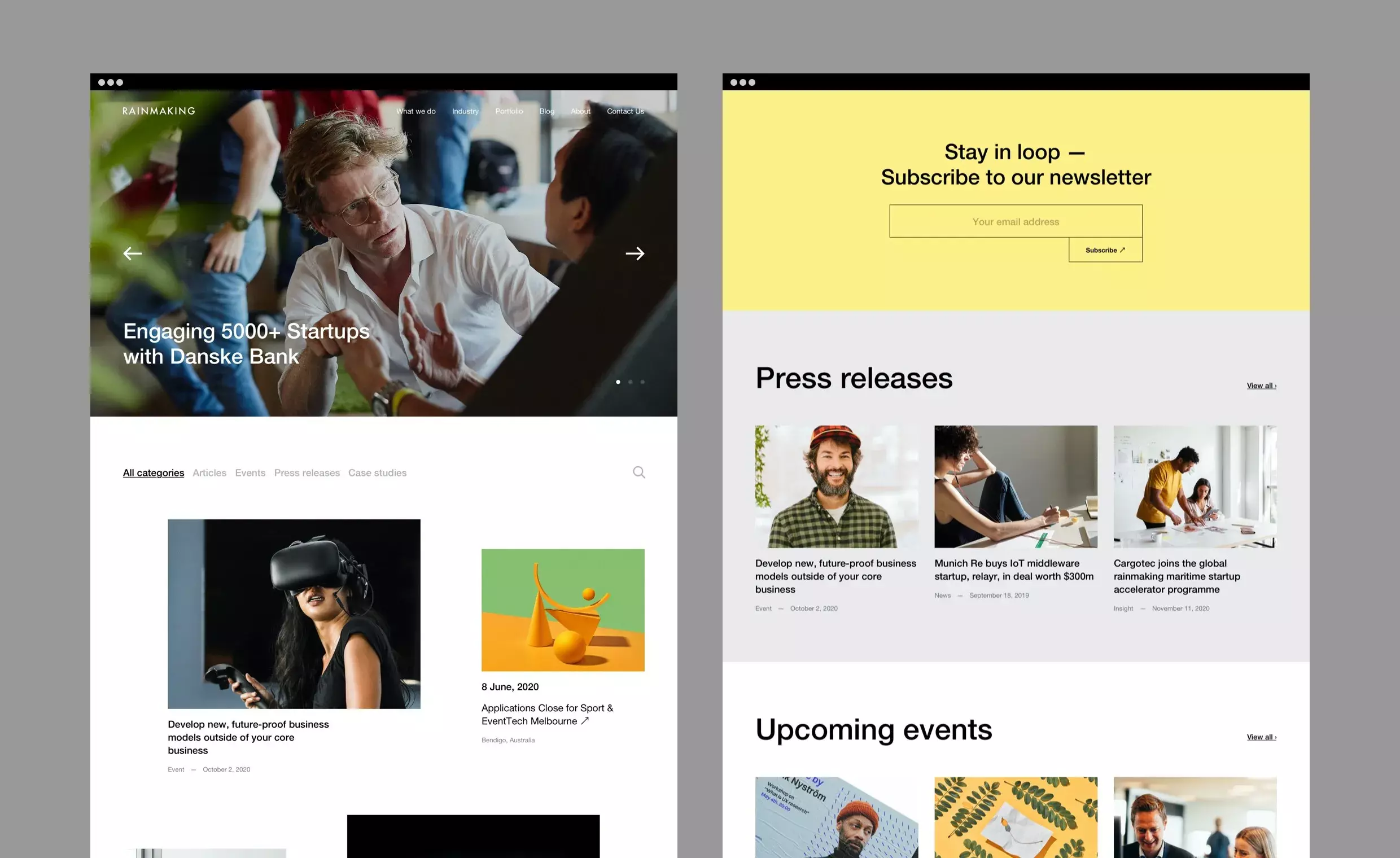
Paying close attention to their new brand platform, we created a new visual identity, complete with bespoke illustration and iconography, then rolled this out across a sparkling new modular website.
Brand design
With Rainmaking operating across a vast array of global markets – including Europe, MENA, Singapore and the US – cultural sensitivity was a top priority for the visual identity.
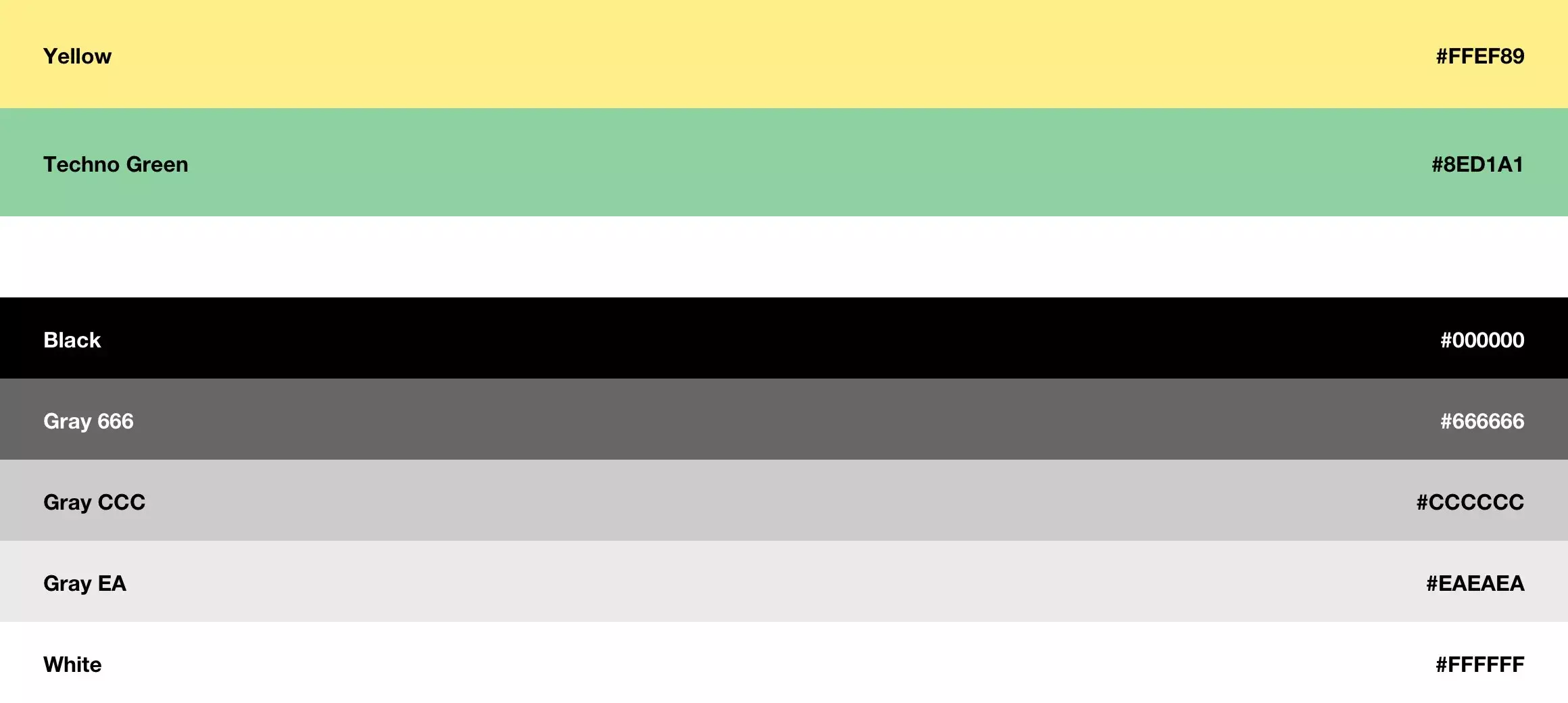
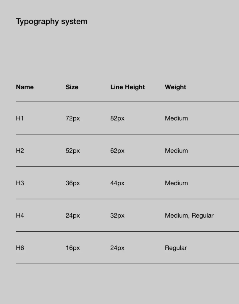
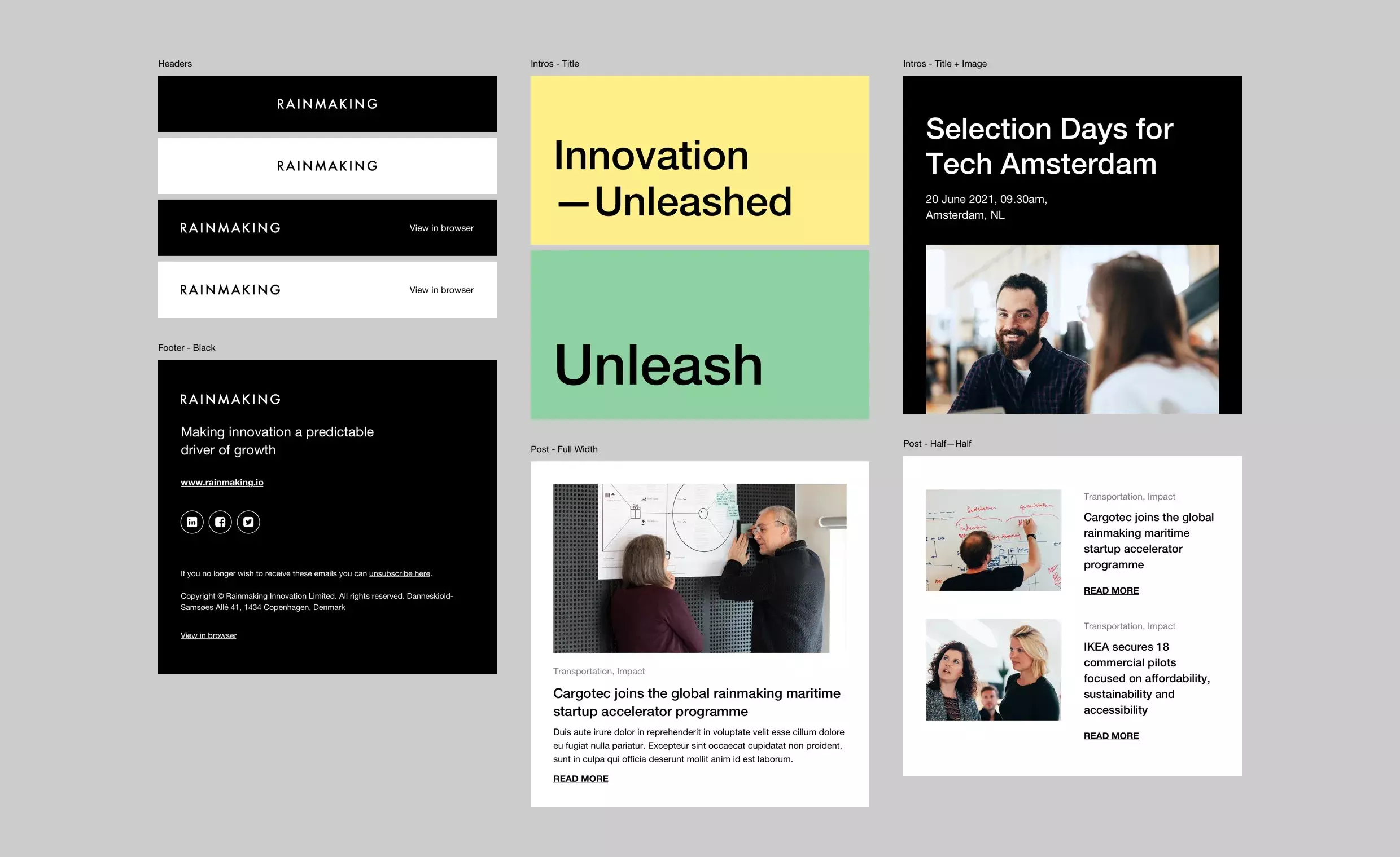
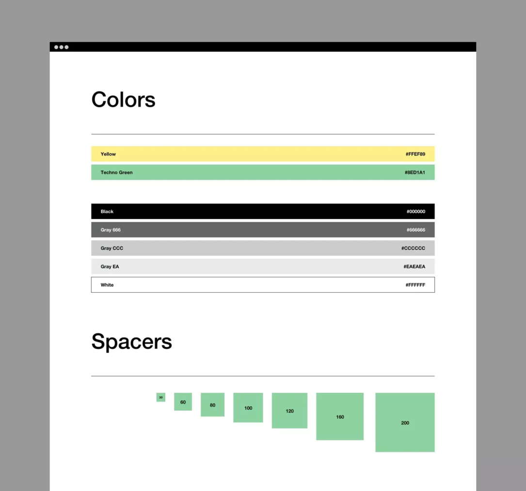
We created a system that was flexible yet memorable. Neutral color palettes and simple, bold typography makes it easy for local markets to adapt and introduce regional content, whilst staying true to the core brand identity.
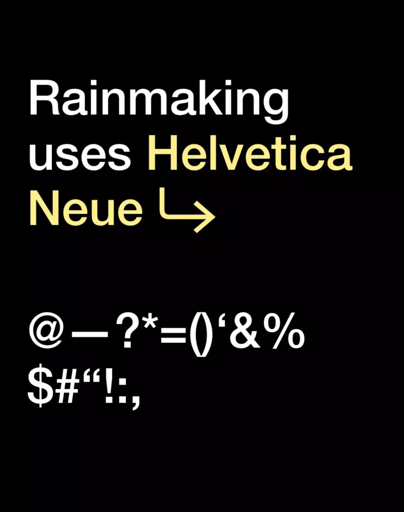
We proposed Helvetica Neue for the brand font, for its clean lines and exceptional multi-language support, making it a breeze to communicate consistently across countries and cultures.
We also created a suite of illustrative icons to represent Rainmaking’s four core functions – strategy, startup engagement, internal venture building and venture building, further helping to differentiate their value propositions.
Website
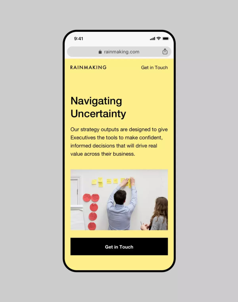
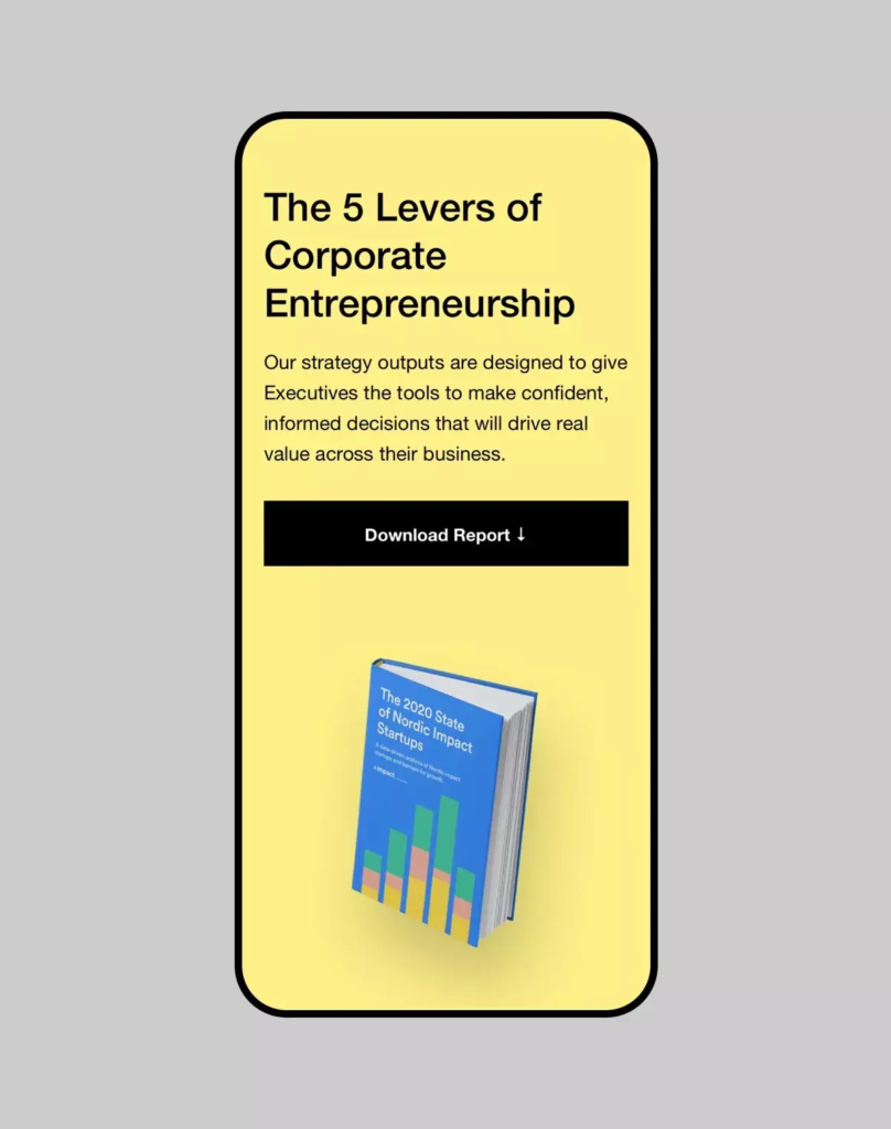
We intentionally created a very simple design language, so that when transferred into development, the possibilities are endlessly customizable. With the new site, Rainmaking can now build new pages within minutes, using just a handful of modules. It’s incredibly simple and fast, and has transformed the way they work.
And just as with the visual identity, the demands of the website were also led by the broad accessibility needs of a global team, stationed everywhere from Osaka to Mexico City. Content creators of all types of cultures, ages and tech knowledge needed to be able to log into the CMS and create their own sub-pages, whilst preserving the integrity of the brand. We achieved this by working with heavily customized WordPress Gutenberg blocks – that is an editable, modular environment that is very user-friendly.
We also rolled out the new brand across Rainmaking’s Hubspot CRM, and connected this to the website, allowing for streamlined working processes that link marketing outreach with the content hub.
