Coding my way to design
Design
Prior to even jumping into this quick study, would just like to say that this is the first time I’m writing anything of this sort, so keep that in mind 🙂
Secondly, if I made grammar errors, please don’t tell me. Let me live in bliss.
So let’s start.
Who is Iconosquare?
Iconosquare is a key metrics tool that helps people grow their Instagram and Facebook presence with exclusive insights and best-in-class management tools.
Starting out in France in 2011, Iconosquare now has over million users, and serves tens of thousands of agencies and organizations.
Check them out on iconosquare.com
Why did they come to us?
Iconosquare reached out to us through Dribbble. They liked our profile and wanted to know if we would like to present some ideas on improving their current dashboard. We obliged with a mini pitch and I guess that was enough. Not sure how we fared with other agencies in terms of pricing, but usually we aren’t the cheapest option.
How we helped?
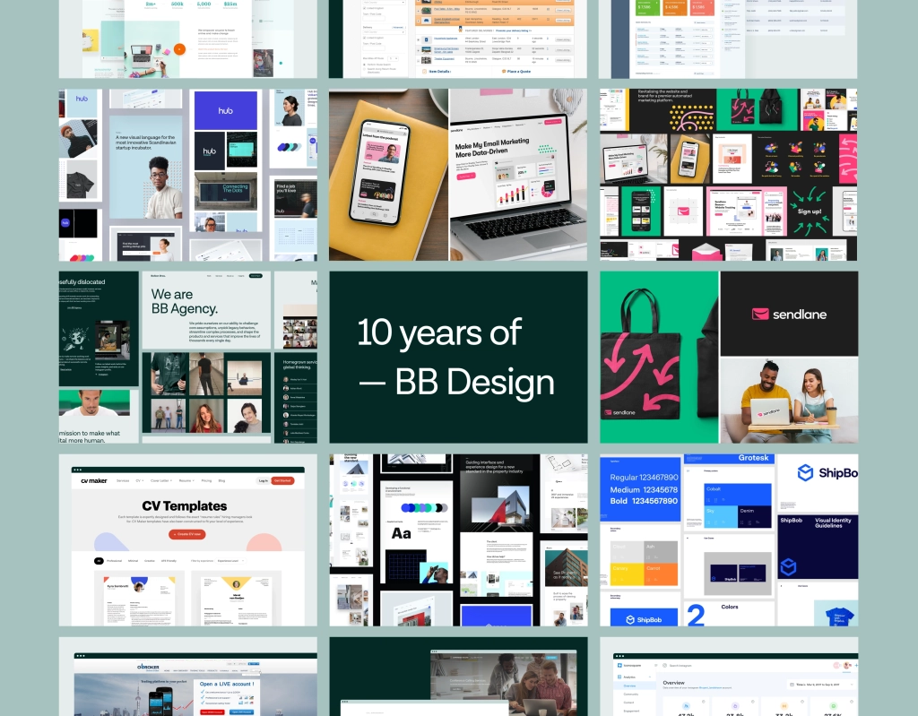
Balkan Brothers helped them visually update their brand and web app as part of our wider piece of work on the whole product that included complete overhauls of user experience and user interface for website, web app and mobile apps.
During that process, we dived deep into color exploration and how it might steer the product into new directions.
More backstory
Iconosquare entrusted us with the keys of the house so to speak. Even though we wanted to hammer down all the walls, pull out the plumbing, cut off the wires, our task was to improve where possible without bringing the house down.
We worked closely with Rachel Hamlin, product manager at the time, to make sure that all our solutions align with Iconosquare’s development team.
Color scheme exploration is a key phase during style, brand and language overhauls. Color can represent different meanings and ideas, and makes a huge difference to the overall visual direction.
Considering the existing user base and demographics data we knew that the safest bet would be to keep it blue. It’s a very popular and neutral color, easily aligned to multiple directions. A lot of colors complement blue as primary, so the choice was obvious. Well, we had to give it a shot and try a trendy setup with purple, but that didn’t pass initial revisions.
You can see some of the options we tested out
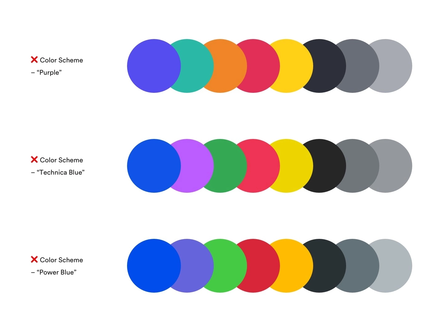
Even though the “Power Blue” contrast level was ranking extremely high (6.42:1 — WebAIM), the required usage of color (heavy) meant that the overall experience was too intrusive. Keep that in mind. It’s all about balancing out the color use and contrasts. Obviously, readability is important but so is the overall usage and how it makes the user feel within that environment.
We finally settled on a soft blue as the principal color, with its vibrant counterparts in green, purple, red, orange and yellow.
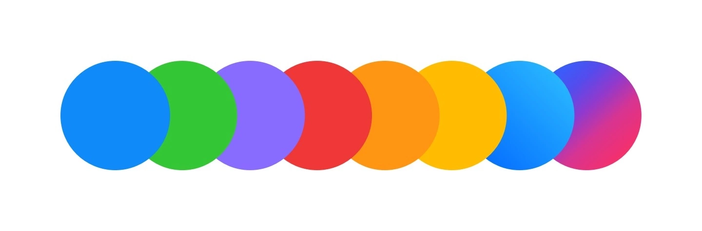
Usually, we select complementary colors using https://coolors.co/app. Not sure how everybody else does it, but this we found to be very helpful in finding the right balance between colors.
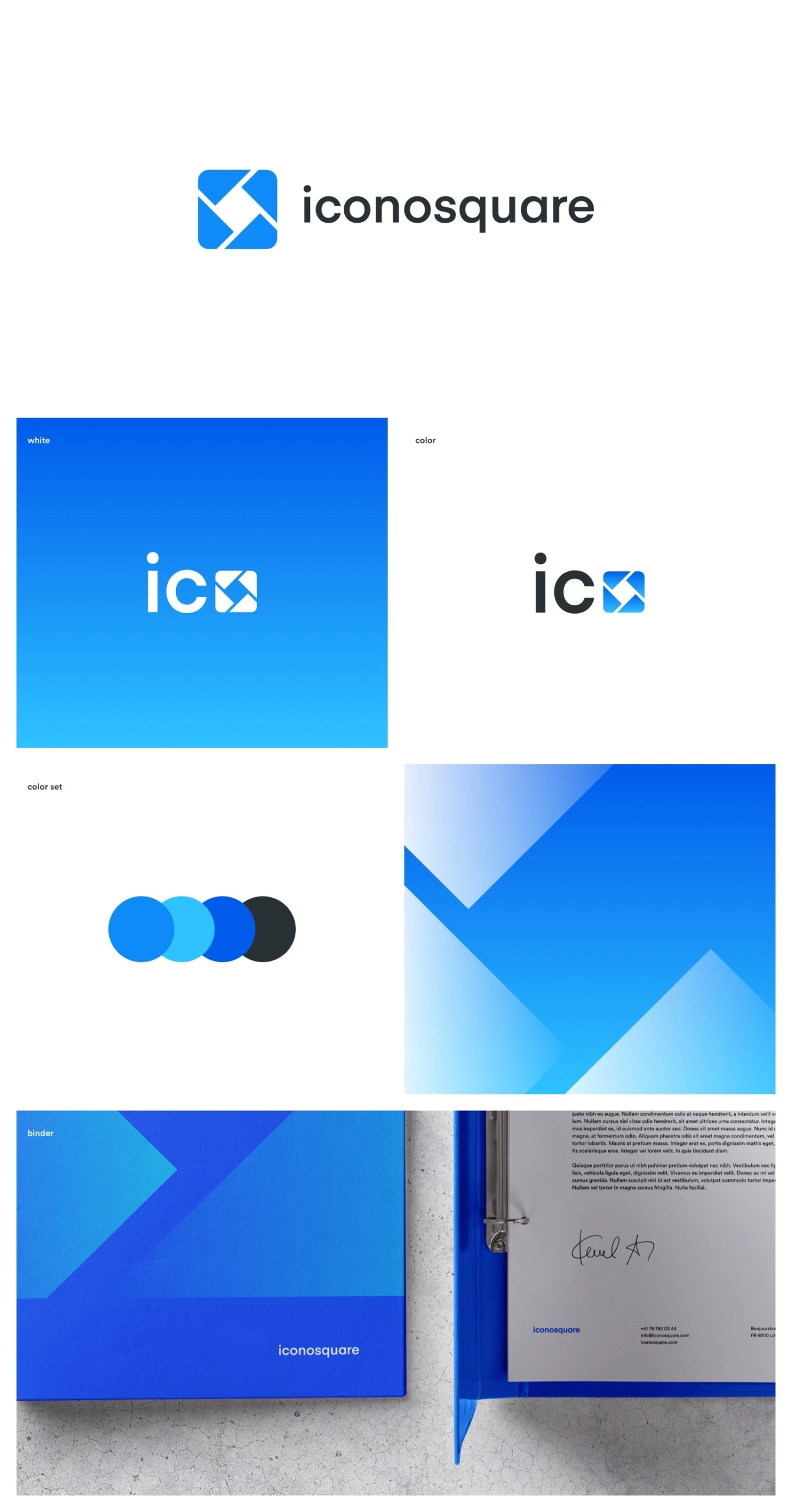
We updated their mark and lettering, as well as the sizing between those elements. Furthermore, their updated color palette gave them the more vibrant look of a progressive, forward-thinking company.
In the process, we explored how different colors could be included in branding to depict a level of modularity and uniqueness.
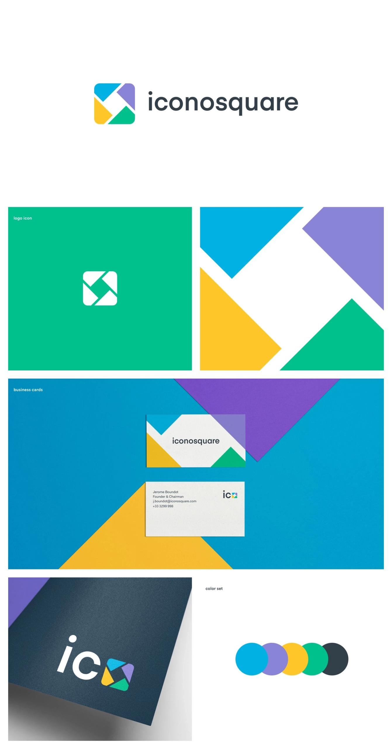
Even though the explored branding with a multi-color approach was the direction we pushed for, the safer way was eventually chosen.
Charlie Isslander and his team Soulmates did a great exploration into the multi-color approach to the overall brand and elements. However, the client wanted a more uniformed approach for the re-brand. Something that wouldn’t stray too much from the familiar path.
We landed on a unicolor approach using the soft blue as the primary.
In the meticulously precise world of dashboard design, where visual balance and readability are the pillars that hold the whole user experience in place, our challenge was to find typography that worked hard.
We needed a font family that was unique, yet familiar; funky but not distracting; crafted, yet accessible.
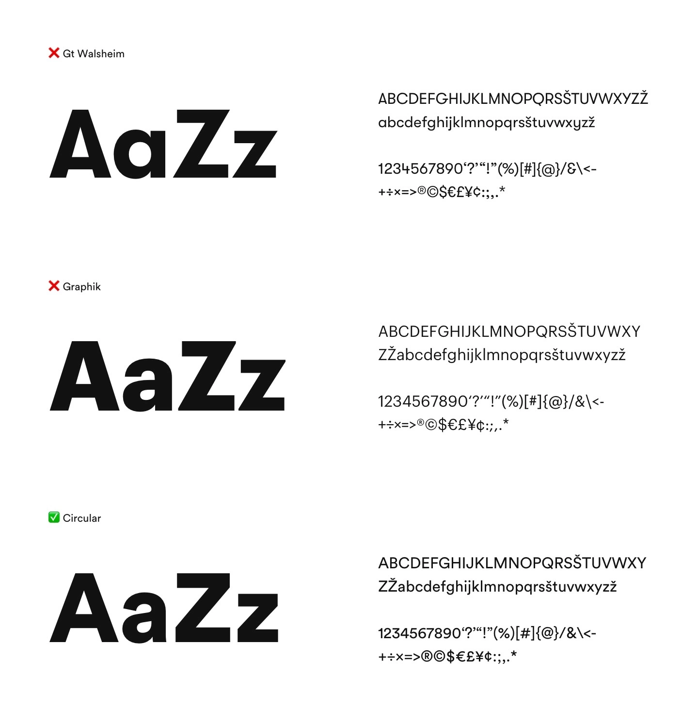
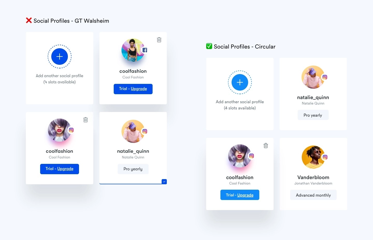
Our aim was to go for GT Walsheim due to its unique rounded precision and interesting readability within an interface environment but ended up using Circular due to its familiarity and ease of use.
Through my years as a product designer, I found that both GT Walsheim and Circular are very interesting font families. Within a dashboard environment where data is king, their wavy shapes allow you to use typography as a design element which in turn allows you to draw attention to main data points and keep your designs clean.
I know that Circular has been basically overused, but the team at Lineto really did a great job creating it. As a font family, it sits so well in multiple environments both within an app and website.
We wanted to create a breathable, expandable design system that could be used across all devices by more than 800.000 users.
The design language needed to be expressive whilst also in line with standard practices for usability and accessibility.
The team from Iconosquare helped us with meticulously testing their then live web app by gathering user feedback and laying out proposed feature upgrades that navigated our exploration.
On some occasions, we went too artistic with design solutions, element placement, and functions, as designers tend to do, but Iconosquare helped trim down the excess exploring and pinpointed the right direction for their product and users.
As said before, sometimes you can’t just bring the whole house down, and start from scratch. You have to align with your client to make the best possible solution within certain parameters.
Below you can see some of the early color and style explorations and finished designs.
Initial ideas and features needed to be revised in terms of function and overall worth (is it worth development hours? will it benefit users?).
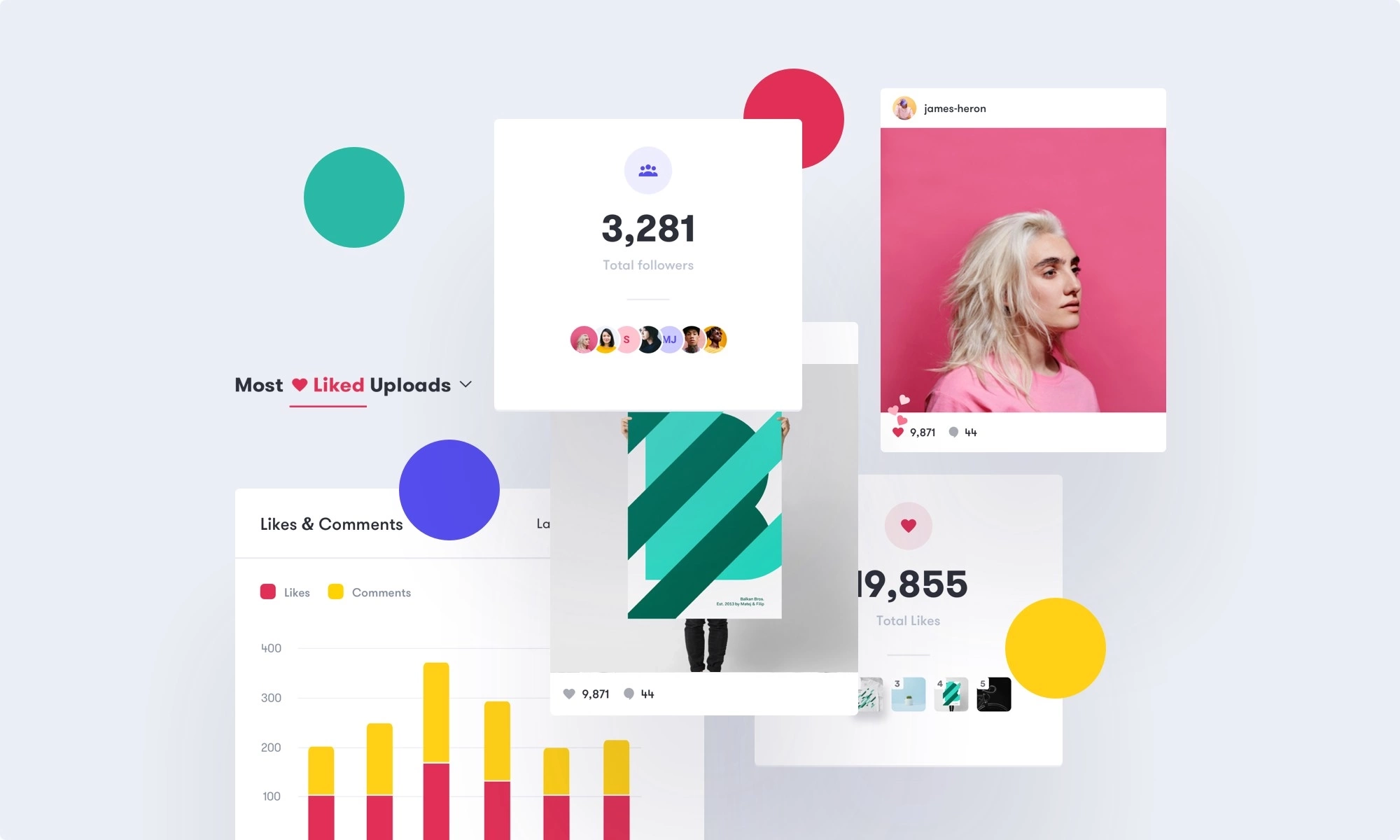
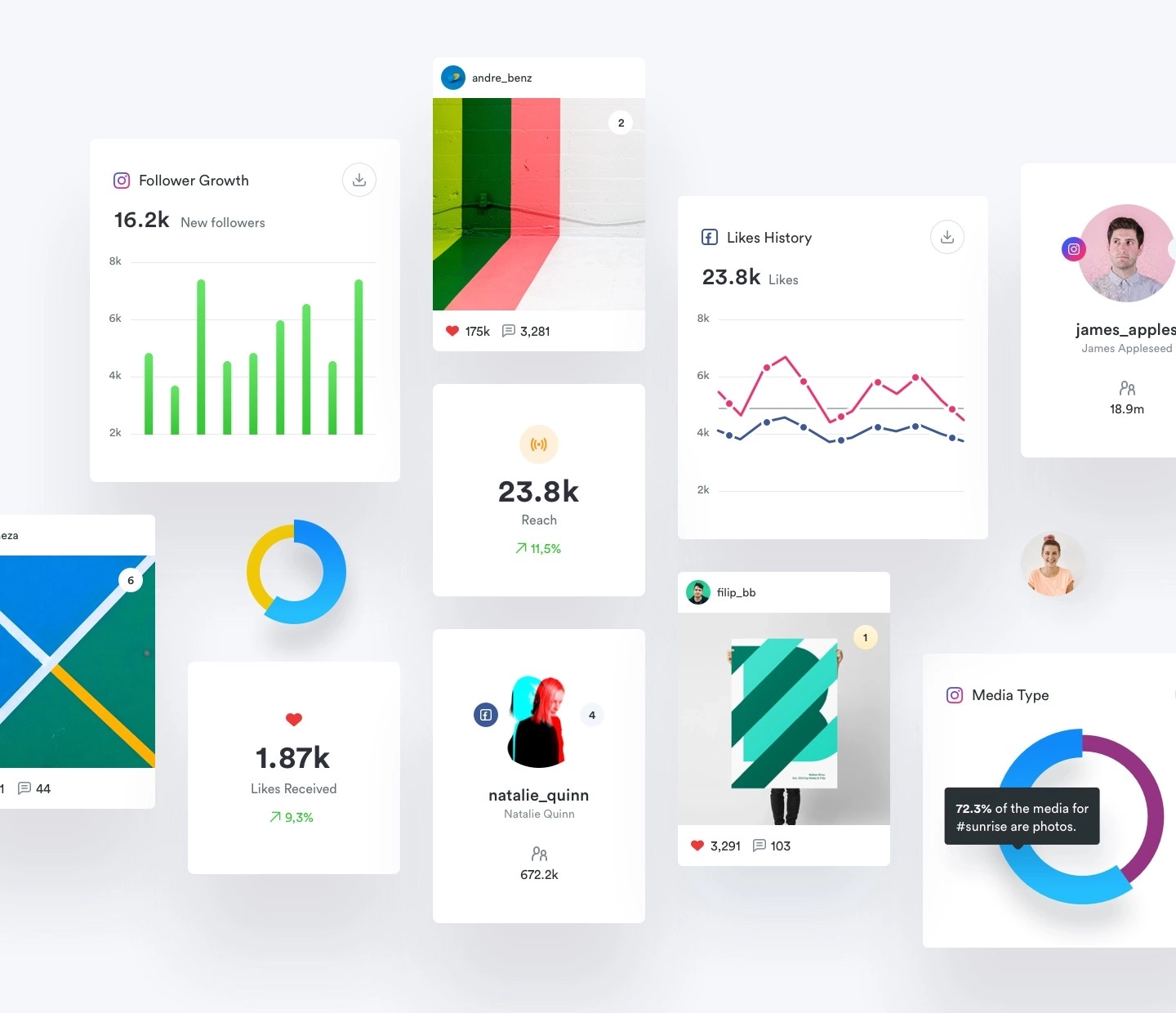
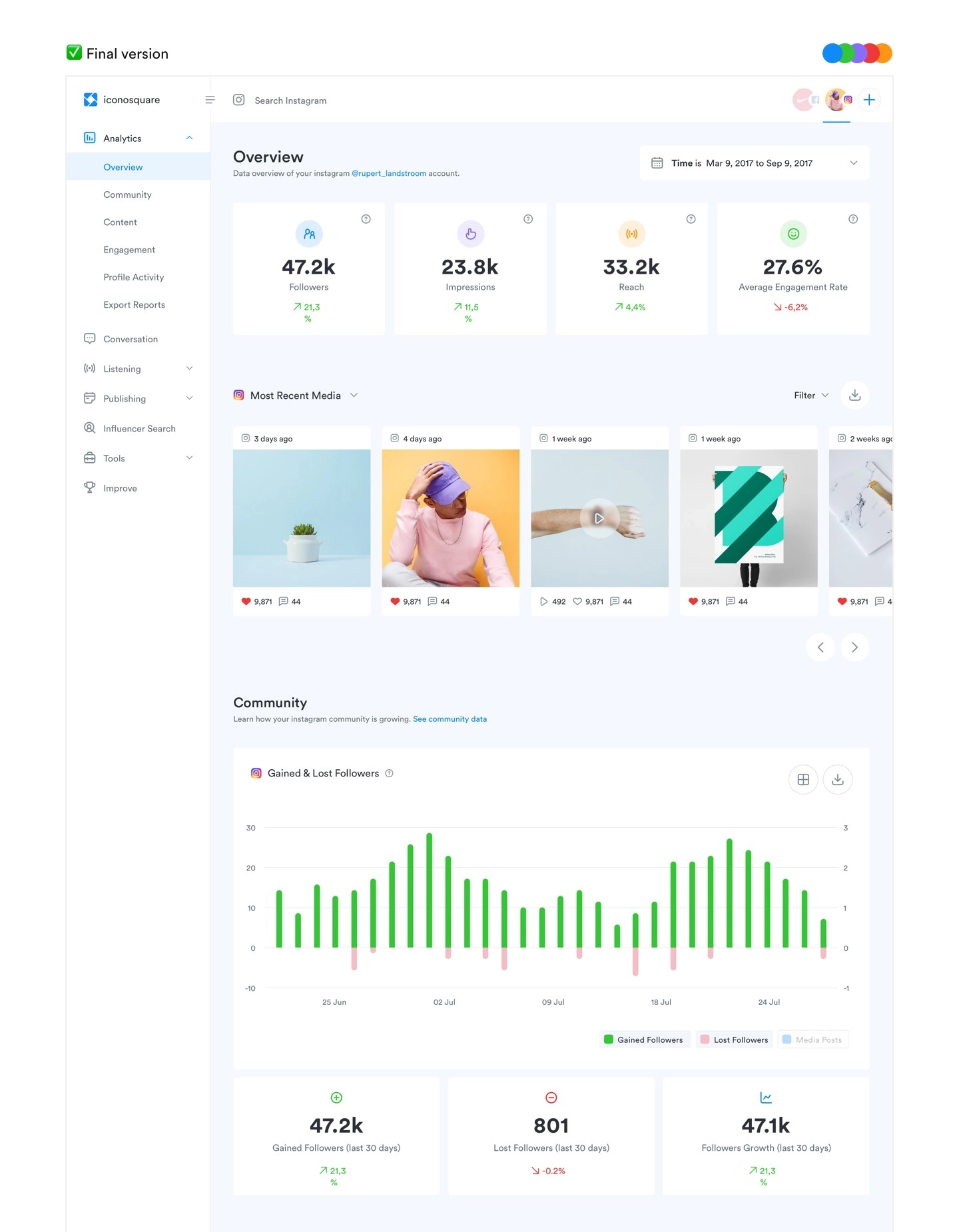
As visible, we designed a module-based design system that is easier to integrate and maintain. By combining modules and column based layout it’s easier to switch information and data.
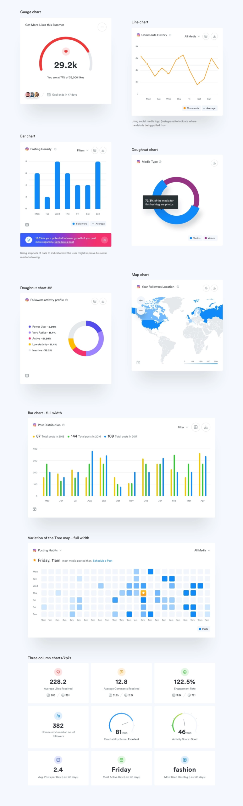
The plan was to use HighCharts for all analytics based information, so charts and data needed to be simple in terms of presentation and functionality.
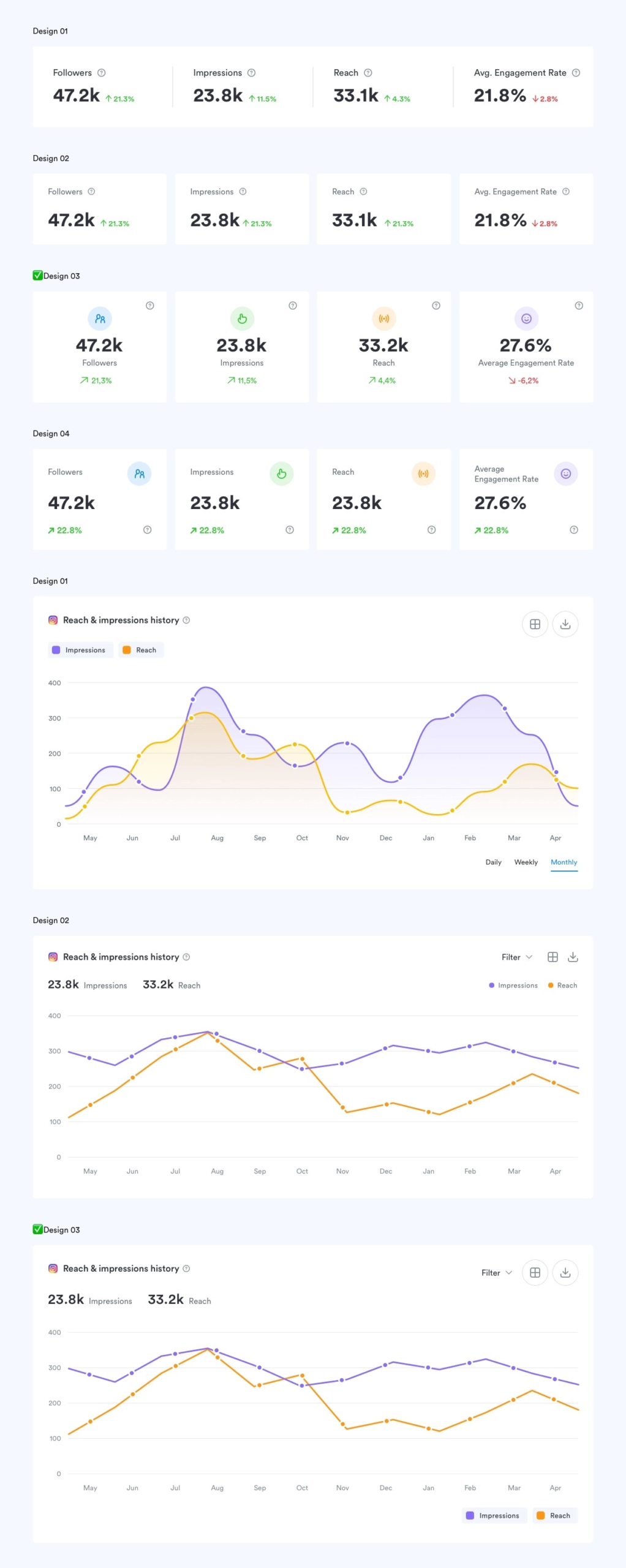
Our standard process doesn’t usually accommodate multiple color schemes this late in the project. Usually, we do a couple of explorations and decide on the final color scheme early on in the project.
With Iconosquare we wanted to make sure that the colors we are proposing will improve user experience and elevate the brand. That’s why we carried 2,3 color schemes mid-way through the project to really determine and test out how a repeat user feels within the web app.
Our goal was to define the best possible solution to display charts and data. We tested out kpi’s, charts, graphs and best ways for users to navigate through the multitude of analytical data.
As mentioned prior, integrating HighCharts required us to keep things simple in terms of design and functionality.
KPI’s design was created to be unique and readable. Using custom iconography and colors to indicate which particular insight category (engagement, followers, reach, likes, comments) data represents.
While the charts were designed to easily depict data and clickable functions (put on the right side only). Clickable buttons on the top, and switches (turn on/off) for data points on the bottom (impressions, reach).
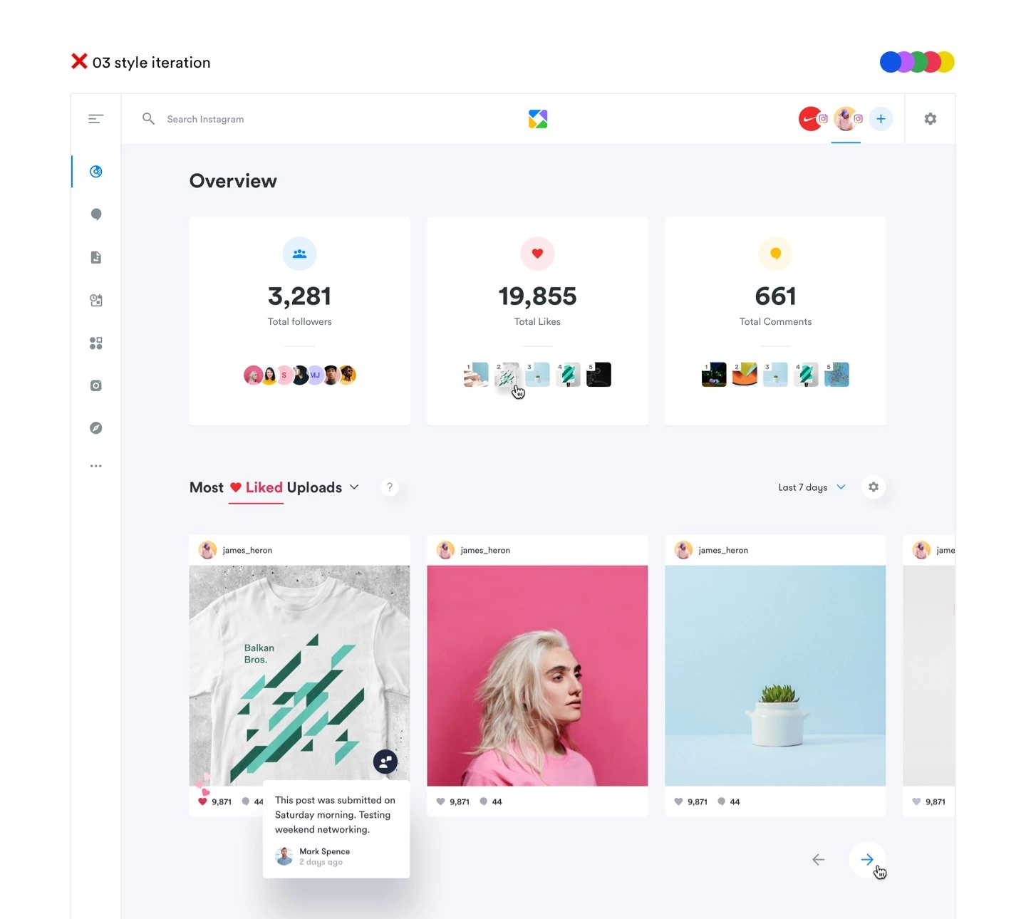
The structure is very modular using the one, two, three or even four columns to display data and charts. We approached designing it as a template for Iconosquare team. This way it is easy to maintain and upgrade.
In establishing a completely new visual language for Iconosquare and improving their UI, we were able to deliver a new app that looks modern, is easier and more simple to use.
Most importantly, this project brought focus to the importance of design and development teams working successfully together. Through collaboration and communication, we were able to take the big leap from exploring colors to delivering functional designs.
We were tasked to deliver design files only, including responsive designs for main web app screens, thus ensuring that their in-house development team had the knowledge on how to tackle coding the app on various screens.
The whole project took around 6 months of designing and included:
Thanks to the whole Iconosquare team, Rachel Hamlin and Romain Ouzeau in particular, for making this happen. Hopefully, all the changes were implemented with no fuss. You can check it all out at iconosquare.com
Big thanks to Camilla Petty for helping us write this down. All the good parts from this article are her doing.
If you are interested in a visually more compelling showcase of this particular case study, you can view it on Behance.