Mapping Out the UX Research
Hey, I’m Elena, a proud member of the BB UX team. Having joined the BB a year ago as a UX Researcher, I take part in improving UX processes, both on project and agency levels.

Before We Start
Before delving into the discussion, I will let Captain Obvious speak: each project is unique, and there is no one-size-fits-all solution. If you were to ask a UX researcher or designer: “What are the mandatory UX research methods you should use?” In most cases, the answer would be: “It depends.” But still, we use some methods more frequently than others, so we can say those methods showcase our standard UX research process.
We work on two project types: marketing websites and digital product design. In the case of marketing websites, the UX research process is more standardized. For digital products, the process is more tailored to specific business requests. In particular, it depends on product complexity and maturity level, project timeline, and the scope of features we build or rebuild.
How we decide what kind of research is needed
First, we review the brief shared by the client at the beginning of each project. It is called the project questionnaire. Based on this information, we do preliminary desk research on the client’s request, the market, major competitors, industry trends, and other factors that may influence our project. Then, we prepare the agenda and the questions discussed on the first call with the client. In some cases, we go deeper into this initial discovery process and initiate a workshop with the client when we gather different opinions from the stakeholders, developers, product managers, and other teams on the client side. Usually, we do it when we want to understand better the motivation, vision, and potential constraints from the business and tech team’s perspective.
Once we have all the necessary information, we brainstorm the goals and plans of the research. We consider the problem from various angles, such as business goals, industry trends, competitors’ solutions, users’ pains, usability, accessibility, scalability potential, and the development effort. This process helps us define what can help us better inform our future design decisions.
At this stage, we usually list out our research methods and future deliverables.
5 most frequently used UX research methods at BB
1. Market Analysis and Competitors Benchmark
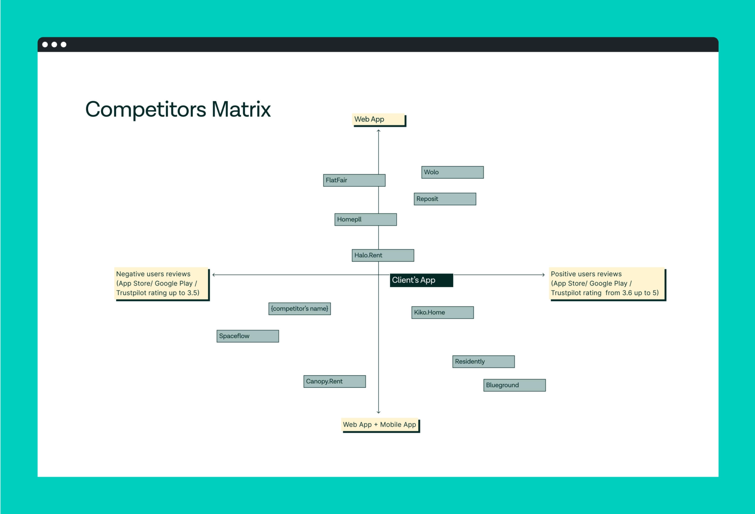
This method should be considered a must because no website or digital product exists in a vacuum environment. We should know what the competitors do to be able to stand out, and this method helps us look at the design goals and problems from the perspective of the market.
Usually, we would look for slightly different things while doing competitors’ benchmarks for a marketing website or a product. Working on a website, we would look at such points as
- marketing strategy
- evaluation speech
- how the website communicates the list of products/ solutions
- website’s target audience
- tone of voice
- content structure
- visual language
For the product, we usually analyze functionalities, architecture, and flows along with a visual language. We look at the list of features and how they work, competitors’ product reviews and ratings, and significant patterns. Market analysis and the benchmark give us insights into established patterns & practices that exist within the industry, both from design and marketing perspectives, which potentially can inform our design process.
2. Analysis Audit
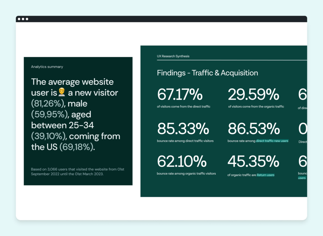
This research method allows us to make a snapshot of where the website or product is at the moment we start. Whether it’s Google Analytics, Hotjar, or any other kind of data the client can provide, we would look at initial metrics to see what we can improve.
When working on a marketing website, we usually search for
- demographic information to support the personas
- user segments and user flows
- traffic sources
- new and returning users’ stats
- bunch of metrics related to the business goals, such as bounce rate, goals conversion rate, average time per page, and many more.
This is how we gather high-level insights. However, the analytics audit can offer many more hidden gems. To uncover them, we compose more complex reports by comparing data from different sources and trying to visualize more specific research requests – For instance, how social media traffic converts to website leads. To do this, we would need to see how many new users from a given social media campaign land on the requested website page and what happens after that: how many of them drop off, what their journey looks like after landing on the landing page, how many of them reach the contact form, and so on.
The tricky thing about analytics analysis is to raise the right question, the answers are most probably there.
3. Interviews
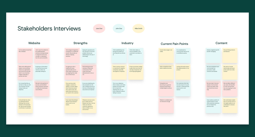
We do a lot of interviews. We speak to the stakeholders, the product users, company’s customers. The goal is to understand the vision, needs, pain points, and motivation better. I would say that the insights we get from the interviews, in many cases, are the most precious ones. Usually, the stakeholder interviews are done with the branding and UI design team, allowing us to cover both usability and visual style-related questions.
4. Personas
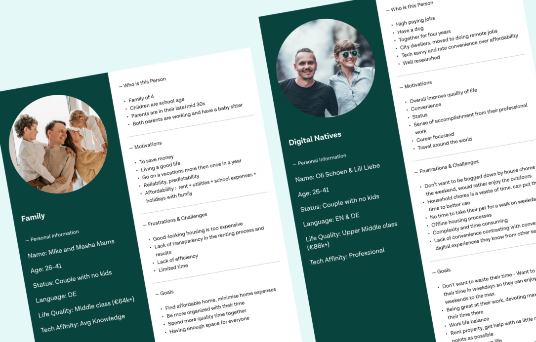
We design for humans. That’s why we need to know them before we make any design decisions. Sometimes we build personas by ourselves using analytics and holding user interviews; Sometimes, our clients share them with us, and we validate them in a way, but the ultimate goal always is to know the people we design for and learn as much as possible about their needs and pains.
Sometimes this process even can be emotional. Recently, I was investigating the digital experience of elderly users and came across a YouTube video about an age sensitivity course. In this video, young nurses had to experience age-related low vision by wearing cardboard glasses. Then, they tasked the nurses to send a message using their smartphones. I did the same experiment to feel how difficult and annoying it might be to perform even a simple action on the smartphone if you are a senior user. It helped me design digital experiences adapted for easy adoption by seniors.
5. UX Review
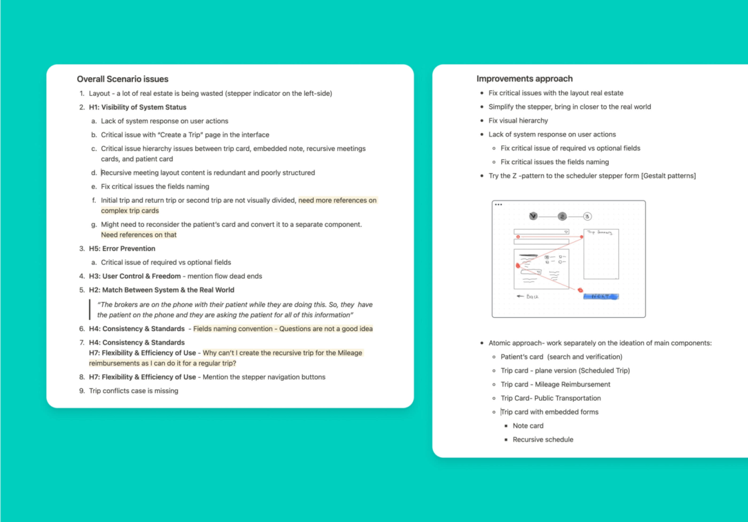
Usability Heuristics is probably the most well-known method of the UX review. Apart from them, as a part of the UX review, we apply different UX laws to an interface or a website, trying to define major usability and accessibility issues such as
- visual hierarchy
- content readability
- colors contrast level
- how good the layouts service the usability purpose
- how clear are the user flows are
- dead ends or logic jumps in user scenarios that impact the experience
- elaboration of edge case error prevention mechanics and other potential issues
In general, the UX review is a good starting point for mapping out the assumptions on what can be improved and a good reference for comparing “before” and “after” in the redesign process.
In some cases, we include less popular methods in our research plan. For example, when conducting research for Immo app research, we had to differentiate user behavior among individuals who belonged to the same personas. To achieve this, we created User archetypes.
In other cases, when dealing with complex product interfaces, we conduct a CRUD review to ensure that the users can access the full range of functions while performing their tasks.
Wrapping Up
UX research is a very creative and flexible process, so sometimes it’s hard to plan it from scratch. If I could offer one tip on how to conduct research that is guaranteed to bring you meaningful insights, I would say to keep in mind the goal to investigate the problem from all potential perspectives you can: business, users, development, security, and any other which is relevant to a project you work on. Each perspective would uncover the methods that suit better to a particular case.
