eOne

From fragmentation to fusion: Breaking down the complexities of data management

How did we help:
UX Research Brand Strategy Visual Identity Website Design UI Design Animations Website Development CMS Integration

Technology, Data Management

Fargo, US

2001

Medium (50-249 employees)

Global

Enterprise


Today’s businesses rely on countless productivity apps, but making the most of the endless data these apps produce can get tricky because they’re often hidden and difficult to decipher. eOne Solutions steps in to demystify data management, ensuring seamless integration across platforms.

Just as eOne simplifies how apps talk to each other (and to people!), we needed to figure out how to present the complexities of their product stack so that it’s easily digestible, relatable, and appealing to the audience. Let’s dive in!

Crafting cohesion: Pioneering simplicity in a data-driven world

eOne Solutions, recognized for their robust, user-friendly data integration tools such as Popdock and SmartConnect, found that the strength of each product’s individual presence on separate websites led to the overarching brand narrative taking a backseat.

Our task was to sort through this and create a clear, single story that brings all of eOne under one strong brand, housed on a single platform. So we started with an immersive exploration of eOne’s ecosystem to inform our strategic approach.
Laying out the groundwork: Mapping the brand DNA

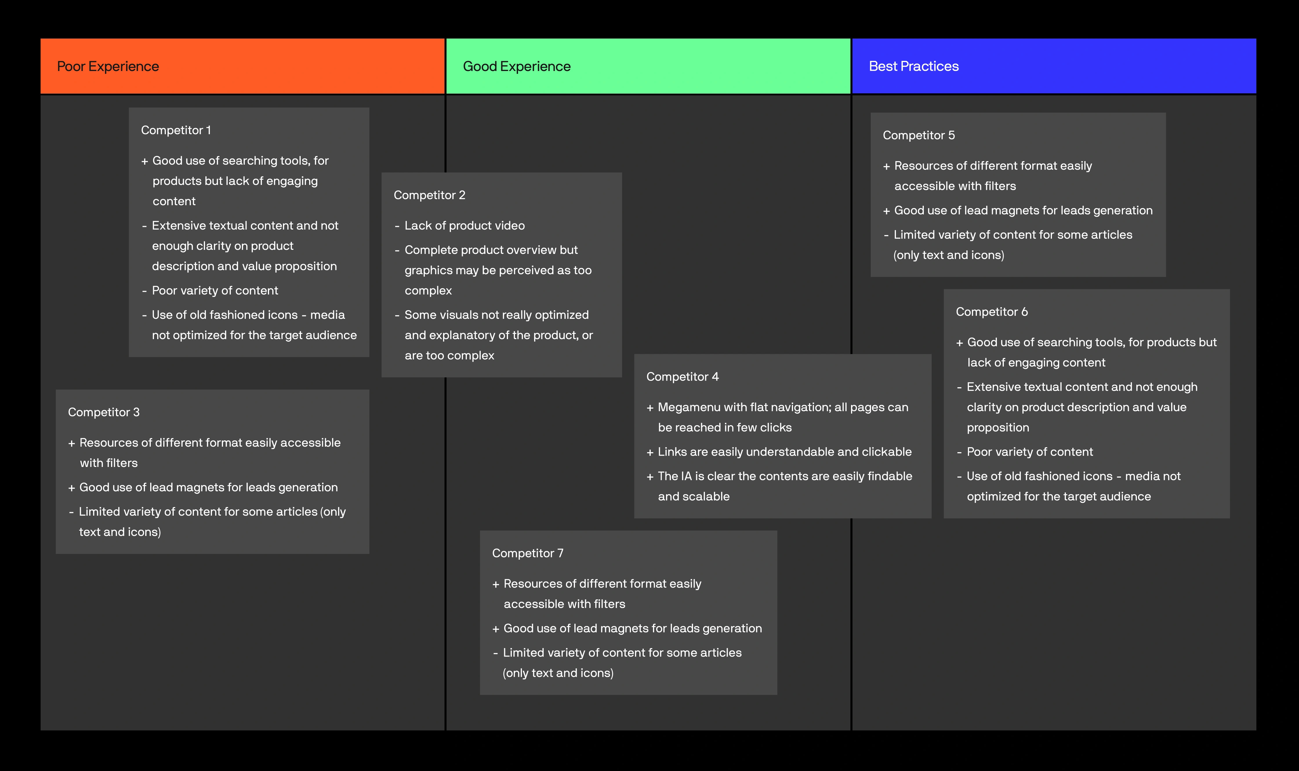
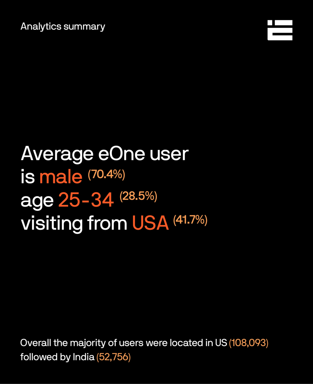
We kicked off with comprehensive UX research, spanning from key stakeholder and user/partner interviews to market and competitive analysis, and concluded with a thorough visual benchmark and data analysis. In synthesizing these insights, we got a nuanced understanding of eOne.

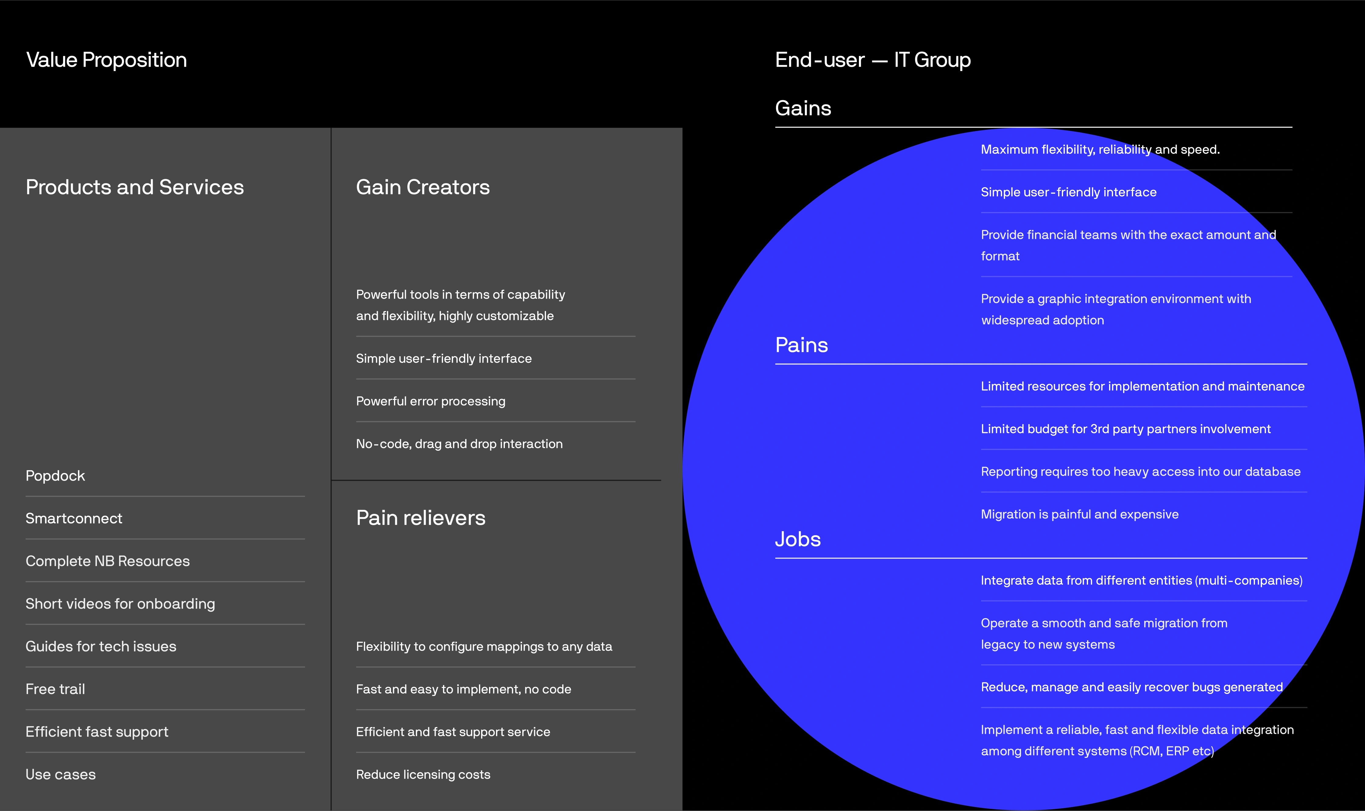
Committed to our user-centered design philosophy, we utilized this research to establish user personas and create a value proposition canvas. These steps informed the development of a polished visual and verbal identity, and a messaging strategy, resulting in a website redesign that addresses the specific needs and challenges of our primary users, all while aligning with eOne’s business objectives.

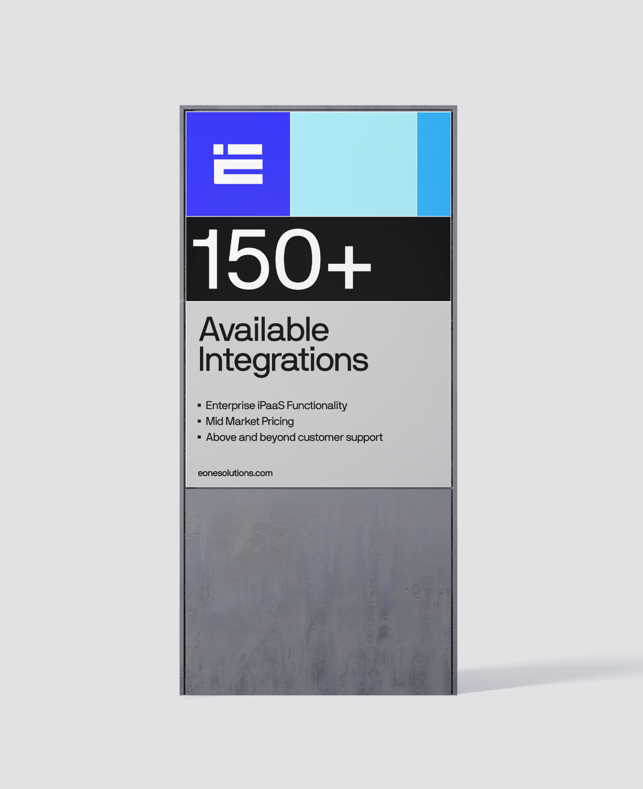
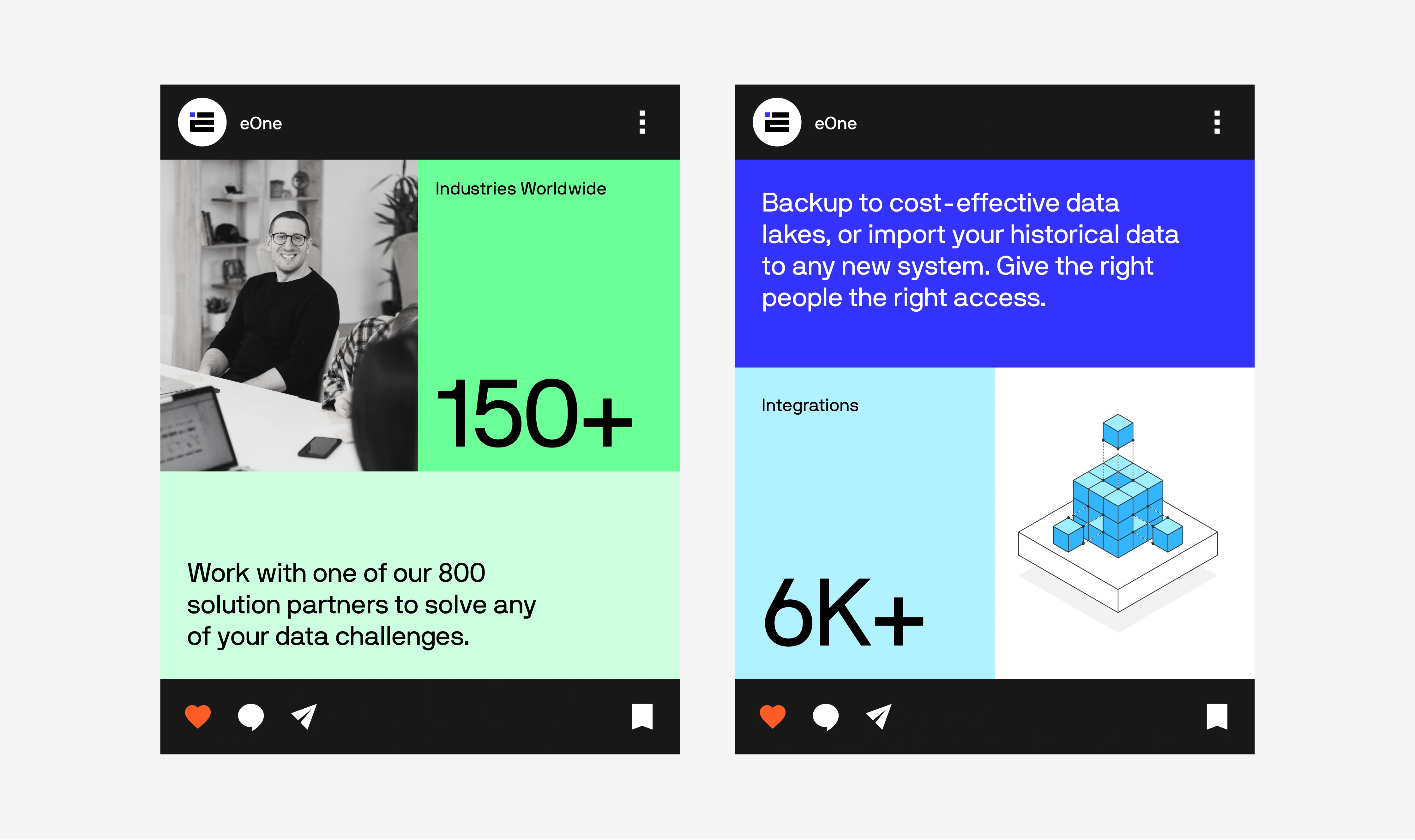
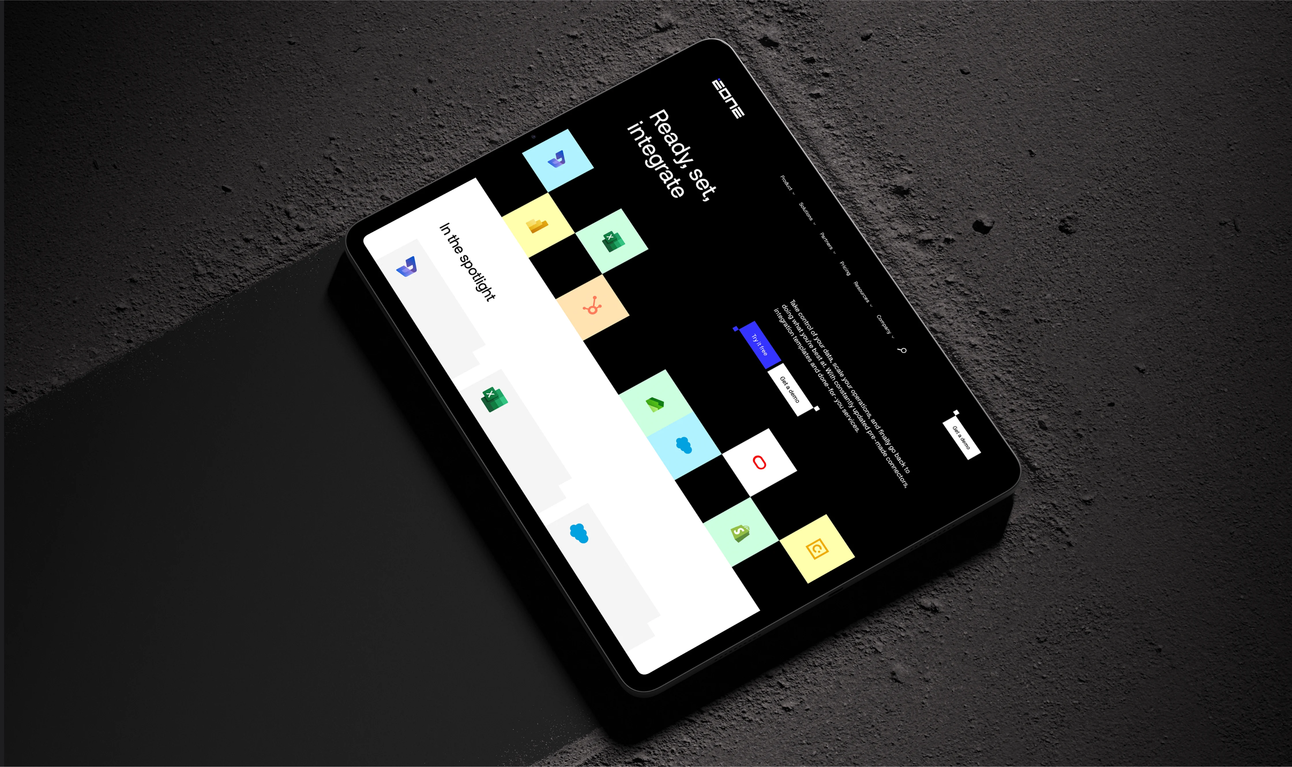
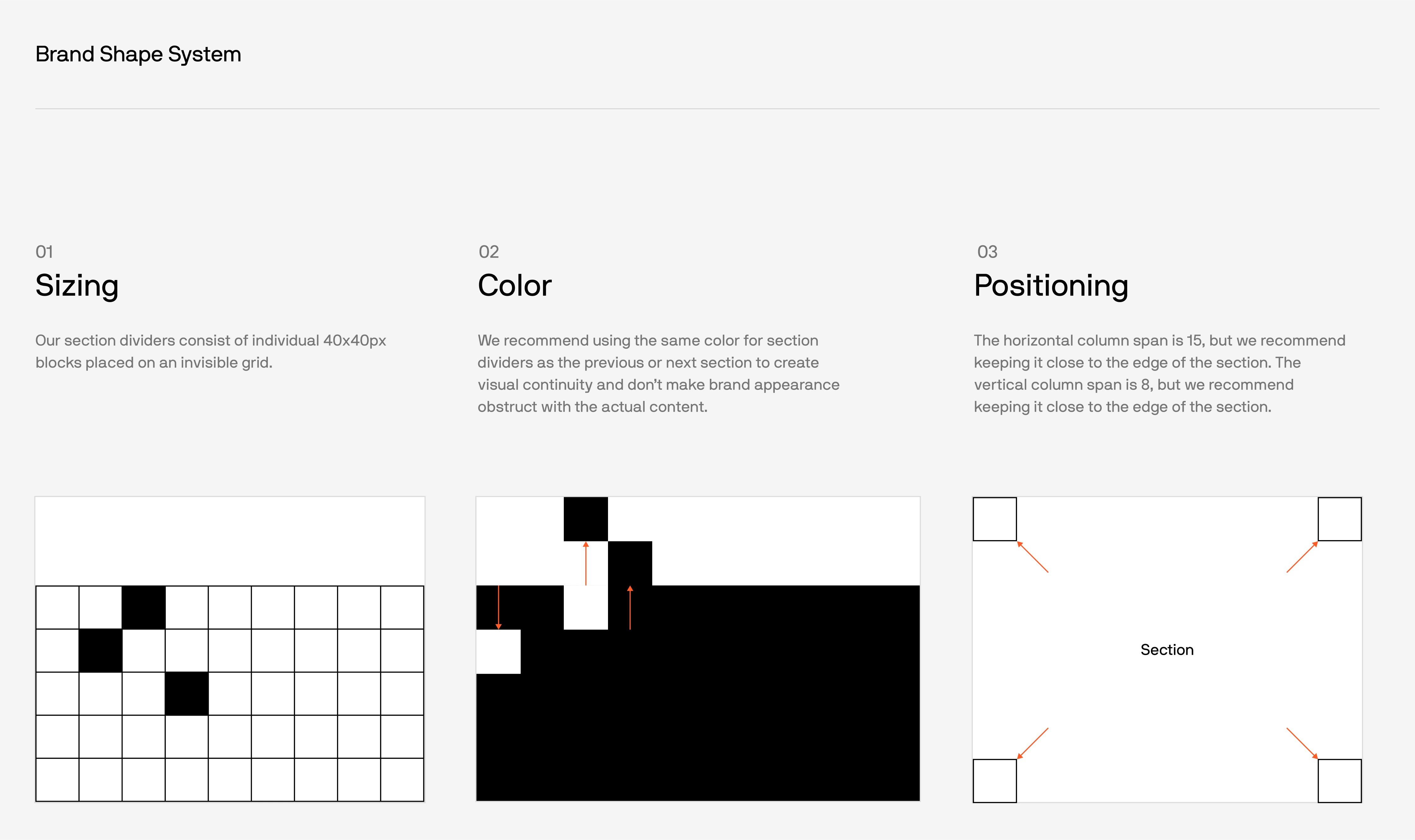
Uniting eOne’s varied brands under one identity posed a creative challenge: we needed to honor the brand recognition built over the years while encapsulating their expertise in a clear and engaging way. Our solution was a balanced visual identity that speaks in vibrant, modular designs, offering both sophistication and simplicity to echo eOne’s user-friendly yet complex solutions.

We preserved familiar elements of eOne’s legacy identity, infusing them into a new visual language of color and form. This resulted in a design that reflects eOne’s system interconnectedness and their commitment to technical excellence and human-centric values.

The new eOne landscape: Navigating solutions with ease

Revamping eOne’s UX meant rethinking navigation from the ground up—we didn’t just draw up a sitemap; we dove in, imagining every click and scroll of eOne’s diverse customers. We set our minds to connect the dots between eOne’s vast products in a way that felt like second nature, guiding users smoothly from A to B, whether they needed a quick summary or a deep dive into the technical nitty-gritty.

We didn’t stop at blueprints. Real-world feedback through tree testing was our compass, steering the user experience to that sweet spot where intuition meets information. It was all about making sure that users found what they needed without a hitch.

From wireframes to real frames: Bringing the narrative to life

Wireframes became our visual language, communicating eOne’s complex offerings in a digestible format. They served as the skeletal framework for UI designers and developers to build upon, ensuring the final design stayed true to our user-centered objectives. These wireframes were the catalyst for our design process, setting the stage for the vibrant, user-friendly interfaces to come.

A cohesive interface: Harmonizing the brand through UI

Our UI mission was to weave eOne’s brand image across all customer touchpoints, starting with collaborative strategy sessions involving UI, UX, and branding teams. Initial efforts focused on crafting mockups to inform the website’s design direction.

As design ideas matured, UI became pivotal, shaping a user interface that aligned with client expectations and functional needs. Regular team syncs fine-tuned a UI that felt intuitive to users, encapsulating eOne’s identity in every interaction.

Bringing clarity to complexity using Product Visuals

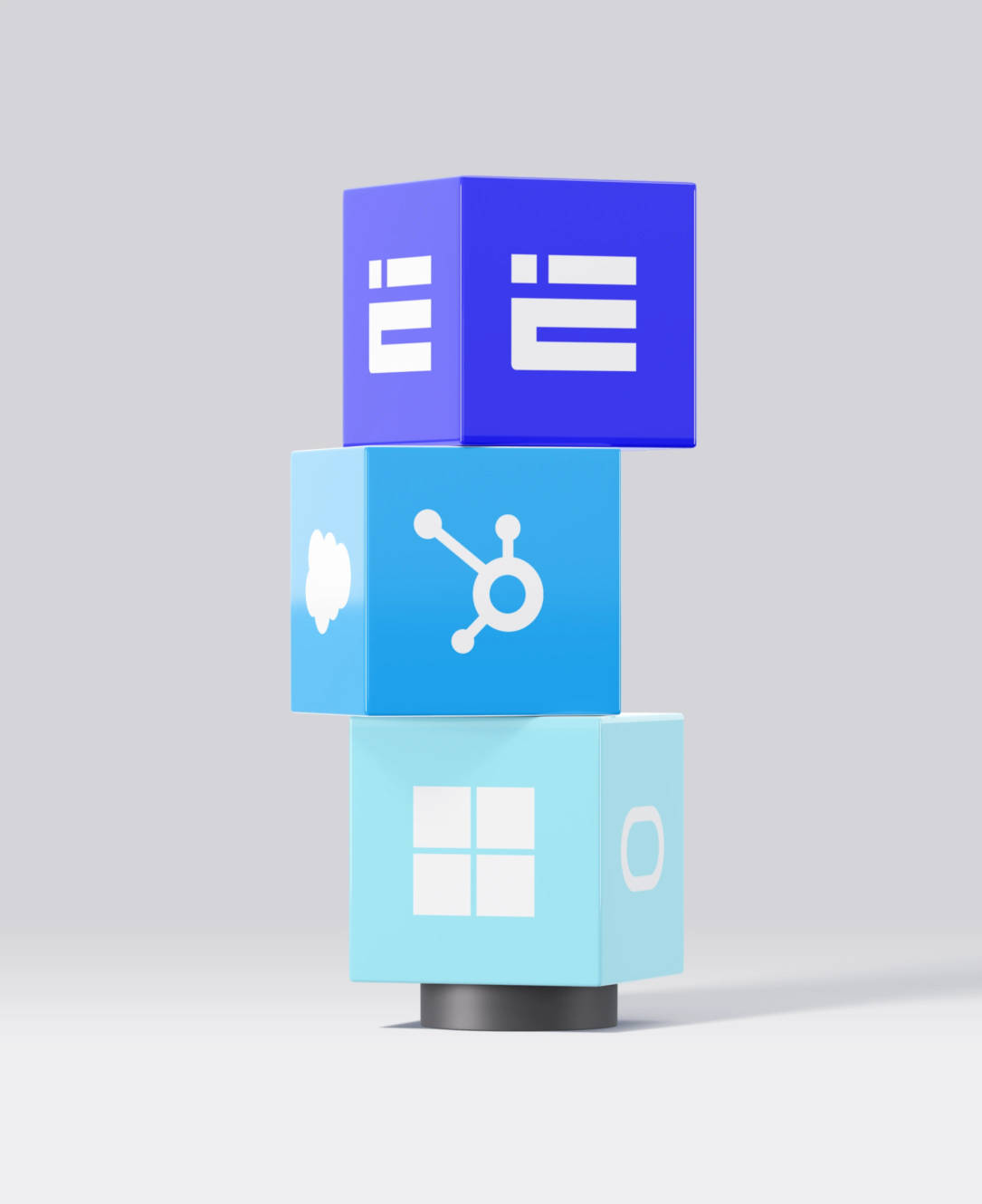
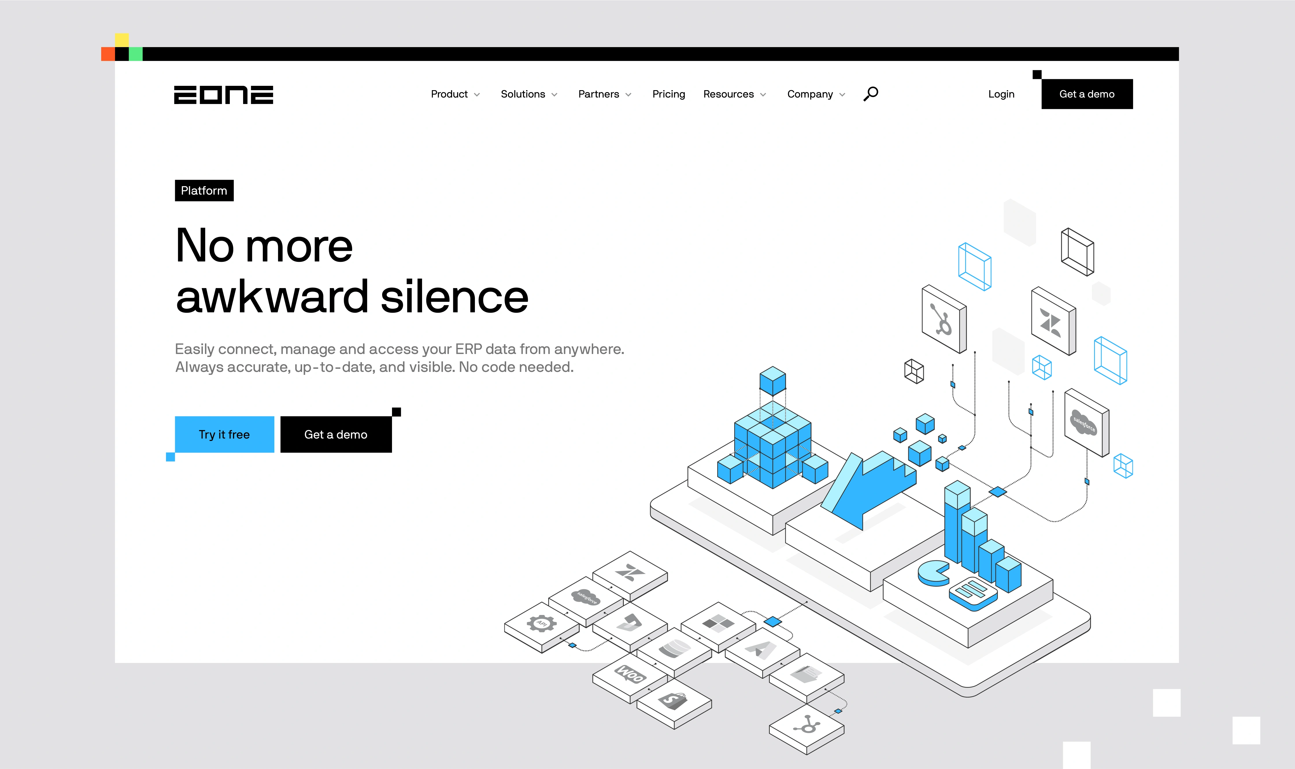
Visuals were not just an afterthought in our redesign of the eOne website; they were integral to the user experience. Our goal was to demystify complex technical concepts and make them easily digestible for eOne’s customers. To achieve this, we developed a comprehensive library of product visuals, meticulously crafted to convey the essence of each eOne product in a visually engaging manner. This systematic approach not only added aesthetic appeal to the website but also served as a vital tool in helping users grasp the technical aspects of eOne’s offerings.

Structured flexibility: Building an intuitive digital space

For eOne’s website development, we chose WordPress and Gutenberg, creating a scalable site that’s easy to manage. Custom Gutenberg blocks streamlined page creation, while unique backend features give the client control over their branding elements.

The site features a range of pre-set components and graphic elements aligned with eOne’s brand guidelines, ensuring brand consistency is maintained effortlessly within the CMS. This setup provides a balance of creative freedom and brand fidelity, within a secure, swift, and responsive framework.

Explore our deep dive into creating an intuitive navigation solution with our detailed blog post on Creating WordPress Mega Menus using the Gutenberg Editor, one of the key features in the eOne project.

Results

300+

Unique assets, product visuals, pages and templates

8

months

Project duration

For those who wish to know more

Explore our deep dive into creating an intuitive navigation solution with our detailed blog post on Creating WordPress Mega Menus using the Gutenberg Editor, one of the key features in the eOne project.

Giannis Koulouris
Creating WordPress Mega Menus using the Gutenberg Editor
Tech

Smart simplicity: The essence of eOne’s new identity

The revamp of eOne’s digital space is a game-changer. It’s the result of deep research, strategic design, and a whole lot of creativity. We didn’t just give their brand a new coat of paint; we got to the heart of what they do—simplifying complex data management. Now, eOne stands out with a clear, cohesive identity that’s all about smart simplicity. This isn’t just a new look; it’s eOne hitting its stride with a brand story that really resonates.

How did we help?

Branding

  • Brand Research
  • Visual Identity
  • Brand Guidelines
  • Brand Applications
  • Illustration
  • Animation

Communication Strategy

  • Market Research
  • Direction of Travel
  • TOC
  • Copy Bank

UX Research

  • Research Synthesis
  • Visual Benchmark
  • Sitemap
  • Wireframes

Interface Design

  • Style Exploration
  • UI Design
  • Design System
  • Product Visuals

Development

  • Website development
  • WordPress implementation
  • Quality assurance

Share this Case Study:

LinkedIn Twitter Facebook

Narrating stories that resonate, building experiences that people cherish, and achieving outcomes that matter demand true partnership. That’s why we’re here for the long haul, walking beside you every step of the way.