The client
Haystack is a collaboration platform that keeps organizations connected by providing a centralized hub for knowledge, communication, and people. Through Haystack, organizations can streamline internal communication, accelerate productivity, improve alignment, and empower their workforce.
Haystack partners with modern brands, looking for a way to connect with their employees. Brands that are put together but still appreciate delightful, playful moments. With that in mind, Haystack’s vision is to create beautifully designed software that scales company culture and increases employee retention.
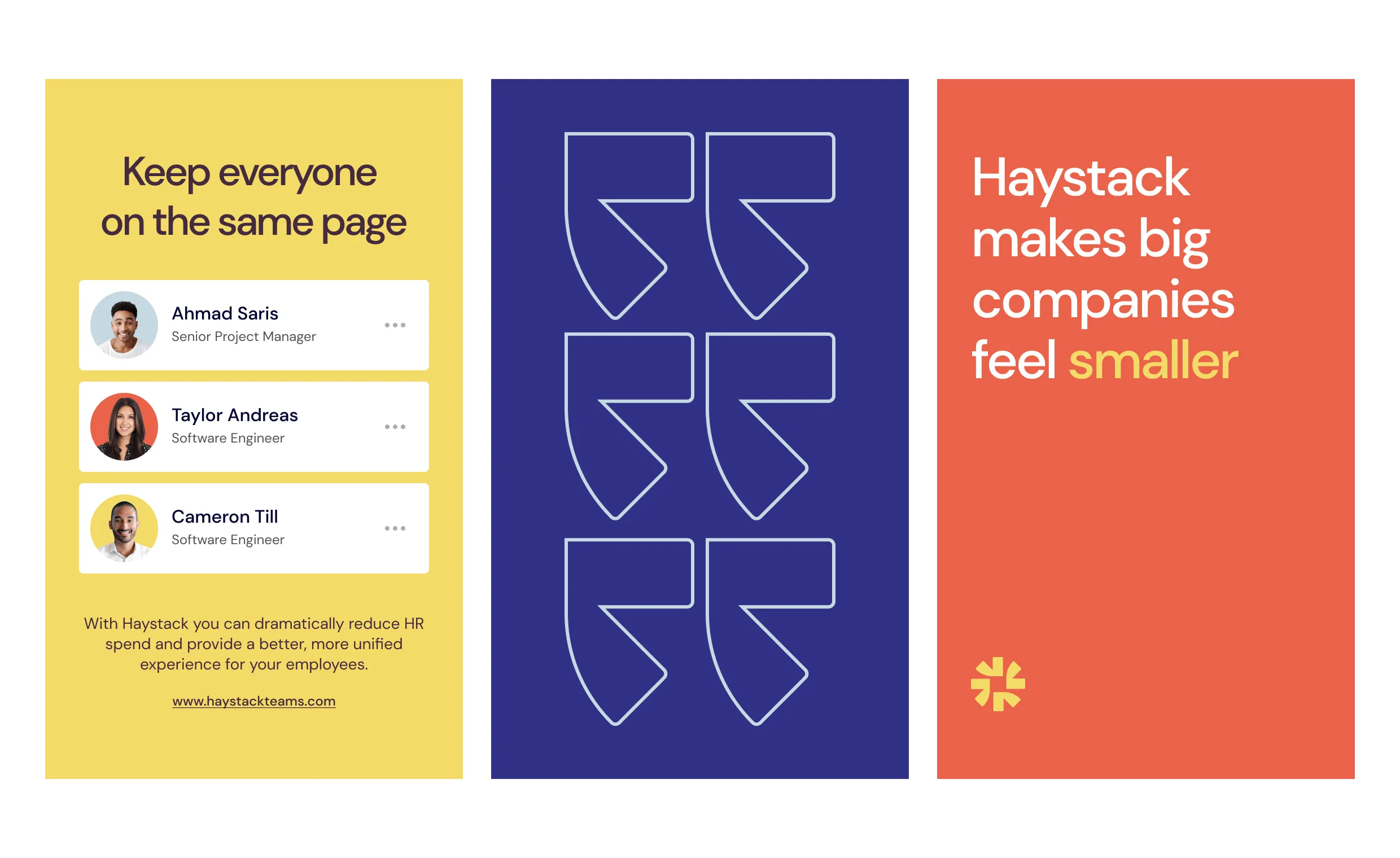
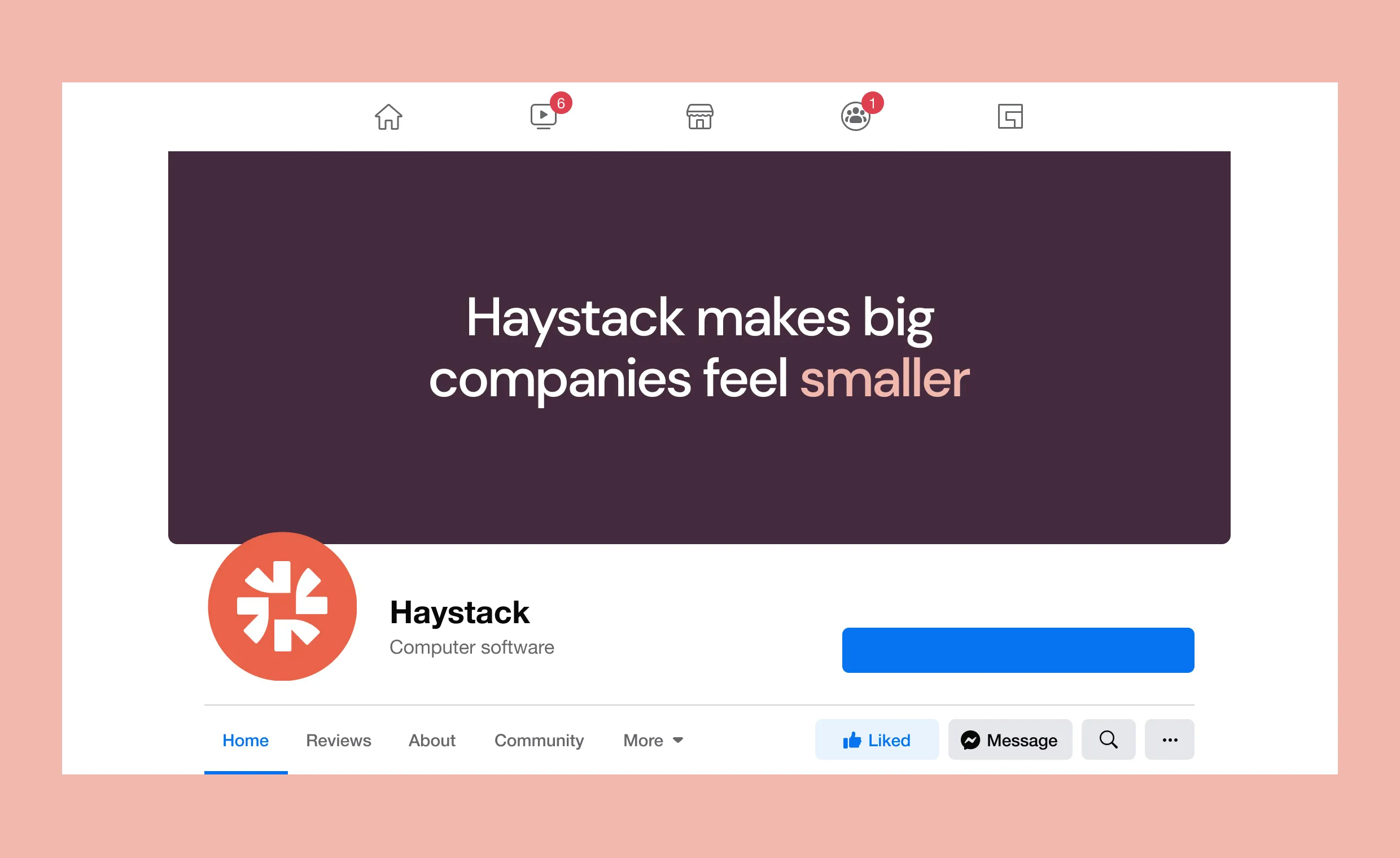
Founded in Los Angeles, Haystack is a team of curious and creative explorers on a mission to make big companies feel smaller.
The challenge
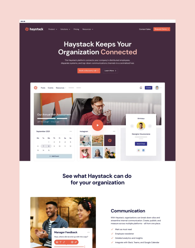
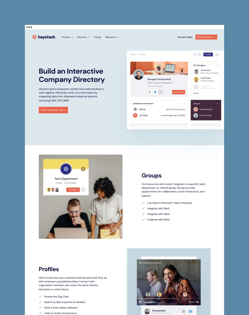
Haystack needed a consistent brand, design language, and a CMS-backed website to scale them into Series A and beyond. Their website lacked depth and striking visuals, so they wanted to amplify their brand visibility and showcase their product in an easily digestible way.
Working with companies with a strong design culture is always challenging, and the Haystack team set the bar pretty high with their work on the product. However, with so many shared values and a similar mission focused on bringing people together, it was an easy decision for BB Agency to jump on this opportunity; and help out.
The solution
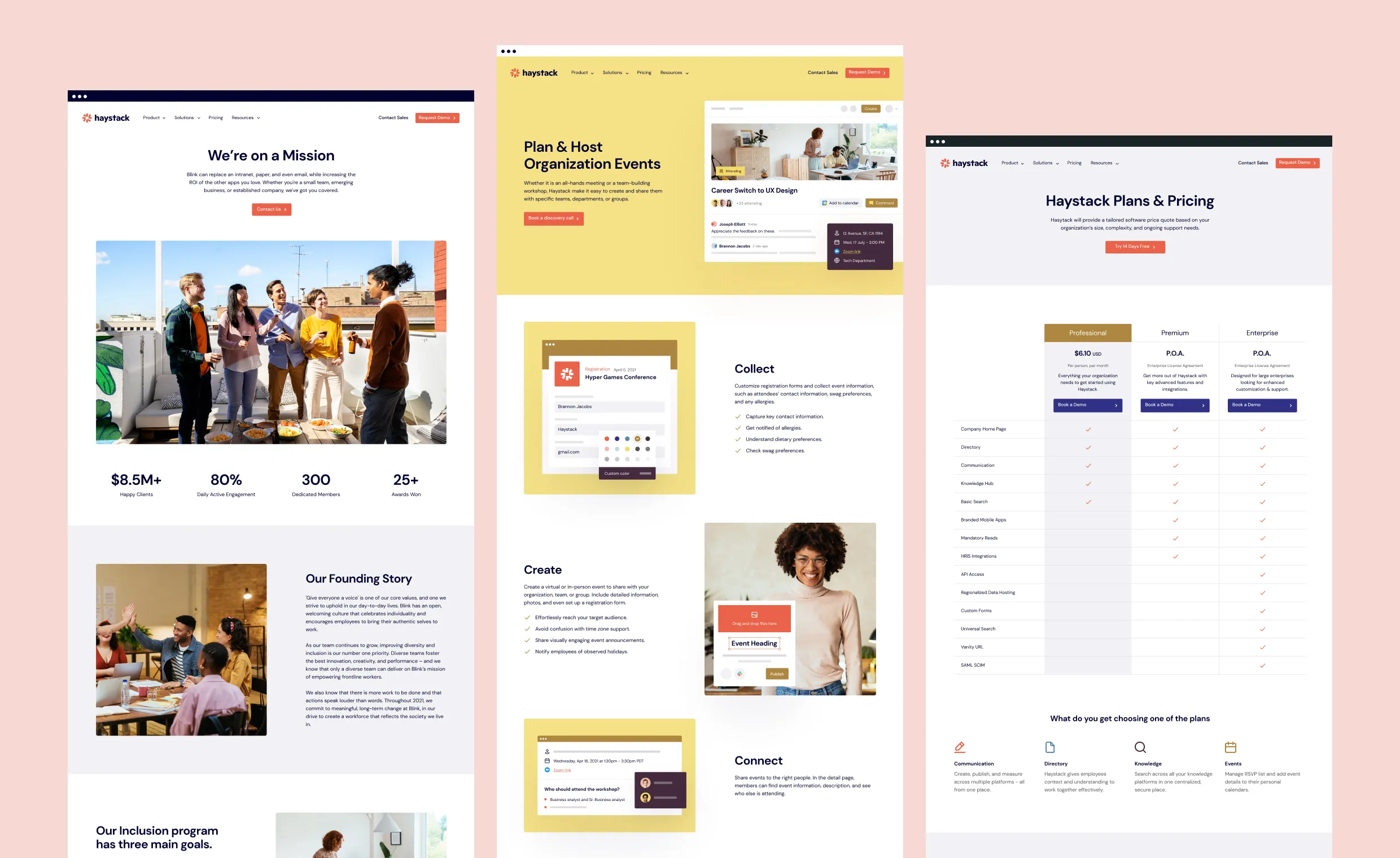
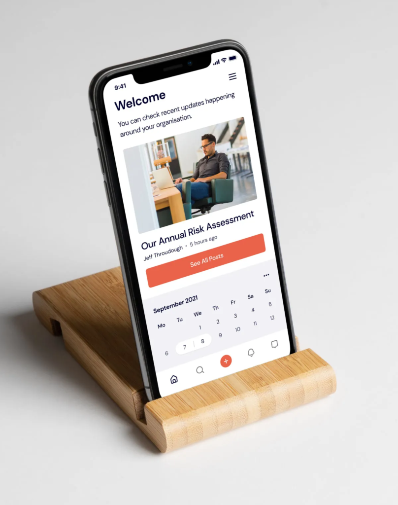
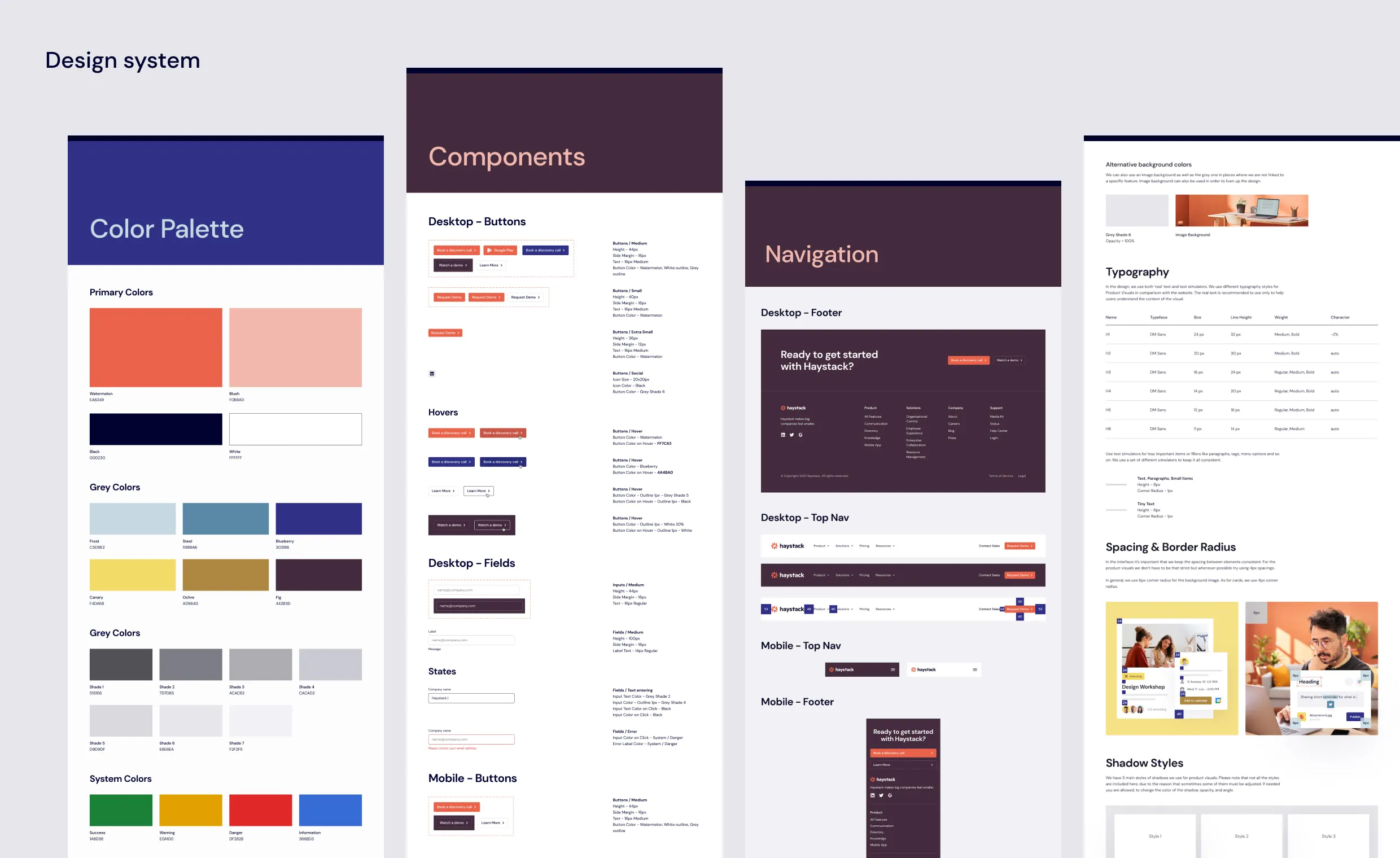
We researched, strategized, and designed the new Haystack visual identity, supported by a brand new website with a design system and Webflow integration.
New visual identity
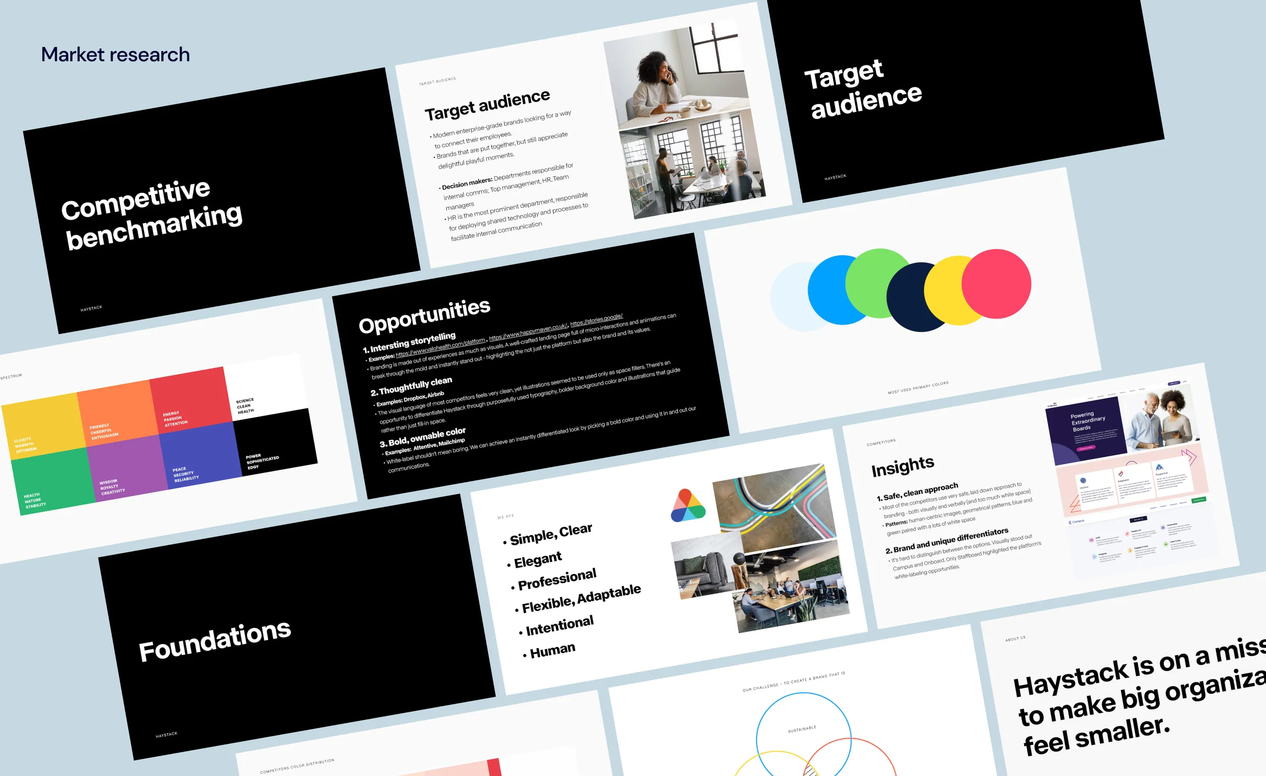
We started the process by conducting market research to define Haystack’s competitors and target audience, aligning expectations along the way. The initial research helped guide the conceptualization and collaborative approach to develop the new Haystack brand and visual identity.
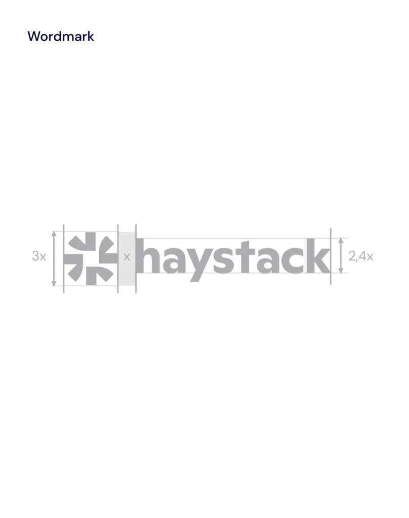
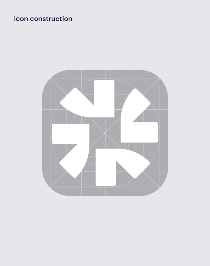
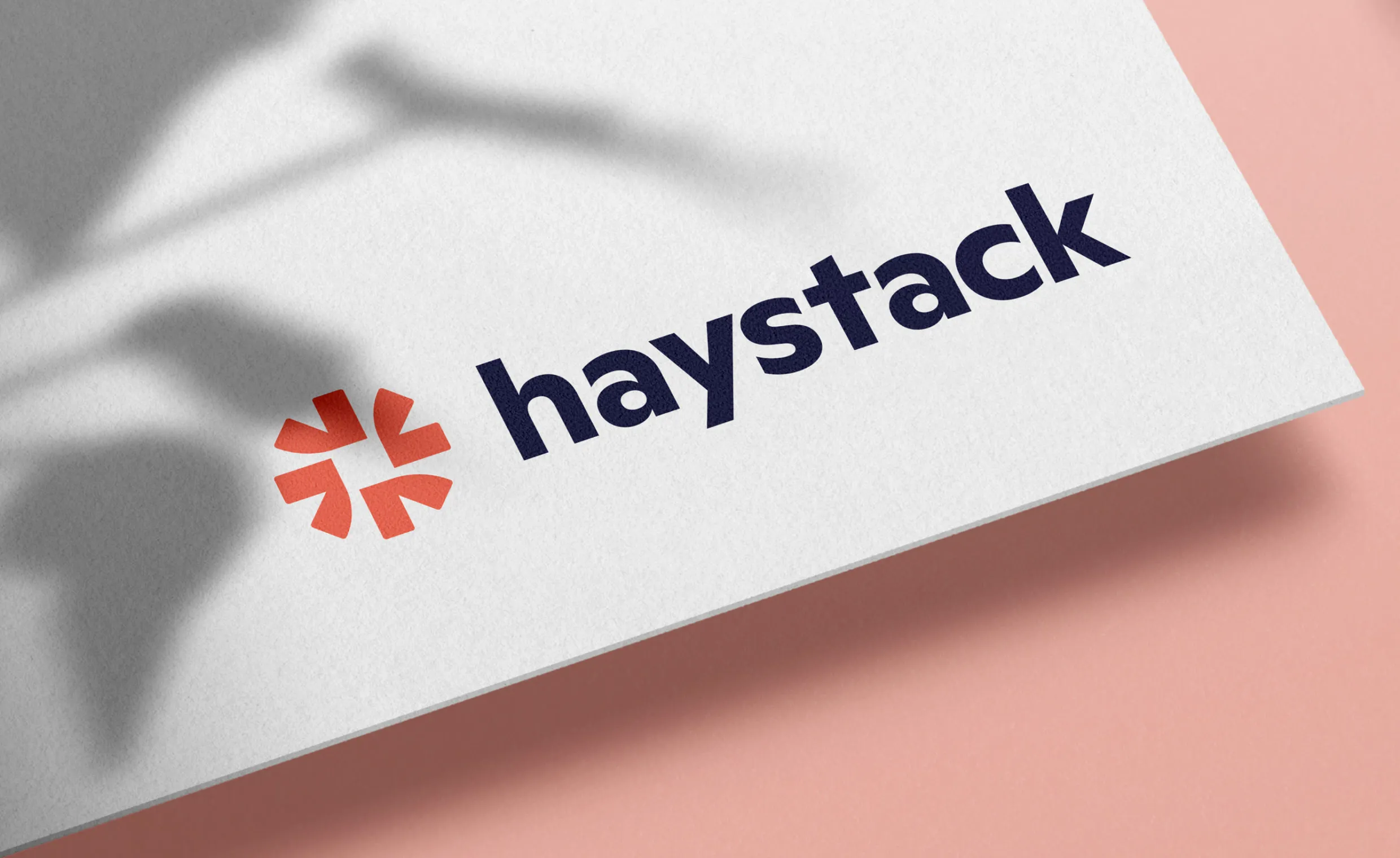
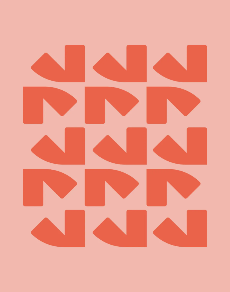
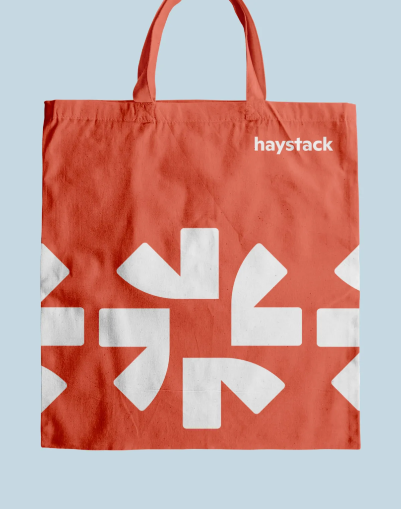
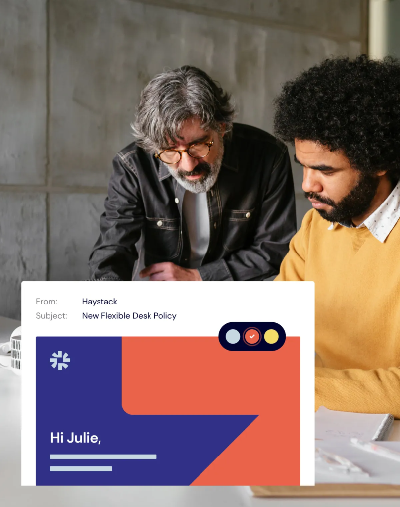
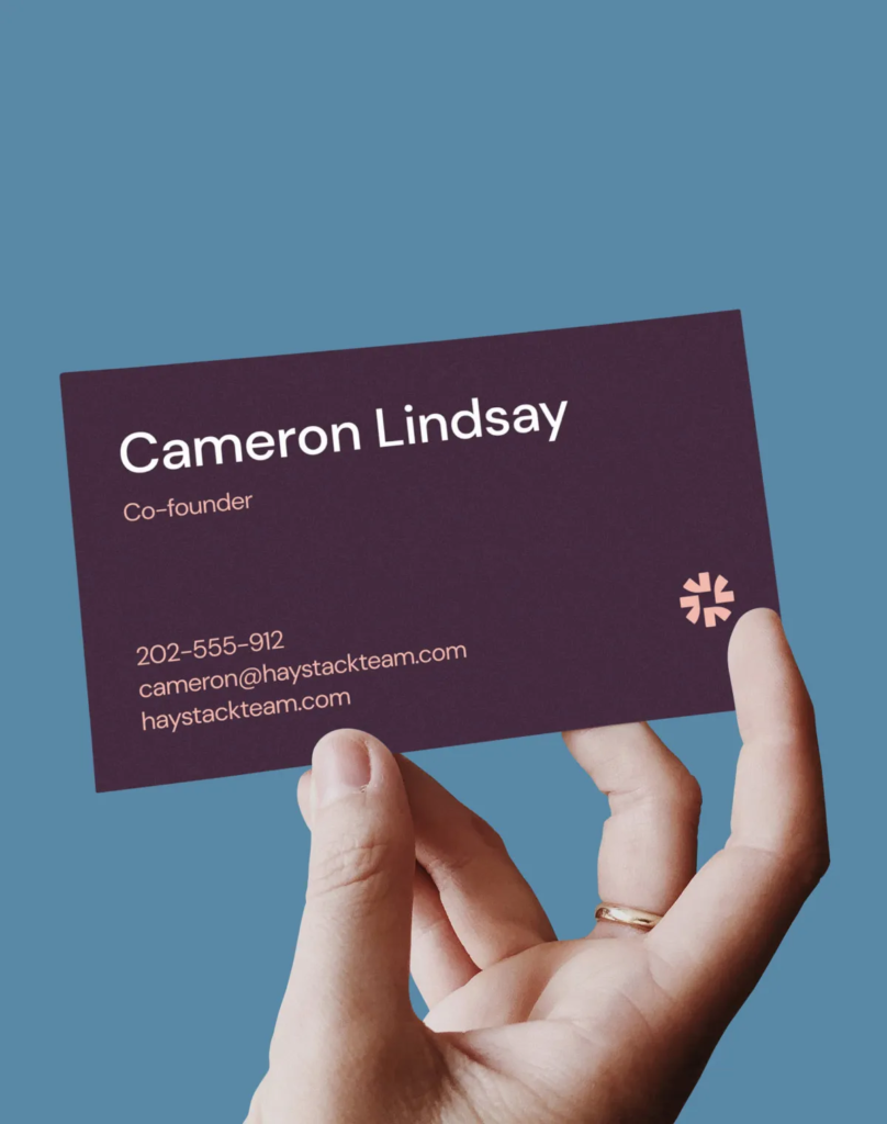
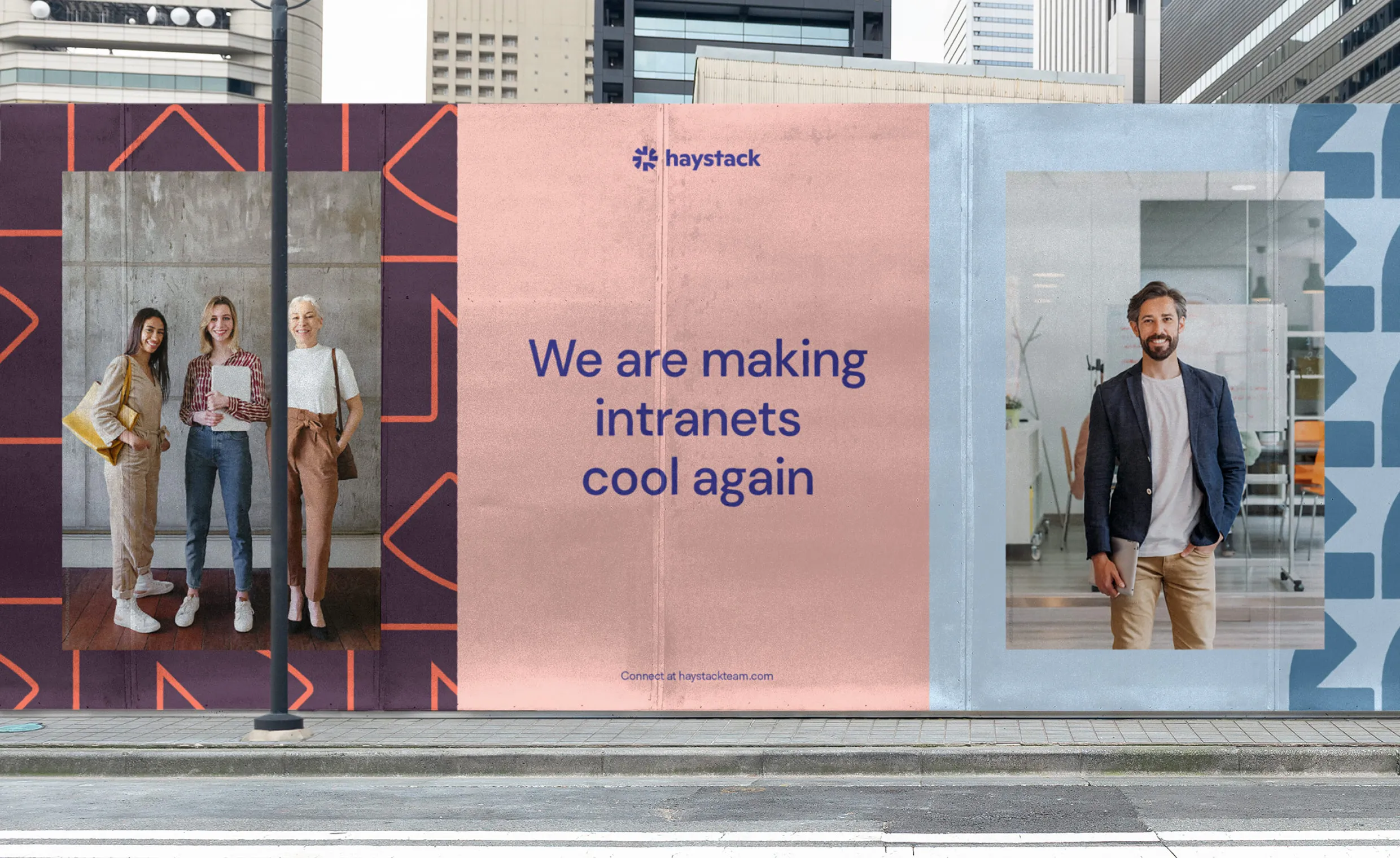
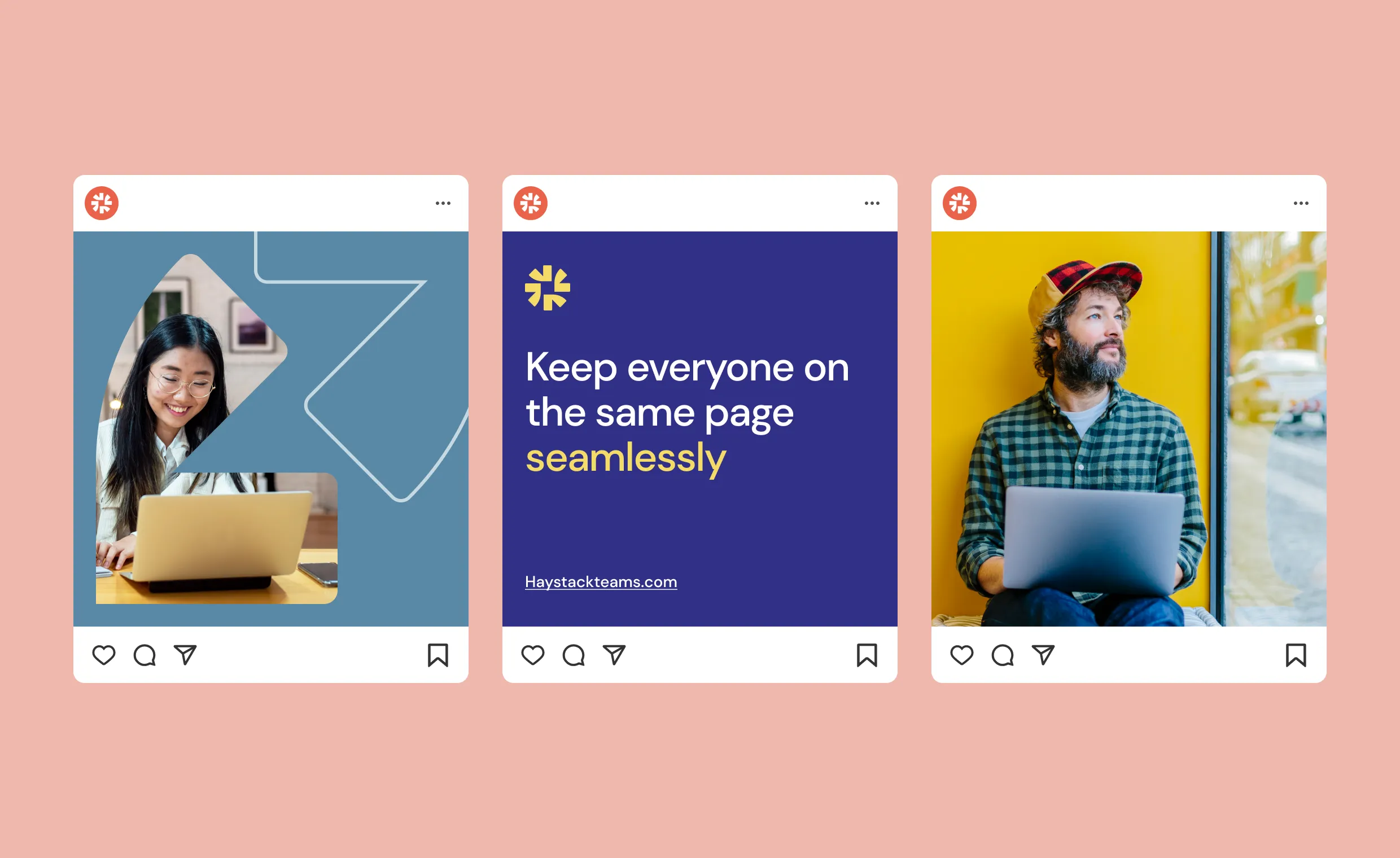
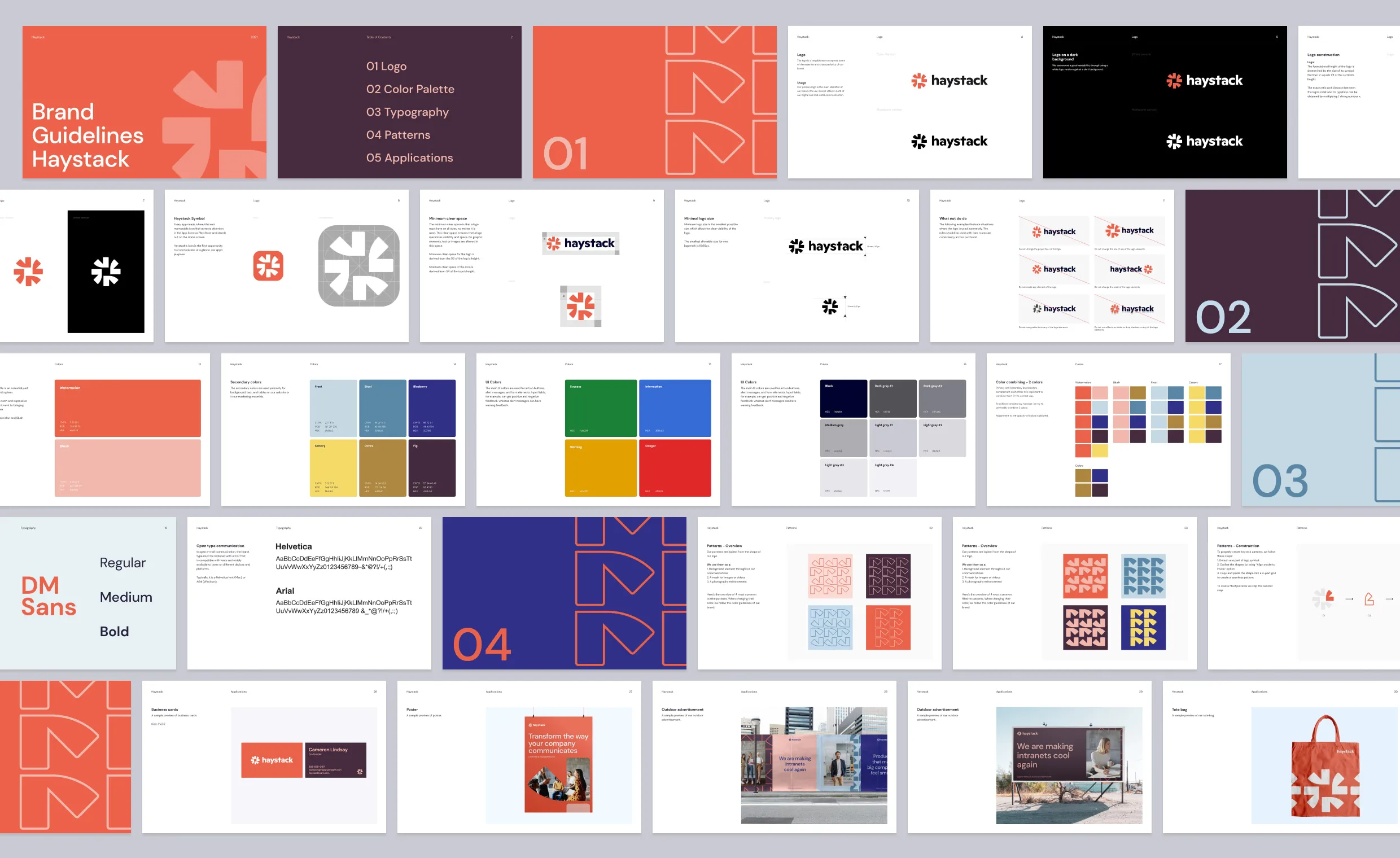
We aimed to convey their personality through visuals – that’s why we created a clean, simple yet sophisticated, and ownable identity. Haystack team had an idea of an ideal mark from the beginning – that’s why we proposed a solution based on simple geometrical shapes that leverage negative space and evoke the purpose of the platform; creating a shared culture in one place.
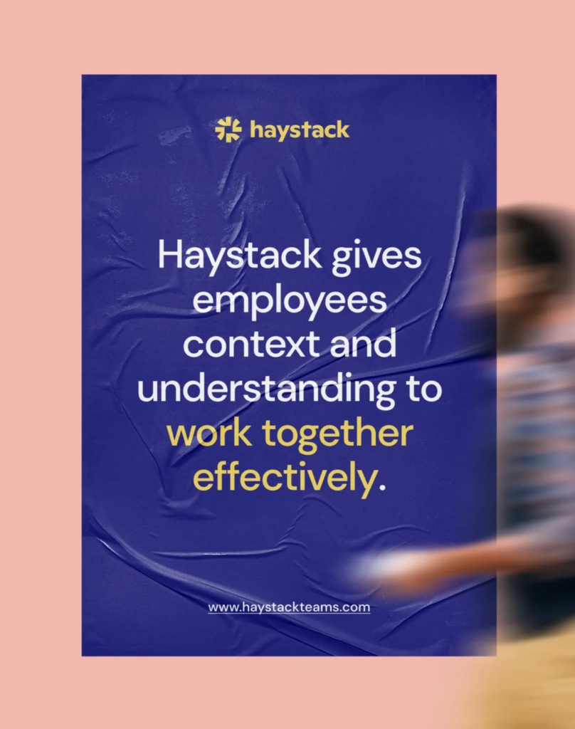
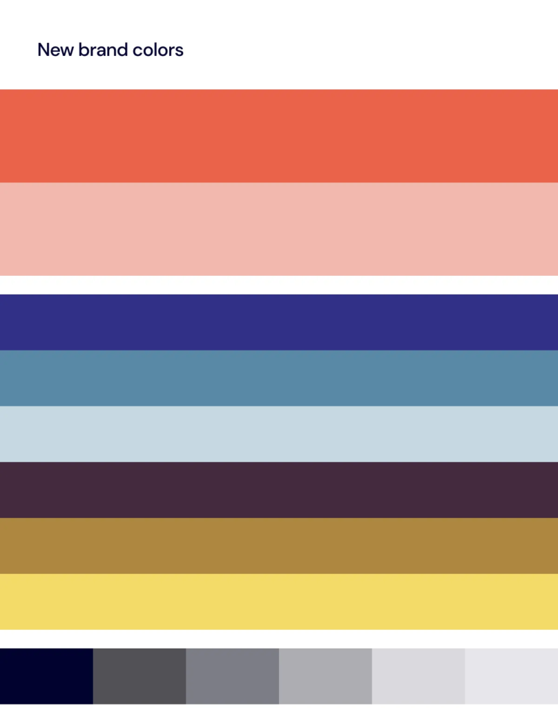
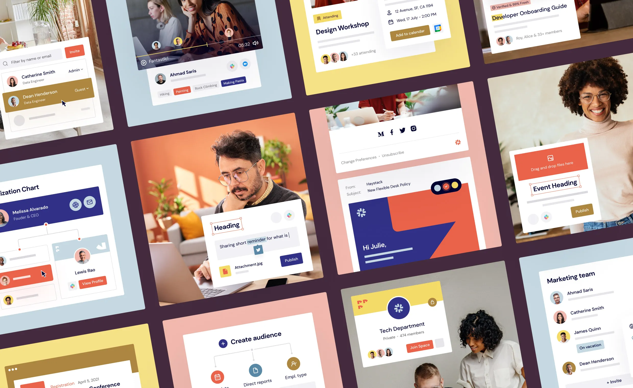
We’ve defined a very ownable and expressive colour palette, reflecting our commitment to bringing teams closer together. We used more natural colours, combining light and darker tones to provide depth and maturity to the brand.
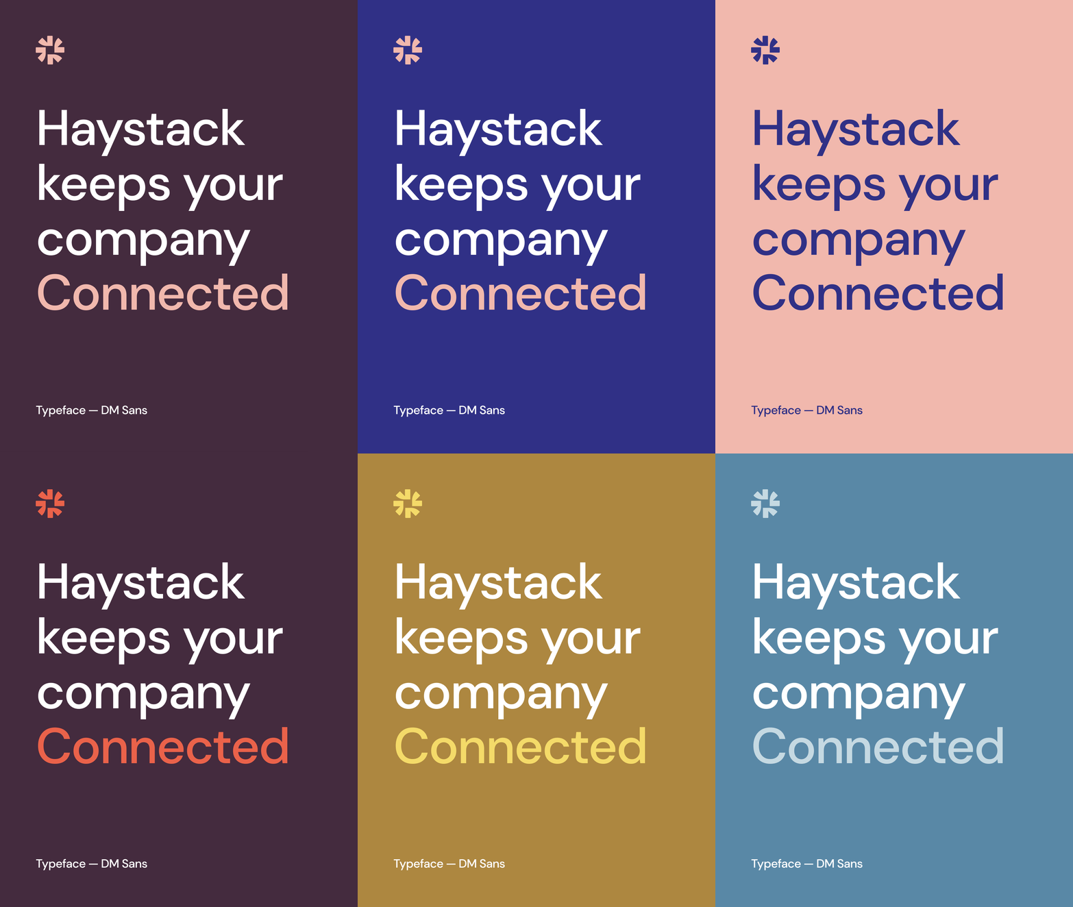
We used a simple, geometric yet dynamic sans serif typeface to complement the Haystack platform perfectly and offer flexibility and consistency across all touchpoints.
New and systemic website
With fantastic clients like NerdWallet, Credit Karma, Honey, Bungalow, MeUndies, the focus was always on fast-growing tech companies, hence the design language needed to balance B2B professionalism with the creativity and boldness of the new Haystack brand.
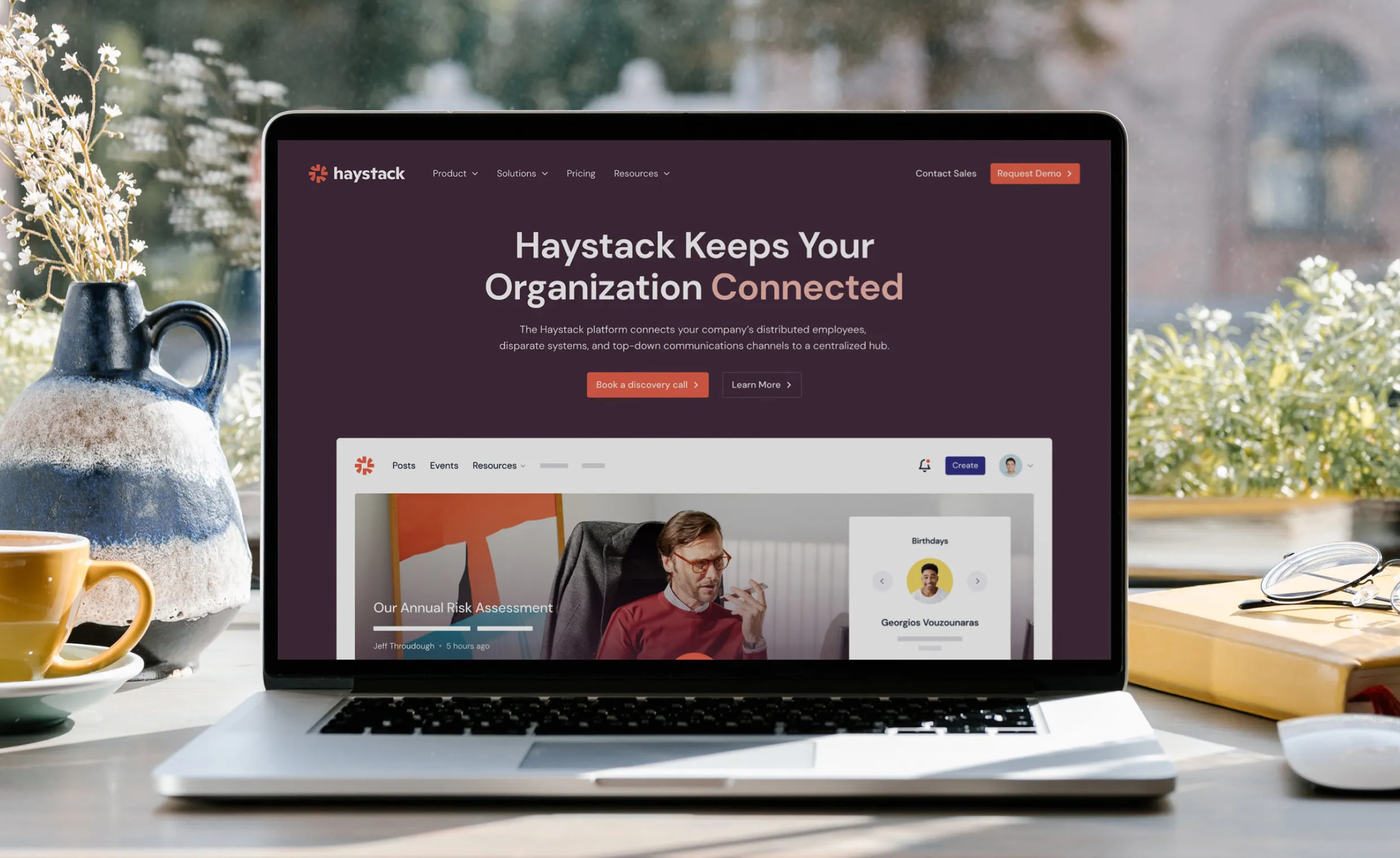
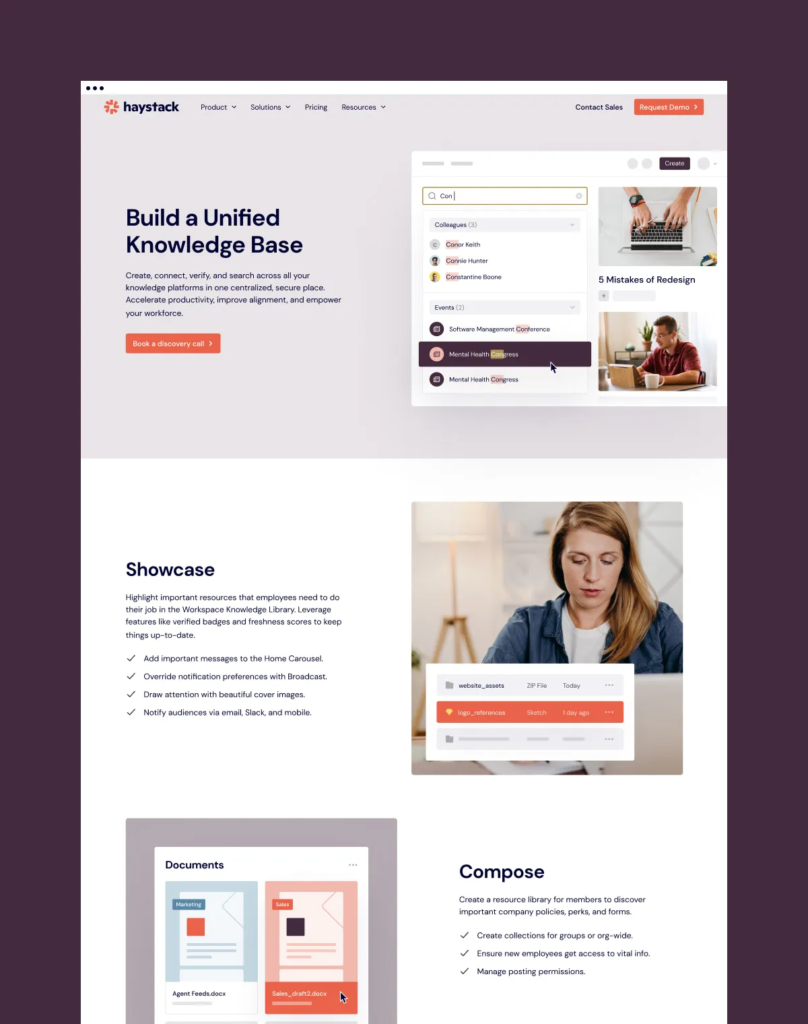
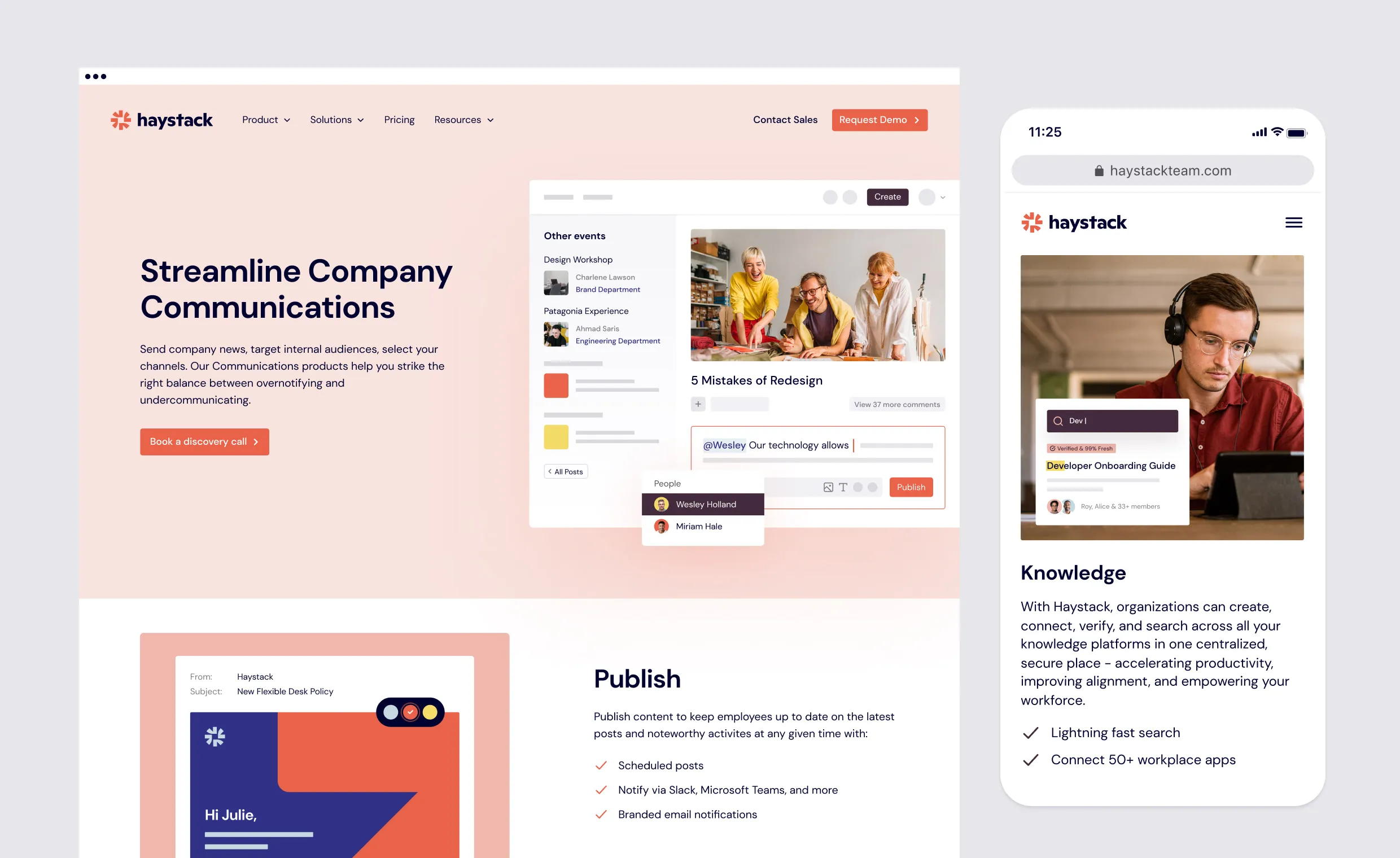
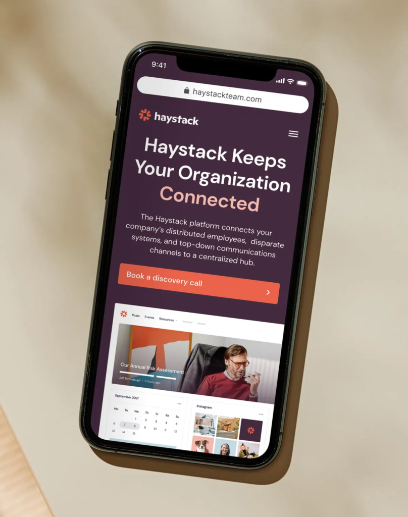
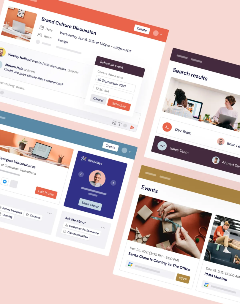
After we finalized the design language, the Haystack team shared wireframes and copy for the website. Through a series of iterations, we turned wireframes into a clean, bold, and systemic website with a strong focus on showcasing their product as a modern, clean, and design-oriented solution.
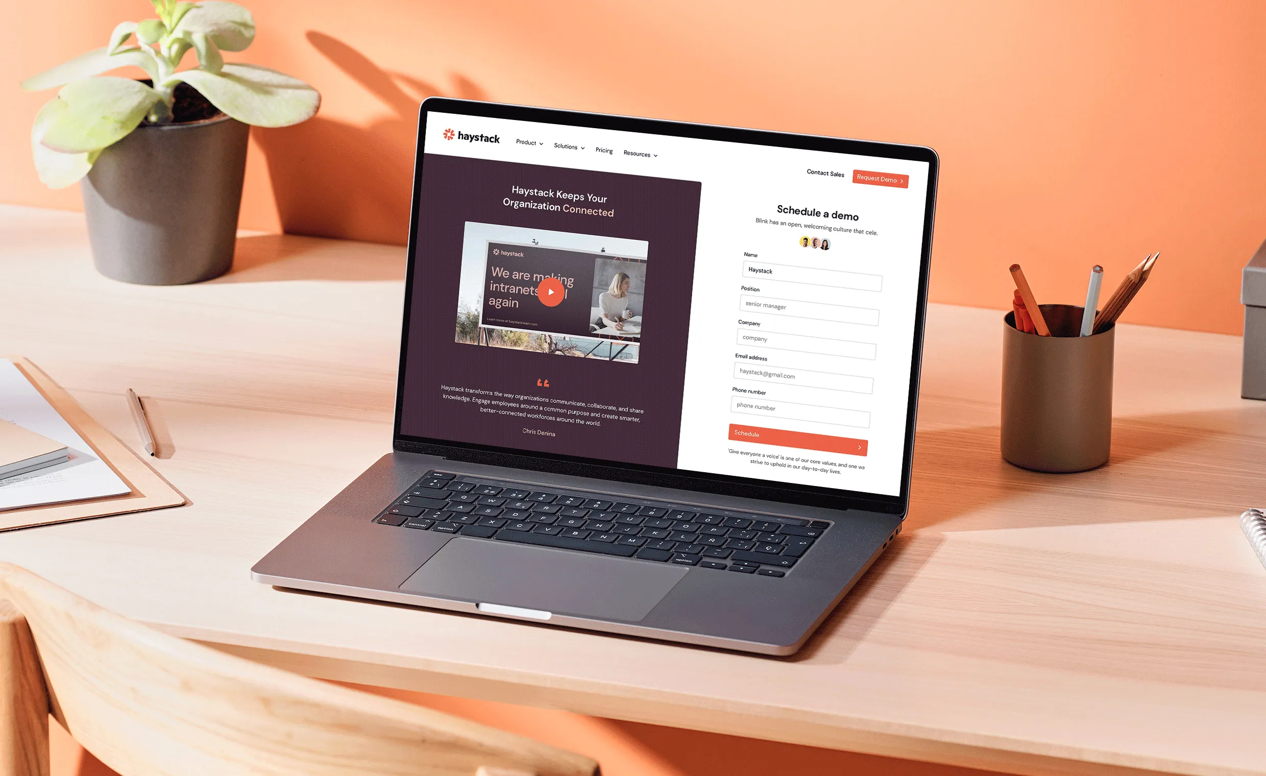
Once we finalized the style and designed the first batch of pages, we built the new website using Webflow CMS, thus allowing their marketing team to publish fresh content consistently and quickly.
