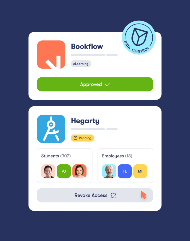
Wonde is a powerful, easy-to-use digital solution that’s changing the way schools and apps control their data. They’re are determined to change the way education technology is perceived, used, and adopted. With Wonde, schools can finally manage their data between third-party apps easily and securely.
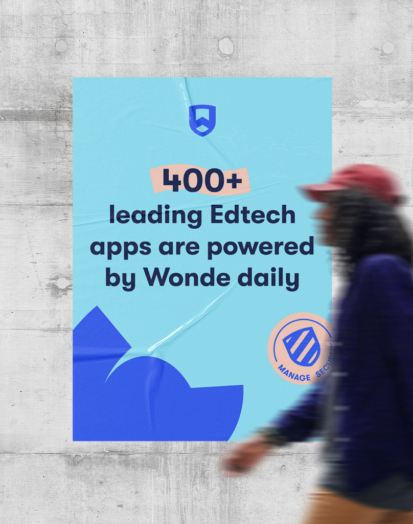
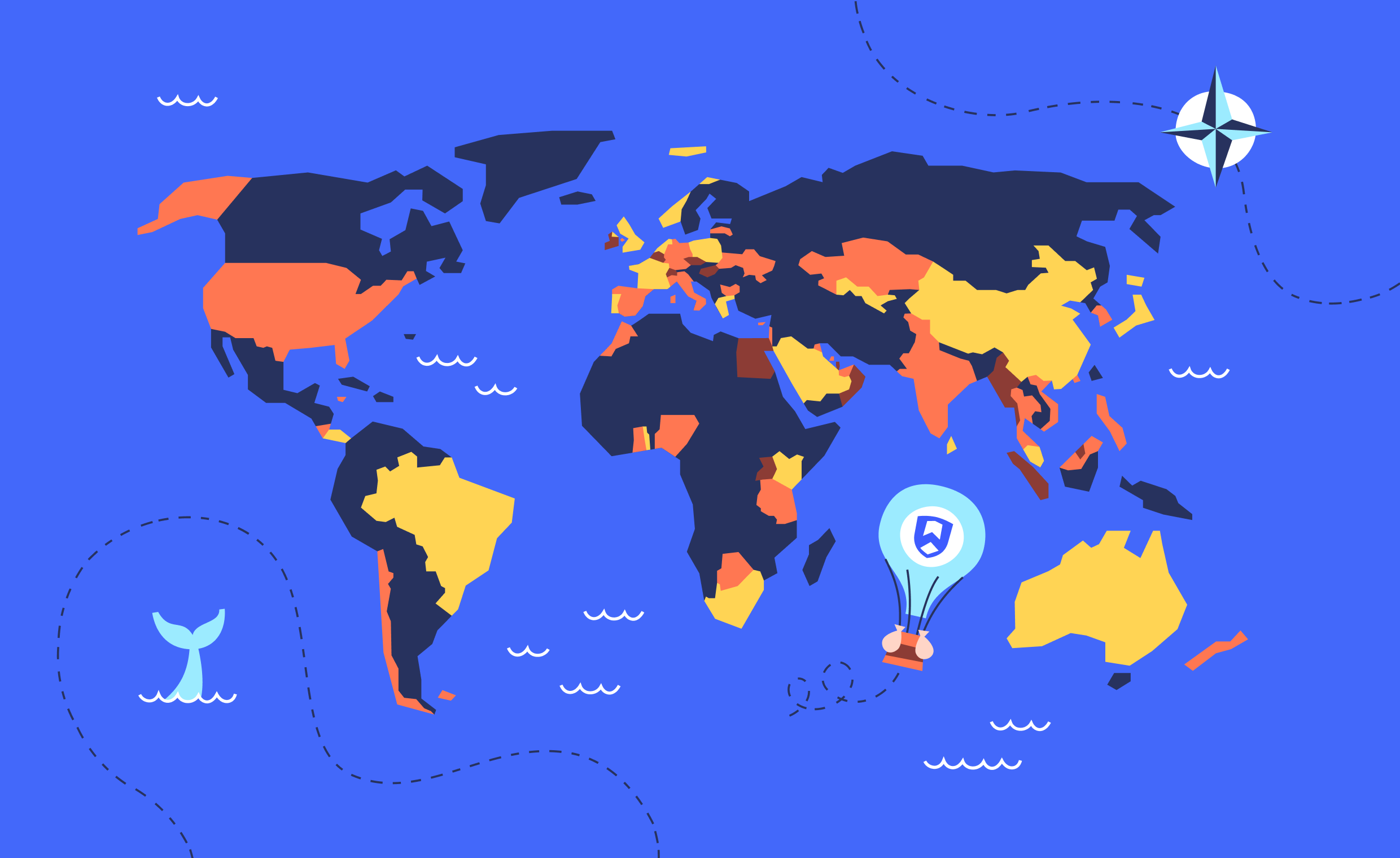
Wonde provides a secure data platform for over 28,000 schools in more than 60 countries and manages the data of 35 million people.
The challenge
The primary goal was to tell Wonde’s story in a way that would build excitement, loyalty and awareness. Wonde wanted a visual identity that reflected their personality and introduced a brand icon that would resonate with students, parents, app providers and the education sector as a whole.
The solution
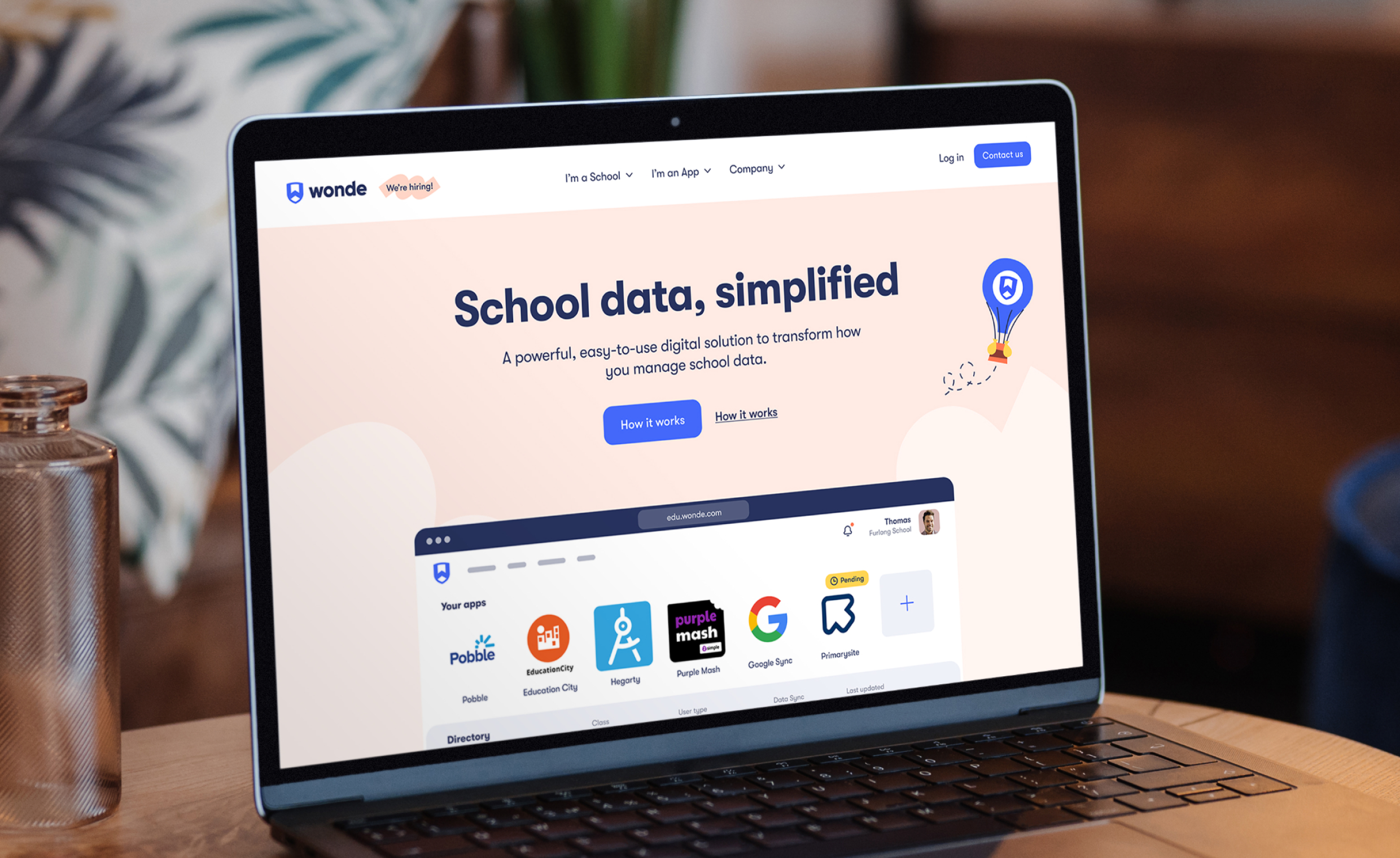
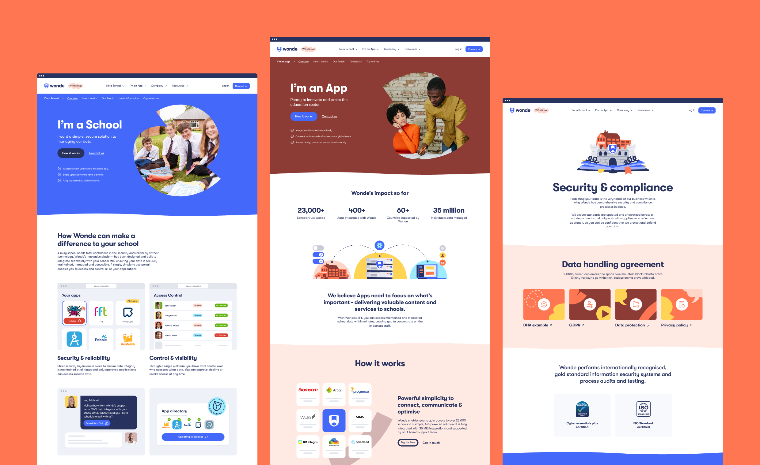
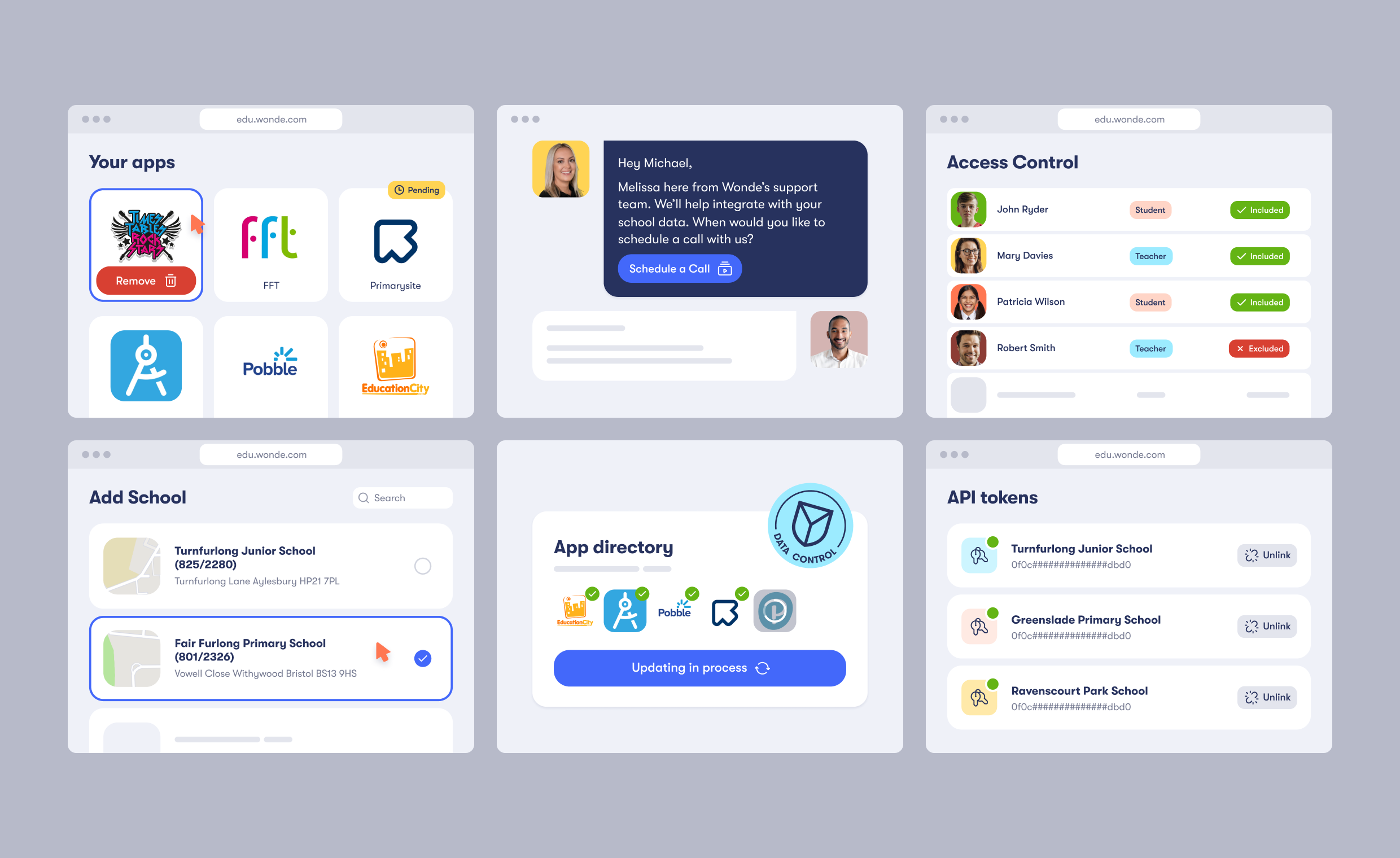
With the new visual identity and website, we created a consistent look and feel across all internal and external communication channels. Our bespoke and systemic WordPress website can now be easily expanded as Wonde’s marketing and client base grows.
A new brand as a key to future success.
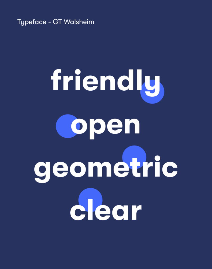
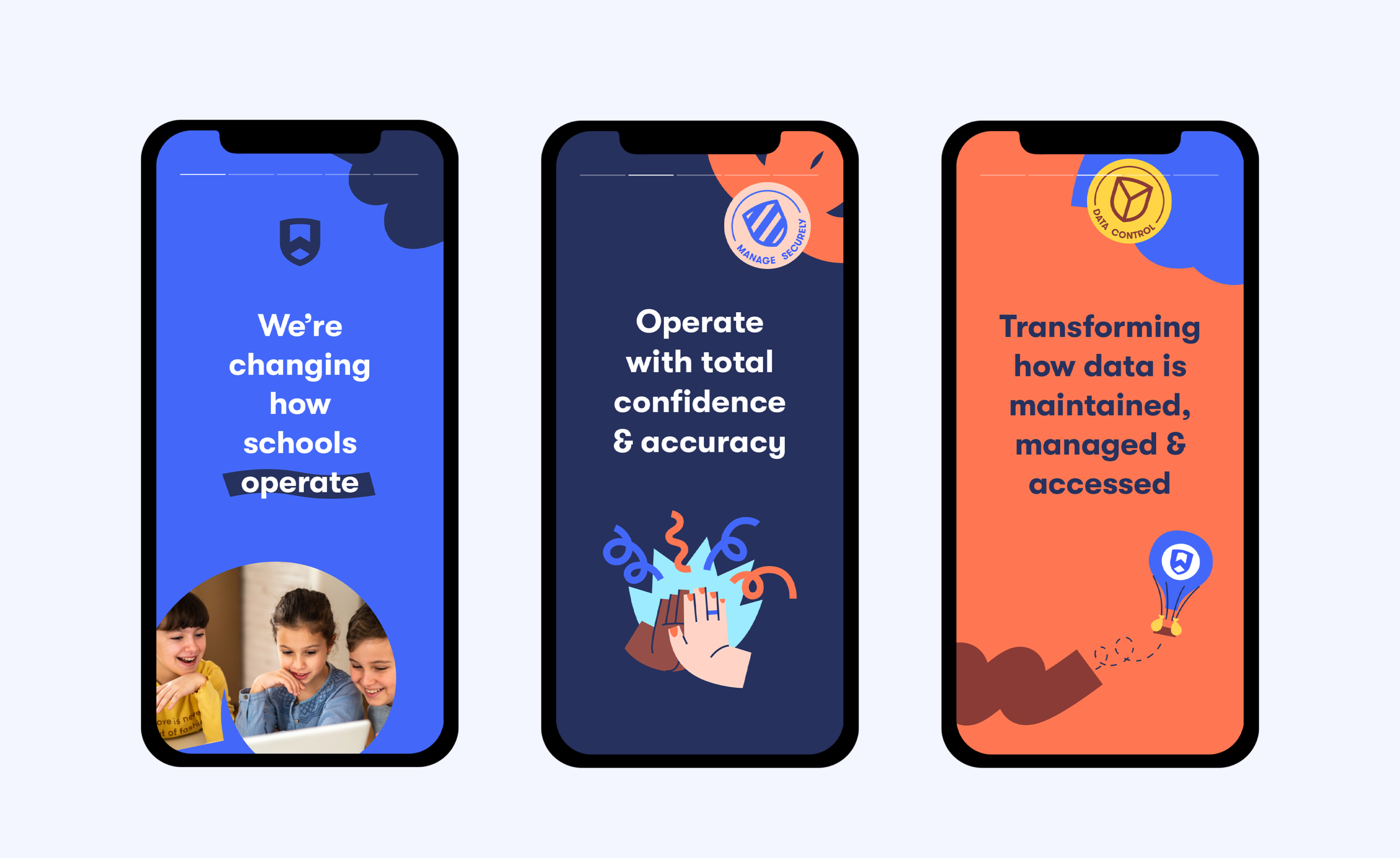
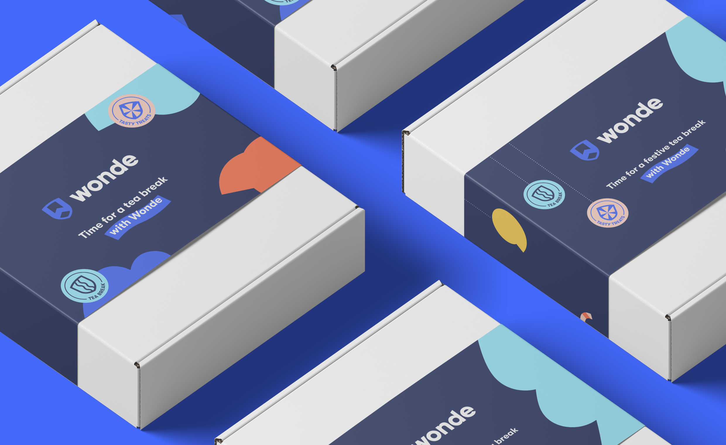
Building an identity that can communicate with the simplicity and reliability of a traditional tech brand had to simultaneously resonate with the education sector.
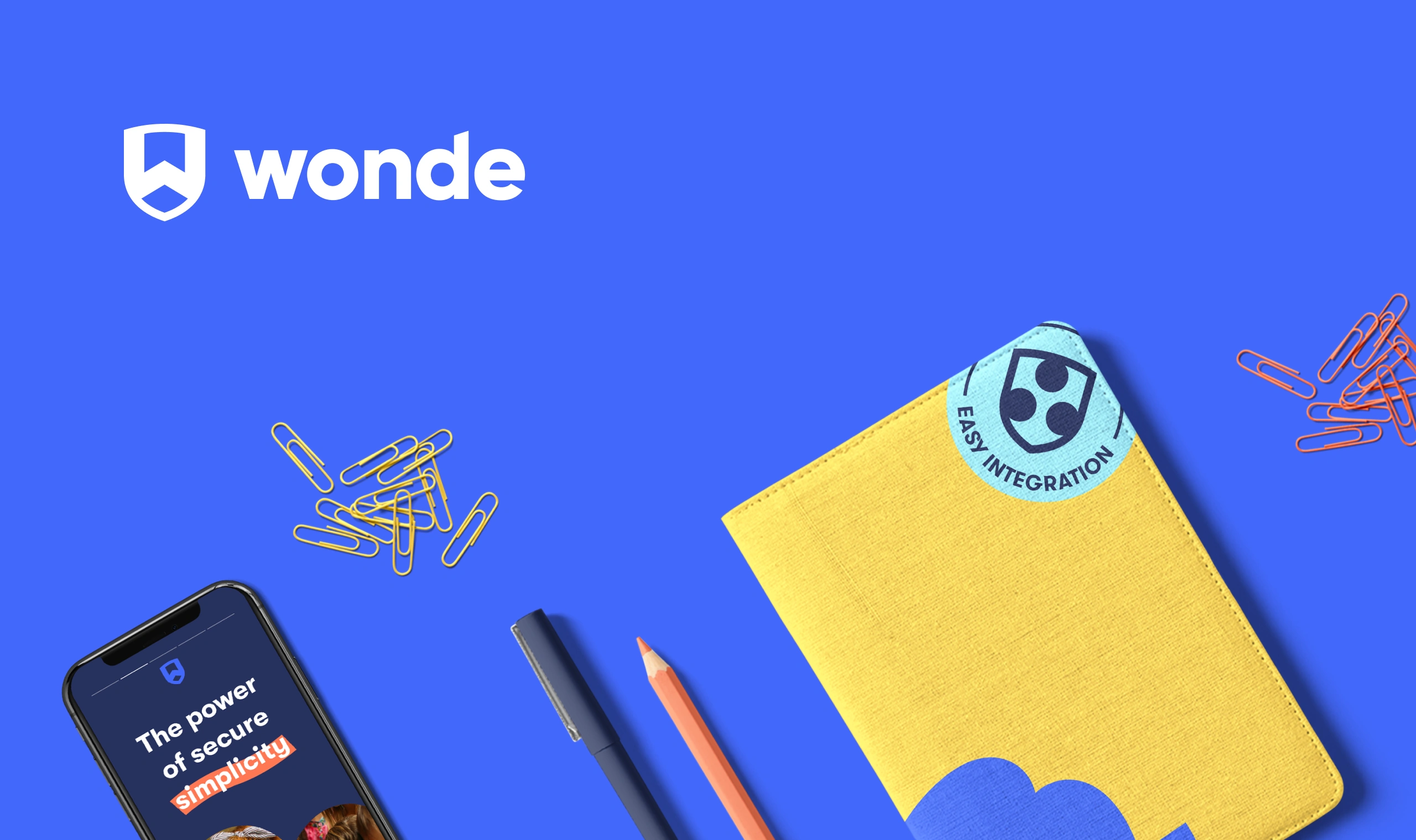
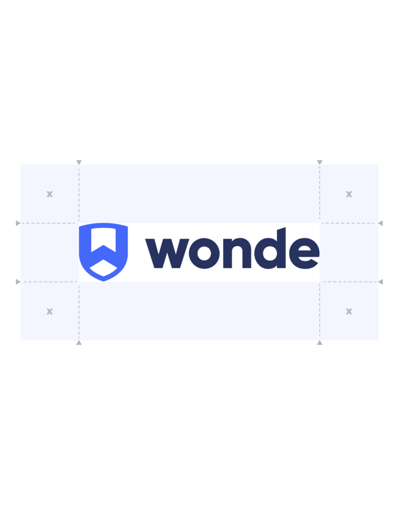
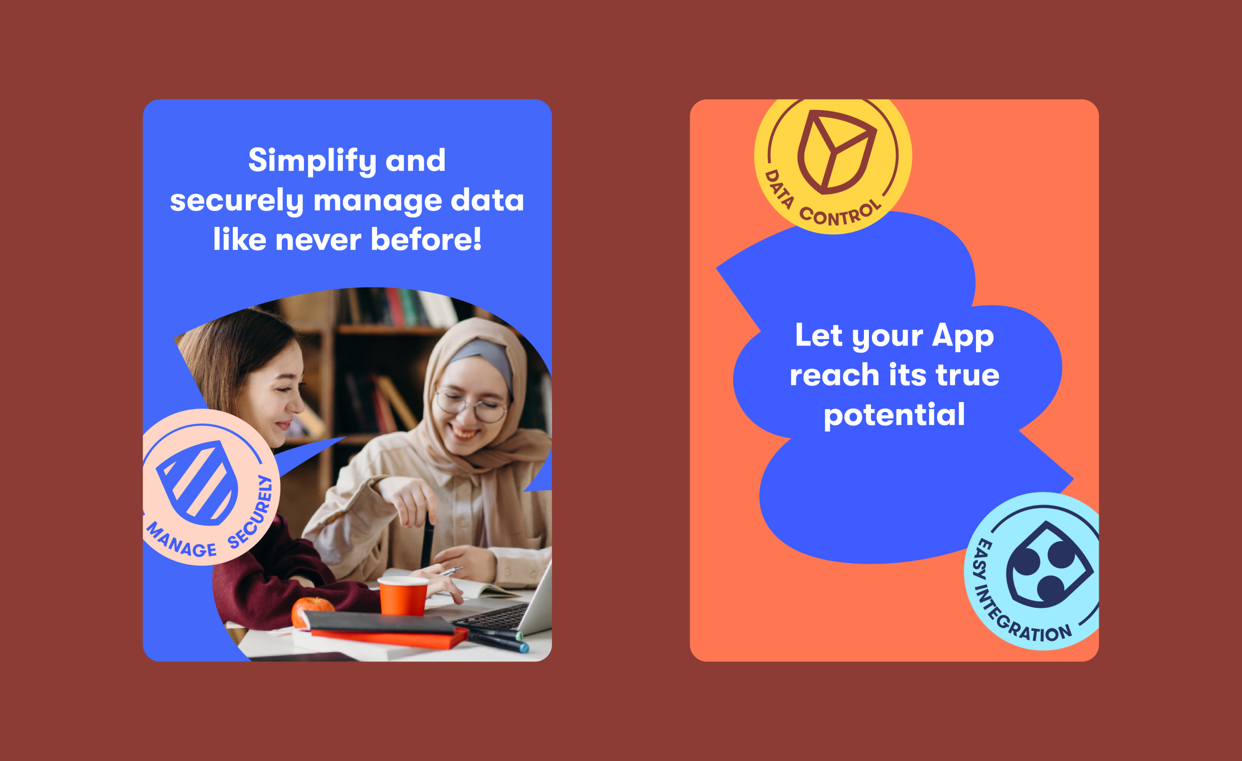
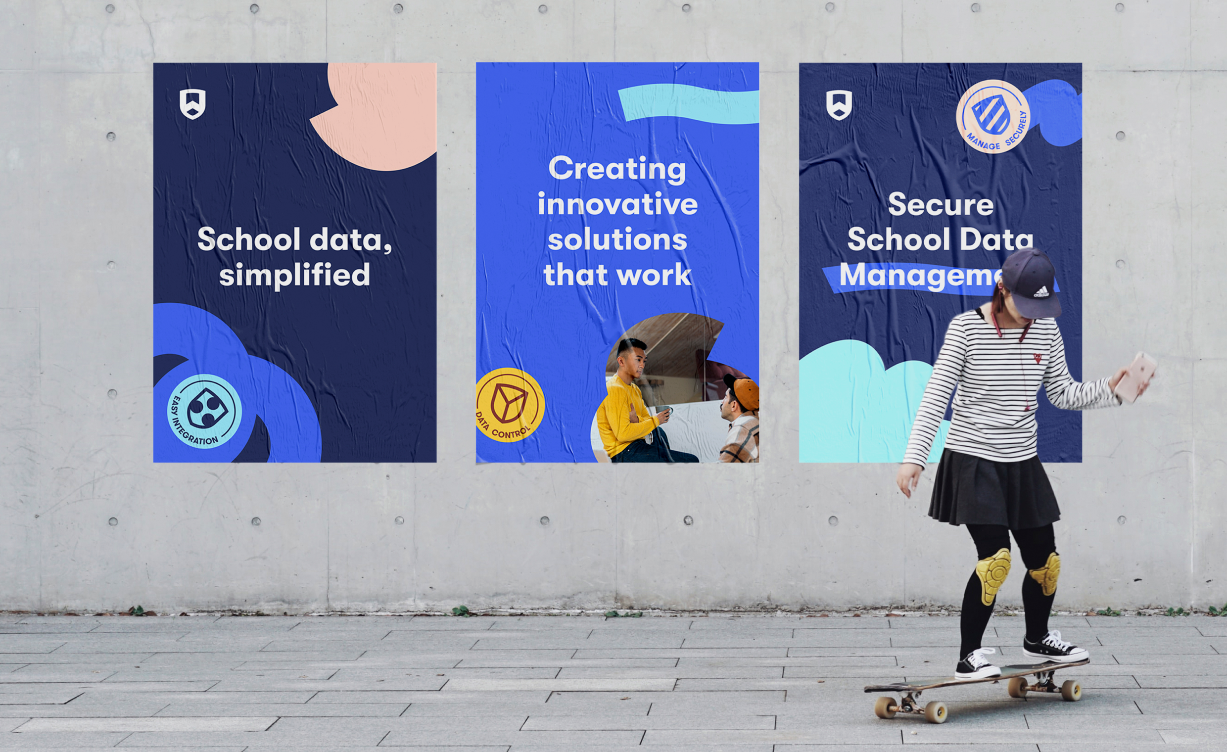
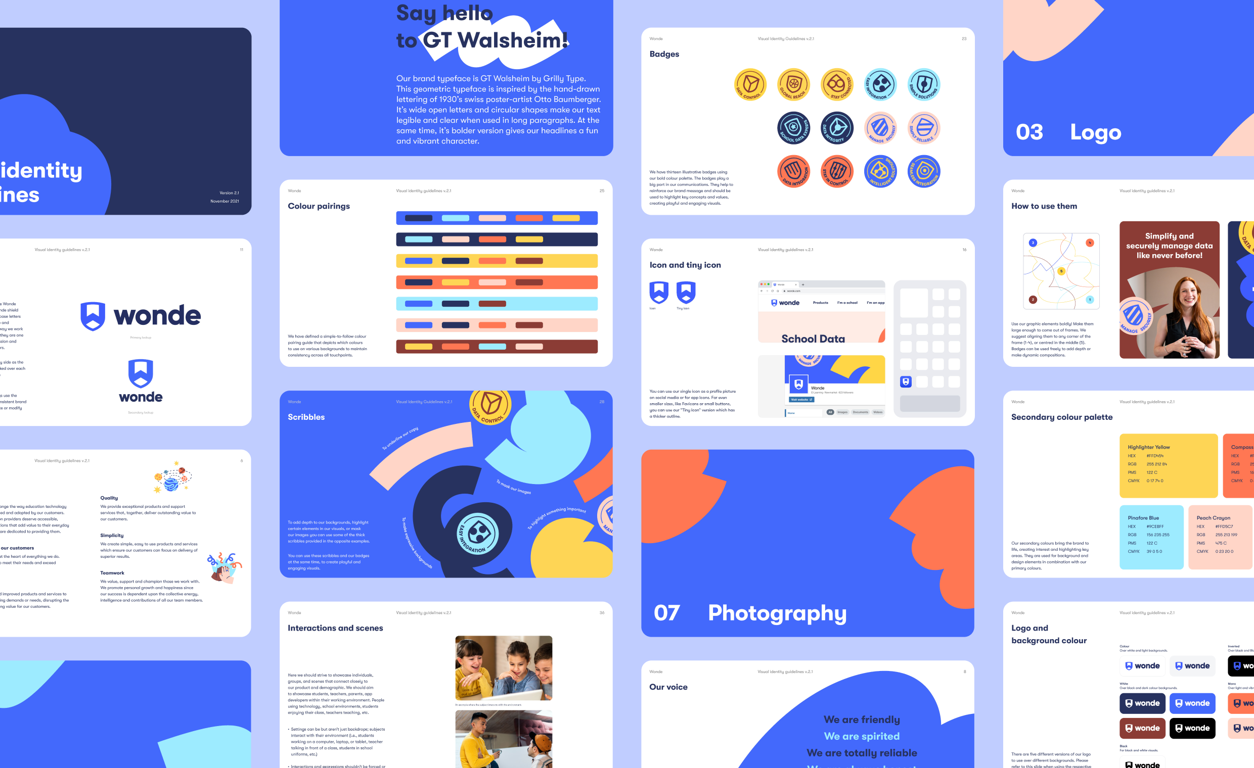
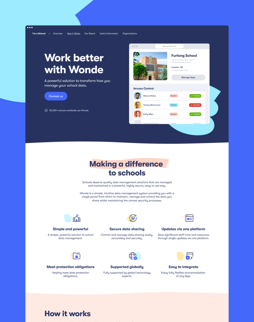
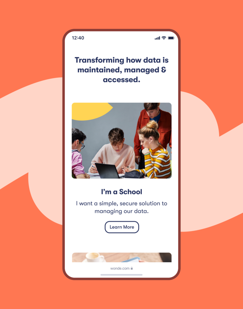
We designed a symbol — the Wonde shield — that functions as both a protective symbol and a school emblem. A lowercase wordmark gives the brand an approachable energy that reflects the way Wonde works and the solutions it offers.
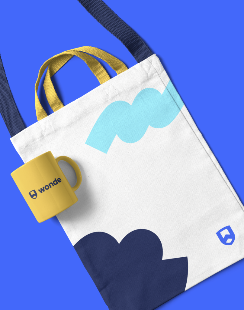
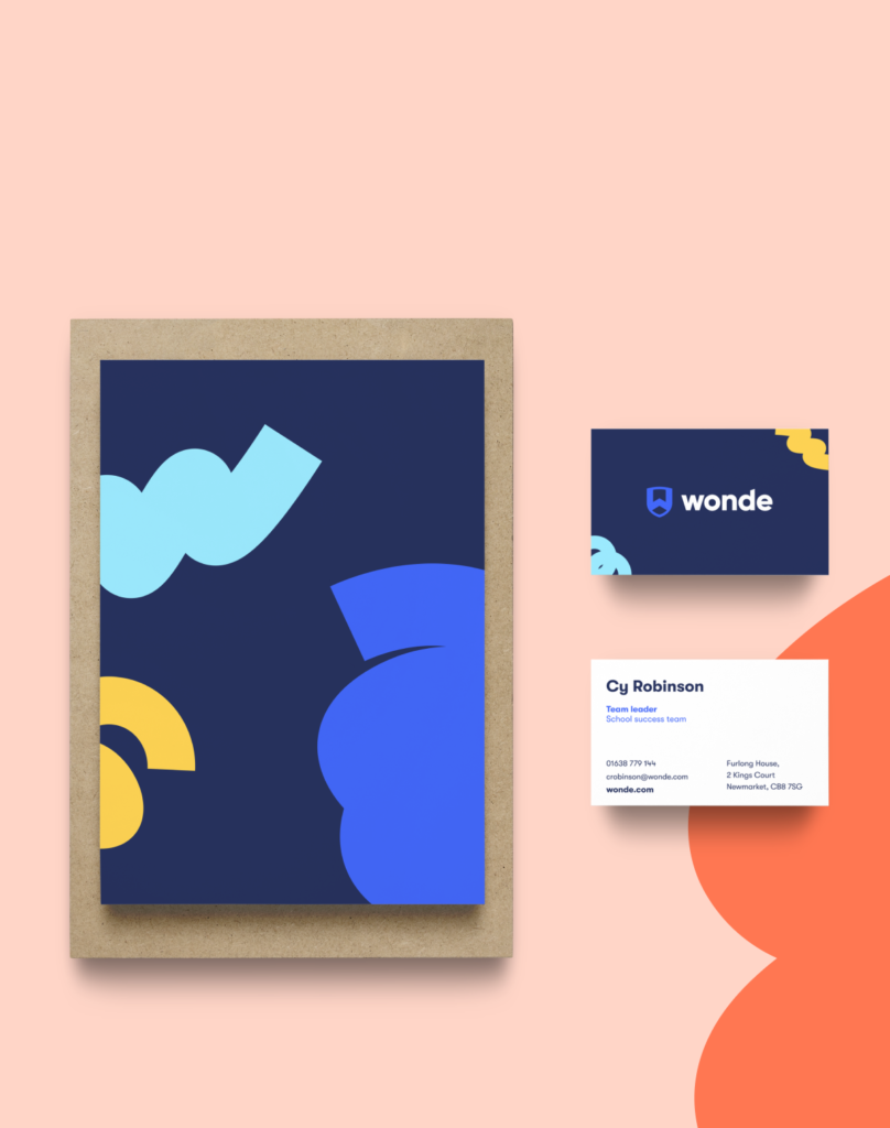
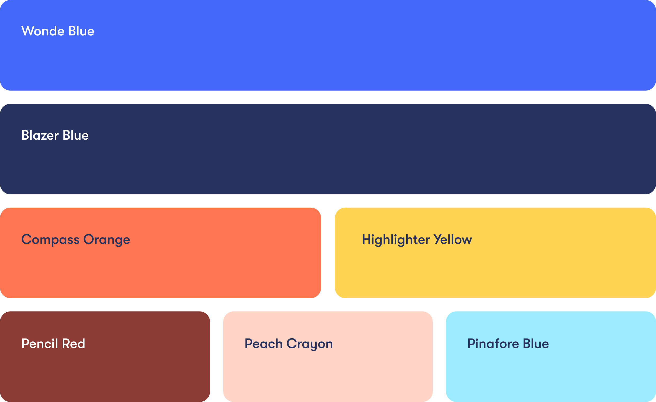
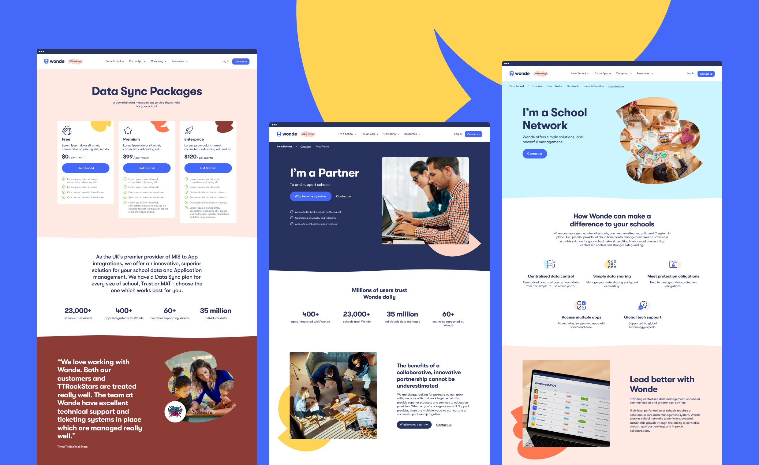
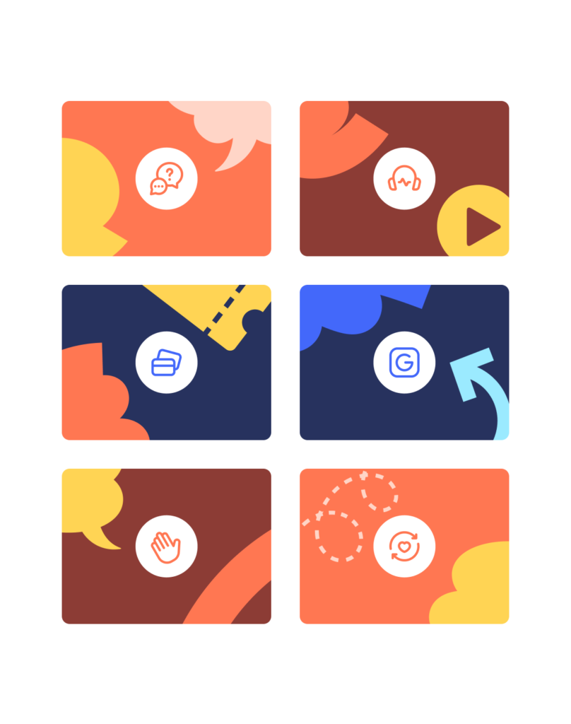
With the color palette, we wanted to reflect the world of classrooms, textbooks and playgrounds. So we started with Blazer Blue and Crayola Blue as the basic colors. Then we complemented them with the warmer tones of Crayola Orange, Sunshine Yellow and Pencil Red.
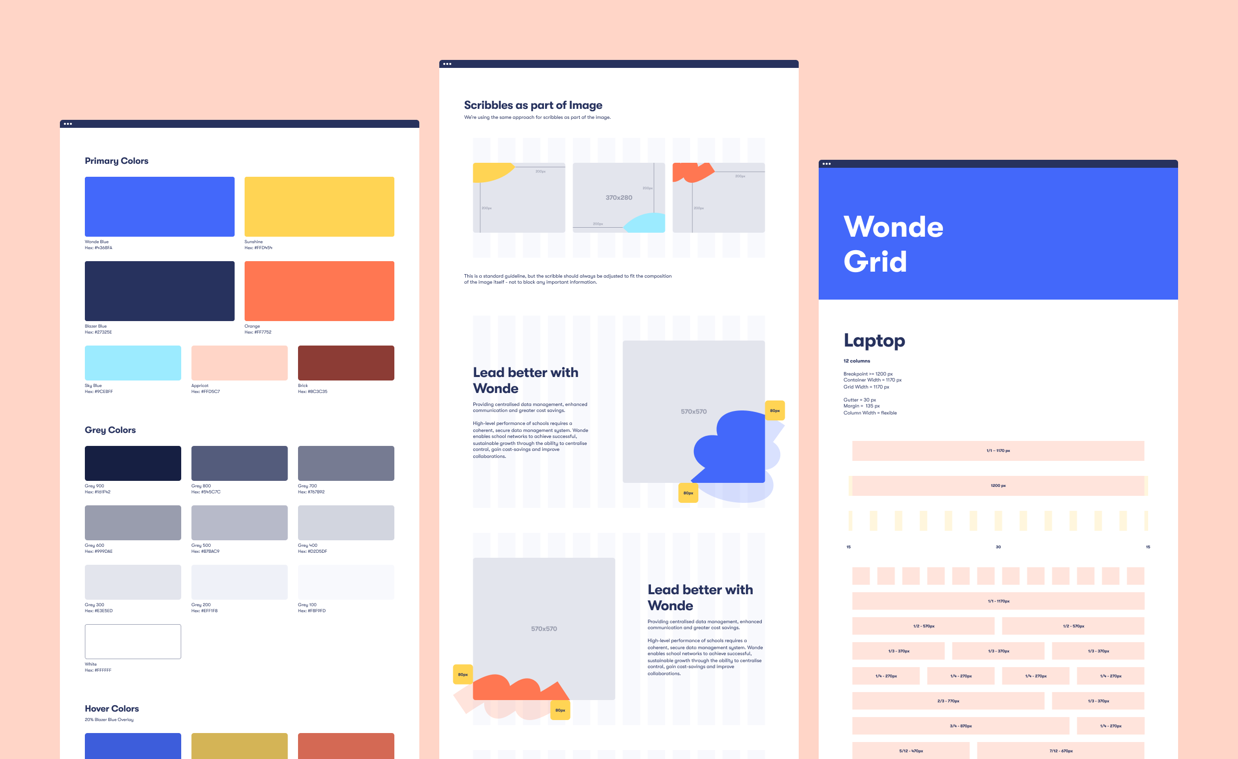
To tie everything together, we created a series of thick scribbles to highlight key words in the copy, crop images, and add some spontaneity to the layouts. We also produced a small collection of badges featuring the brand’s key concepts and values to create playful and engaging collaterals.
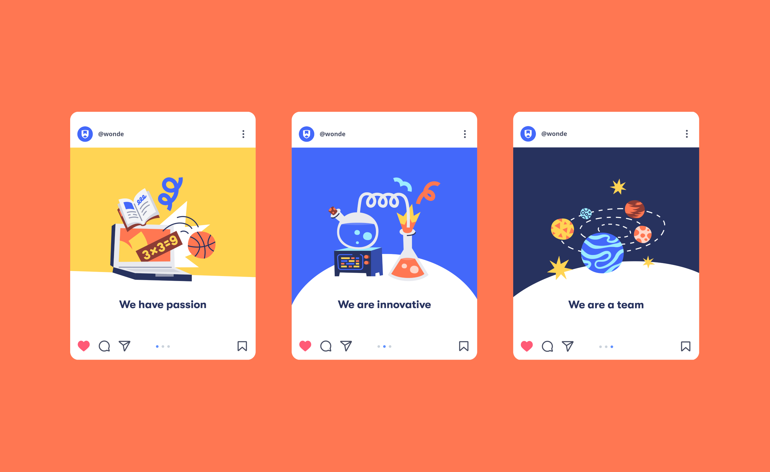
Finally, we topped it all off with an equally expressive and straightforward illustration style, building on the shapes and gestures we found in the primary type and custom scribbles.
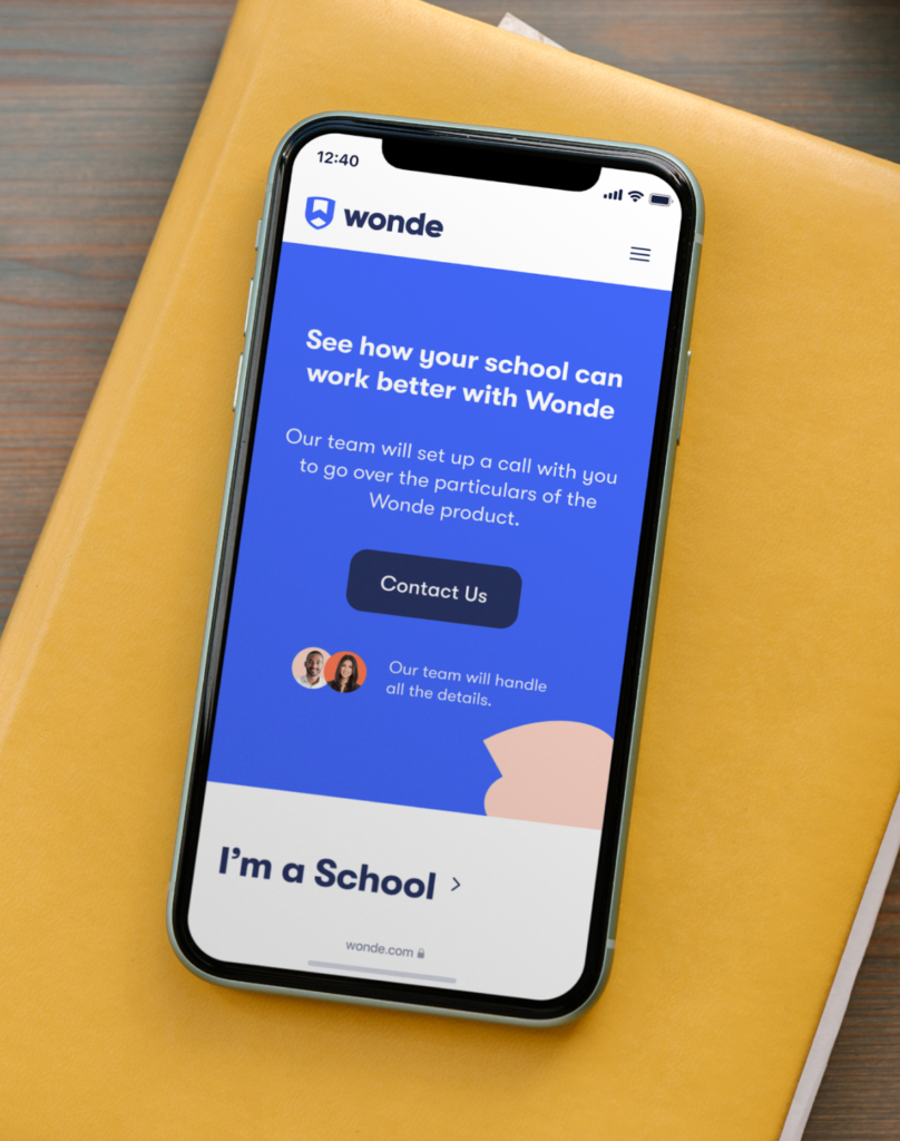
Bespoke WordPress website for flexibility and ease of use.
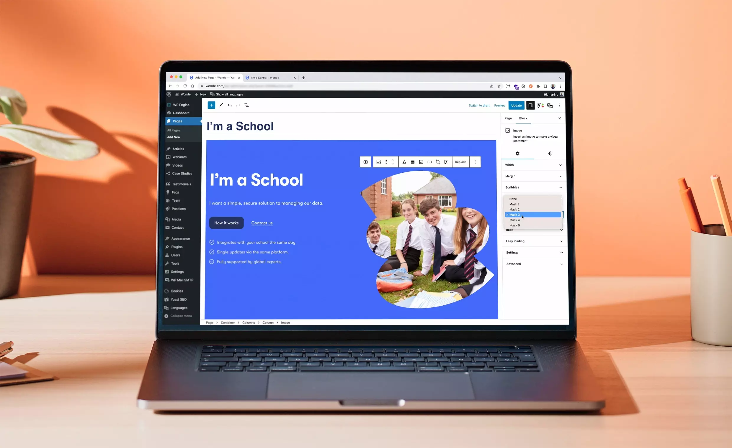
To address the need for consistency across all internal and external communication channels, we chose to build Wonde’s new digital home with WordPress. We knew WordPress, paired with a customized Gutenberg block editor, would be the perfect solution for a highly dynamic website that offers new content on a weekly basis.
When building the digital environment for Wonde’s marketing team, we always kept in mind that they needed a consistent, engaging, and innovative website, and that’s why we strategically integrated branding elements into the WordPress environment. A systemic multilingual solution empowers the team to seamlessly generate new landers, campaigns, and modules that match the brand.
We created a WordPress theme based on a custom-made Gutenberg blocks plugin to support clean, yet playful design language that would appeal to the education sector, tech brands, and the kids who use the apps. With our target audience in mind, we developed a modular design system that could be maintained across all touchpoints.
Created a whole Wonde family of brands.
From day one, we have been incredibly impressed with BB Agency’s creativity, hard work and commitment to the projects we have given them. Through their interpretation of our briefs, they have given us a family of three stand-out brands that we are incredibly proud of. The BB team has such a great understanding of Wonde and are so ingrained in everything we do, they are seen as an extension of our own company!
Peter Dabrowa,Co-Founder and CEO of Wonde
The Result.
After 5 months of close collaboration, we successfully launched Wonde’s new brand and website using WordPress CMS.
We’re incredibly proud of the modularity and flexibility of the WordPress environment our development team built. In addition to the website, we’ve defined a simple design system around colours, typography, pairings, modules, spacings, and components.
As a direct result of our collaboration and successful rebrand, we’re closely working with the Wonde team on launching a suite of their sub-products including eVouchers and Mylogin.
Elevating the product experience of the ecosystem that brings companies closer to their customers.
UX ResearchProduct InnovationInterface Design
Torii
Building the world’s best home buying experience.
Market ResearchBrand GuidelinesBrand Messaging
Narrating stories that resonate, building experiences that people cherish, and achieving outcomes that matter demand true partnership. That’s why we’re here for the long haul, walking beside you every step of the way.
To provide the best experiences, we use technologies like cookies to store and/or access device information. Consenting to these technologies will allow us to process data such as browsing behavior or unique IDs on this site. Not consenting or withdrawing consent, may adversely affect certain features and functions.
Functional
Always active
The technical storage or access is strictly necessary for the legitimate purpose of enabling the use of a specific service explicitly requested by the subscriber or user, or for the sole purpose of carrying out the transmission of a communication over an electronic communications network.
Preferences
The technical storage or access is necessary for the legitimate purpose of storing preferences that are not requested by the subscriber or user.
Statistics
The technical storage or access that is used exclusively for statistical purposes.The technical storage or access that is used exclusively for anonymous statistical purposes. Without a subpoena, voluntary compliance on the part of your Internet Service Provider, or additional records from a third party, information stored or retrieved for this purpose alone cannot usually be used to identify you.
Marketing
The technical storage or access is required to create user profiles to send advertising, or to track the user on a website or across several websites for similar marketing purposes.