How we helped Justuno transition into a new era
Every new project brings a new challenge and a possibility to achieve something big. There is a level of excitement and the possibilities are endless. When it comes to Justuno, we knew right away that it would be a huge project with several challenges, but we couldn’t wait to face them and tackle any obstacles along the way.
Justuno is an omnichannel platform that enables digital marketers to engage website visitors, increase conversions, and gain customer insight with advanced targeting and robust analytics. With offices in San Francisco and Austin, Justuno is on a mission to provide robust marketing solutions that help convert clicks into customers.
As they continued to grow as a company, Justuno’s needs changed and the time came for a new visual identity, new website, and an overall improved user experience. In addition to that, they wanted their new look to be appealing to the more upscale market, as well as potential new international customers.
The research
We started the project by doing an extensive company review, market research, and competitive benchmarking to inform our strategy development. With a detailed breakdown of the industry, target audience, and Justuno goals, we defined a set of actionable opportunities to help us re-focus Justuno towards a more upscale market.
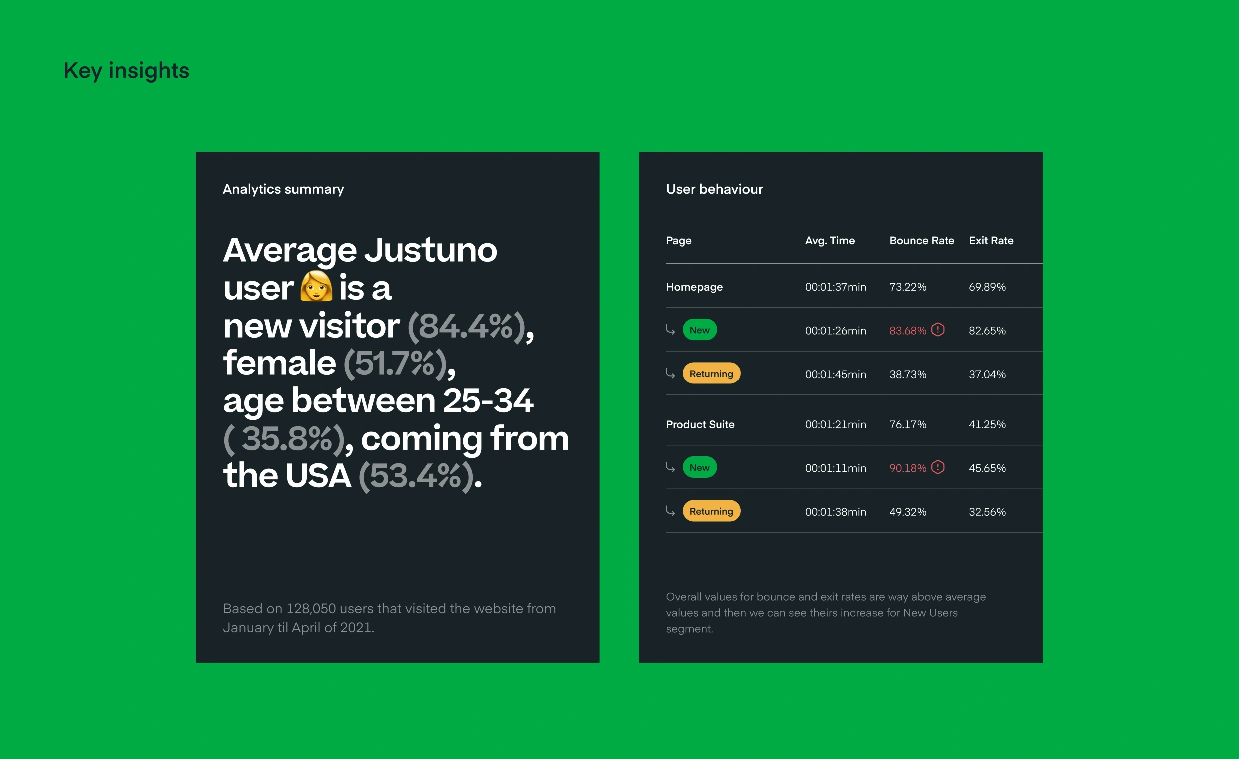
Next we analyzed quantitative information about how people were using the website. This included audience data, retention and referral data, user behavior, and examining standard user flows and conversion points.
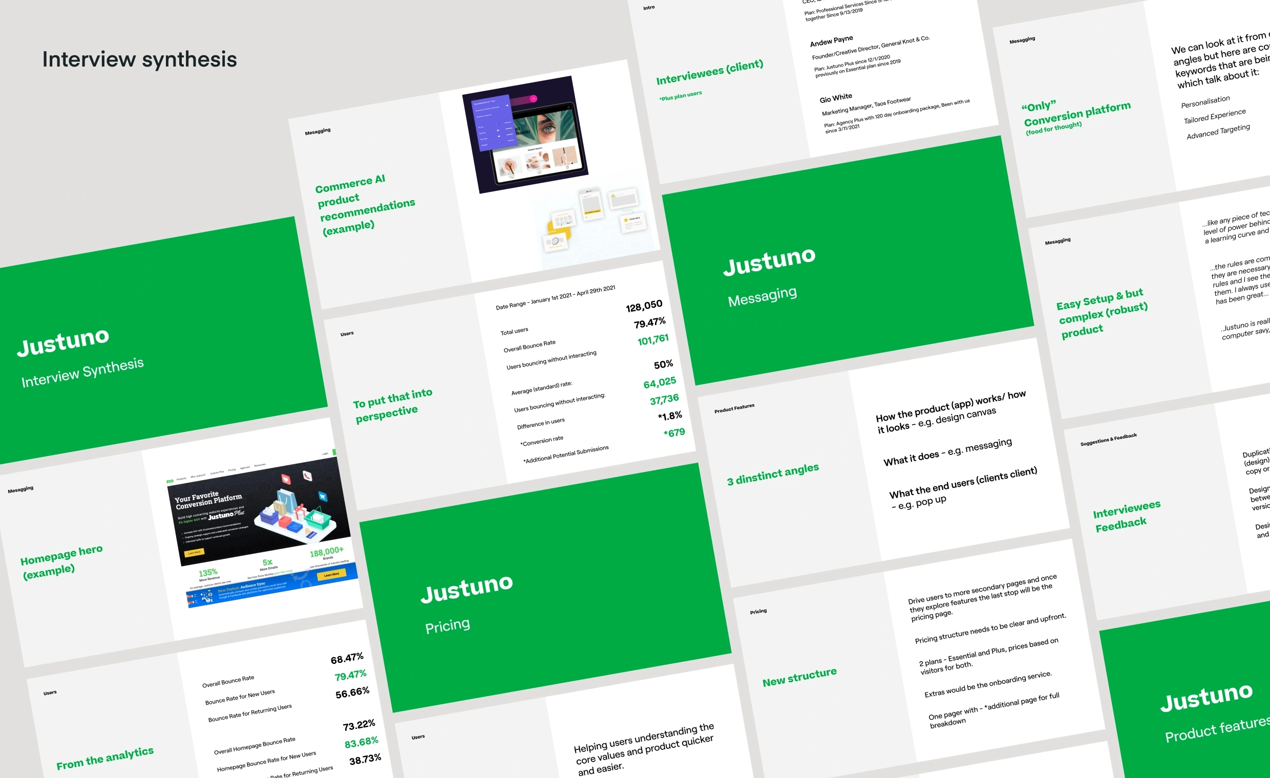
We carried out both user and team interviews to better understand why and how people are using Justuno. Insights from the growth, partnerships, customer support teams, and users helped us define target personas. These personas allowed us to better respond to each customer’s different challenges and highlight what Justuno does better than its competitors.
Communication
The communication during this project definitely had its ups and downs, but a lot of it was influenced by outside factors. When there is a big time difference, the communication usually flows more slowly, and there is always space for improvement here.
When it comes to communication tools, we mostly used Zoom, Slack, and Asana during this project to be in touch with the client and stay organized. Zoom and Slack worked wonderfully, but Asana was quite a challenge for the Justuno team because they had never used it before.
Nevertheless, the client’s ideas always came through and they were very happy with everything in the end.
Rebranding
Going enterprise, but not corporate, was our north star as we developed the new visual identity for Justuno. Our target was a slightly more enterprise market; however, we didn’t want to lose touch with smaller businesses.
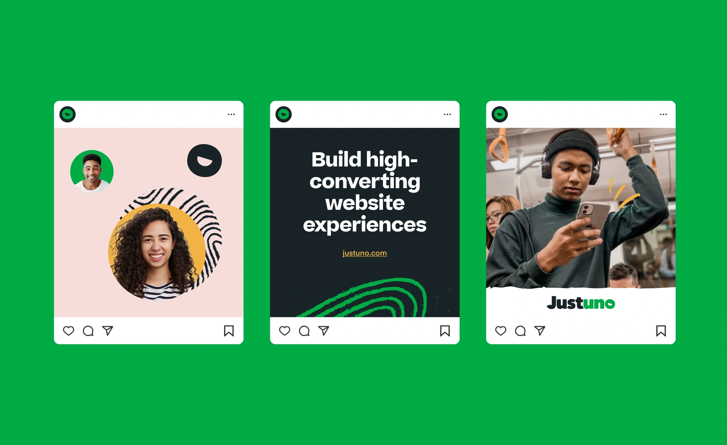
We wanted to maintain Justuno’s friendly, energetic and quirky personality, so we aimed at a language that thoughtfully manifests their strengths, playfulness, and creativity. One of their core strengths is that they value and care about people, both internally and externally.
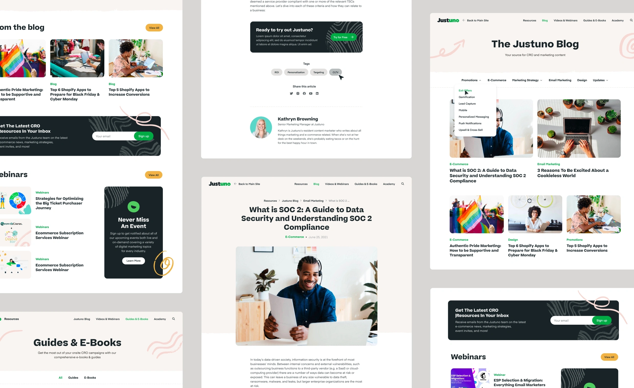
We focused on their people-friendly and charming culture by introducing scribbles and patterns to give us that approachable, humanistic aesthetic. We made the layout engaging, simple to navigate, and easy to digest with bite-sized product visuals and features. We pushed for a simpler, concise copy and built trust by emphasizing KPIs, great ratings, reviews, and customer stories.
To balance the expressive and quirky visuals, we’ve structured a consistent and scalable design system that allows Justuno to further grow and develop its brand across all marketing touchpoints.
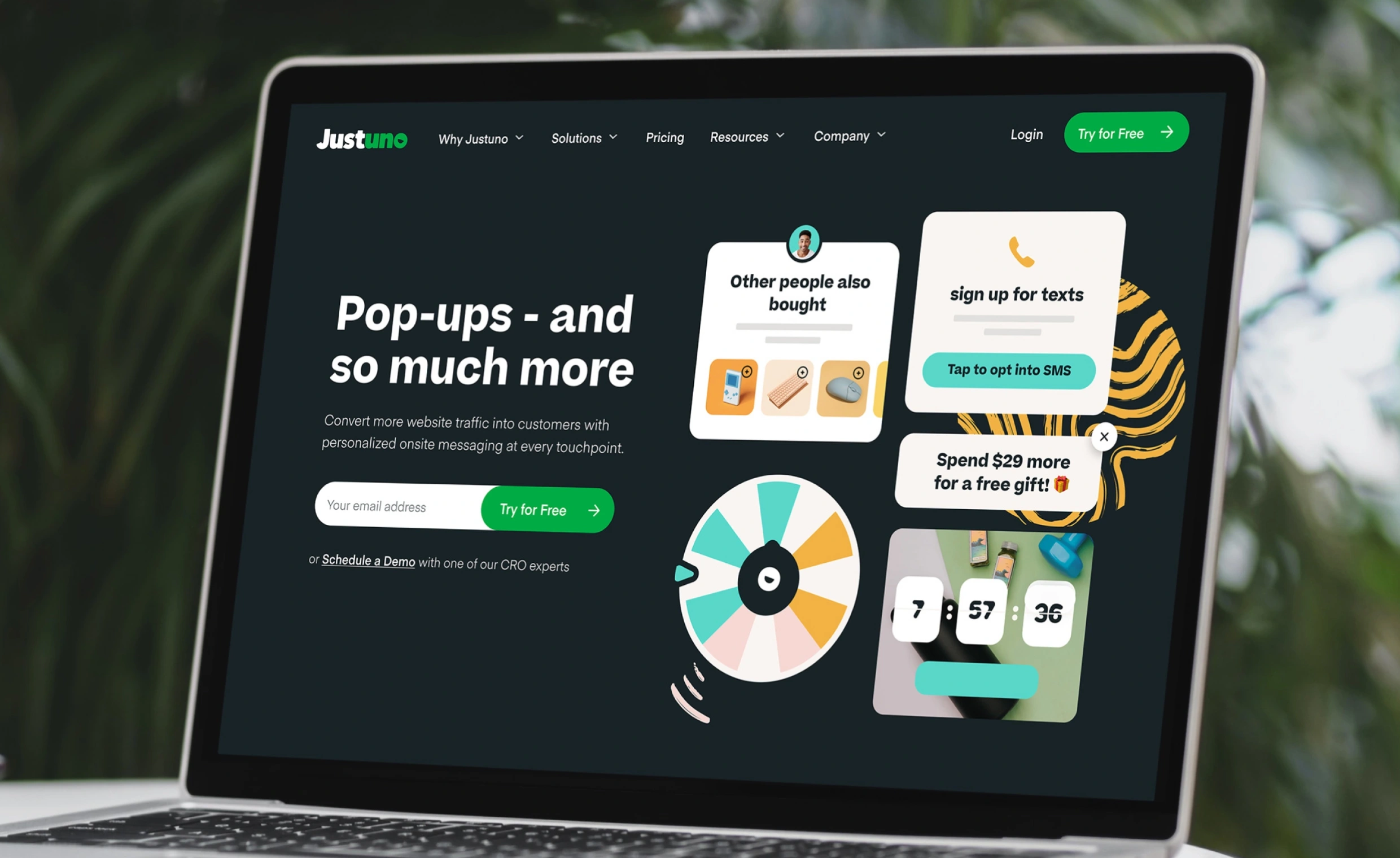
Visually, the new Justuno website is more modern, elevated, engaging, and interactive, thus making it user-friendly and ready to take Justuno to the next level.
Making it work
Having a new and improved visual identity is great, but it all needs to be supported in the backend with a solid website build. Justuno’s previous website was managed through WordPress; however, the rigid setup hindered their SEO ratings, causing usability issues and site errors. We decided to keep everything in WordPress but paired it with a custom-built Gutenberg block editor. That way, we removed all the unnecessary clutter, plugins and improved core web vitals, page speed, and SEO ratings.
Justuno’s marketing team now has a working environment that allows them to publish new content quickly and be more creative and consistent in the process. The new build will enable them to post content efficiently, including articles, ebooks, webinars, case studies, and other page types and layouts.
The change
After five months of collaboration, we have successfully launched the new Justuno brand and website experience using a Gutenberg-based WordPress CMS. We have successfully restructured and migrated over 500 web pages to offer consistency and focus to the Justuno brand.
The new identity, visual strategy, website experience, and design system will allow Justuno to target a more upscale market with more confidence. Now they have an identity that is people-friendly, quirky, charming, and uniquely Justuno.
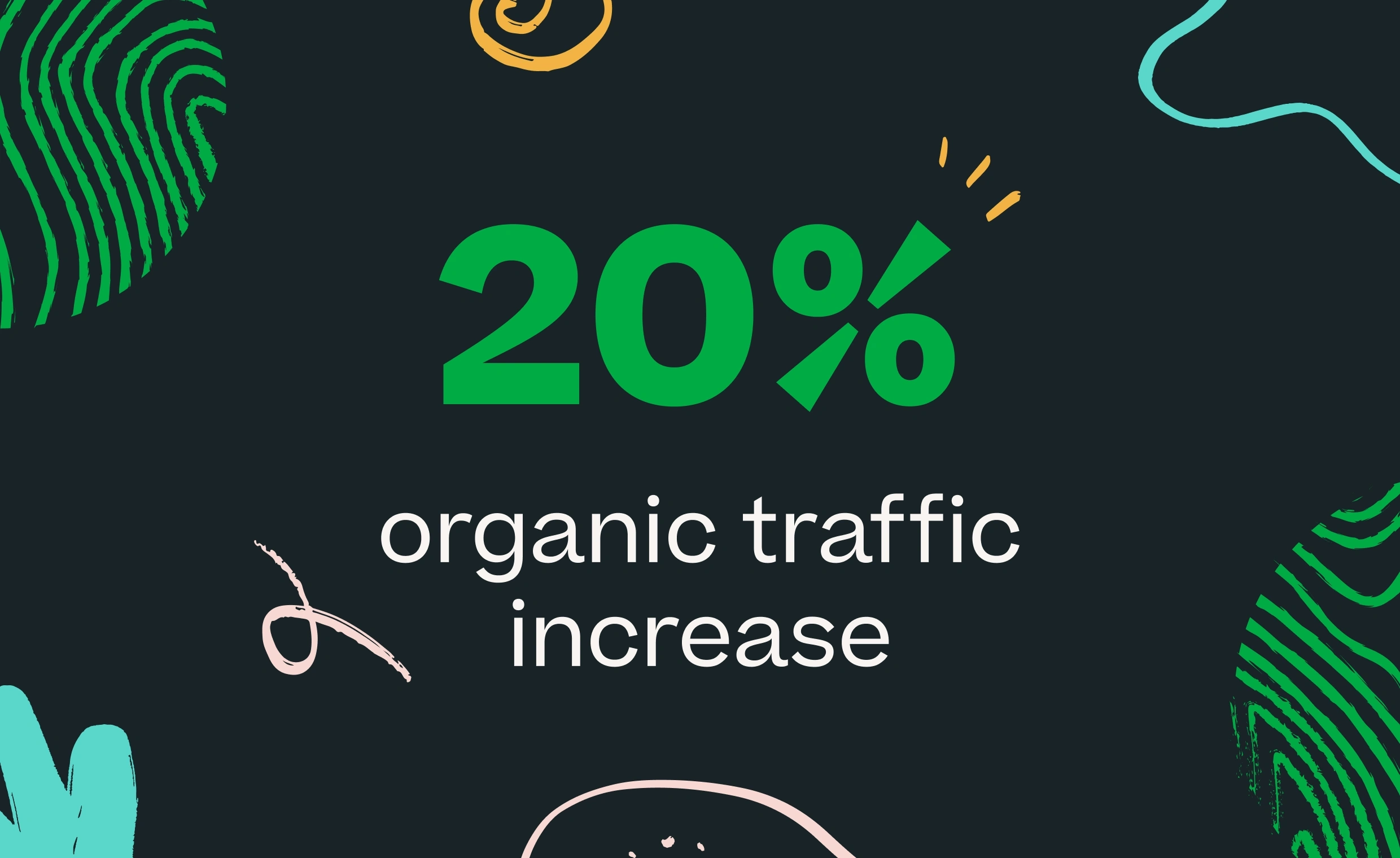
We are happy to report that after talking to the client, we can say that they noticed changes in their website statistics very fast. They saw a 20% increase in organic traffic, and their average session duration has increased by 5%. In addition to that, their website conversion rate, just looking at free trials, is up 30% year over year. It all shows us that the website is more intuitive and working better than it was before.
