Reimagining the Future of Data Science
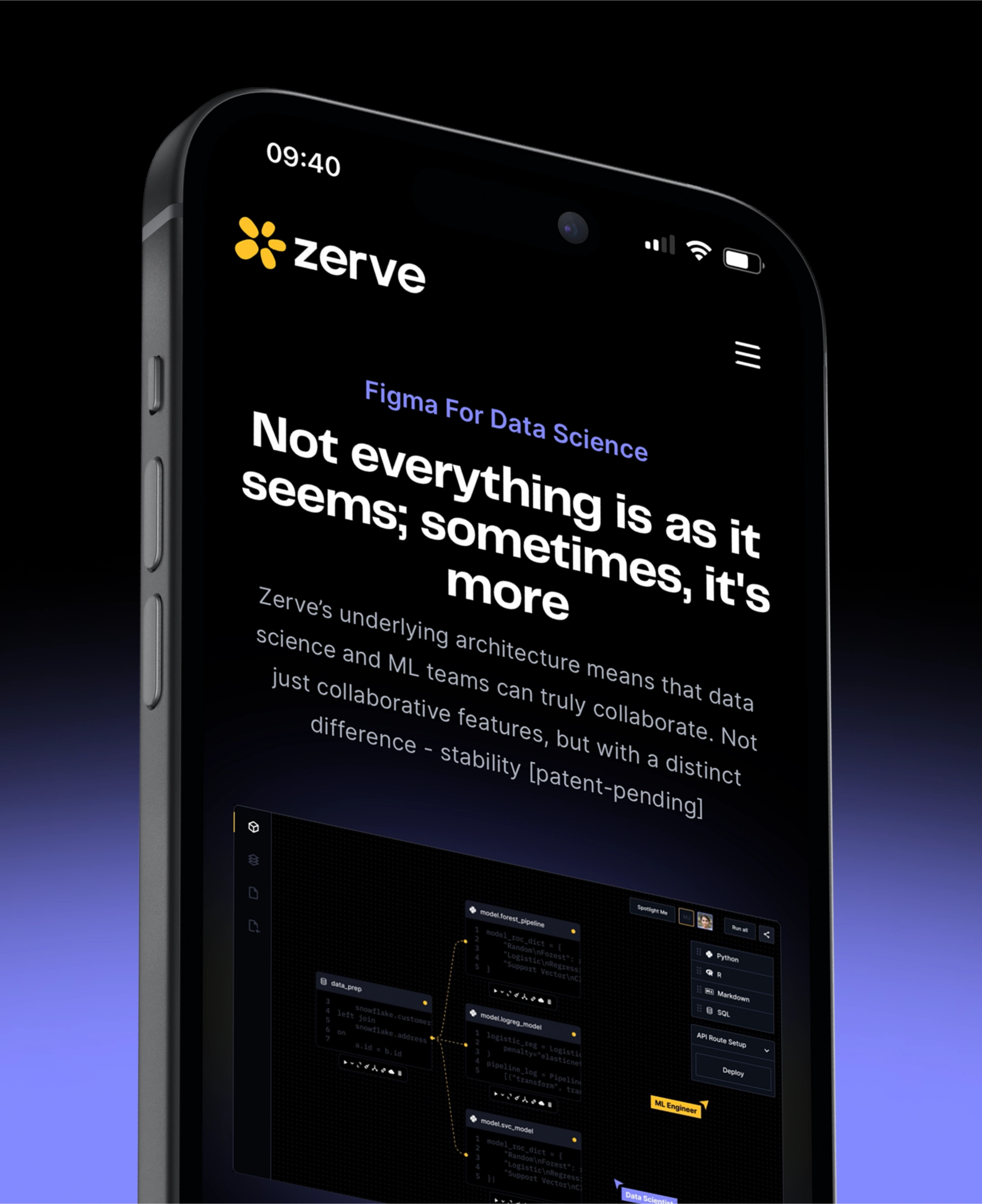
Zerve AI, a next-generation data science & AI workbench, is on a mission to bridge the gap between data science development & engineering. However, their existing visual identity didn’t fully reflect their trailblazing mindset or resonate with their tech-savvy audience, so it was due for a refresh.
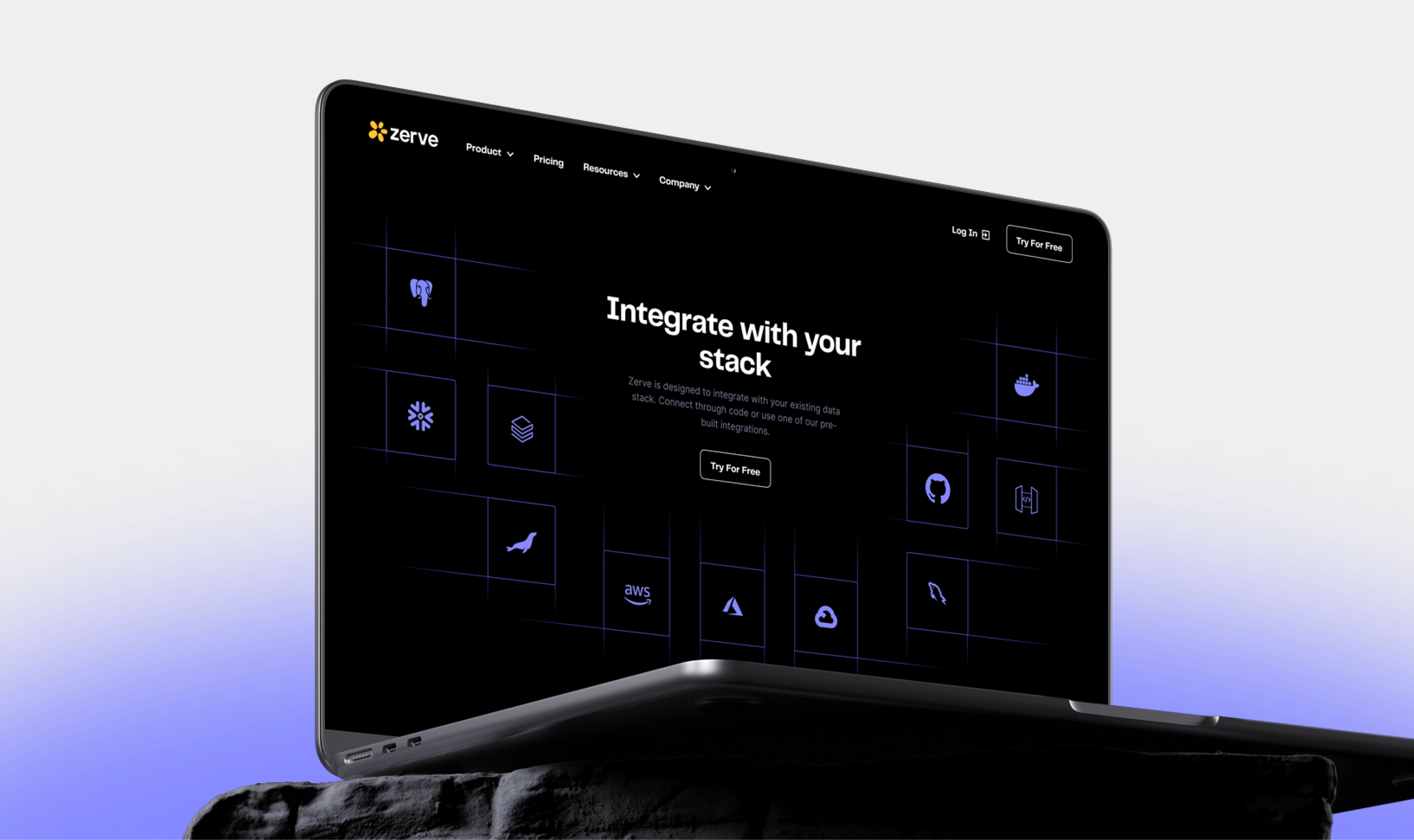
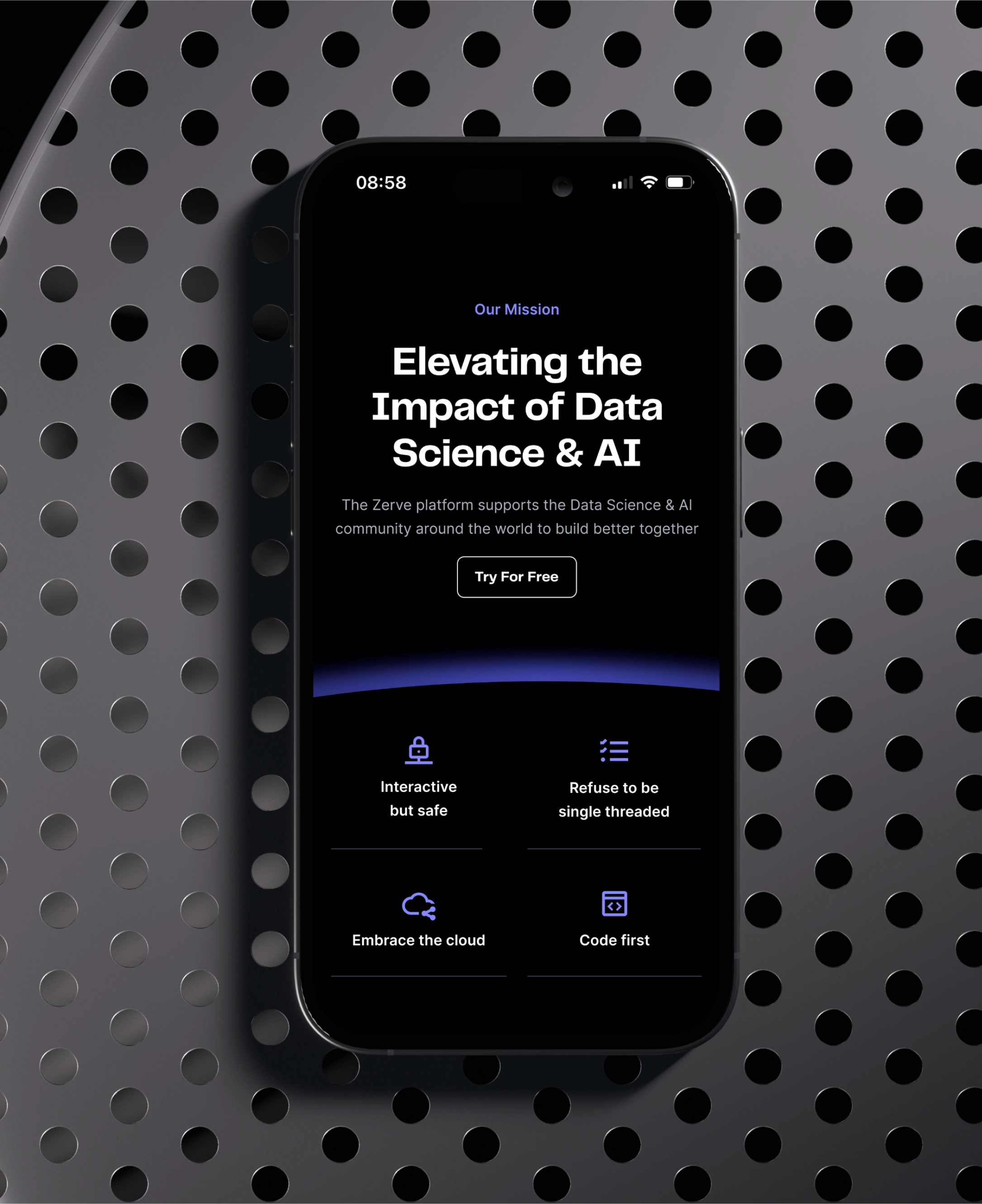
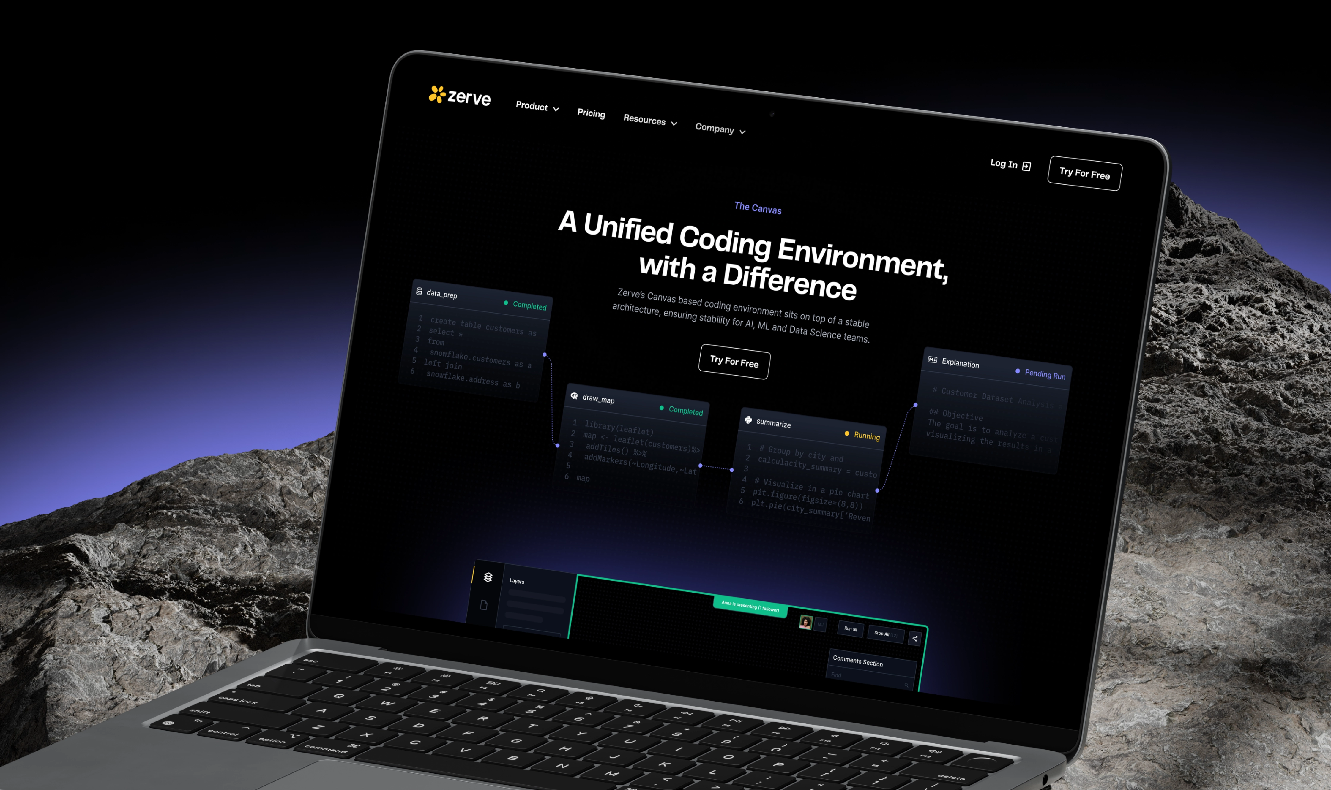
Moreover, they needed a website redesign so that it showcases the platform’s powerful features in a way that feels intuitive, engaging, and visually appealing for data scientists and coders. This case study delves into how BB Agency partnered with Zerve AI to create a sleek, sophisticated browsing experience that empowers data scientists and coders to push the boundaries of their work.
Translating Research into Actionable UX Design
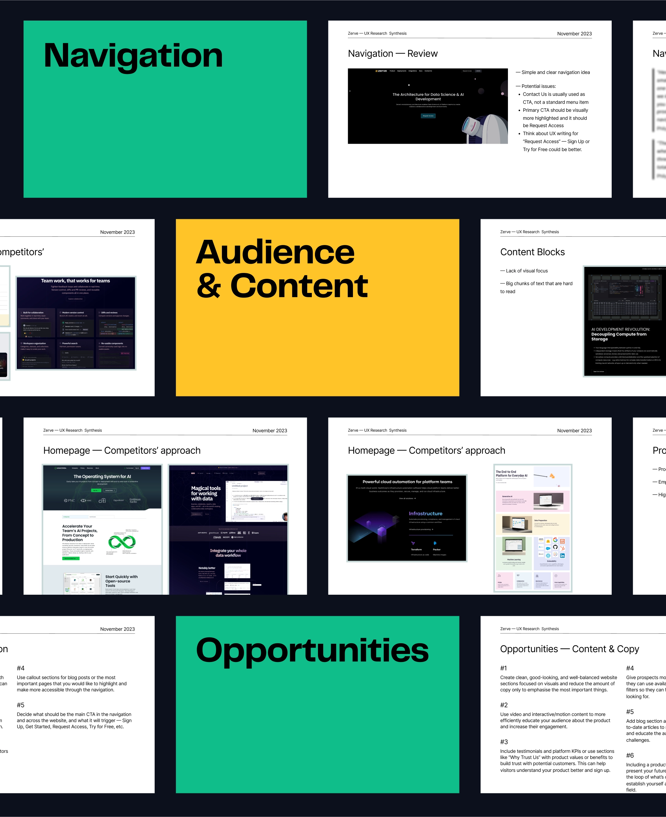
Our collaboration kicked off with our UX team’s deep dive into the world of data science and AI. Through stakeholder interviews, competitor benchmarking, and market analysis, we identified key opportunities for Zerve to differentiate themselves and resonate with their target audience.
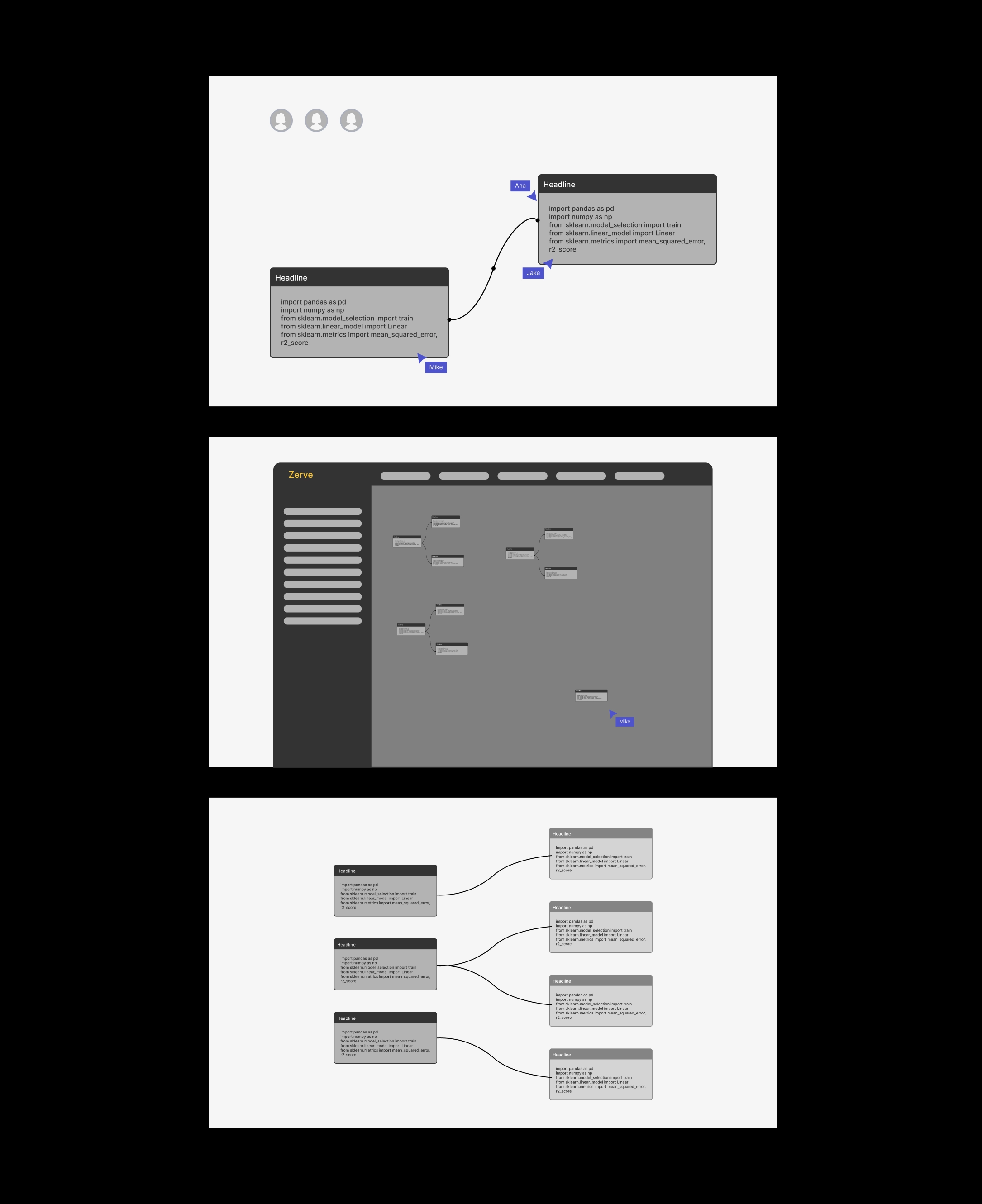
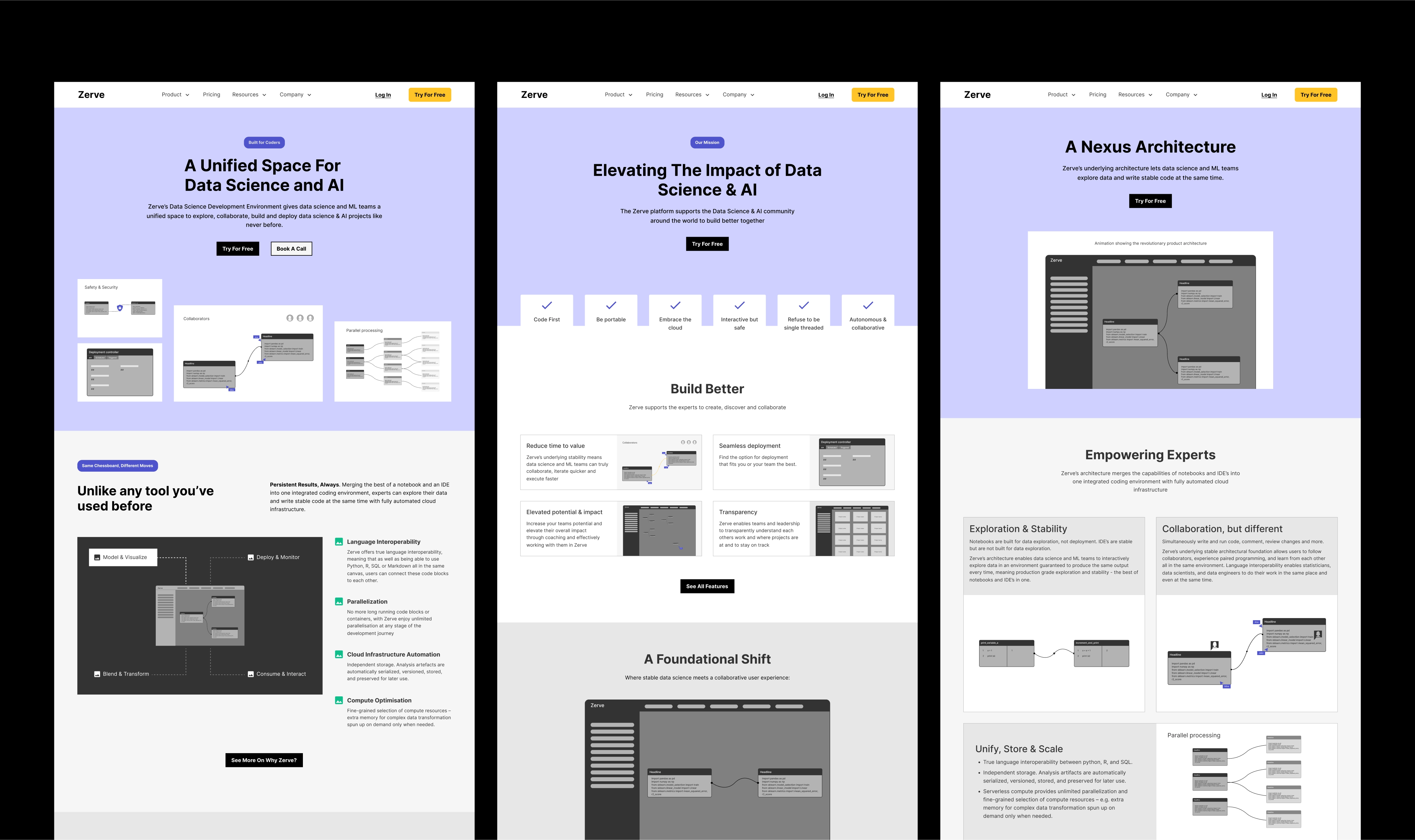
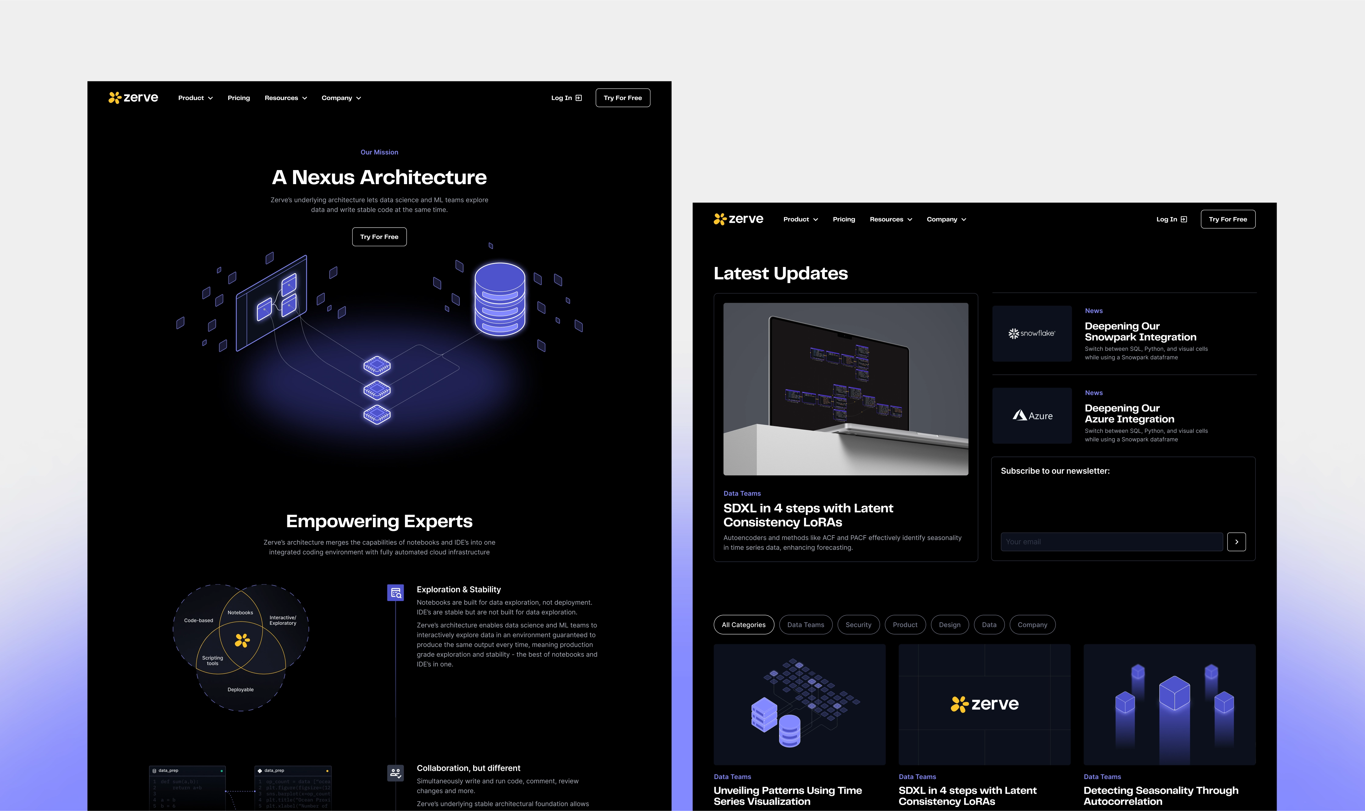
Synthesizing our research, we created a blueprint for Zerve’s new website, including strategic recommendations, a detailed implementation plan, and a sitemap outlining the information architecture for each page. The wireframes we created prioritize intuitive navigation while highlighting Zerve’s innovative features and architecture.
Refining the Brand for Maximum Impact
Zerve AI’s brand refresh was a strategic undertaking, aimed at creating a more cohesive and impactful visual identity that mirrors their groundbreaking work in the data science field. We made subtle but thoughtful changes to the logo for enhanced balance, with the new wordmark typeface introduced for better legibility.
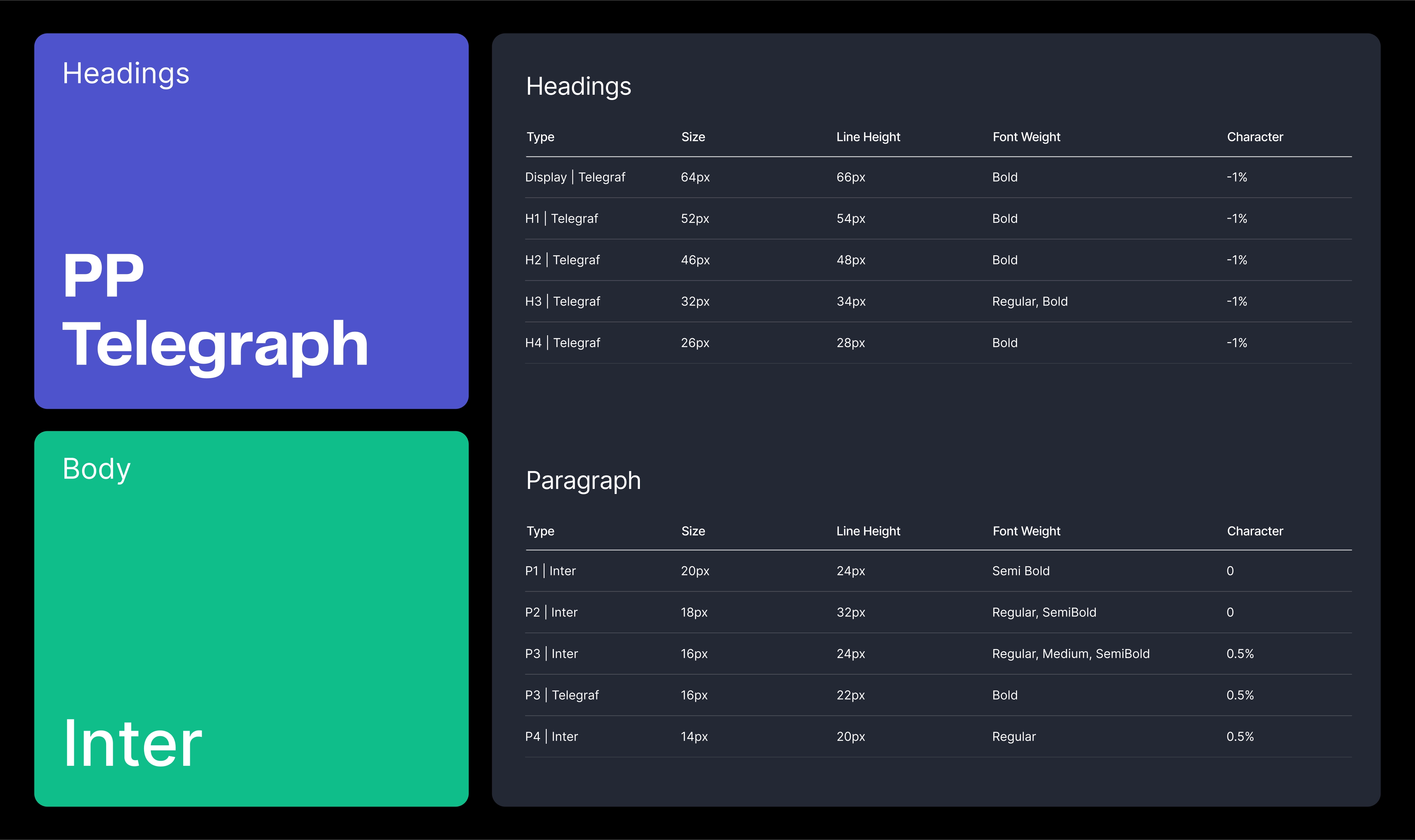
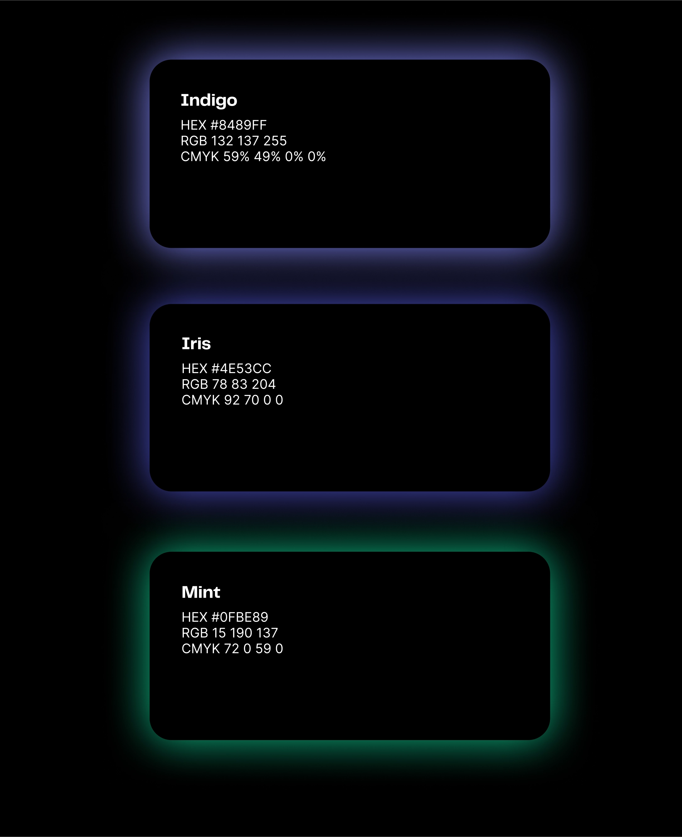
A carefully curated color palette, dominated by dark tones to evoke sophistication and timelessness, was punctuated with vibrant accents of yellow, purple, and green to inject energy and rhythm. The chosen headline typeface, PP Telegraf, with its sharp angles and distinct character endings, adds a modern, tech-forward edge. Paired with the highly readable Inter font for body copy, the overall typography ensures clear and impactful communication.
Fueled by insights from UX research and inspired by the refreshed brand identity, our UI design team set out to craft a cohesive visual language that would seamlessly guide users through complex features while ensuring an intuitive and engaging experience.
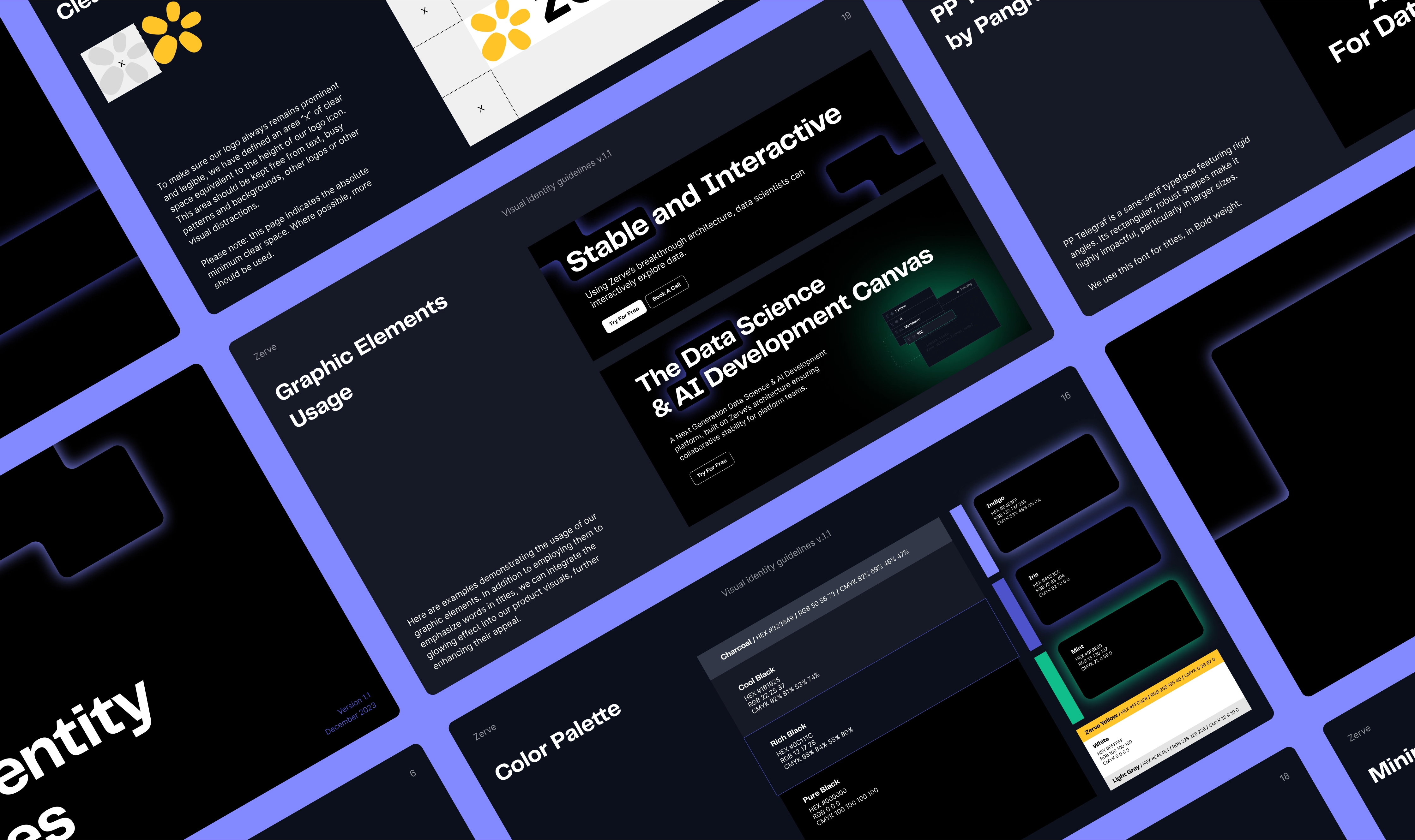
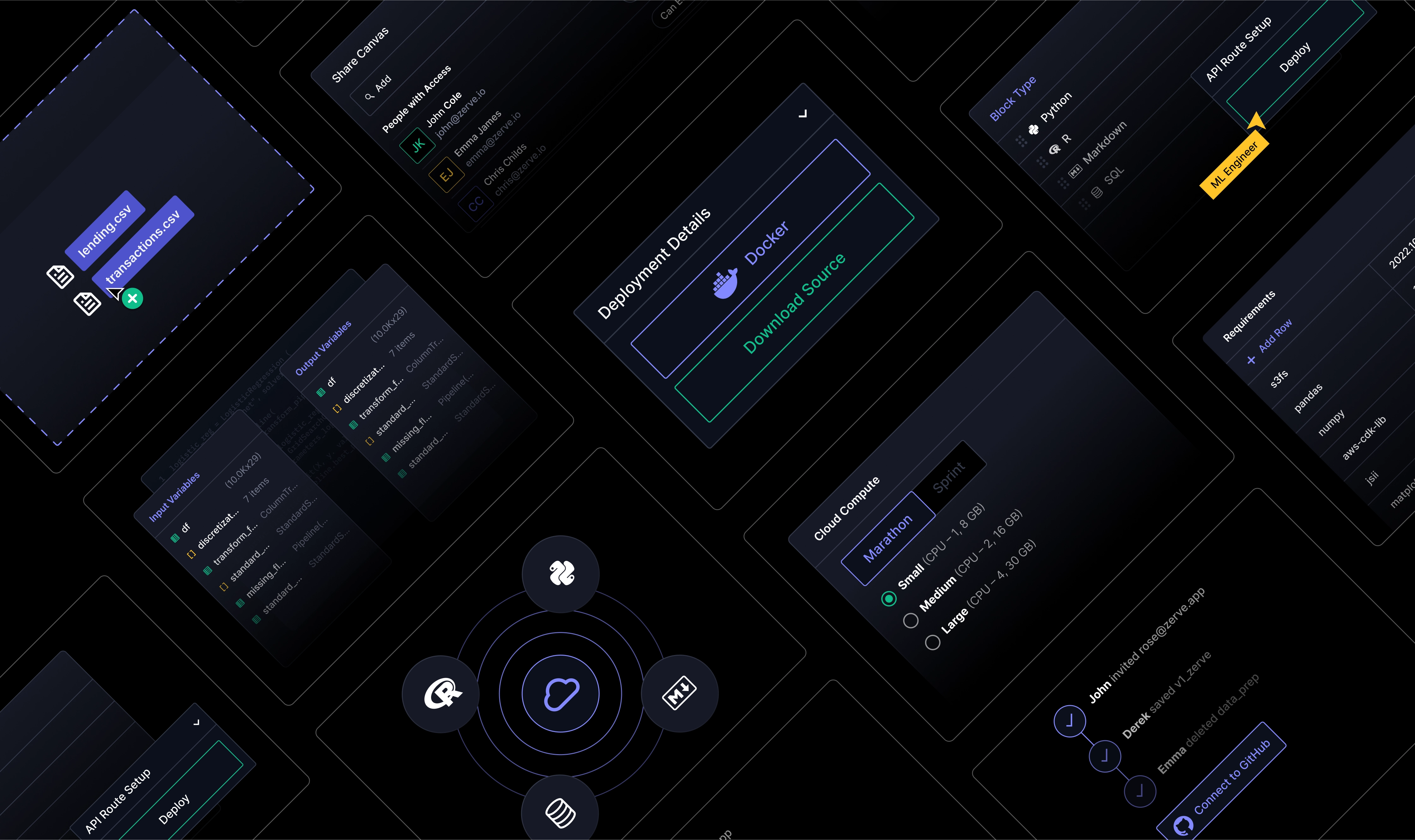
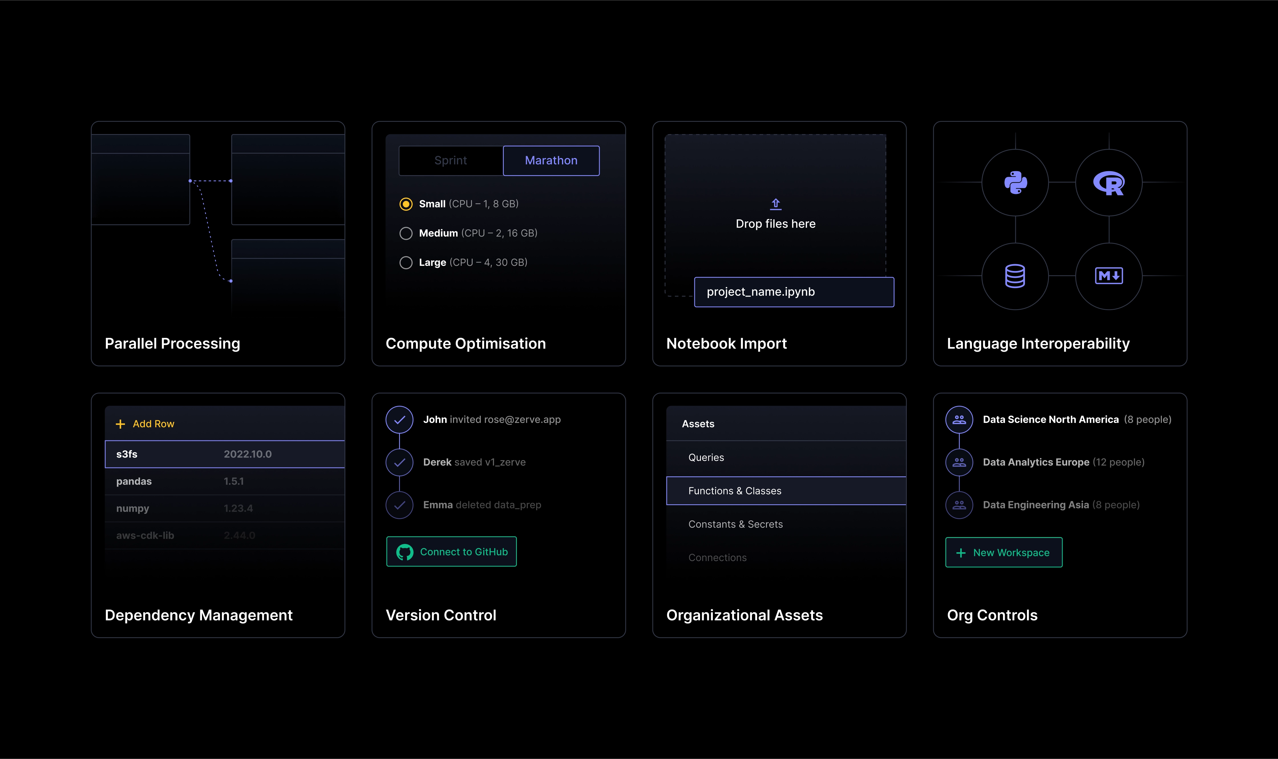
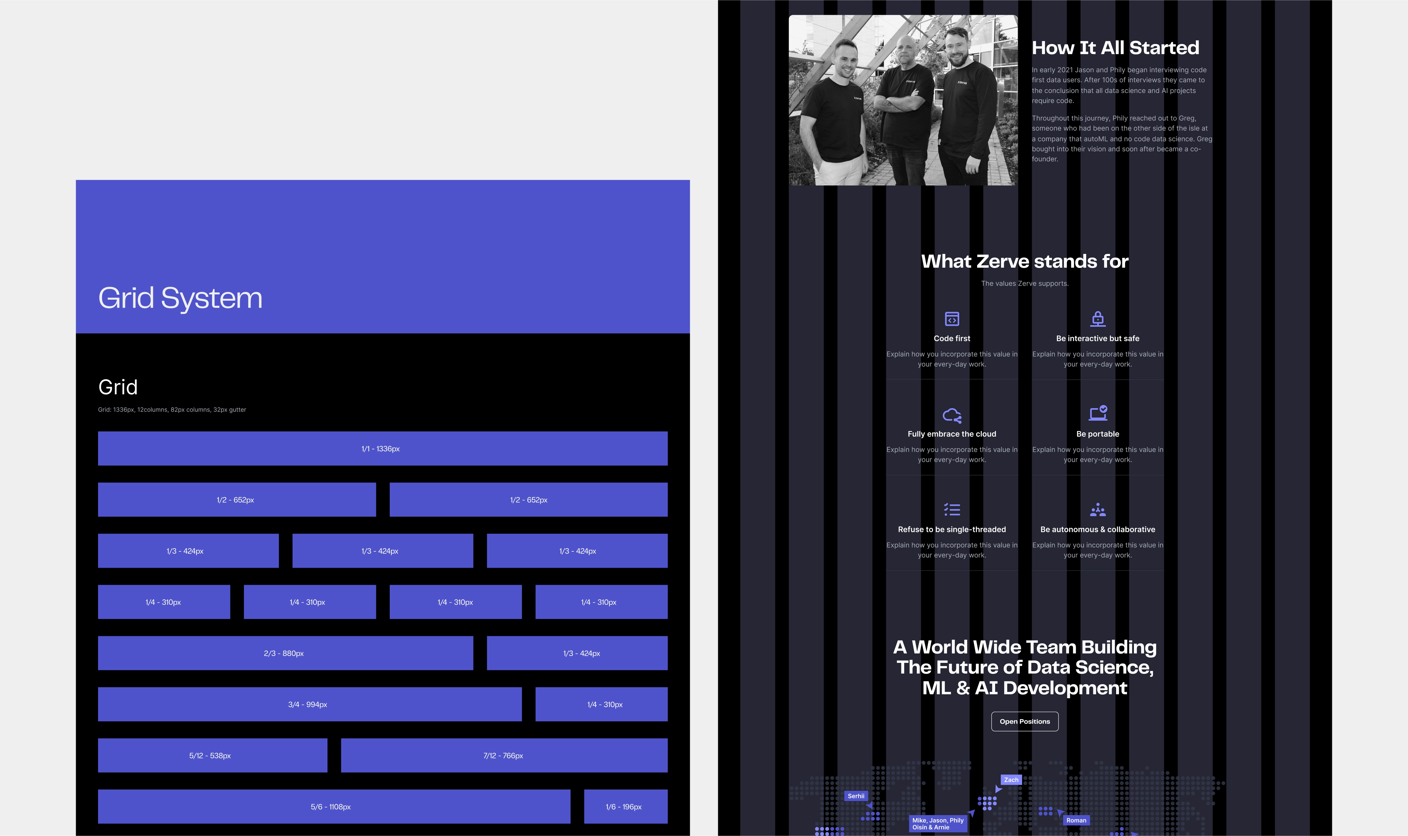
We crafted a design system that highlights Zerve’s key features while maintaining a sense of simplicity and impact. Product visuals were thoughtfully abstracted to strike the perfect balance between clarity and aesthetic appeal. To enrich the visual experience, we expanded Zerve’s color palette and developed a series of unique graphic elements, illustrations, and light animations. Here’s how the key design elements break down:
Dark color palette with gradients: A timeless dark theme serves as a sophisticated foundation, creating a striking contrast against vibrant UI elements. Gradients add depth and dynamism, ensuring smooth color transitions and a touch of visual flair.
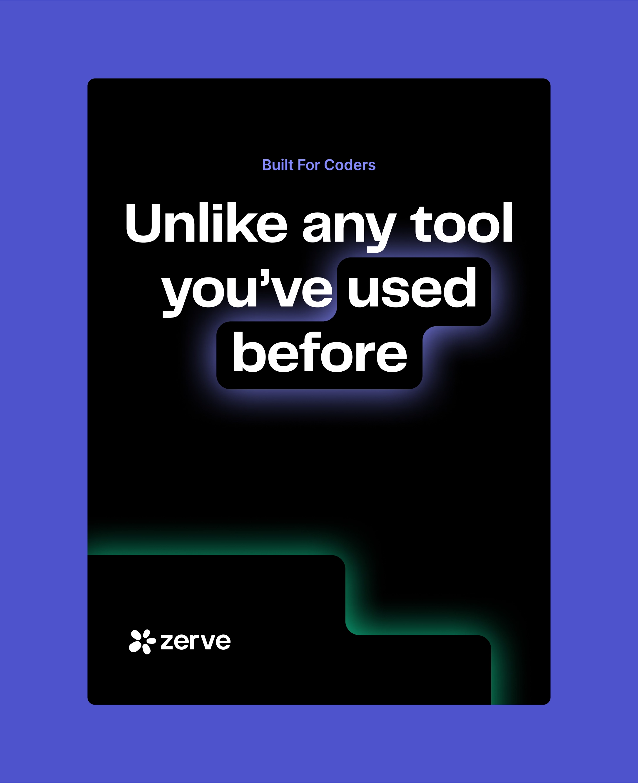
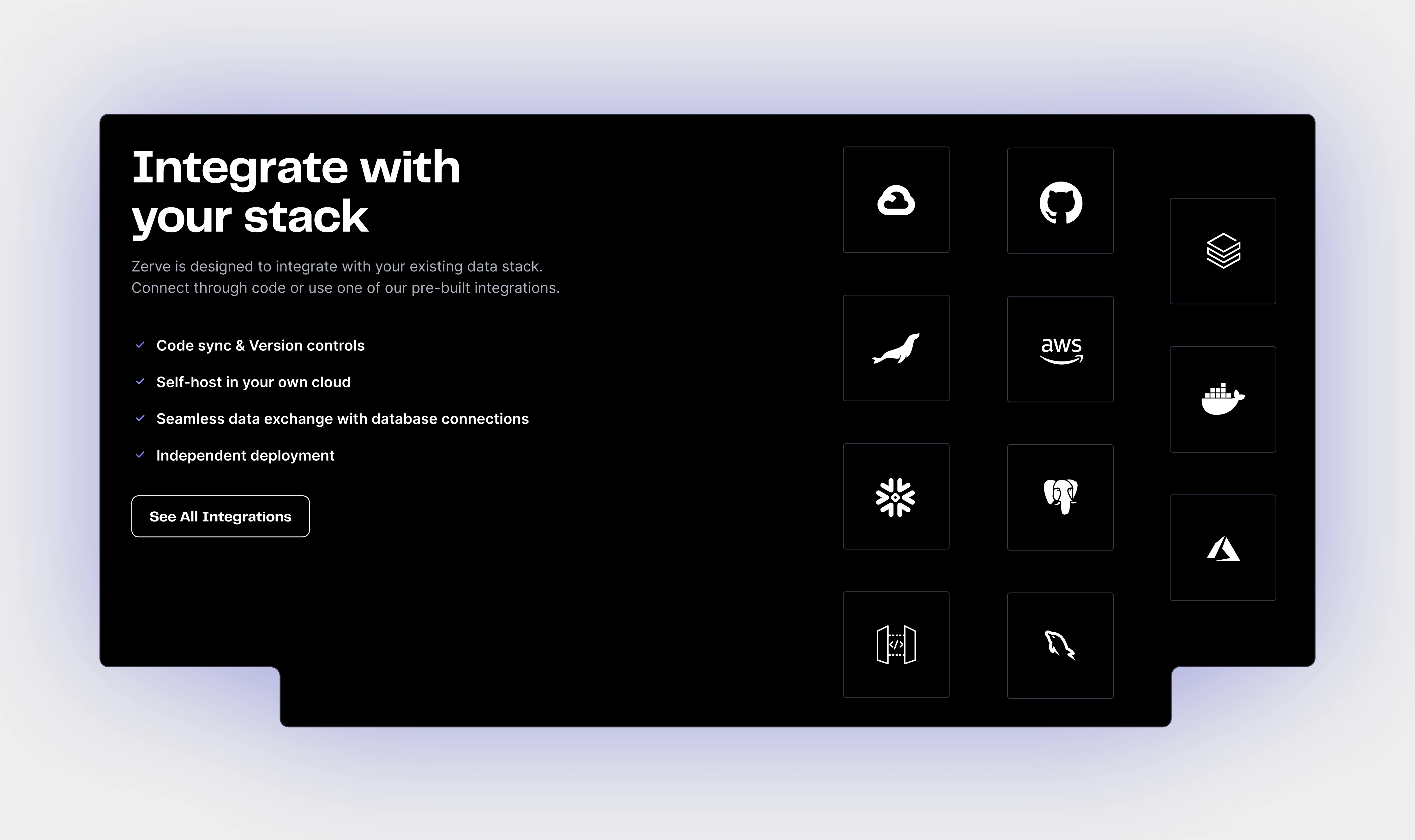
Geometric shapes: Inspired by the idea of collaboration and connection, rounded graphic elements guide the user’s eye, highlighting essential information and complementing product visuals. These elements, with their black fill and bright outlines, harmonize with the logo’s design language, reinforcing brand cohesion.
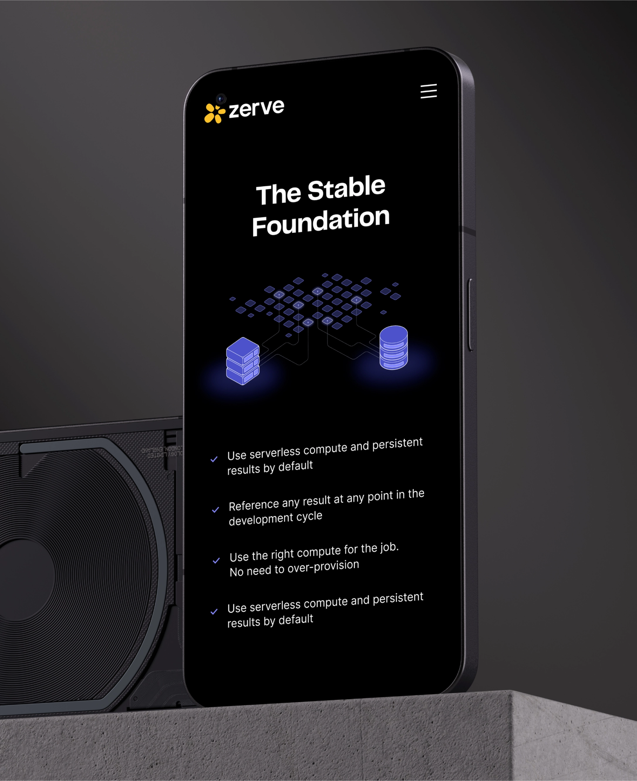
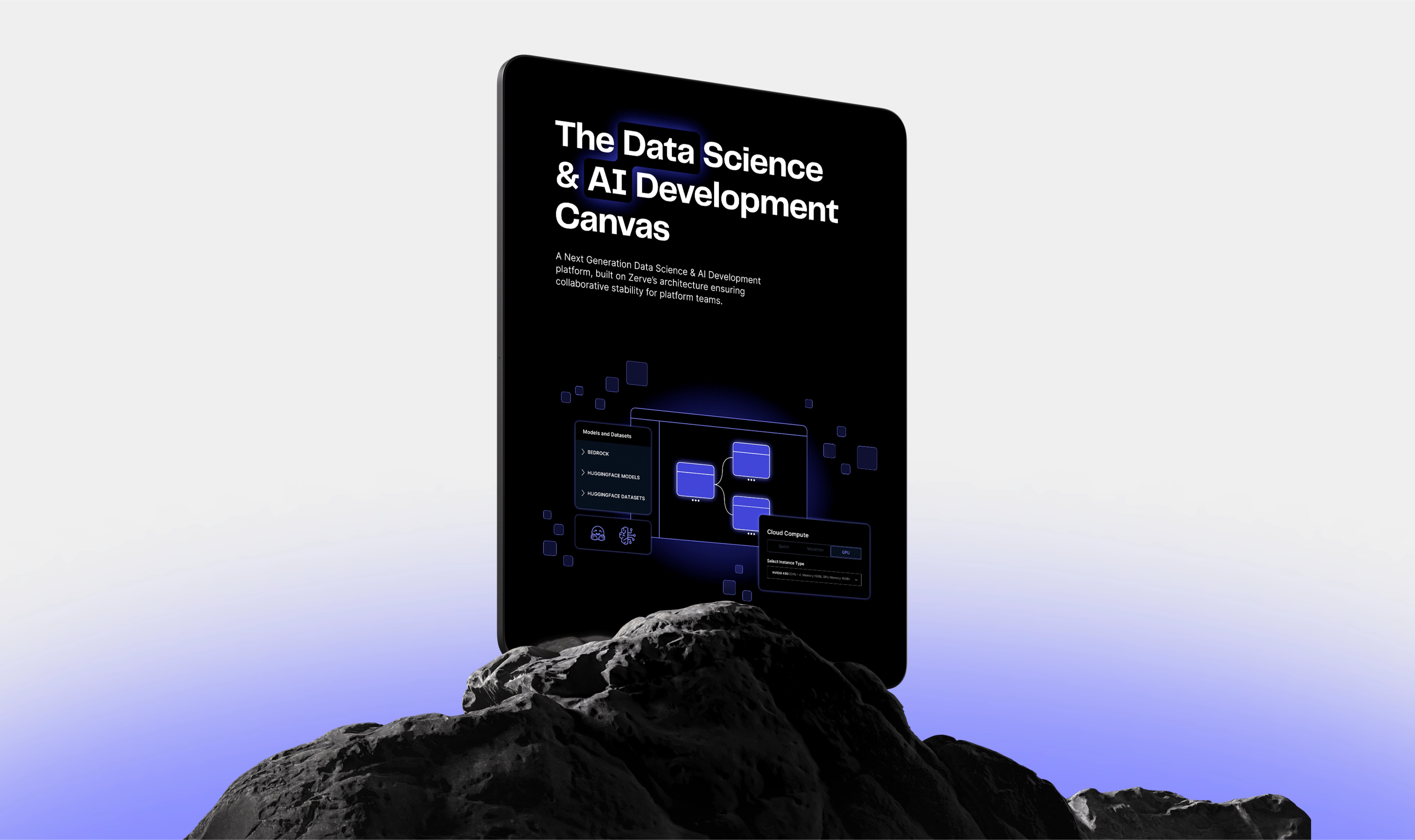
Custom illustrations: Clean, linear illustrations, animated with subtle movements, were designed to break down complex concepts and make them more approachable. By incorporating gradients and subtle glows, these illustrations infuse a futuristic vibe while effectively communicating technical information.
Designing for the People Behind the Algorithms
Every design decision was made with data scientists and coders in mind. This balanced interplay of visual elements creates an interface that is both visually stunning and intuitively functional. The result is a user experience that reflects Zerve’s future-focused vision and at the same time empowers users to grasp the complex features with ease.
The website’s content is organized clearly and concisely, ensuring that visitors can quickly find the information they need. The sign-up and registration process was streamlined for a frictionless experience, with key features prominently displayed for easy access.
