10 years of BB Design
Designs from 10 years ago are the work of one of our co-founders and our Head of Design, Filip Justic. In contrast, the later work is the collaboration of more than 50 people that are a part of BB Agency today.
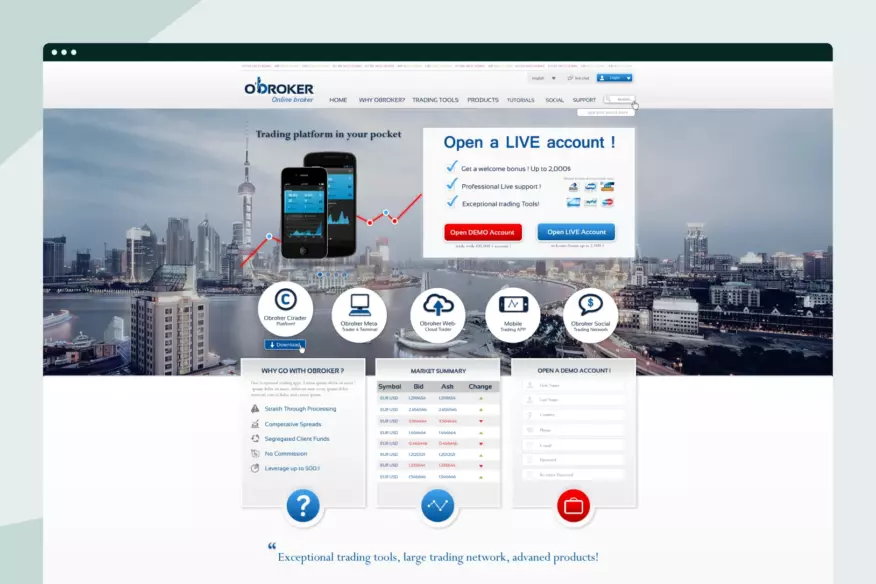
2012 – oBroker
The first commercial project BB worked on was part of their first contest on 99 designs. Filip and Matej created the initial design language for oBroker’s website in 2012.
The design we’re sharing didn’t win the pitch but landed the brothers a position in the contest’s finals and thus provided a moral boost to pursue a career in IT.
2013 – Shiply
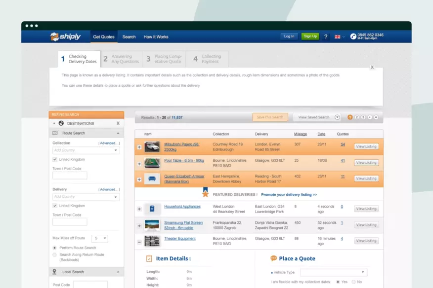
Shiply is an online marketplace for various transportation services from the UK. One of the first large-scale projects we worked on back in 2013. We won Shiply’s website redesign contest in 2012. Based on our redesign proposal, we also overhauled their web app.
It was a massive project for Filip and Matej, who worked tirelessly in Adobe Illustrator to redesign the web app. Also, this is one of the first projects where we reached out to Marino, our partner and Head of Development today, for development support.
2014 – InvoiceSherpa
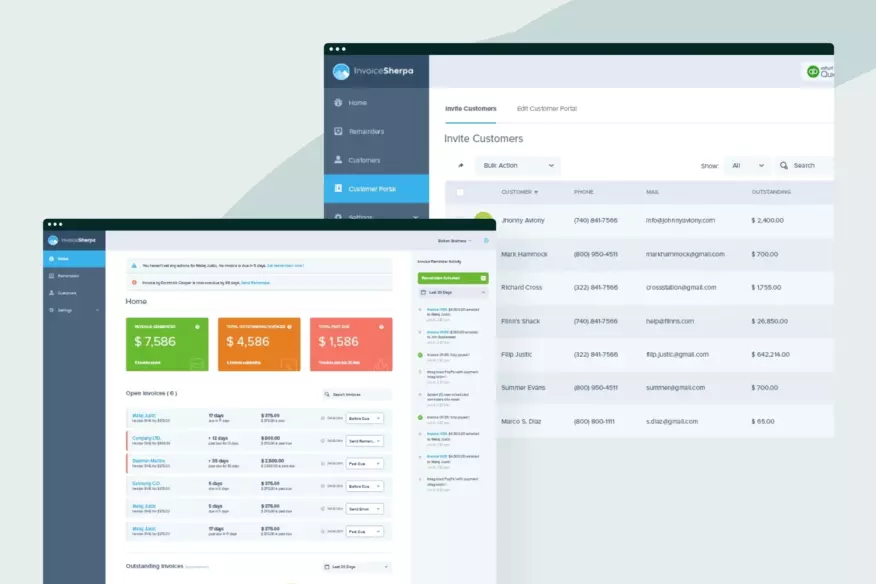
InvoiceSherpa is an industry-leading accounting and payment platform from the United States – to this day, we aren’t sure what Shaun Clarke saw in our portfolio to decide and hire us, but this was an important project for us back in 2014.
We redesigned InvoiceSherpa’s website and product, and based on the fresh new design solutions; we gathered a lot of positive reactions from the Dribbble community. We worked with Shaun on two additional products as well. This is the first time we collaborated with Don Gepulango, as he was brought on as a front-end developer by InvoiceSherpa. Later Don became a full-time employee at BB and has been ever since.
2015 – Conference Calling
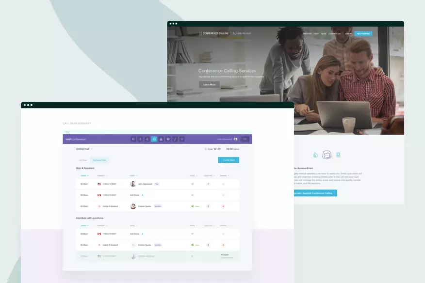
Conference Calling is a cloud-based conferencing software that makes conference calls better. Kurt Birkenhagen brought us on to redesign the Conference Calling website. Then, based on that project, we landed the redesign of their web app and, later on, another iteration of the website.
We collaborated with Conference Calling for over four years and got many positive reactions from the client, users, and design community.
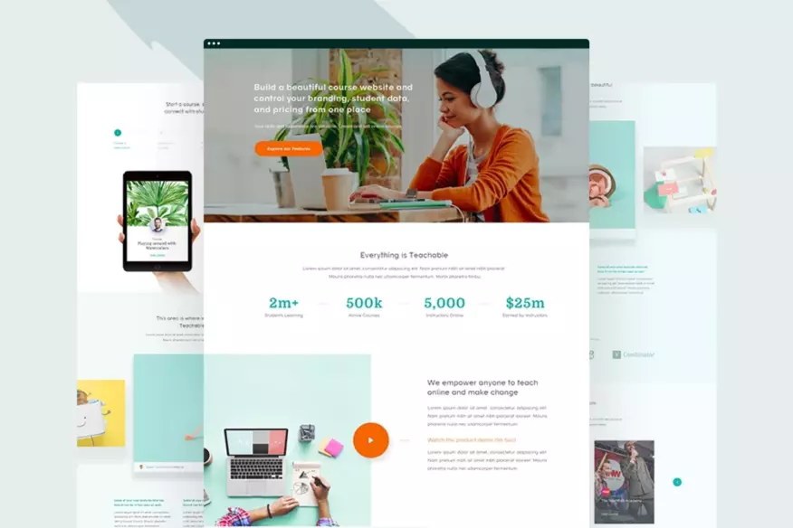
2016 – Teachable
Teachable is a world-famous online course platform used by more than 100.000 creators. We collaborated closely with a manager who introduced us to the Teachable team and got scoped to redesign the Teachable website experience from the ground up.
Incredibly proud of this project, as it’s one of the first projects we did for a well-established brand from the US. Afterward, we worked on multiple projects with the Teachable team, and today we still work closely with their previous CEO, Ankur, on launching some new stuff.
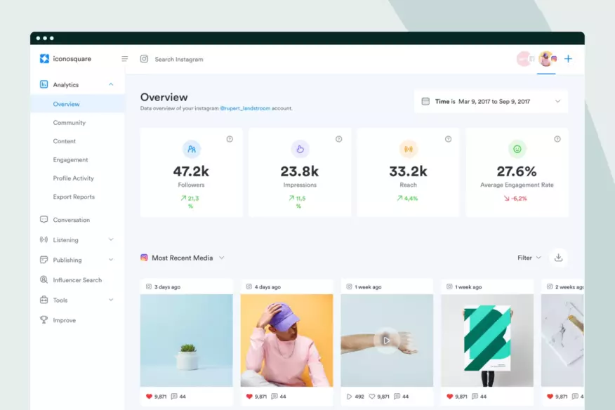
2017 – Iconosquare
We did a comprehensive visual overhaul for Iconosquare, social media analytics, and management tool. This project was worked on by Filip and outside collaborators, as BB worked on Iconosquare’s brand, product, and website, thus completely redesigning all digital touchpoints.
Also incredibly proud of this project as this is the first time we collaborated closely with an existing product and design team from Iconosquare. It required a lot of communication, compromise, and fluidity in our decision-making.
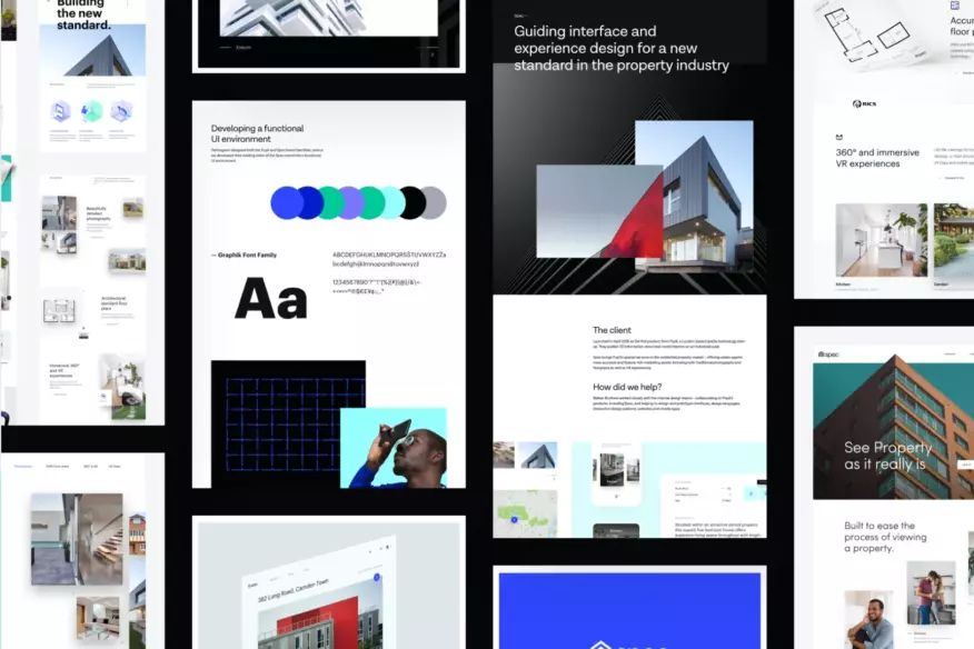
2018 – Spec
Spec is building a new standard for residential property, as they help digitize building interiors and thus help estate agents to deliver feature-rich marketing assets.
Sharing this project as we consider this one to be of extreme importance for the agency. Not necessarily because of the project and results but because of the people we collaborated with.
Spec was the first project where we worked with AR technologies. Also, it was the first project where we closely collaborated with Matthew Wheeler, whom we collaborate with to this day. The first time we saw Vicente Reyes Montelagre’s work, who was the illustrator on the project back then, and today our Brand Team Lead. It was also the first time we collaborated with CrissCross studio on a motion project with whom we also collaborate today, and the first time we had the opportunity to work with a visual identity that Pentagram created, so a lot of “new” stuff that we faced on this project.
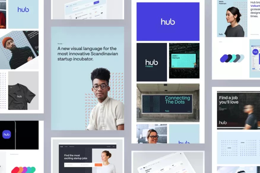
2019 – The Hub
The Hub is a go-to startup platform for finding talent and investors in Northern Europe. For some reason, this was one of our most notable projects on Dribbble that year. It received more than 4.2m views across more than 15 different shots.
We consider it a jumping board to working more closely with The Hub and Rainmaking team as we worked on multiple projects based on the success of The Hub rebrand, website, and product environment.
2020 – CVMaker
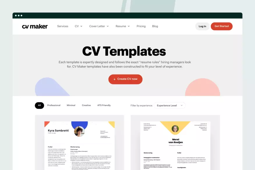
CVMaker is a resume builder tool from the Netherlands that goes deeper into the hiring process and helps people land their dream jobs. Adding this project as one of the most important ones in 2020, as this is the first time we had an extensive UX Research process. We collaborated closely with TrueToForm on researching CVMaker’s current website and product.
This project completely changed our perception of how research can help build real digital experiences. Based on this, we have a dedicated UX department working on over 85% of agency projects today. In addition, we’re working with the CVMaker team still to this day, as we have completely overhauled their brand, website, product, and design system. Even though we worked on some significant projects in 2020, like ShipBob, Wibbitz, and Otsuka Pharmaceutical, I still consider CVMaker highly important for the agency.
2020 – ShipBob
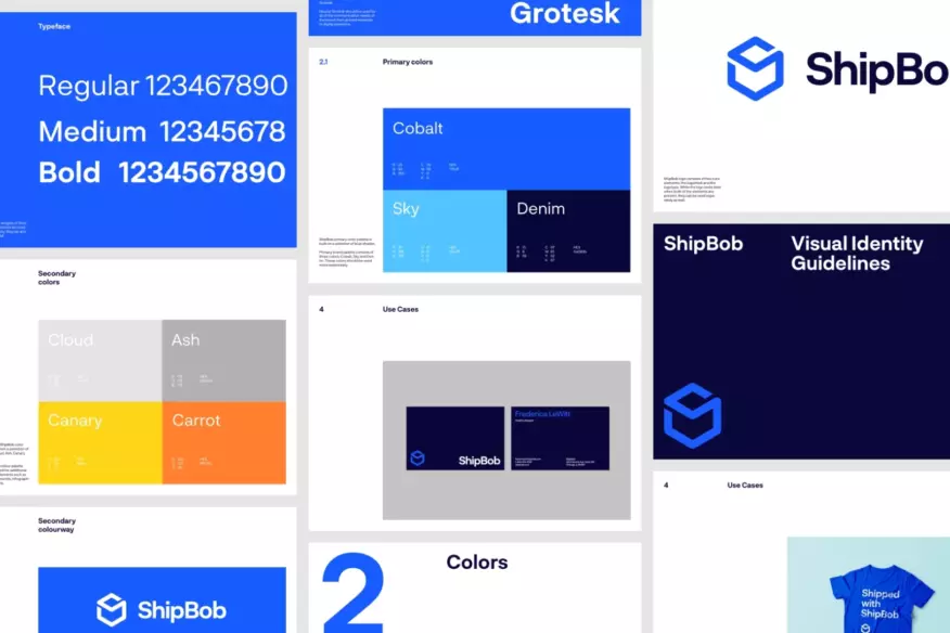
ShipBob is the best-in-class fulfillment solution for e-commerce brands.
We’re sharing the ShipBob project as it was one of the most referenced redesigns we did until then. Based on our improvements to the website, the ShipBob team reported an immediate increase in conversion rates of 27%.
We’re happy to report that ShipBob was our first Unicorn client; well, they became one in 2022 as they are now valued at more than $1B and have since risen more than $260m in funding.
2021 – Sendlane
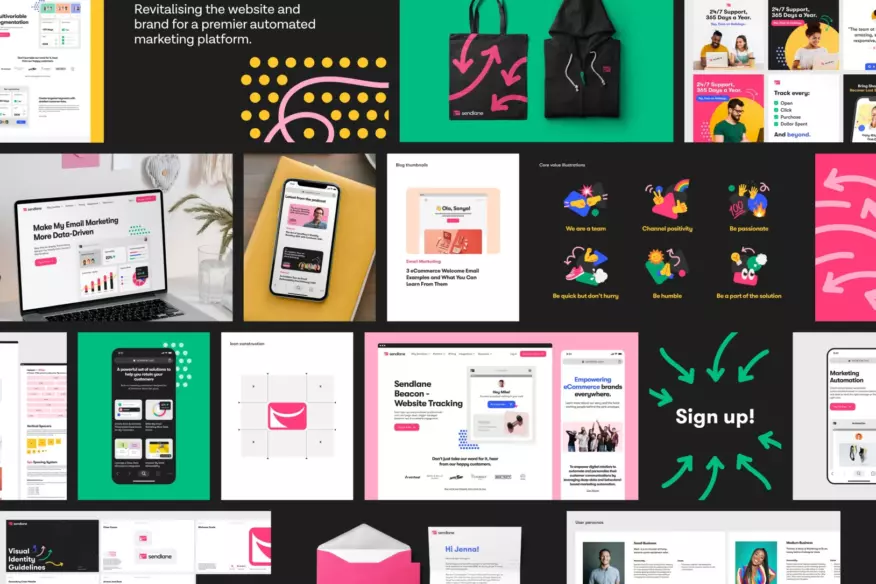
Sendlane is a robust and comprehensive Email and SMS marketing tool helping clients deliver exceptional e-commerce customer experiences. This project was a perfect combination of trust from the client’s side in the team of talented experts from the BB side and the possibility to do a complete visual overhaul and build something new, innovative, and groundbreaking.
The result is the culmination of hard work, talent, and timely execution as we did a full-cycle process, including discovery, visual identity, new website structure, web design, and Webflow development. Since the launch of Sendlane’s new website, we have worked on their product, design system, and two additional brands and are looking to support Sendlane with new exciting projects.
2022 – BB Agency
We worked on many fantastic new brands, websites, and products throughout 2022. If only we could choose one that would stand above the others; however, that’s impossible because we’re so proud of how we have evolved our services, processes, and thinking.
With that in mind, it seems that one of the most important projects we did in 2022 was working heavily on our agency, establishing an organizational structure, new processes, and policies, and opening up HR, Sales, and Marketing departments. This is a year of change and transition for BB – and the real work has just begun.
